


Join our typography community!
A friendly online forum for all questions around fonts and typography. Get answers to all your typography questions or help others with your expertise.
Typography Feed (complete)
- Past hour
-
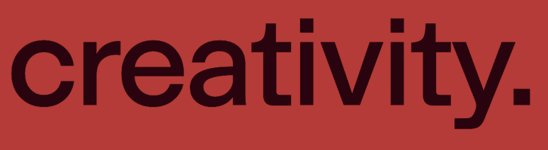
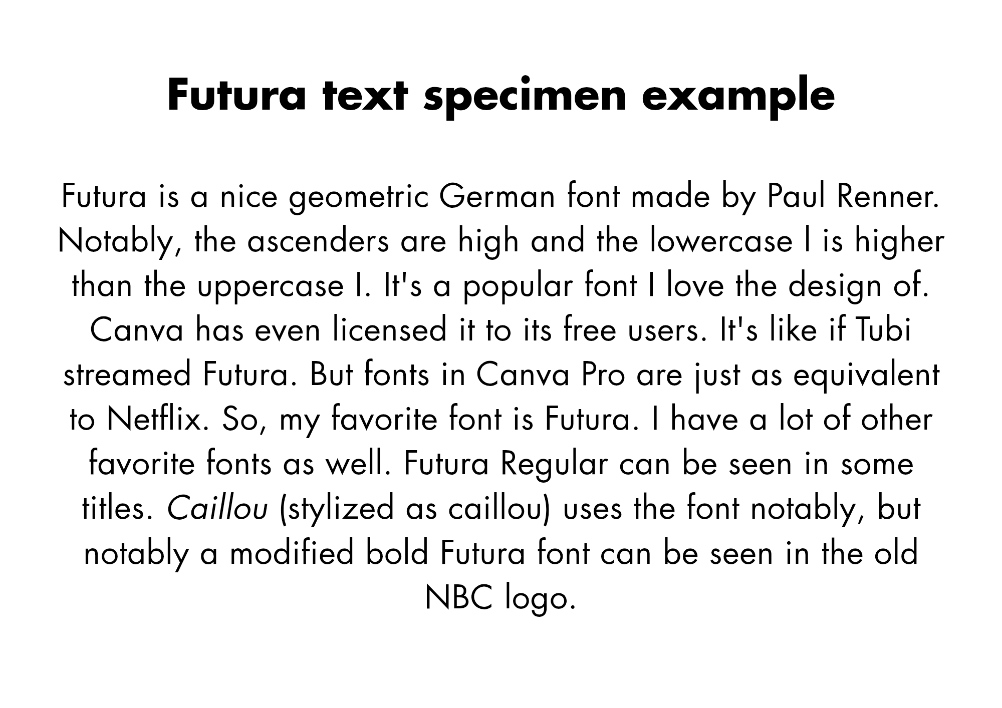
Yeah I love the design of Futura, a lot. An Italian typeface named Forma looks like a blend of Helvetica and Futura. I think Futura looks nice. I like using it. How would I get more into typography, since I used Canva. I like fonts like Futura, Gill Sans, Proxima Nova and Gotham for being geometric.
- Today
-
Night Flight was a programming block on USA Network from 1981-1988.
-
jwg2695 joined the community
-
I like the design of this font, and it looks good. I have some example sentences. What are you thoughts on futura?

-
chesstounette joined the community
-
A.C. Jung joined the community
- Last week
-
thanks Ralf :)
-
miguel_flaco joined the community
-
Nice! Thank Ralf, that was quick!
-
Modern Gothic. ☞ https://www.allcapstype.com/typefaces/modern-gothic
-
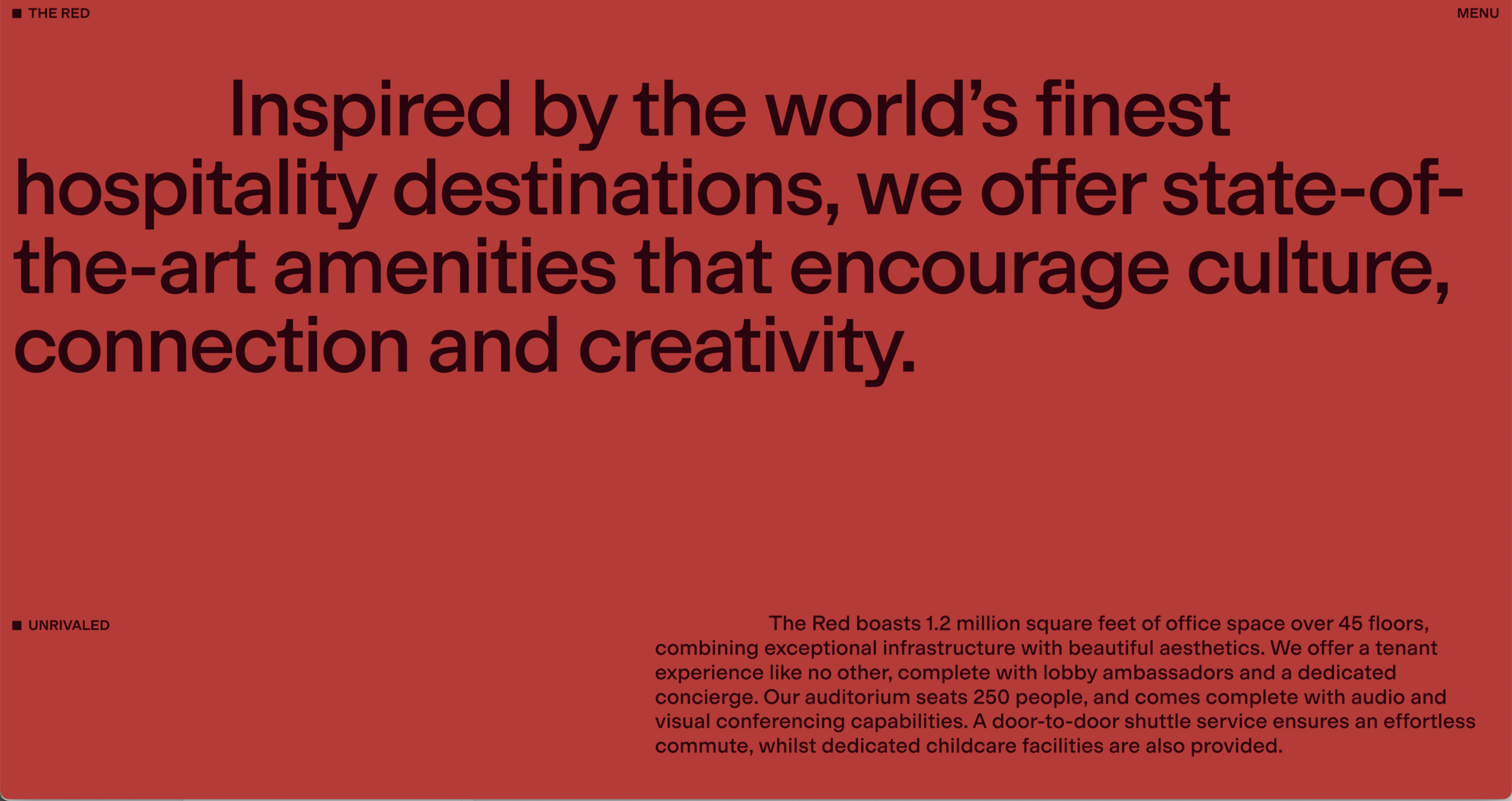
Hi! I'm trying to identify the typeface used on this website. https://www.333southwabash.com/the-red I'm curious about this typeface and was wondering if anyone recognizes it. When I inspect the page elements, the font name appears only as "MG". It's a really nice website, designed by Made Thought and developed by Aristide Benoist. I've been searching for quite a while and can't seem to find it. I'm almost certain I've seen this typeface before, but I can't remember its name. Do you think it's a custom typeface, or does it resemble an existing font family? Thanks for any leads!


-
Mario joined the community
-
Hiroshige ☞ https://fontsinuse.com/typefaces/4154/hiroshige
-
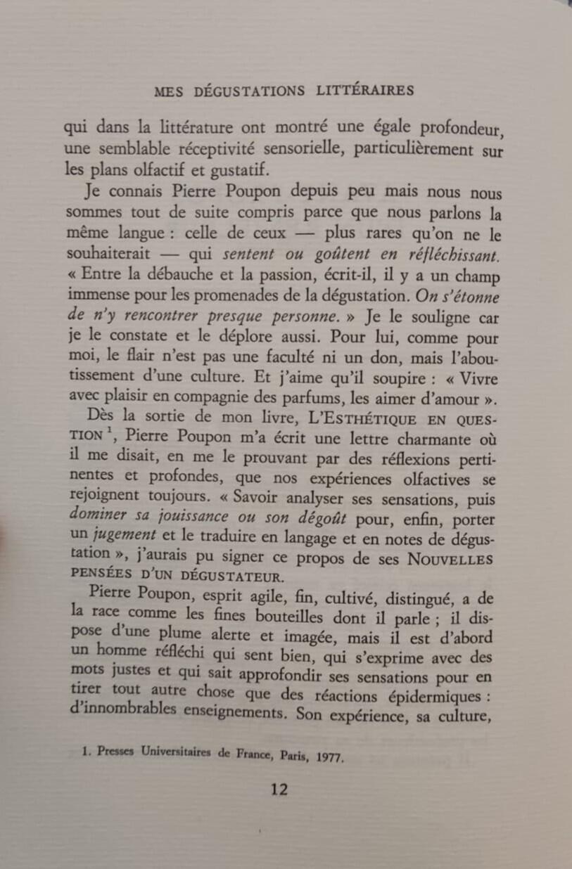
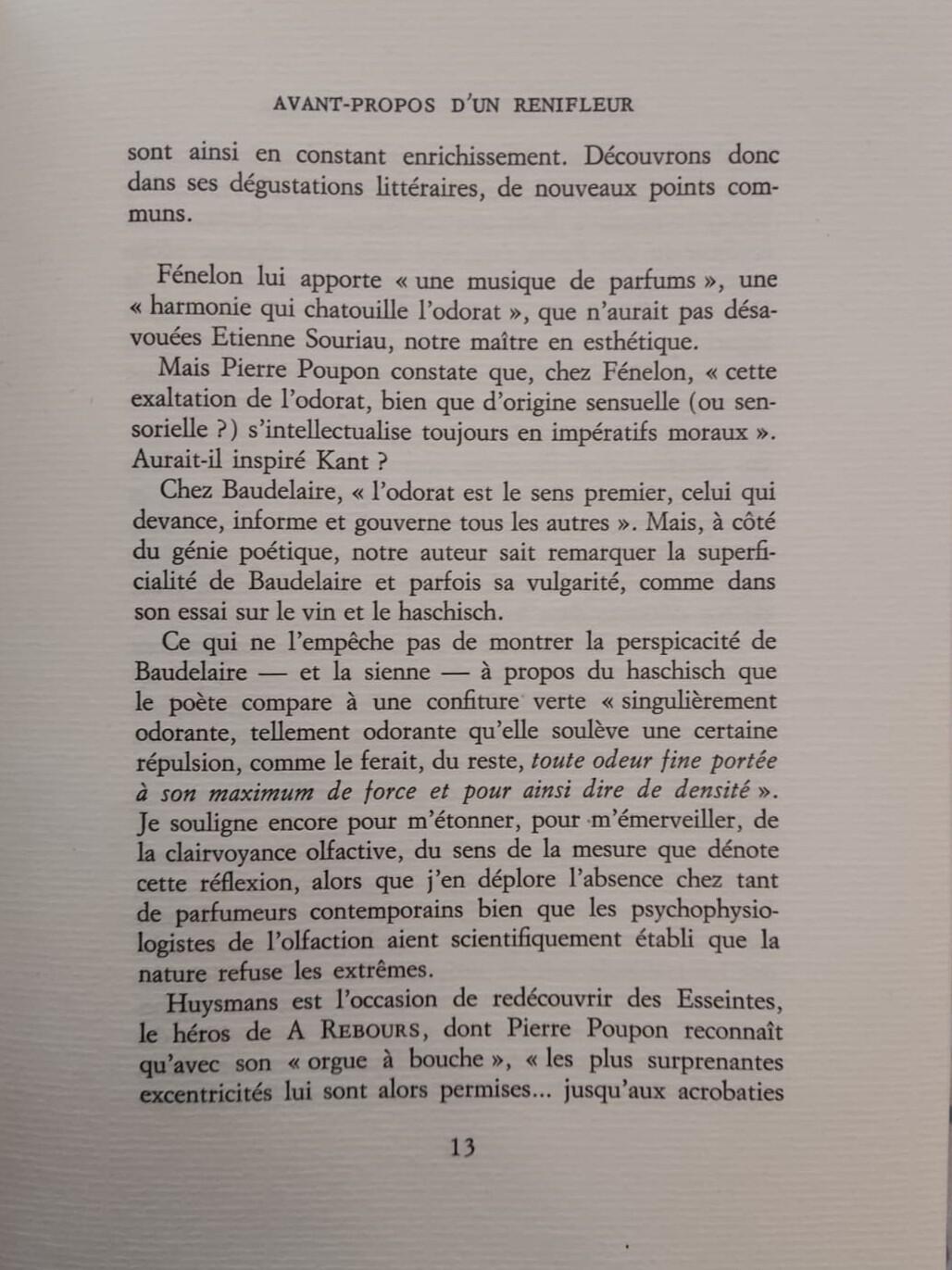
Early backend; capable of graphics; several grayscales; DIN A4; full page can be displayed; page layout can be checked before setting on film (backEnd); for the time a high-resolution screen. It was the beginning of WYSIWYGLinotype Certronic 300 Input device (frontend; CRTronic) Disadvantages: not graphic-capable; no enlargement; character matrix and number of characters specified; reduced ASCii code so, for example, no German special characters can be displayed. Typeview 300Hans-Jürgen Lintermann joined the communitySome flavor of Garamond—Simoncini Garamond seems a likely culprit. EDIT: Upon further study, I suspect this is actually Sabon, given the italic j and f.Free: https://www.1001fonts.com/search.html?search=CaslonArial was designed as a replacement for Helvetica, and to be metrically compatible with Helvetica. A few glyphs are different but, for the most part, I regard them as interchangeable.Pictures are from a book titled Mes Dégustations Littéraires by Pierre Poupon. Publisher is Confrérie des Chevaliers du Tastevin. Pressed by L'Imprimerie Darantière in France, 1979. Italic f and italic j are as seen in the pictures throughout the book, so not sure whether they are an imperfection or not. I would appreciate any help pointing out the typeface used. Thanks in advance.
 renifleur joined the communityHey, back again with yet another race font question. I swear I used to be able to find these pretty easily. Original image can be found here: https://www.rundisney.com/events/disneyworld/wine-and-dine-half-marathon-weekend/events/10k-race The amperstand seems to be Becker Gothics Tuscan. But I'm stumped on 'Wine/Dine' and '10k'. I'd think those inverted notches would be fairly easy to find, they don't seem a common feature, but I am stumped. Any help is appreciated! Disney seems to prefer fonts in the Adobe catalog, FWIW.
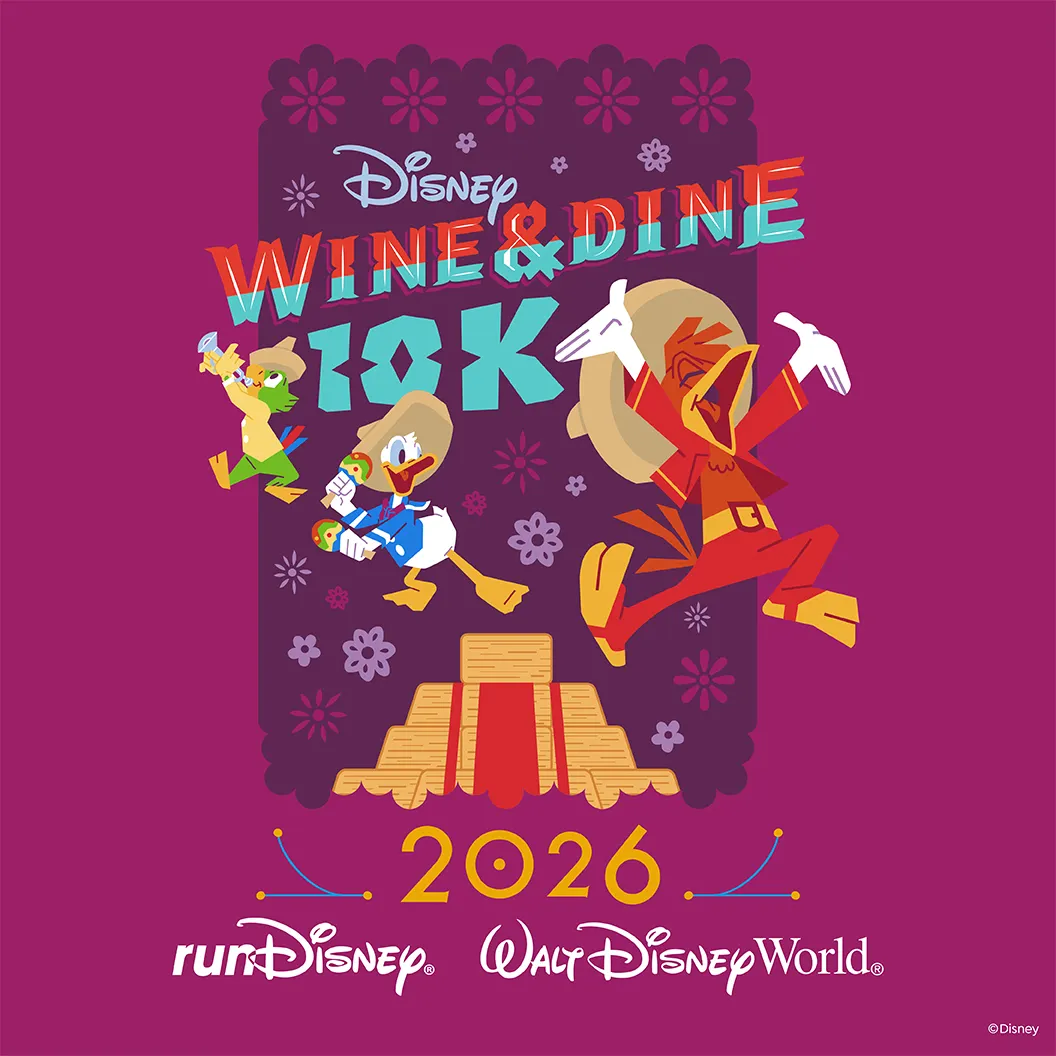 thanks! look pretty accurate!You should probably take a look at Google's Libre Caslon Text, and even Crimson Text. Both are free. A little different but still gorgeous, and free, JunicodeWhen we started using Indesign for our mag, we used Caslon, but now we can't access it. I want a similar font for our headings which was Caslon italic swash especially, as I liked the swirl on the top of the B serif etc. I am a home producer and find it all confusing. Can we buy it as a one off for myself and my sub editor, only 400 copies twice a year. A charity so not much money. Is there a suitable option?
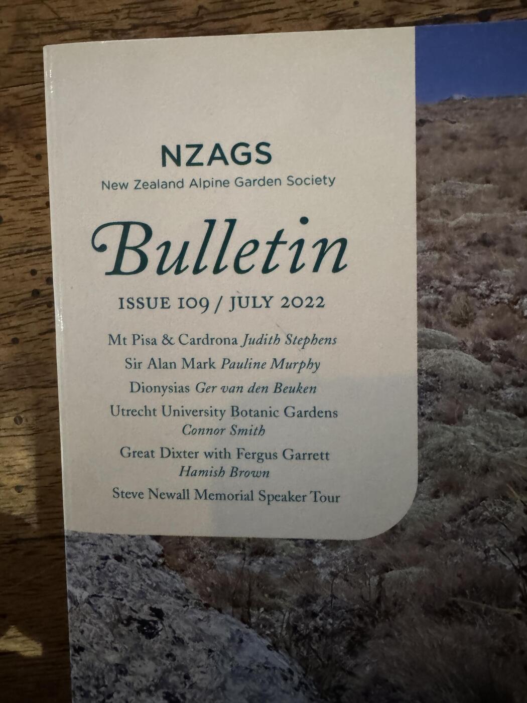 NZ Alpine magazine editor joined the communitySemplicità is an Italian geometric typeface, made c. 1928.All of these fonts are available outside of Canva -- several are bundled with Mac, Windows OS, or MS Office. Lato and EB Garamond are open source. It's hard to have an opinion on a font outside of a subjective context. That said: I would never use Arial while Helvetica exists. And I'm not a big fan of the MS Office "C" fonts, which all feel a bit 'generic'.Risha_Punzalan joined the communityGiven how the letters fit together and that this is a logotype, I was ready to call it completely custom. But Retro Star may have been its starting point.I'm trying to identify the font used in the attached "Jerky Munch" logo. It has a chunky, soft, retro 1970s feel with exaggerated rounded forms and tight spacing. Does anyone recognize it, or know of a close match? Any help would be appreciated. Thanks!
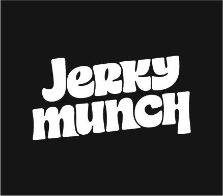
- Earlier
ITC Ronda Bold with a modified c comes close as well (Avant Garde Gothic Bold would also work for the c).Hi all, I was wondering if anyone could help identifying this font? I've used it previously but outlined my artwork and didn't keep open files! Closest I've found is All Round Gothic which is close but not quite right. Thanks!


Important Information
We are placing functional cookies on your device to help make this website better.