


Join our typography community!
A friendly online forum for all questions around fonts and typography. Get answers to all your typography questions or help others with your expertise.
Typography Feed (complete)
- Yesterday
-
Check out Ghastly Panic.
-
TroutSlayer007 joined the community
-
losboats joined the community
-
CKÖ joined the community
-
Quite similar, but not as delicate: Sabellicus. A bit more about the style. Somewhat similar: Lingwood EF, Hoefler Titling Light, Requiem Fine
-
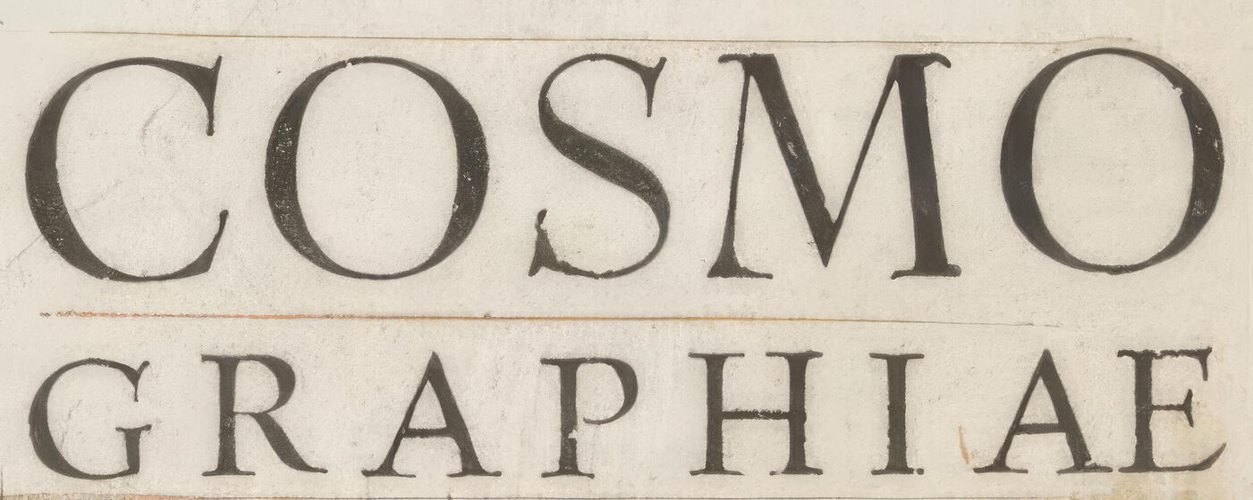
Please help mi identify a digital typeface, the closest possible to the font from this book cover. The book COSMOGRAPHIAE by Sebastian Munster was printed in Basel, Switzerland, 1544.
.jpg.6af00bc7a89720998fb8a7bfc9b5c332.jpg)
-
Filipix joined the community
-
It’s probably just badly printed oder scanned, distorting the actual outlines.
-
Hello, That is exactly what I meant. TNR seems to be the correct font, but some of the strokes on the letter still do not match completely. Is it possible that the TNR used in my letter was customized? This seems like a new technique to me, and I’m really impressed by it.

-
I see no problems with Times New Roman. If you more definite answers, a better image resolution is necessary.

-
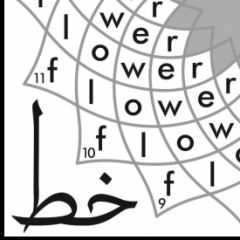
Dear Friends, Pleased to launch this contest on 2026-06-03 Juggle 16-petal flower & Win Jawi dynamic fonts https://maryamsoft.com/FontShop/fonts.aspx That's right: Just juggle 32 6-letter Malay Jawi words ending with ng in curves, starting with the numbered space and ending near the flower center. Each numbered space begins two (2) words: one to be entered clockwise, the other to be entered counterclockwise. https://goodmami.org/rumi-jawi-web/index.html Happy juggling and All the Best with Flowers

-
Thank you for this. However, I tried Times New Roman, but the result looked very different. The letters on the letter seem more spaced out, while Times New Roman looks thicker. Do you mean it might be a custom font? Thank you for taking the time to look into this.
-
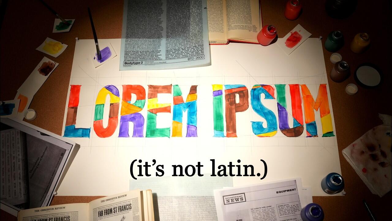 Every internet source got the story of Lorem Ipsum wrong. The Rabbit Hole YouTube channel set out to find the answers.
 - Last week
-
Nick1746292 joined the communitySueZogFish joined the communitySynt, by DinamoThe first sample appears to be Times New Roman. The second sample is harder to pin down (not a very clean sample). Neue Rain Light is similar, but it is likely something more generic.I would like to thank Kevin Thompson and Bradford Wollte for those links. I am very happy to have found (and downloaded) those books as references. And, with those as a starting point, I also found and downloaded a 2016 U.S. Government Printing Office Style Guide. Not a replacement for the Chicago Manual of Style, but nice to have as a supplemental/alternate reference.For those interested in this topic in the future, the United States Government Publishing Office provides PDFs of two type books published by the Government Printing Office (GPO) in 1921 and 1931, which contain specimens of Century Expanded as well as other type faces used by the GPO at that time. They can be found through the search on GovInfo. Here are the direct links: 1921, 1931. One of these is likely the exact type face used in the publication I was inquiring about. The United States Geological Survey also provides PDF copies of specimen books of type faces used in their maps, one from 1947, here or here, one from 1977, here or here, both of which also contain specimens of Century Expanded. For anyone interested in type faces in US government publications, these are certainly valuable sources. Thank you to Kevin Thompson for identifying the type face for me and for pointing my research in this direction. Now all I have to do is recreate that type face…Hello, Could you please help me identify this font? I found it in a letter that was sent to me by a printing service. I was a bit curious because I have never seen this type of font before. Thank you very much for your help.

 Anjali joined the communityUnderDOT joined the communityI also found a couple of type books from the Government Printing Office. Here is one from 1931.Here is a 1933 style guide from the Government Publishing Office.Thank you again, @Kevin Thompson . I totally overlooked the links under "Info". I especially find the comparison of the same letter at different font sizes on this page illuminating, as it explains some of the differences between my printed text and some of the font specimens.Xyri joined the communityRobby Woodard joined the communityAt the link I initially posted (see above), go to the far right column and check out the various specimen links (like this one). To answer your question: Yes, modern versions of the same typeface will vary from printed samples created 90 years (or more) ago. Which foundry cut the original metal type, what point size the original sample used, and ink gain / paper stock used will all contribute to visual differences between digital versions of the typeface and the original. Also, what source was used to create the digital version? Original metal matrices? Printed samples (text or headline size)? A phototypesetting version created decades after the metal original?Thanks for the reply! I agree, it is close for most of the letters. I have Impact Regular - did take a look at it, but initially bypassed it because the letters weren't......well, "wide" enough! lol Impact Wide definitely gives the broadness of the letters - but, it seems like the curves in the S are too rounded. And, the middle crossbar of the E is centered - whereas in the picture, it looks to be a bit higher than middle. Crazy how some slight changes, and you have a whole new font!! Honestly, I'm probably being too fussy - I don't think my customer will even notice. Here is how "Padaloma Regular", and then italicized, ended up looking in the game. For the "Boulder County" part - as you mentioned - I did end up condensing the letters, then stretching them taller, first......before shearing to match the italics angle. I appreciate the help and the views!
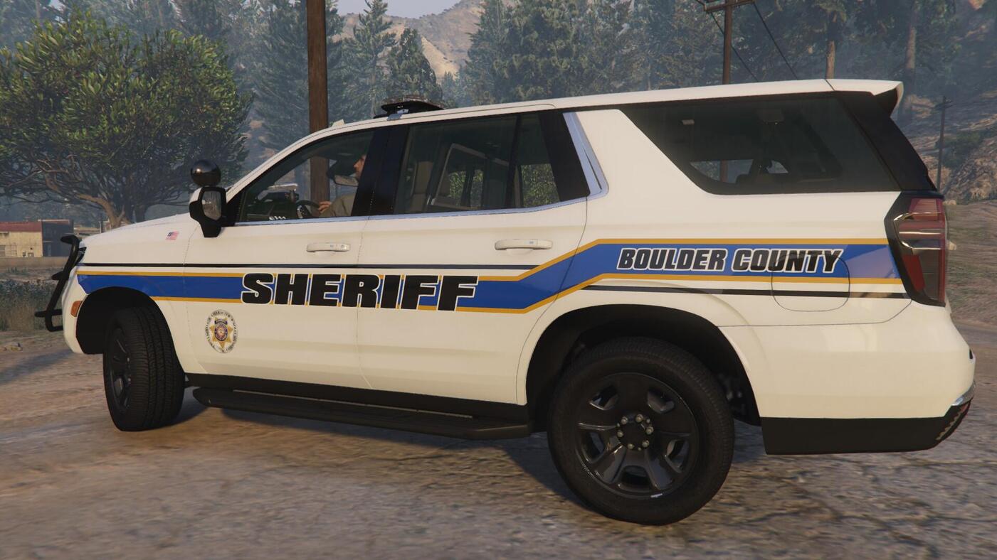 Thank you, @Kevin Thompson . Would you say the differences are due to one font being an old, metal version and the other probably a redesign for computer displays and current printing technology? For example, the bottom of the foot of the Y, T, and P are concave in the Geographic Board font, while it is straight in Century Exanded; and the top edge of the upper serif of the l, i, and b are horizontal in the Geographic Board font, while they are slanted in Century Expanded.Hi, I'm looking for the font used in this newsletter by Rose Los Angeles : https://d3k81ch9hvuctc.cloudfront.net/company/RZj4pb/images/7e6ce5be-db3f-4aab-a64d-ff3a4b3bffae.jpeg https://www.instagram.com/rose_losangeles/ https://roselosangeles.com/
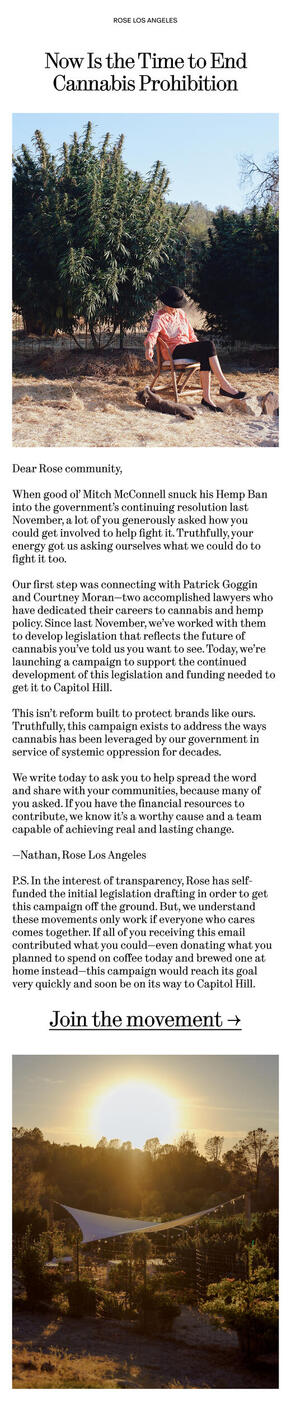 A metal version of Century ExpandedThe United States Geographic Board, created in 1890 to maintain uniform geographic name usage throught the federal government, has published its decisions on standardized place names in the United States and abroad in small brochures during its early years. Below is a photo of one entry from the Decisions of the United States Geographic Board, No. 18, from 1932. Here are links to scans of the full original publication: https://books.google.de/books?id=2IfBjJTQy6YC&pg=RA1-PA7&lpg=RA1-PA7&dq=%22lost+boy+creek%22&source=bl&ots=ZR6USUm9Ve&sig=ACfU3U1f6NMI0XrPVKvWR_1I5SG5kqBKgg&hl=de&sa=X&ved=2ahUKEwj7kP_lsqGDAxXagf0HHaIsDys4KBDoAXoECAIQAw#v=onepage&q=%22lost%20boy%20creek%22&f=false https://ia800909.us.archive.org/26/items/TextBookOfGeology/Decisions_of_the_United_States_Geographi.pdf What font is used in the depicted entry?
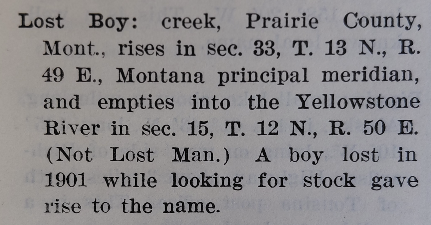 Impact Wide Italic is the closest thing I can find. Possibly Boulder County done in Impact with a skew/shear applied.


Important Information
We are placing functional cookies on your device to help make this website better.