Skip to content

Typography Videos

The best videos from the fields of typography, calligraphy and lettering
This talk took place in the Rose Auditorium at The Cooper Union on November 27, 2017 as part of Type@Cooper's Herb Lubalin Lecture Series. This recording is made possible with generous support from Hoefler & Company. 
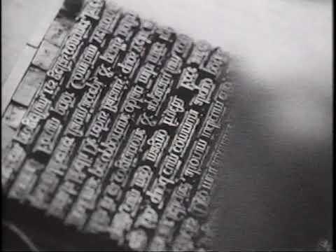
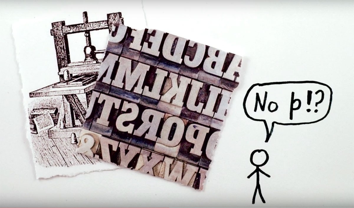
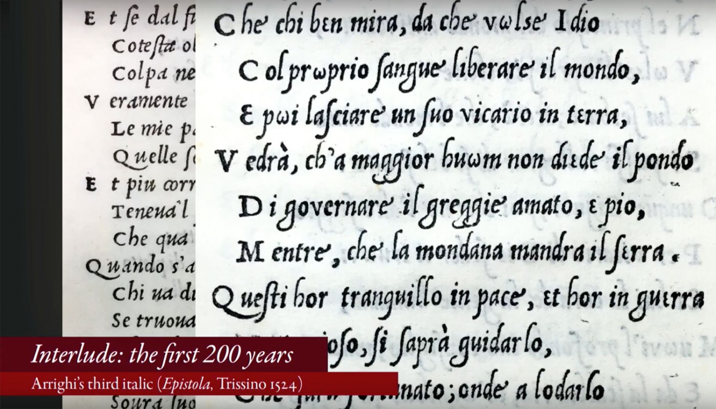
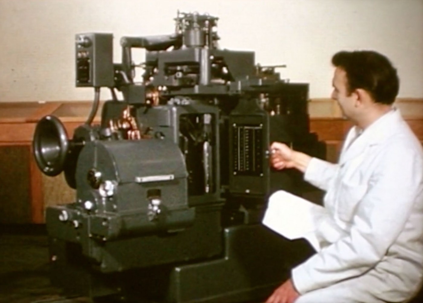
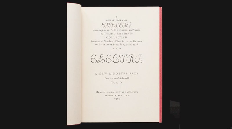
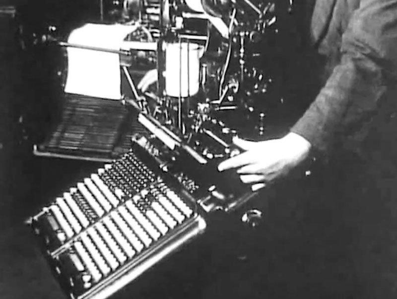
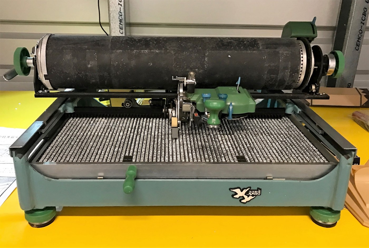
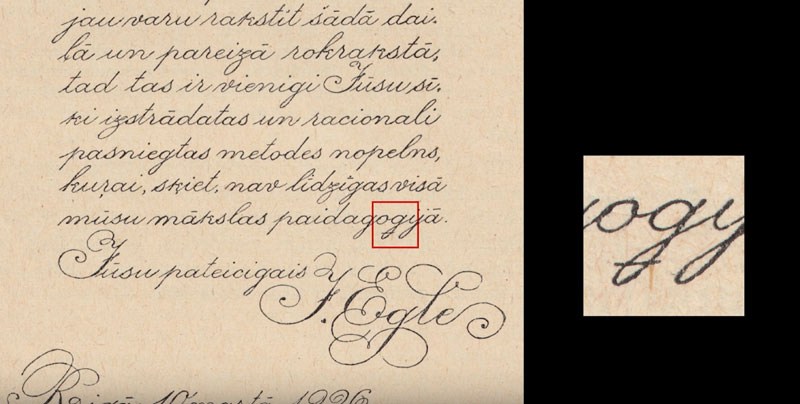
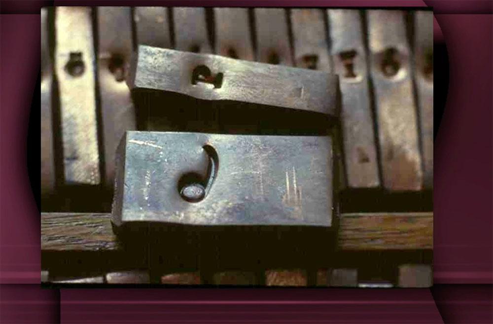
The invention of printing with movable types took place in the mid-fifteenth century, and from the very beginning the challenge was not just producing multiples of texts, but to do so in an attractive and convincing manner. How did the early printers accomplish this so successfully, and in what ways did the process evolve? Letterpress remained a dominant printing process through much of the 1970s and is undergoing a renaissance today. In what ways did 'modern' technology affect the manufacture of metal printing type, and will such types continue to be developed and produced?
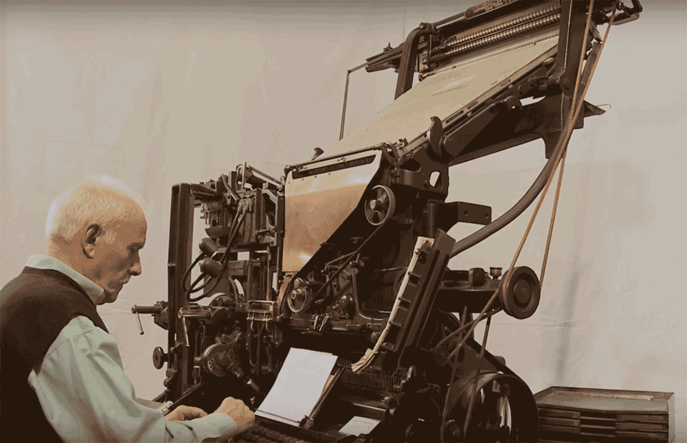
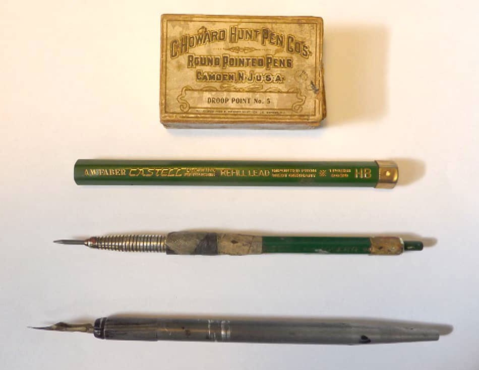
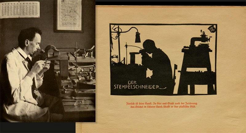
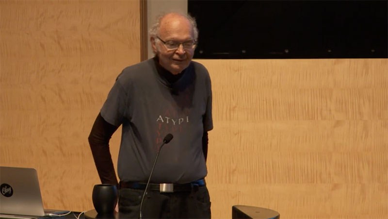
Raymond 'Stan' Nelson is a practicing punchcutter, typefounder, and letterpress printer who had the great good fortune to work in the Graphic Arts Collection at the Smithsonian's National Museum of American History from 1972 to 2003, and continues to serve there as a Museum Specialist Emeritus. Stan's extensive knowledge of printing and typefounding history, as well as over forty years of practical experience with the oldest technologies for making printing types, gives him a unique perspective when examining the tools and methods connected with the production of metal letter. Stan can be seen making type in videos available on YouTube, as well as in the BBC production The Machine that Made Us, hosted by Stephen Fry.
“The Making of a Renaissance Book”, originally issued as a black-and-white film shot on location at the Plantin-Moretus Museum in Antwerp, covers cutting a type punch; making a copper strike and justifying the matrix; casting and dressing the type; composition, imposition and proof-reading; inking and running off the sheets; stop-press corrections.
The proliferation of 19th (and 20th) century wood type and its impact on typographic norms, with David Shields
Throughout the nineteenth (and early twentieth) century the proliferation of wood type played an integral role in the creation of American visual culture. With the introduction in 1827 of innovative production techniques, affording low cost and the proliferation of a wide range of styles and sizes, wood type gave tremendous impetus to job printing and mass advertising.
David Shields is an Associate Professor and Chair of the Department of Graphic Design at Virginia Commonwealth University in Richmond. 
David is currently focusing his research on 19th century typographic form and visual culture arising from investigations of Rob Roy Kelly’s American Wood Type Collection. He keeps a slow blog of his research at Wood Type Research.
Soon after the invention of upright roman type, an interloper entered the arena—italic. Rather than displacing roman, it wound its way into our typographic culture, becoming an essential part of languages that use the Latin script. Our written communication depends on it, yet in all the books that have been written about type design there are often only a handful of pages about this essential style. This talk will explore the roles italic plays in our typographic culture: as a language feature, a typographic element, a historical marker, a design object, and a business product. These roles have shaped the design of italic and inspired innovation and creativity. But they have also often forced italic into a subservient position. What is the essence of italic? Has that identity survived its use as a secondary complement to roman? Is it possible that this servitude has given italic the freedom to flourish? This is the story of how italic established itself as part of our typographic language, was transformed as it was relegated to secondary roles, and yet remains a strong and essential part of typeface design.
The Monotype is a wonder of mechanics and engineering and in this film you will see the process of manufacturing the Monotype from beginning to end.
The film starts by showing the Salfords, UK train station and entrance into the Monotype factory, then shows all of the milling, drilling, cutting, and casting required to make the casting machine. After that, we see the keyboard and paper-punch apparatus being constructed.
The film ends with footage of testing and calibrating the machine and images of the Monotypes being shipped all over the world.
Learn all about the ‘Monophoto’ Filmsetter from Monotype. This machine attempts to bridge the gap in typesetting from the hot metal machines to the “new and exciting” world of photo typesetting.
The Monophoto machine is a casting machine that uses a photographic process to set type instead of the old, hot-metal process from the past. Using light-sensitive paper, a photographic lens, and photo type matrices, the Monotype casts type that can be used for offset printing.
This talk took place on June 20, 2017 at the Koret Auditorium at the San Francisco Public Library as part of Type@Cooper West's Letterform Lecture Series 
W. A. Dwiggins and Linotype’s Chauncey Griffith developed an affectionate and productive partnership that lasted for nearly thirty years. Dwiggins first drew the sans-serif Metro (1929), intended to be Linotype's answer to Futura, Gill Sans, and Kabel; Metro faded from the scene here in the U.S. but continued to be used in U.K. newspaper into the 1970s. Spurred by his deep interest in book design, Dwiggins next produced the tour de force text types Electra (1935) and Caledonia (1939), which have been used to produce countless thousands of books up to the present day. As his next assignments Dwiggins — the virtuoso user of stencils for illustration and decoration — created an elaborate suite of decorative units called Caravan, which could be used as single glyphs or combined in myriad ways to create lines and fields of decoration. (Prior to its commercial release, this design had the working title, “Chinese Spinach”!) Returning once again to text types, Dwiggins drew Eldorado (1953) and Falcon (released postumously in 1962). Beyond his five designs for Linotype, Dwiggins also imagined four alphabets of decorated initials for the Plimpton Press (1936) which saw widespread use in the books Plimpton printed for Alfred A. Knopf; these will also be given attention in the presentation.
Book designer, photographer, and teacher Bruce Kennett lives in rural New England. After earning a B.A. in humanities and working as an architect and printer, he moved to Austria to study calligraphy and book design with Friedrich Neugebauer, and later translated Neugebauer’s The Mystic Art of Written Forms. During the 1980s, he was the managing director of Maine’s renowned Anthoensen Press, and since then has maintained his own studio with clients that have ranged from the Folger Shakespeare Library, Boston College Law School, and the Grolier Club to L.L. Bean and the Mount Washington Observatory. In the peaceful surroundings of his country studio, Bruce designs illustrated books and exhibition graphics, and makes large-scale murals of his photographs. 
Bruce has collected the work of W. A. Dwiggins since 1972, and has been writing and lecturing about him since 1980. His comprehensive biography, W. A. Dwiggins: A Life in Design (Letterform Archive, 2017), captures the inspiring accomplishments and wit of this amazing artist.
Johannes Bergerhausen at TEDxVienna
Prof. Johannes Bergerhausen born 1965 in Bonn, Germany, studied Communication Design at the University of Applied Sciences in Düsseldorf. From 1993 to 2000, he lived and worked as a designer in Paris. First he collaborated with the Founders of Grapus, Gérard Paris-Clavel and Pierre Bernard, then he founded his own office. In 1998 he was awarded a grant from the French Centre National des Arts Plastiques for a typographic research project on the ASCII-Code. He returned to Germany in 2000 and, since 2002, is Professor of Typography and Book Design at the University of Applied Sciences in Mainz. Lectures in Amiens, Beirut, Berlin, Brussels, Dubai, Frankfurt, London, Malta, Paris, Prague, Rotterdam, San Francisco, Sofia, Weimar. Since 2004, he is working on the decodeunicode.org project, supported by the German Federal Ministry of Education and Research, which went online in 2005. Semester of research 2007 in Paris. He received many design awards like RedDot, Type Directors Club of New York, ADC, iF, Best German Books and more. In 2011, together with Siri Poarangan, he published »decodeunicode — Die Schriftzeichen der Welt«, a repertoire of the world's 109,242 digital characters. In 2012, he was awarded with the Designpreis in Gold of the Federal Republic of Germany. He is currently working on a digital cuneiform font.
This silent film was restored from a print sent from the U.K. to New Zealand in 1925.
The film starts with a brief overview of the Monotype Works buildings as well as the company homes for workers. See hundreds of Monotypes being built in the factory from raw materials to the casting machine and keyboards. 
Around 17:00, we watch the process of making a letter mould from drawing, to wax mould, to punch, to final matrix including using a Benton Engraving Machine. At 28:00, you can see the perforated punch paper being produced.
At 30:00, you can see the factory canteen where the labor force eats lunch as well as the end of the day when everyone leaves by foot or bicycle.
At 33:25 minutes, His Majesty the King, Duke of York (whom "The King's Speech" was based on) visits the Monotype factory, which was obviously a very big deal. He inspects the workers and factory and then learns how to type on a Monotype keyboard. A hearty farewell is given as he leaves the factory.
At 38:30 you see a 15 minute detailed explination of how a Monotype works from keyboard to casting. Finally at 53:10 the Monotype Schools for teaching keyboarding and casting as well as displays of Monotype batteries in various print shops in London. 
See more printing, journalism, and typographic-related films at: printingfilms.com
Hooksmith is a film about Russell Frost, a New Zealand born, former fly fisher who now runs Hooksmith Press, producing letterpress prints in his workshop based in East London.
Russell was kind enough to open his workshop to us, and offer an insight into the creative and technical aspects of his letterpress craft, giving us a glimpse into the machinery, equipment and process required to create his prints.
A film by Joshua Panter
This talk took place in the Koret Auditorium at the San Francisco Public Library on February 15, 2017 as part of Type@Cooper West's Letterform Lecture Series. This recording is made possible by Adobe Typekit.
My name is Jim Parkinson. I’m a lettering artist, logo designer, font designer and painter. In 1945, when I was a child in Richmond, California, I met my first lettering artist. His name was Abraham Lincoln Paulsen, and he lived across the alley from us. His studio was an extra room in his house and, on many afternoons, I would sit and watch him work. I was enchanted and wanted to be a lettering artist before I even started learning the alphabet. That was seventy years ago.
I have been a professional lettering artist, puzzling over the alphabet for over fifty years, I had no real life plan, I just lurched from job to job. Whoever wanted some lettering. I have had some disappointments and successes. I have also had some very good luck, and, quite by accident, bumped into just the right lettering people at exactly the right times in my life. Today l spend most of my time designing fonts and logos and making paintings. 
After all these years, it would be crazy if I didn't have a few stories to tell … wouldn’t it?
Jim Parkinson has been lettering and designing typefaces all his life. At least it seems that way. In the 1960s, he did greeting card lettering for Hallmark Cards in Kansas City. Later, back in Oakland, as a freelancer, he did lettering for just about everything including sign painting, lettering for packaging, book covers, editorial lettering, drum heads for bands, posters, movie titles, etc. In the 1970s, he designed the logo for Ringling Bros. and Barnum & Bailey circus. 
Today, he specializes in designing typefaces and typographic logos. He was one of the designers of ITC Bodoni and he drew Parkinson Electra for Linotype. Jim has designed custom fonts for newspapers and magazines, including Rolling Stone, The San Francisco Chronicle, and The National Post. He has also designed dozens of retail fonts. Many of them are released by his one-person company, Parkinson Type Design. Other font designs have been published by Adobe, Monotype, FontShop, Linotype, The Font Bureau, and ITC. His typographic logos appear on the covers of many magazines and newspapers, including Rolling Stone, Newsweek, Esquire, InStyle, El Grafico, Men's Journal, Texas Monthly, Variety, The Detroit Free Press, Excelsior, The Los Angeles Times, and The National Post.
Jim loves lettering. It keeps him out of trouble.
Rudolf Koch (1876-1934) designed Kabel, Neuland, Koch Antiqua (AKA Eve), and over a dozen other typefaces. He was a seminal figure in the twentieth-century revival of calligraphy, an author and private press printer, and a revered and influential teacher. This talk will cover the work of Koch and his collaborators in the Offenbacher Werkstatt, including students Berthold Wolpe and Warren Chappell, in a high-definition show and tell from the extensive Koch collection at Letterform Archive.
Rob Saunders is the curator and chairman of the Board of Directors of the Letterform Archive. He is a designer, teacher, publisher, and management consultant. He taught at The School of the Museum of Fine Arts Boston and Tufts University, while serving freelance clients and agencies, before founding a book publishing enterprise that included Alphabet Press (graphic design), Picture Book Studio (children’s books), and Rabbit Ears Books (book/audio packages), which was acquired by Simon & Schuster. Prior to becoming Curator of Letterform Archive he served as a creative and marketing consultant with clients in the hospitality, technology, and financial industries.
This talk took place on Tuesday, October 18, 2016 at the SFPL as part of Type@Cooper West's Letterform Lecture series. This recording is made available by a generous sponsorship from Adobe Typekit.
Type licensing is a nearly invisible concept to most type users. What most people think of as “buying a font” is almost always “licensing font software” – but what’s the difference, and why should anyone care?
Once upon a time, type was used almost exclusively by trained craftspeople, using specialized equipment – but now type is something anyone can get and use, with scant awareness of a typeface as intellectual property, protected by laws and licensing agreements. The average type user is left wondering what they are really allowed to do with it, usually at their own legal peril.
Christopher Slye will take a tour through the business of type and its licensing practices, past and present, explaining its mysteries and its relevance for businesses, users, and type designers alike – with a focus on modern media like desktop publishing, the web, and mobile apps.
Christopher Slye is Business Manager for Adobe Type and Typekit. Since joining Adobe’s typographic staff in 1997, he has worked in the design and production of Adobe Originals typefaces, helped guide Adobe’s type-related technology and initiatives, contributed to the development of open web font standards, and managed all aspects of Adobe’s type licensing programs.
This talk took place on Tuesday, September 20, 2016 at the SFPL as part of Type@Cooper West's Letterform Lecture series. This recording is made available by a generous sponsorship from Adobe Typekit.
Donald Knuth reminisces and talks about things he remembers.
Donald Knuth's main life's work has been to write The Art of Computer Programming, a work-still-inprogress that attempts to organize and summarize what is known about the vast subject of computer methods and to give it firm mathematical and historical foundations. (The four volumes published so far have been translated into many languages and more than a million copies have been sold.) As a researcher in computer science, I am more or less the "father;' of several subareas called the analysis of algorithms 1 LR(k) and LL(k) parsing 1 attribute grammars, empirical study of programming languages, and literate programming. My best-known research in mathematics is represented by the Knuth-Bendix algorithm for word problems, the Robinson-Schensted-Knuth correspondence between matrices and tableaux, and an analysis of the big bang that occurs in the evolution of random graphs. As a university professor I introduced a variety of new courses into the curriculum, notably Concrete Mathematics, and I supervised the dissertations of 28 excellent students. And as a programmer, I wrote software systems called TEX and METAFONT that are used for the majority of today's mathematical publications and now have more than a million users worldwide.
This talk took place on July 19, 2016 as part of Type@Cooper West's lecture series at the San Francisco Public Library. 
Robert Bringhurst has written that Hermann Zapf was “The greatest type designer of our time, perhaps the greatest type designer of all time.” Zapf was also one of the most respected calligraphers and typographers of all time. He produced a huge body of work, a good deal of which has been reproduced in books and articles about Zapf, but much of which has rarely been seen. Similarly, a good amount has been written by and about Zapf, but much is still to be recorded. This illustrated talk will review some of the highlights of Zapf’s career, along with some little-knbown facts about the life and work of this exceptional artist, whose life spanned the entire gammut of type manufacturing methods.

Important Information

We are placing functional cookies on your device to help make this website better.

Account

Navigation

Search

Search

Configure browser push notifications

Chrome (Android)
  1. Tap the lock icon next to the address bar.
  2. Tap Permissions → Notifications.
  3. Adjust your preference.
Chrome (Desktop)
  1. Click the padlock icon in the address bar.
  2. Select Site settings.
  3. Find Notifications and adjust your preference.