Skip to content

Typography Videos

The best videos from the fields of typography, calligraphy and lettering
Stanley Morison argues in Politics and Script that the nineteenth-century invention of the sans serif lowercase was no less than ‘the most novel and permanent contribution to letter-design that has appeared on the printed page since the Aldine Italic of 1501’. Given that the sans serif has become the dominant typographic form of the past century (for all but lengthy text setting, and sometimes even for that too), it is more than a little surprising that its early development in the century prior — from a brutish all-caps poster style into a viable upper- and lowercase text style — has scarcely been studied or documented. This talk will trace its evolution as uncovered to date by a primary-source research project in progress.
Sara Soskolne is senior designer at Hoefler & Co. Though originally a graphic designer in her home town of Toronto, after ten years of apparently never being able to find quite the right typeface for the job she finally decided to just learn how to make them herself, jumping careers and an ocean to study typeface design at the University of Reading where she earned her MA in the subject in 2003. Since joining H&Co she has contributed to the design of a wide range of typefaces including Verlag, Chronicle, Sentinel, Gotham, Tungsten and Quarto. She has taught typeface design at the Yale School of Art, at New York’s School of Visual Arts, and with Sumner Stone was a founding instructor of the Type@Cooper Condensed Program.
Canadian designer Carl Dair’s film on the lost art of type punch cutting. Initiated by Rod McDonald and Sheridan College in Canada, and narrated by Matthew Carter, this 45-minute film was made in 1957 when Carl Dair studied type making under master letter-engraver P. H. Rädisch at the Joh. Enschedé en Zonen Type Foundry in Holland. After Dair’s death, the film was archived for almost 60 years before Carter and McDonald became aware of it and agreed that it was an important part of typographic history and should be restored. 
 
Many typefaces available to us today are not stand-alone designs, but were introduced as inventive solutions to very specific problems of type manufacture, typesetting restrictions, or printing issues. As those designs become part of the overall typographic landscape, it’s easy to forget how closely connected they are to the original problem, or how much potential there may be to explore solutions to a new problem. Looking at some now-classic typefaces, we’ll see how they turned out the way they did, and hopefully encourage some fresh responses to newer challenges.
Dan Rhatigan worked as a designer and typographer for 15 years in Boston and New York before moving to England in 2006 for graduate school at the University of Reading. After receiving his MA in Typeface Design, he spent 7 seven years working with Monotype as researcher, type designer, and eventually Type Director. He now lives in New York City again, where he works as an independent type designer and consultant.
Ann Bessemans’ talk from ATypI 2015 in São Paulo
These days rhythm within typefaces is treated very homogenously. The perfect example is the currently dominant early 21th century letter model where all the letters within a typeface get roughly the same width. But how does this development affect reading comfort? Currently, there is no closed definition of reading comfort and how to test it (quantitatively) in the best possible way. Tracy (1986) describes readability in terms of quality of visual comfort, as an important requirement in the comprehension of long stretches of text without experiencing physical complaints. There is strong evidence that visual comfort has to do with the rhythm of the typeface. Studies show that stripe patterns impede the reading process due to visual discomfort. Visual discomfort refers to the adverse effects of viewing certain kind of visual patterns, like text. This lecture will offer new insights into the way how to define reading comfort and why measuring visual comfort, independent from reading performance, seems to be innovative.
In her slide presentation, Valerie Lester sets Bodoni in the context of the places and the era in which he lived, and presents some rarely-seen images of his work. She introduces the people with whom he worked and who influenced him, paying special attention to his father in Saluzzo; to Cardinal Spinelli in Rome; to Fournier; to his employers, the duke and duchess of Parma; to Guillaume du Tillot, the prime minister of Parma; to the Amoretti family of printers; to his talented and loving wife, Margherita Dall’Aglio; to the Didots; and to his two great patrons, Nicolás de Azara and Joachim Murat (Napoleon’s brother-in-law). And of course, she does not forget to describe the food he ate and the wine he drank.
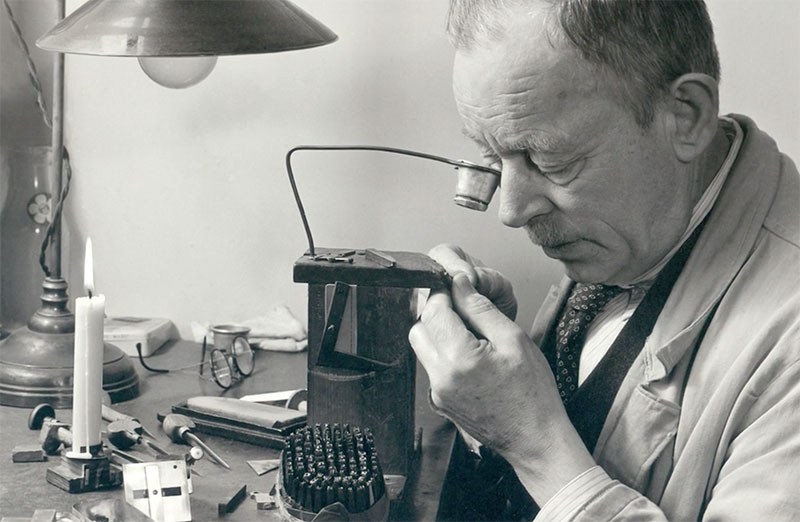
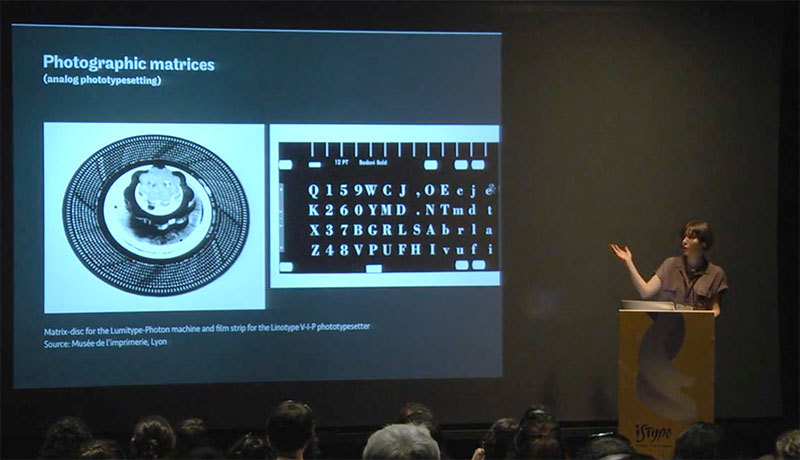
Valerie Lester is the author of Giambattista Bodoni: His Life and His World, the biography of Giambattista Bodoni (Godine, Spring 2014). She is also the author of Phiz, the Man Who Drew Dickens (Chatto & Windus, 2004), a biography of her great-great- grandfather, Hablot Knight Browne, Dickens's principal illustrator; and Fasten Your Seat Belts! History and Heroism in the Pan Am Cabin (Paladwr Press, 1995), which is a history of Pan American World Airways told from the point of view of its cabin crew. Her translation of Le Grand Meaulnes (The Magnificent Meaulnes) was published by Vintage Press in 2009.
“Letraset and other brands of rub-down type literally put typography in the hands of the people. Rub-down type made it possible for students, professionals, and everyone else to design with real typefaces, without needing professional typesetting services. A cheap and easy way to experiment with typography and other graphic elements, Letraset put a lot of care into making type easy to use well, but it also resulted in a lot of ways to use type badly, but with interesting results. With some care and attention, however, it was a great way to develop an eye for typography.”
The Saguache Crescent newspaper in Saguache, Colo., has been printing its news the same way since the 1800s. Lay the letters. Ink. Press. Publisher Dean Coombs’ family has had the business for three generations, and has helped print out the weekly broadsheet on a linotype since he was 12 years old. See how the news is made the hard way.
This talk will present ongoing research into the use of letterforms as a means of security for citizens and governments alike, thwarting forgery in plain sight and in secret. Some strategies have relied on high-profile collaborations, and others on home-grown cunning. Interwoven is a story of war and peace, technology, culture and economics. The narrative will focus on American banknotes from the Colonial period to the present day, with additional examples of government permits and lottery tickets.

Important Information

We are placing functional cookies on your device to help make this website better.

Account

Navigation

Search

Search

Configure browser push notifications

Chrome (Android)
  1. Tap the lock icon next to the address bar.
  2. Tap Permissions → Notifications.
  3. Adjust your preference.
Chrome (Desktop)
  1. Click the padlock icon in the address bar.
  2. Select Site settings.
  3. Find Notifications and adjust your preference.