- 0 comments
- 4,931 views
Typography Videos
The best videos from the fields of typography, calligraphy and lettering


- 0 comments
- 3,975 views

- 0 comments
- 4,689 views

From the Typography.Guru YouTube Channel ☞ https://www.youtube.com/c/typographyguru
- 0 comments
- 5,097 views
- 0 comments
- 3,337 views

- 3 comments
- 17,352 views
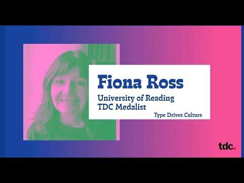
In this video, TDC Medalist Fiona Ross presents the keynote address and discusses her long career focused on affording visible voices to global linguistic communities.
- 0 comments
- 4,430 views

- 0 comments
- 7,278 views
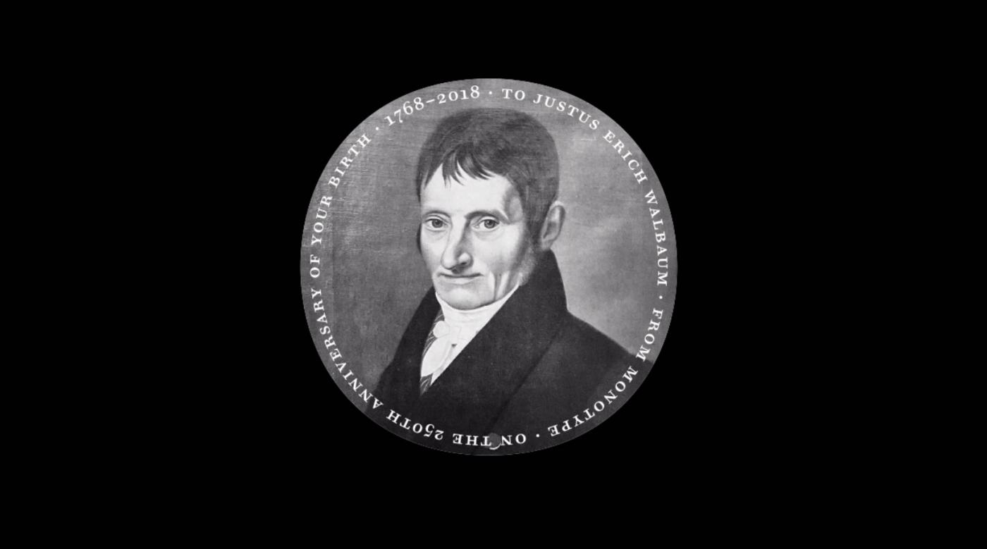
Charles Nix is a designer, typographer, and educator. He is a Type Director at Monotype, where he, Carl Crossgrove, and Juan Villanueva designed the 69-font Walbaum family, released in June 2018.
- 0 comments
- 5,119 views

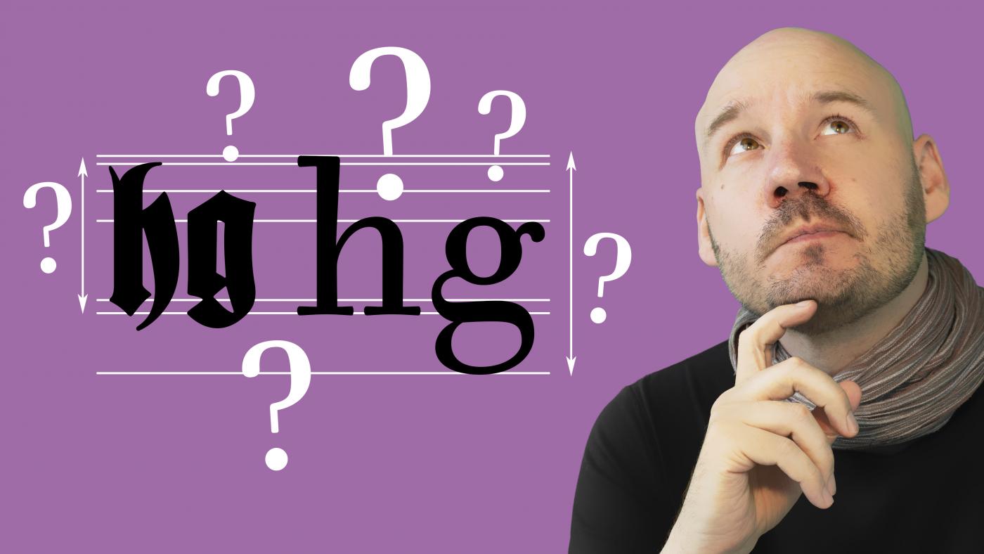
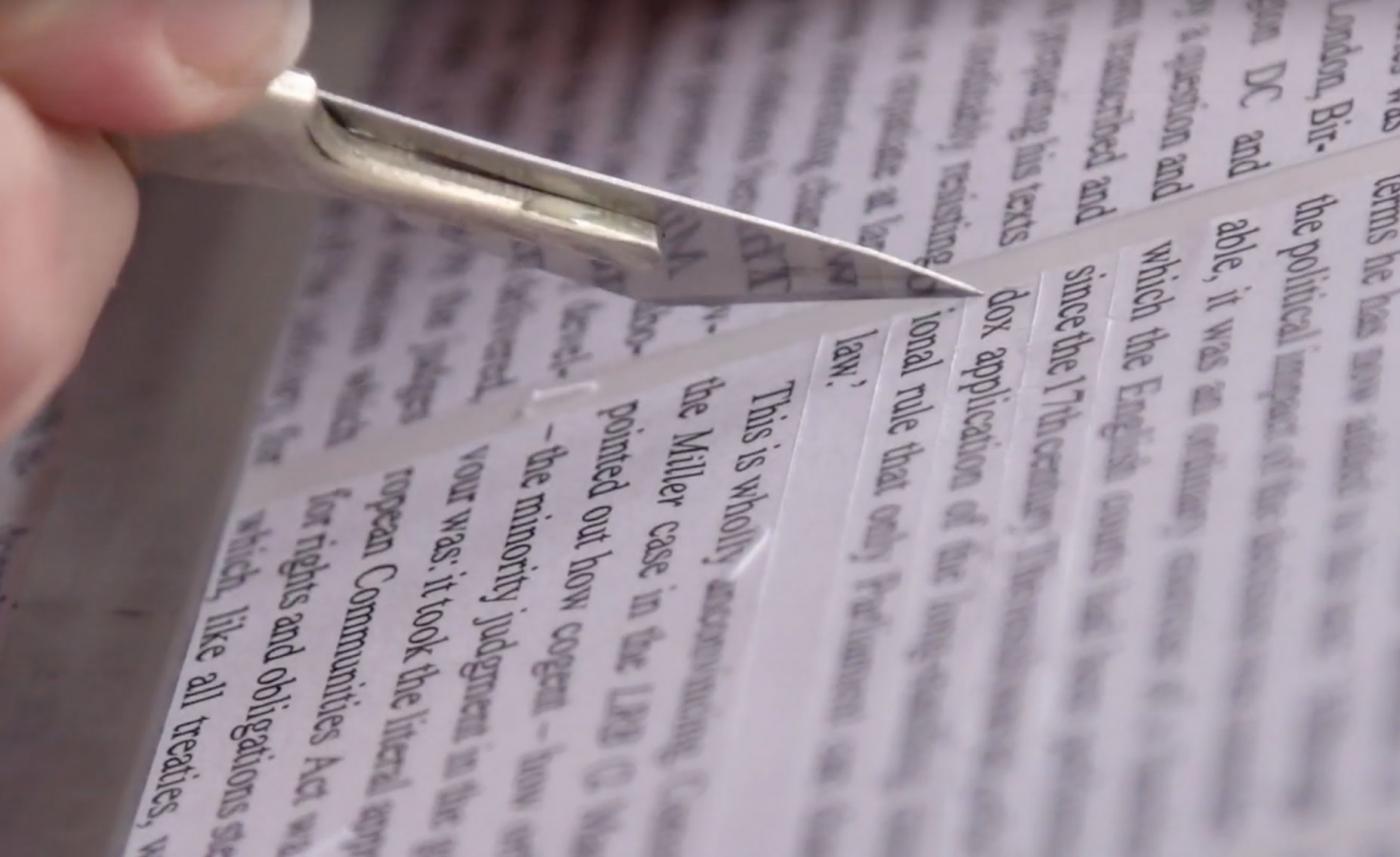
Ogham is an old Irish script made by carving notches into stones. It fell out of use more than a millennium ago—but it's an interesting exception to a linguistics and computer-science rule that I'd never even realised existed. Let's talk about the Ogham Space Mark.
- 0 comments
- 6,312 views
- 0 comments
- 4,578 views
- 0 comments
- 4,645 views
- 0 comments
- 5,514 views
Filmed, edited and motion graphic designed: Jasmine Chen
- 0 comments
- 4,597 views
- 0 comments
- 5,814 views
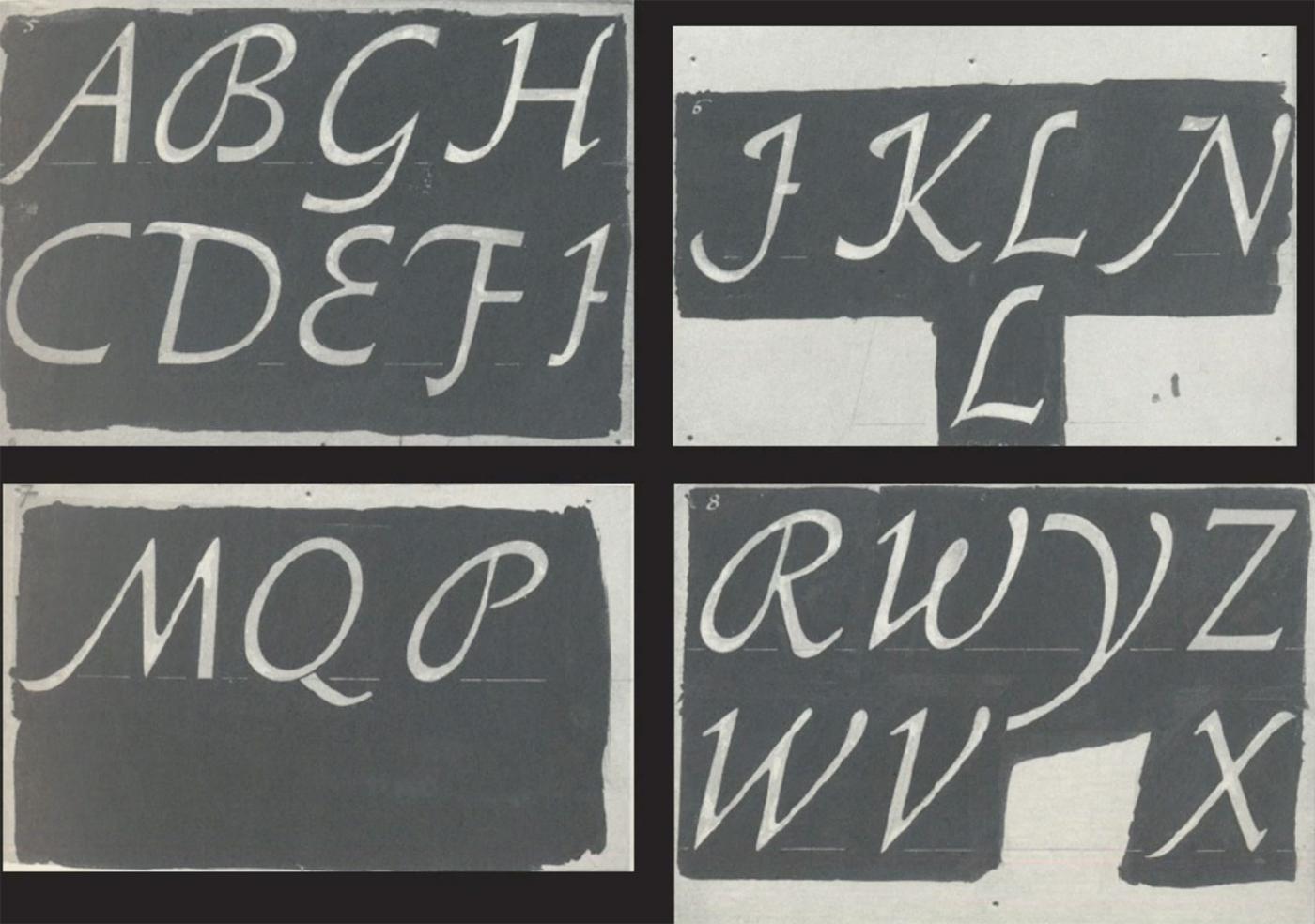
The world of German typefaces in the first half of the 20th century was incomparably rich, though not as widely known as it deserves. Most of the focus has been on the work of Rudolf Koch and the raft of geometric sans serifs that proliferated in the 1920s in the wake of the Bauhaus. Of the many schriftkunstlers—Georg Belwe, F.H. Ehmcke, F.W. Kleukens, Walter Tiemann, and E.R. Weiss—whose work dominated German typography and book design at the time, the one most deserving of rediscovery is F.H. Ernst Schneidler (1882–1956).
Schneidler studied architecture at the Kunstgewerbeschule Düsseldorf under Peter Behrens and was later a student of Ehmcke’s. From 1920 until 1949 he was the director of the Department of Graphic Arts and Book Design at the Württembergische Staatliche Kunstgewerbeschule in Stuttgart. The program that he created provided an alternative to the crafts expressionism of Koch’s Offenbacher Werkstatt and the modernism of the Bauhaus, emphasizing a broad experimentation that encompassed calligraphy, typography, title page design, monogram and logo design, and book illustration. A sampling of the work that Schneidler and his students did between 1922 and 1935 was gathered into a four-volume portfolio entitled Der Wassermann (1945). His teaching was influential with a number of his students going on to become noted calligraphers and/or type designers in their own right, chief among them Georg Trump, Imre Reiner, Walter Brudi and Albert Kapr.
Schneidler’s output as a type designer is not only varied, but fascinating for its reinterpretation of traditional forms. His twenty-one typefaces include a range of blackletters as well as several romans, a script and some designs that are hard to classify. His most famous design is undoubtedly Legende, though Schneidler Initials and Schneidler Mediaeval have had their adherents. This talk will survey all of Schneidler’s type designs, both issued and unissued, in the context of their time.
- 0 comments
- 4,969 views
- 1 comment
- 33,149 views

- 0 comments
- 6,407 views
David Jonathan Ross draws letters of all shapes and sizes for custom and retail typeface designs. A native of Los Angeles, He began drawing typefaces at Hampshire College and joined The Font Bureau in 2007 where he honed his bézier-wrangling skills. Now he publishes his designs at his own foundry, DJR, as well as working on projects with Type Network and developing display faces for his Font of the Month Club. You’ll find him in Western Massachusetts with his partner Emily and their two dogs, Sophie and Lily.
- 0 comments
- 4,185 views