


This talk took place on April 3, 2018 in the Rose Auditorium at The Cooper Union as part of Type@Cooper's Herb Lubalin Lecture Series. We are grateful to Hoefler & Co. for their generous support to archive this lecture series.
The world of German typefaces in the first half of the 20th century was incomparably rich, though not as widely known as it deserves. Most of the focus has been on the work of Rudolf Koch and the raft of geometric sans serifs that proliferated in the 1920s in the wake of the Bauhaus. Of the many schriftkunstlers—Georg Belwe, F.H. Ehmcke, F.W. Kleukens, Walter Tiemann, and E.R. Weiss—whose work dominated German typography and book design at the time, the one most deserving of rediscovery is F.H. Ernst Schneidler (1882–1956).
Schneidler studied architecture at the Kunstgewerbeschule Düsseldorf under Peter Behrens and was later a student of Ehmcke’s. From 1920 until 1949 he was the director of the Department of Graphic Arts and Book Design at the Württembergische Staatliche Kunstgewerbeschule in Stuttgart. The program that he created provided an alternative to the crafts expressionism of Koch’s Offenbacher Werkstatt and the modernism of the Bauhaus, emphasizing a broad experimentation that encompassed calligraphy, typography, title page design, monogram and logo design, and book illustration. A sampling of the work that Schneidler and his students did between 1922 and 1935 was gathered into a four-volume portfolio entitled Der Wassermann (1945). His teaching was influential with a number of his students going on to become noted calligraphers and/or type designers in their own right, chief among them Georg Trump, Imre Reiner, Walter Brudi and Albert Kapr.
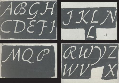
Schneidler’s output as a type designer is not only varied, but fascinating for its reinterpretation of traditional forms. His twenty-one typefaces include a range of blackletters as well as several romans, a script and some designs that are hard to classify. His most famous design is undoubtedly Legende, though Schneidler Initials and Schneidler Mediaeval have had their adherents. This talk will survey all of Schneidler’s type designs, both issued and unissued, in the context of their time.

Recommended Comments
Create an account or sign in to comment