“In the realm of decorative typefaces, only a few are usable for longer texts, but Ermina’s swallow-tail serifs disappear in small sizes and her open drawing is perfectly legible.”
“To be a type designer requires an acute attention to detail, an innovative creative eye, and the ability to apply a concept with meticulous diligence through all possible micro-permutations, which can require years.”
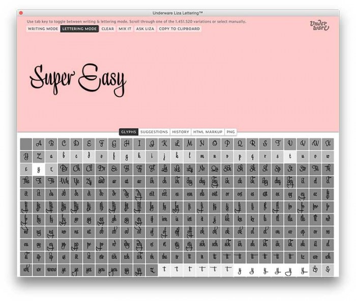
With Liza Lettering there is no excuse not to become a lettering artist yourself. With the combined app & font, it’s as simple to make a skillful hand lettering as doodling with the pen.
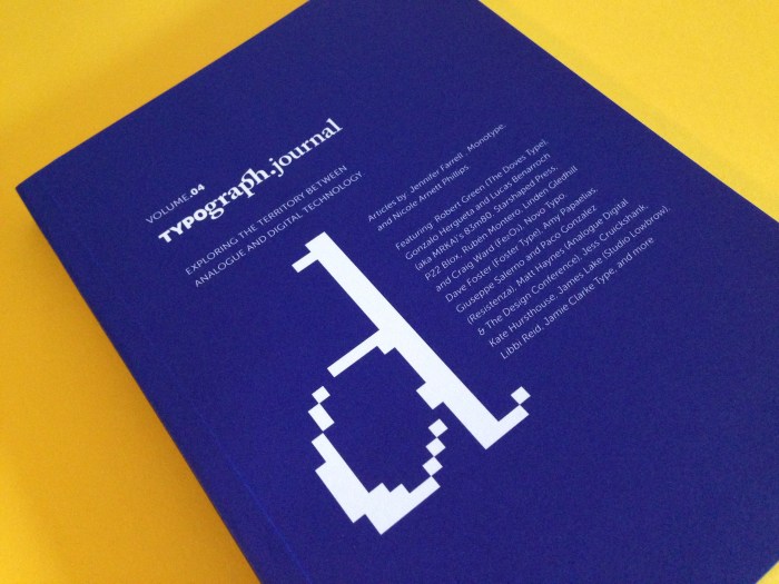
Volume 04 shines a spotlight on creative's who embrace technology in their work. We investigate the space between archaic design craftsmanship and today’s digital lead practices – we also look at some fascinating projects that combine both old and new mediums.
“Having harboured a desire for a rounded font within the Fontsmith library for some time, Phil Garnham recognised that FS Emeric offered the perfect skeleton around which to design it …”
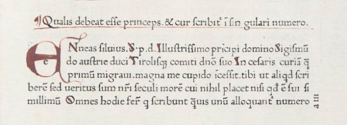
“The Renaissance affected change in every sphere of life, but perhaps one of its most enduring legacies are the letterforms it bequeathed to us.” An article by John Boardley from I Love Typography.
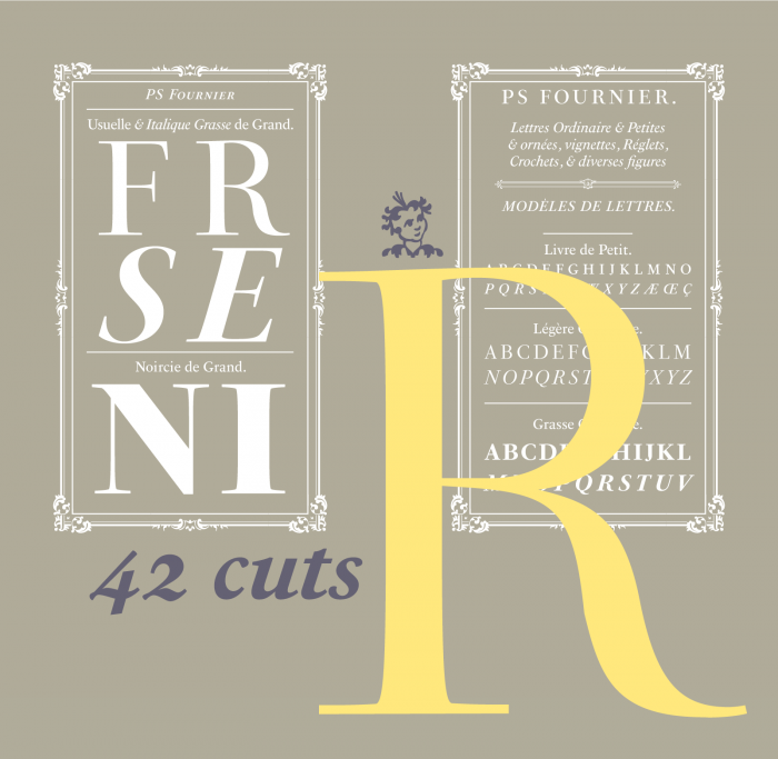
“PS Fournier, created by Stéphane Elbaz, is designed in tribute to Pierre Simon Fournier. PS Fournier successfully elegantly represents the transition to the modern era of typography. Featuring three optical sizes, PS Fournier is designed to perform in any context.”
“What is British Typography and Branding and why is it different from Dutch or German? Why does every piece of British Design have a very distinct style with typography as the main element?”
“Our prompt was that the font had to be an exact replica of the letters in the logo,” says Maag, who knew it would be a challenge due to its reverse creative process. “Usually you make the font and then do the logo,” he notes. Dalton Maag had 3 letters and 4 figures to use as a roadmap.
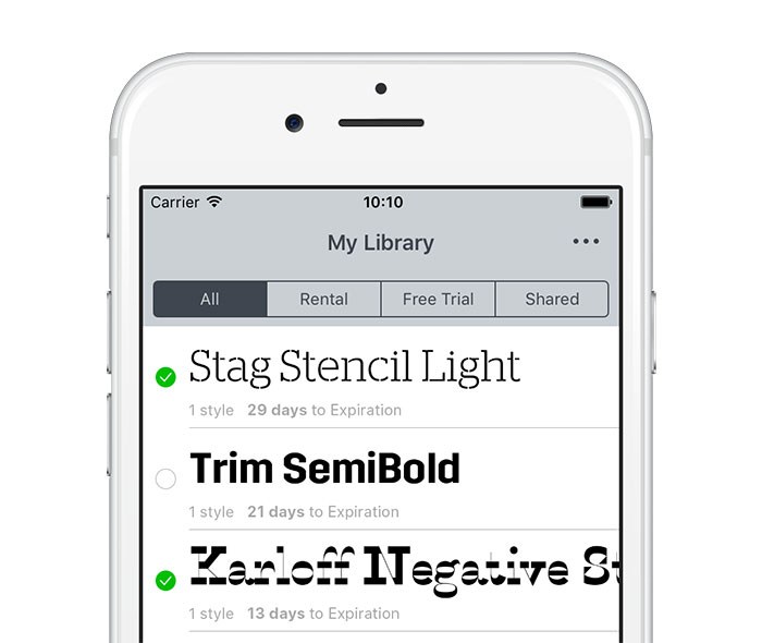
“Volunteers from our ranks or from outside the group will offer informal help to anyone who is looking for career, industry or educational guidance by professionals in the fields of type, typography, or the lettering arts.”