


Typography Weekly #32
8 typography news links in this category
-
“Microsoft surprised many last week by including an overhaul of all emojis in the preview release of the Windows 10 Anniversary Update.”
-
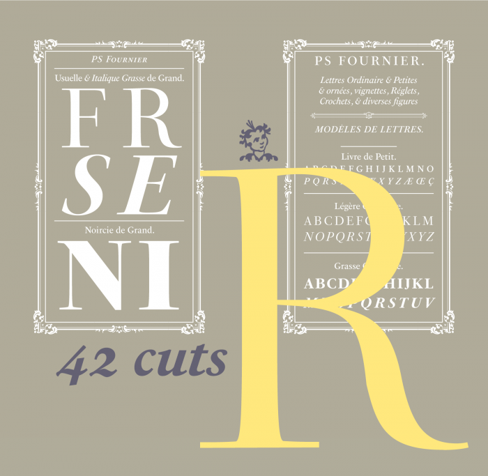
“PS Fournier, created by Stéphane Elbaz, is designed in tribute to Pierre Simon Fournier. PS Fournier successfully elegantly represents the transition to the modern era of typography. Featuring three optical sizes, PS Fournier is designed to perform in any context.”
-
“What is British Typography and Branding and why is it different from Dutch or German? Why does every piece of British Design have a very distinct style with typography as the main element?”
-
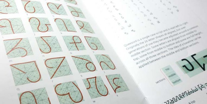
“The invention and design of a new script is quite rare. One for an alien race is perhaps even more so.”
-
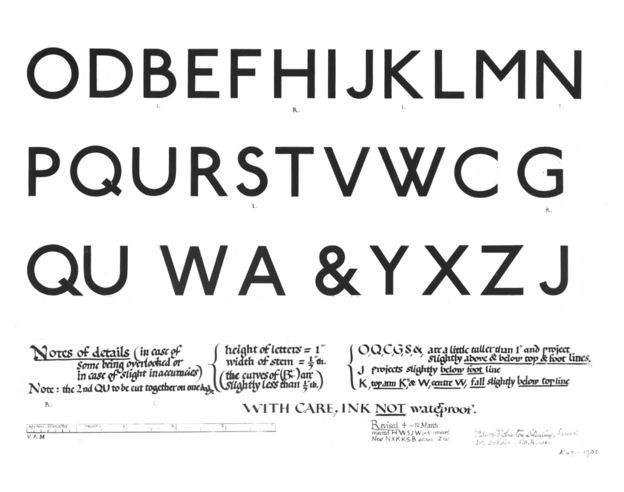
“One of today's most popular typefaces owes its inspiration to radical work done for the signage on British transport a century ago. Johnston Sans changed everything.”
-
“The official t-shirt of ILoveTypography.com, the world’s most popular fonts & typography blog. Featuring Indie Inline, a script font designed by Maximiliano Sproviero from Lián Types.”
-
“So you have seen a typeface in use – on a poster, in a magazine, on a website … and you want to know what’s the name of that typeface. Here are 5 useful tips to identify it.”
-
A method is described for rapidly investigating relative legibility of different typographical features. A paper by Jonathan Dobres, Nadine Chahine, Bryan Reimer, David Gould, Bruce Mehler & Joseph F. Coughlin.


Don’t miss the latest typography news!
Typography Weekly via email: Subscribe here
Typography Weekly via RSS feed: Subscribe here

