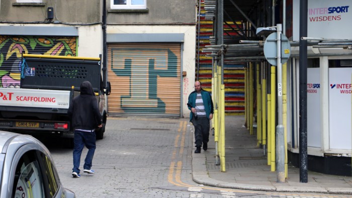
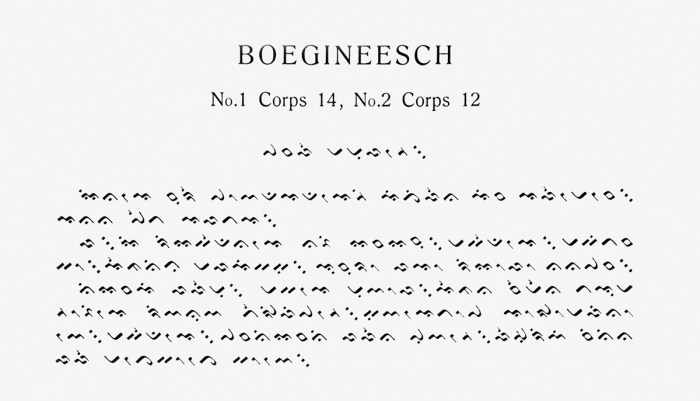
An observation of typography, lettering and visual communication in Hastings, a town rich in history, in the county of East Sussex on the south coast of England. Ranked third most deprived seaside town in England, the town centre is split into two main areas...
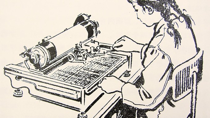
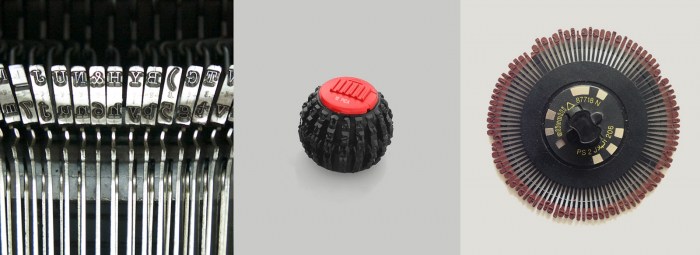
A campaign to raise funds to create a museum exhibit dedicated to Chinese typewriters and other rare East Asian Information Technology artefacts and archival materials on printing, telegraphy, computing, and more.
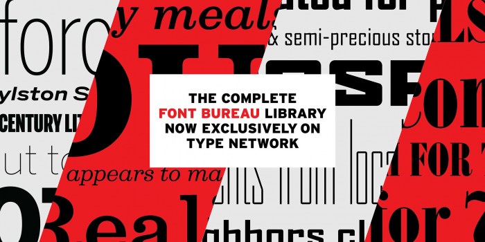
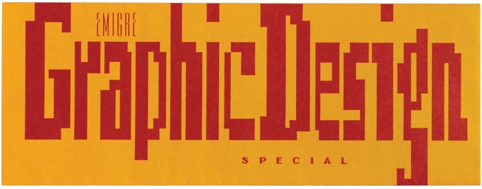
After a Twitter discussion following a Fontstand article about Emigre, Kris Sowersby published a detailed comment about the interview and state of type design/distribution today.
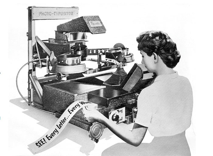
By Peter Bain. There was probably no place that photocomposition had a greater effect than on the New York advertising scene in the mid-20th century. The liberation from the limitations of metal type … provided the typographic designers and type directors of the city with more possibilities”