By Thomas Bohm
I work with typography week in week out designing, illustrating and typesetting books, publications and websites and there is an issue that keeps coming up, which I would like to discuss. I am always amazed at the range of new typefaces being offered and new typographic possibilities, but there is a need in the market for very large and diverse typeface families. We need highly legible typeface families for extended reading which have a very broad language, character and symbol coverage. We are currently not swamped with typefaces in this area. If you or a graphic communication designer had to think of one typeface to use that may support an unusual character that you need, which is not supported in the typeface you are currently using, what would you try?: Minion by Robert Slimbach, I bet.
We have over 150,000 typefaces (also known as fonts) available for direct download, more are added every week. Most historical typefaces are also available in a digital form. How many though are truly up to the job and able to handle the most complex and diverse content? Let us take an academic article (like in an academic journal) as a case study. You would have the print edition in which you would have the Latin characters, possible small caps in upright and italic and oldstyle numerals, superscripts and subscripts, mathematical characters, foreign characters such as Greek for possible equations or formula, you also have tables of numerical data which you would need lining numerals. You may also need some dingbats (miscellaneous symbols). How many typefaces do you think that are available that can handle this type of information? The fact is, actually not a lot. You could probably count the ones immediately available to you on your computer on one hand. Next scenario, the print edition will also be published online, on a webpage in HTML. Most typefaces these days have webfont versions available, but does the typeface even support all the characters and symbols this academic article needs?
Veronika Burian (Burian, 2016) wrote an article called Why Do We Need More Typefaces? In it she mentions:
An effective way of weakening this question usually asked by lay persons is to pose another question, such as, ‘Do we have enough music, or clothes, or art?’ In the same spirit, I agree with Cyrus Highsmith’s reply, ‘You know, I heard the same thing about people!’.
Let me respond to this: we have lots of music, how much is actually good, truly unique and motivating? If you listen to music regularly, what percentage do you really like and keep, and what percentage do you wish you had not bought, downloaded and thus discarded? If you listen to a specific genre of music, as a percentage of all the music you have listened to, what percentage would you say is actually original and truly unique or inspiring? I think you know the answers to these questions, and feel I have made my point… I know this is a highly personal and subjective issue, who is to say what is truly good and what is truly bad? If we discuss clothing, which of your clothes last the longest and which ones disintegrate in no time at all. Which ones do you wear the most and which ones never? If we are discussing art, we could say: all art is good, it is good for the person making it, it is thought provoking for the person interacting with it, and better than probable blank walls. If we apply this analogy to typefaces, we could say all typefaces can be enjoyed and have a purpose. I am not going to attempt to bash or criticize things, merely to suggest an opportunity and active need in the market of typefaces. The issue is not necessarily: of how much (quantity), but of how useful (how useful is it and how useful could and should it be).

Why design new typefaces which are not really any different to others already designed in previous years and that non-typographers and non-designers would not be able to see any difference in? People think new is automatically better, how is it any better, in what way? I think we are getting to the stage where we have enough typefaces (at least from a shape style point of view). It seems typeface designers are happy with ‘reinventing a design of a wheel that already works’. Erik van Blokland (Biľak, 2011) says: ‘If an existing typeface does the job, there is no reason to make a new one.’ Erik Spiekermann (Båtevik, 2015) says ‘If you look at the type foundries, every foundry has a Times New Roman, Garamond, Helvetica, Futura and Din’. The point can also be made that: we cannot edit and extend an existing typeface because of copyright or ownership issues… I get this, so then a new typeface has to be created. The thing which is frustrating for me as a designer is that with new typefaces, they might not be much better or better at all aesthetically than something previously done. So what we have is a new typeface which might not be more usable (in terms of language and symbol support) which also might not be as good from a letter design/aesthetic point of view than a previously historical proven one. Maybe, as information designer Paul Mijksenaar (Mijksenaar, 2018) says on his companies website ‘Build on the good and make it better’. Essentially the point I am striving for is, if you make something new and similar to something that exists, make it much better than what has been previously available. Better in the letter design, language and symbol support, weight range, technically, hinting, etc. I would like to propose a new possibility that would really benefit typographers, people using typography and a wide variety of content. Why do we not faithfully update and add to previously well designed, used and proven typefaces? Are there any examples of this happening?, yes, Nadine Chahine at Monotype has designed Frutiger Arabic, Neue Helvetica Arabic and Univers Next Arabic. There is also the Frutiger Next family which supports Greek and Cyrillic, has small caps in all weights and has oldstyle and lining numerals. Recently the road signage typeface in the UK called Transport was updated and extended. It was originally designed between 1957–1963 by Jock Kinneir and Margaret Calvert, and then updated to include many different weights, text figures and small capitals by Henrik Kubel and Margaret Calvert in 2012. The first release of Transport did not have expert features and so was not really usable in an extended text setting. The typeface Noto commissioned by Google is also worth mentioning. Noto fonts cover all 93 scripts defined in Unicode version 6.0 (released 2010), although less than 30,000 of the nearly 75,000 Chinese, Japanese and Korean (CJK) unified ideographs in version 6.0 are covered. In total, Noto fonts cover nearly 64,000 characters, which is under half of the 137,439 characters defined in Unicode 11.0 (released in June 2018).
Maybe we could use two typefaces, there is the possibility of using two or more typefaces (the x-height of the second typeface can be made the same as the containing/body text and the closest matching weight can be chosen from the second typeface), which is more in-keeping and contains all the characters and symbols you need. This is not ideal, it is much better to have everything you need from one font family.
What is the benefit of designing a very extensive character and symbol range for your typeface?: your typeface can be used for many more items, from airport signage to academic books and the web. The wider your typeface character and symbol support is, the more chance people will use it and the more useful it will be. Not for 1 minute am I suggesting that wide character and symbol support is easy for typeface designers to achieve. Typeface design is very hard, fact, it requires the input from specialists in many different areas and can take many years to finish. There is the actual design of the shapes, there is the kerning, there is the glyph naming and sorting, there is the hinting, coding, there are testing issues with people, software testing, and then there are sale and distribution issues. This is no easy process.
Accessible and more usable variations of characters and symbols
There are clear and actual needs for typefaces to have the option to choose more accessible and usable variations of characters and symbols. See research from myself called Letter and symbol misrecognition in highly legible typefaces for general, children, dyslexic, visually impaired and ageing readers [2018 third edition] (Bohm, 2018). Characters such as the capital I (i), lowercase l (el), number 1 (one) and 0 (zero) are usually not defined enough and can get misrecognised. There may also be a need for infant characters, for children. Here is a current need, not often available or supplied, that would be welcome for complex information design projects. Recently the typeface Source Sans has been released (16th September 2015), what is interesting from an accessibility view is that it offers through OpenType ‘sylistic sets’ option a capital I (i) with a stroke on the top and bottom, and infant lowercase a and g, and a slashed zero. This is what users of typefaces want, they want accessible character options. Unfortunately there is no capital I (i) with a stroke on the top and bottom in small caps upright or italic… and what about the diacritics, foreign language marks for this variant. Also, why not provide the default typeface setup using the most legible characters?, if the user then decides to use less legible characters available, then that is their choice. Provide the most legible character and symbols by default which does not rely on advanced typographic knowledge to implement.
Major brands commissioning new typefaces
In recent years we have seen major brands commission typeface designers to design them their own typeface. Recent examples include IBM (IBM Plex), Netflix (Netflix Sans), Apple (San Francisco) and BBC (Reith). Here once again we are seeing new typefaces. Why so? The main reason being that they can avoid huge typeface licensing costs associated with pre-existing typefaces. I actually understand and get why they do it and the important thing to note from a ‘new typeface perspective’ is that they are not directly offering them to the public, they are not giving us the option to buy them. The need and requirement for the new typeface primarily satisfies their own needs. Yes some might be available for public use, but they are not commissioning and designing them directly for the public to buy (like fulfilling consumer demand, put another way).
Examples of diverse information
- Different number styles like in timetables or financial tables.
- Use of a typeface on the web, which can encounter very diverse uses and applications.
- Different languages of the world.
- Mathematical formula.
- Signage in the environment.
- Information for children or the ageing, for example.
- Information being used by people with some kind of impairment.
- Dictionaries.
Examples of similar typefaces
Non-designers and non-typographers will not be able to tell the aesthetic difference communicated from the typeface’s letters and symbol shapes in typefaces like:
Sans serif
- Neue Haas Grotesk (1956), Helvetica (1957), Arial (1982), Bau (2002), Akkurat (2004), Aktiv Grotesk (2010), Acumin (2015), Real (2015).
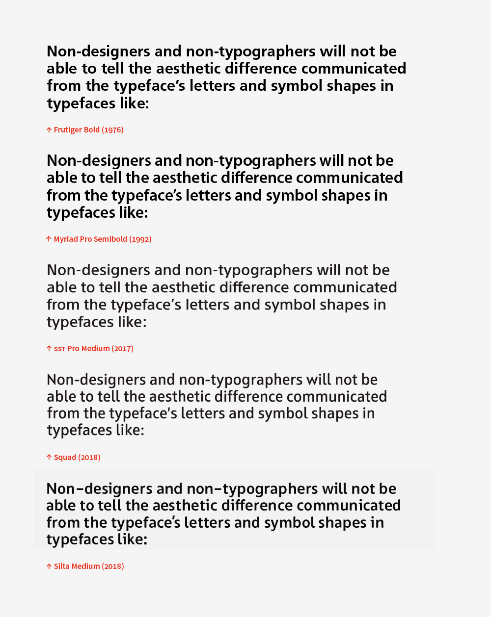
- Frutiger (1976), Myriad (1992), Monotype SST (2017), Squad (2018), Silta (2018) (see Figure 1).

Figure 1: four typefaces (Frutiger, Myriad Pro, SST Pro, Squad, Silta) which non-designers and non-typographers will not notice the difference between.
- Avenier (1988), Corbel (2005).
- Avant Garde (1970), Century Gothic (1991).
Serif
- Arnhem (1998), Mercury Text (1999), Rosart (2016).
- Times (1931), Times New Roman (1932), Lyon Text (2009).
- Clarendon (1845), Sentinel (2009).
- ITC Century (1894), Clarion (1985), Miller Text (1997), Source Serif (2014).
- Swift (1987), Constantina (2006).
- Collis (1993), Novel (2008), Elena (2010), Permian (2011), Lava (2013).
Slab serif
- Serifa (1967), PMN Caecilia (1991), Roboto Slab (2013), Zilla Slab (2017).
- Rockwell (1934), Lubalin Graph (1974).
Examples of good, versatile and wide supporting typefaces
Lucida
The huge Lucida family designed by Charles Bigelow and Kris Holmes and released from 1984 onwards, consists of: Lucida Arrows, Lucida Blackletter, Lucida Bright (it features more contrasted strokes and serifs than Lucida Serif), Lucida Calligraphy, Lucida Casual (similar to Lucida Handwriting, but without connecting strokes), Lucida Console, Lucida Typewriter Serif, Lucida Fax, Lucida Handwriting, Lucida Icons, Lucida Math, Lucida OpenType, Lucida Sans, Lucida Grande (which supports Latin, Greek, Cyrillic, Arabic, Hebrew, Thai languages), Lucida Sans Typewriter, Lucida Sans Unicode, and Lucida Serif.
Minion
Designed by Robert Slimbach, the first version of Minion was released in 1990. A Minion Pro version was released in 2000 which contained expert glyphs (small caps, superscripts/subscripts, different numeral styles, etc.) in a range of weights (from regular to bold) and in condensed versions. It also supports Greek, Cyrillic and Vietnamese. There are italic swashes and ornaments also available. There is a Minion Math version externally available from Johannes Küster, each font has 5800 glyphs. In 2018 Minion Pro was re-released again, which is now called Minion 3. New features in the typeface include: African and Vietnamese languages, full IPA (International Phonetic Alphabet) support, refinement of both the Cyrillic and the Greek extensively (even adding a second Greek style), and introduced a new script: Armenian.
Meta and Meta Serif (see also Fira)
Meta designed by Erik Spiekermann. The first version was digitally available in 1991 and contained basic Latin, small caps and oldstyle and lining numerals. Later an OpenType Pro version was released which supports Latin, Cyrillic, Greek and Hebrew. The typeface is available in weights from Thin to Black and also condensed. In 2017 a Meta Georgian was released with design support from Akaki Razmadze which supports modern Georgian, as well as additional symbols for the Old Georgian, Megrelian, Svan, Abkhazian and Ossetian languages. In 2018 a Variable version of Meta was also made available.
Meta Serif was designed in 2007 by Erik Spiekermann, Christian Schwartz and Kris Sowersby. It is available from Light to Black and in a Pro version which contains expert glyphs (small caps, superscripts/subscripts, different numeral styles, etc.). Language support is extensive and supports Cyrillic and Greek.
Between 2011–2012 as part of the Carrois Type Design team and together with Erik Spiekermann commissioned by Edenspiekermann, a DG Meta Science was created for De Gruyter publishing house. It contains an expanded version of Meta and Meta Serif (called Meta Science and Meta Science Serif). It has two weights plus italics with more than 2800 glyphs. The typefaces contain extensive coverage of Latin Extended, Greek Extended, Cyrillic and Coptic writing systems, and also phonetic extensions, geometrical shapes and much more.
Fira
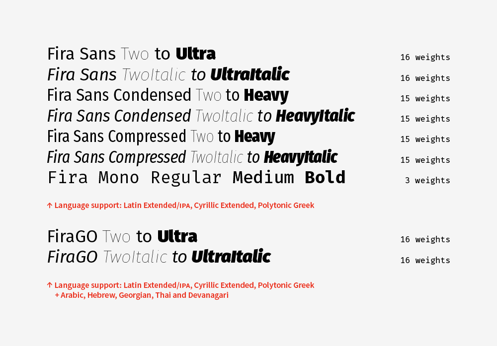
Originally designed by Erik Spiekermann, Ralph du Carrois, Anja Meiners and Botio Nikoltchev in 2013, it is available in 16 weights and has small caps and oldstyle numerals, it is also open-source (open-source means it is free for personal and commercial use and can be modified). Condensed and compressed versions were added along with Fira Mono and Fira Code.
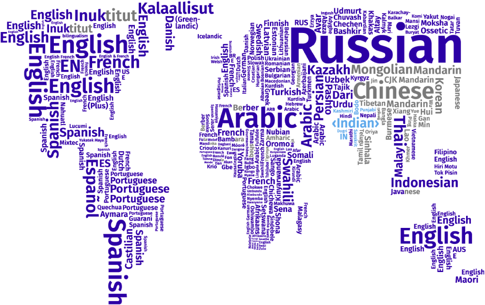
Fira Go as of 2018 supports Arabic, Devanagari, Georgian, Hebrew and Thai letters in addition to Latin, Greek and Cyrillic. The designers were: Arabic (Ralph du Carrois, Titus Nemeth and Hasan Abu Afash), Devanagari (Rob Keller, Kimya Gandhi and Natalie Rauch), Georgian (Akaki Razmadze and Anja Meiners), Hebrew (Natalie Rauch with consultancy support by Yanek Iontef), Thai (Mark Frömberg with consultancy support by Ben Mitchell).

Figure 2: Fira typeface showing the different weights and styles available.

Figure 3: World map showing the language coverage of Fira Go. Dark blue text: languages covered by FiraGO. Light blue text: languages partly covered by FiraGO. Grey text: languages not yet covered by FiraGO. Map courtesy of bBox Type.
TheSans, TheMix, TheSerif
Designed by Lucas de Groot between 1994–1999. The most current version is fully OpenType Pro and supports Cyrillic and Greek. TheSans and TheMix come in Arabic versions. There is also a TheSans and TheMix Mono.
Cambria and Cambria Math
Cambria was commissioned by Microsoft and designed by Jelle Bosma in 2004. It has full OpenType Pro features and supports Greek and Cyrillic. Cambria Math was the first font to implement the OpenType math extension, itself inspired by TeX led by Jelle Bosma and Ross Mills. These typefaces come free with Windows Vista operating system up and Microsoft Office 2007 up.
Fedra Serif
Fedra Serif was designed in 2003 by Peter Biľak. It is fully OpenType Pro and has some range of math characters and symbols. It supports Greek, Latin, Cyrillic, Arabic, Hebrew, and Armenian. It is available in weights from Book to Bold. Fedra is also available in Fedra Sans, Fedra Mono and Fedra Serif A and B with different ascender and descender heights (very useful for compact texts like in newspapers or dictionaries).
Examples of old typefaces which need to be faithfully and respectfully updated for 21st century use
- Why is Monotype Bembo italic small caps not available?
- Why is Info Display small caps not available?
- Why is Monotype Baskerville italic small caps not available?
- Why is Collis bold not available?
- Why is Arnhem Greek not available?
- Why is Lola small caps not available?
- Why is Adobe Symbol Medium italic, bold or Light not available?
- Why is Meta with a stroke on the top and bottom of the capital I (i) not available?
So what do we ideally need from new typefaces?
- Proper superscripts and subscripts.
- A range of numerical styles (oldstyle and lining).
- Small caps in all weights and variants.
- Extensive language support (Latin, European, Greek, Cyrillic, Arabic, Hebrew, CJK: Chinese/Japanese/Korean, etc.).
- Scientific and mathematical symbols.
- A range of dingbats.
- Swashes.
- Accessible characters.
- Infant characters.
- The typeface to be available in a wide range of weights (Thin to Extra Bold, Condensed).
- Maybe in styles such as monospace, handwritten, informal, slab and rounded sans serif versions.
- Available to buy and also open-source.
- Original and useful designs, or extension of historically proven typefaces.
- Good hinting (so the typeface renders well on screen).
Summary
- You could say we need no more similar typefaces which have a small character and symbol support, all which are basically the same to non-designers and non-typographers (the majority of your users).
- Is new automatically better? Do we need better of what we have?
- You could say we just need better and more extensive versions of typefaces already designed.
- We need some of the really good old typefaces like Monotype Bembo to have a full OpenType Pro range and have mathematical symbols, Greek, etc.
- Let’s collaborate better together as typeface designers and with typeface designers who can design for different languages and character support.
- Let’s build extensive typefaces available in both sans and serif which are truly useful and can support a wide range of information.
- In the typeface industry, we need both professional typefaces which are purchasable, and open-source typefaces which are free. The two different typeface categories each have their own uses for different circumstances.
References
Båtevik, B. (2015). Subtle Expression in Typography. BA thesis: Westerdals School of Communication, Norway. Retrieved October 2018, from http://arvebaat.com/erik-spiekermann.html.
Bohm, T. (2018). Letter and symbol misrecognition in highly legible typefaces for general, children, dyslexic, visually impaired and ageing readers [2018 third edition]. Retrieved October 2018, from https://typography.guru/journal/letters-symbols-misrecognition/.
Burian, V. (2016). Why Do We Need More Typefaces? Retrieved October 2018, from http://www.alphabettes.org/why-do-we-need-more-typefaces/.
Mijksenaar, P. (2018). https://www.mijksenaar.com.
This paper was amended half a day later after the publication date in regard to comments by Fred Smeijers and Erik Spiekermann, thanks Fred and Erik.
About the author
Thomas Bohm studied graphic communication design at college (BTEC, Leicester College, UK) and university (BA, Norwich University of the Arts, UK). Now works for book publishers and businesses, and continues to run User Design, Illustration and Typesetting a graphic communication design, illustration and production service. Writes, researches and occasionally publishes. Published Punctuation..? (2nd edition, User Design, 2012) a fun and fully illustrated book on punctuation. Has been published in Information Design Journal, Baseline, Slanted and is a member of the Association of Illustrators and the International Institute for Information Design.
-
 3
3


Recommended Comments
Create an account or sign in to comment
You need to be a member in order to leave a comment
Create an account
Sign up for a new account in our community. It's easy!
Register a new accountSign in
Already have an account? Sign in here.
Sign In Now