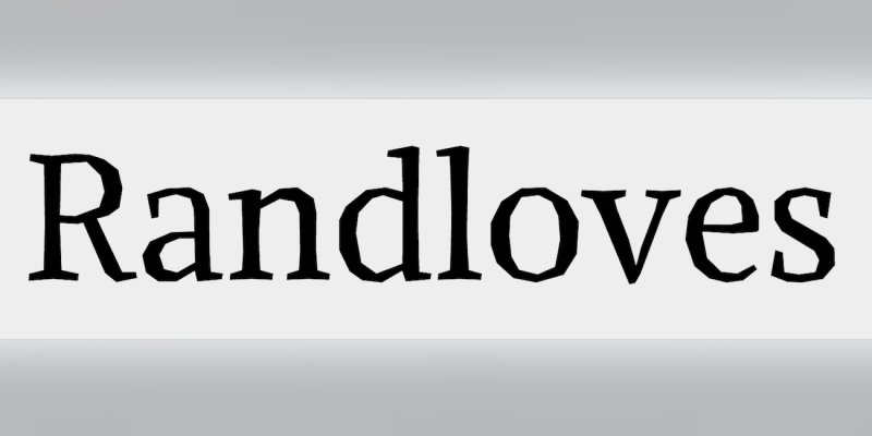
As opposed to the soft Regular its letterforms consist of only straight splines and additional expressive features are introduced in characters like T, Z, M, E.”
Open external Link
Where this entry is used: Serif, but no curves allowed

Where this entry is used: Serif, but no curves allowed
We are placing functional cookies on your device to help make this website better.
Recommended Comments
There are no comments to display.
Create an account or sign in to comment
You need to be a member in order to leave a comment
Create an account
Sign up for a new account in our community. It's easy!
Register a new accountSign in
Already have an account? Sign in here.
Sign In Now