Search the Community
Showing results for tags '7qestions'.
-

Lettering vs. Type Design: 7 questions for Ksenia Belobrova
Ralf Herrmann posted a journal article in Journal
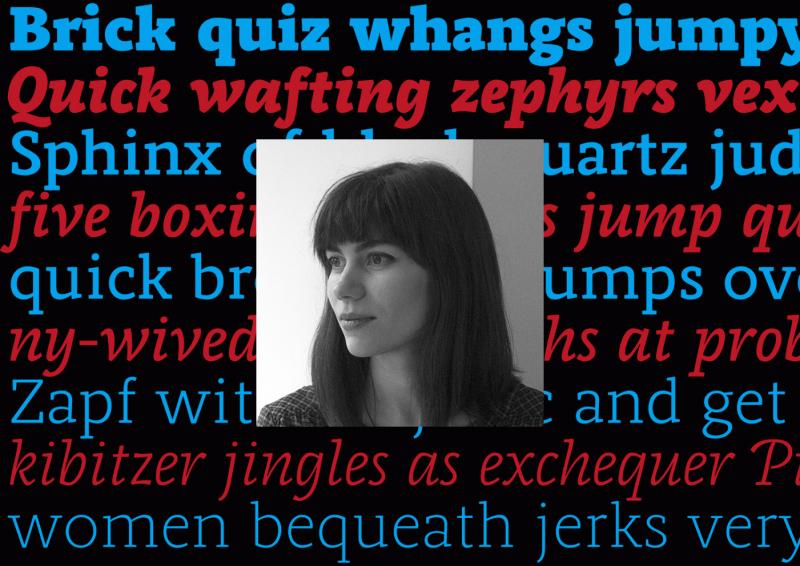
1. To begin with, please tell our readers a little bit about yourself and how you became interested in drawing letters. I think the most interesting thing about me is that I grew up in a provincial town near the sea. I did spend my time sailing yachts, playing the violin and painting. When I was seventeen I left my lovely hometown and moved to Moscow. My passion was art and I was planning to become a book illustrator and designer because I love books and everything related to them. So I passed my exams and started studying at Moscow State University of Printing Arts. There I learned a lot about art and design history, illustration and book design. But for me the most important course was calligraphy and type design class led by Alexander Tarbeev. I fell in love with typography and type design. And I found the perfect teacher. Since then my ruling passion in life has been drawing letters. I practice calligraphy, draw letterings, logotypes and work on typefaces. My hobbies are music and art. I play the guitar, study singing and of course draw and paint when I have free time. 2. How many years did you practise calligraphy and lettering and what was your first lettering/calligraphy job? I have been doing it for about eight years now. My first calligraphy attempts had to do with the beginning of Alexander Tarbeev’s class and it was nearly eight years ago. Since then I’ve been practising hard, but it was just for myself. I studied calligraphy, drawing non-commercial letterings and typefaces a lot. And honestly I don’t remember what was my first commercial lettering job. But my first released typeface was Voltaire script made in Artem Gorbunov’s design bureau. It was my first big commercial project and I was happy with the result. 3. If you had to pick one lettering/calligraphy job you are most proud of, which one would it be? Tell us a little bit how this project came about and what you liked about working on it. That’s hard! I’m afraid I can’t choose one. And I’m not too proud of any of my works because they always could have been better. I’m a perfectionist so I struggle with that all the time. But I can choose one project that is very important for me despite being old and noncommercial: the posters for the Ukranian calligraphy and typography festival Rutenia. I was an unknown student and I was afraid of everything. But it was an amazing event and the task was both interesting and difficult, so it was a real challenge. I wanted to try my skills and it took me 3 days to make the posters. I mixed European calligraphy with old Cyrillic calligraphy traditions. I was proud of the result and I received a lot of appreciation from people I respect and admire very much. That was a perfect beginning and that encouraged me to work even harder. 4. What is your ideal creative environment? Where do you work? Studio space? Home office? Co-working? I used to work at home. It’s difficult for me to focus on the work though when it’s noisy or you get disturbed in any other way. Sometimes I work in co-working spaces, but not so often. 5. Now let’s move on to your latest release. What was the inspiration, goal or idea behind the development of Jonesy? And what uses for it do you have in mind? I love monoline connected signs. I love the way they look and I think they are perfect for street signs, logotypes and small typography too. I’ve seen many of them during my trips through Europe. But there are not so many typefaces in this fashion. And that’s understandable, because it’s rather complicated to create them. If a typeface you work on is just a monoline without connections, that’s OK. If a typeface is connected but it’s not monoline, that’s OK as well. But if it’s monoline and connected at the same time, you are in trouble. You have to work on letterforms a lot to make them acceptable even a bit. Then you will realize that it’s absolutely not possible in some combinations and you have to create a lot of alternates and ligatures. In the case of Jonesy it’s been hundreds. Of course I talk about situations when you want your typeface to look as good as possible. So it was a challenge and I didn’t see similar typefaces on MyFonts or anywhere else. It was really interesting for me and I thought it might be useful for other designers who love this kind of typography and have no appropriate tool. 6. Which drawing tools and software tools did you use to design the typeface? I always start working on a typeface with lettering or calligraphic sketches on paper. I use pencils, markers and a wide range of calligraphy tools. Regarding the software: I used to work with Adobe products and Robofont (with associated programs). For lettering I use Illustrator and sometimes Robofont too. For typefaces I use Robofont, MetricsMachine and Superpolator. 7. Jonesy comes with hundreds of ligatures and alternative glyphs to give the font a more handwritten appearance. For a calligraphy job you have total artistic freedom writing words and phrases with the ability to react to context and meaning, while typefaces require any letter combination just to work all the time. Do you enjoy calligraphy more because of that and do you feel limited by this aspect while designing typefaces? Or has the OpenType technology removed this clear border between calligraphy and typesetting in your opinion? Great question! Yes, I really enjoy calligraphy/lettering because I have complete freedom to write and draw as I please. But I enjoy the process of creating typeface even more, because it’s like a brainteaser. You have a lot of issues and limitations, but if you solve these problems you have a clever type system that works and looks well. Of course OpenType technology improves our lives as type designers a lot in that regard, but I’m sure typefaces will never be able to look like calligraphy or lettering. And I don’t think it’s bad because they serve different purposes.


