

Search the Community
Showing results for tags 'font identification'.
Found 1 result
-

Why there isn’t a font behind every letter you see
Ralf Herrmann posted a journal article in Journal
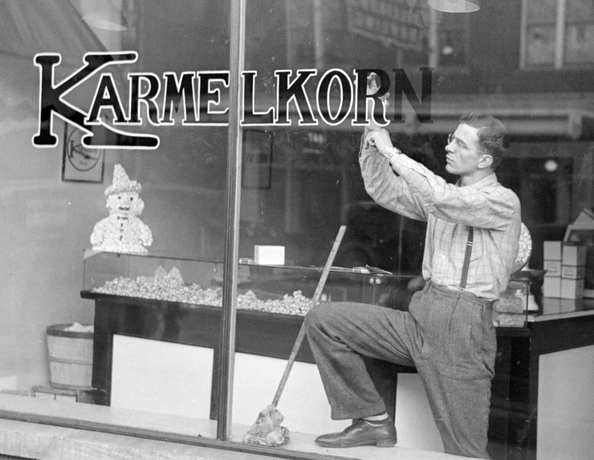 Today we take it for granted to use fonts for almost anything. Not just printed matter, but also logos, stamps, t-shirts, neon letters, and so on. Anything is possible—we just need to provide an image file. But this is a rather new development, considering how long movable type is in use. Over more than 500 years, fonts (made from metal or wood) were connected to letterpress printing, were each letter had to be made in the target print size, arranged by a typesetter, inked and finally printed on a surface like paper. That’s how things like the text block of books, flyers, letter heads, business cards, or posters were being made. But this technique was not suitable in many other areas. Think of a 50 inch sign on a train station building for example. It wouldn’t make sense to create a set of 50 inch letters just for this case and then press these huge letters against a sign or even the building wall itself. It was done differently and the following sections describe typical areas where letters were often not created using fonts. The Signpainter Signs over shops or on shop windows, political banners, train station signs, advertising boards and banners, large-scale ads on walls—those are all uses usually created by sign painters in the past. A sign painter could draw or write alphabets in many different styles, but his job had little to do with the letterpress letters used in print shops. The sign painter’s tool were brushes and pencils and every sign was usually a unique design, with letters specifically drawn for this one use. That’s what we call lettering. Sign painter training But it wasn’t just advertising. Even street signs, or the signage for busses or trains could have been lettering. If the same letters had to be repeated over and over again, there might have been stencils or technical drawings for each letter. But those were usually just for internal use, not sold publicly like letterpress fonts. And because of that, there was often not even a need to name the sets of letters just used internally. And so we also cannot identify a certain name in hindsight. The only chance is that the sign painter’s alphabets were interesting enough for someone to create a font later based on the original lettering design. A sign painter working on streetcar signs in the 1940s. Older logos, like the one from Coca-Cola in this case, were almost always drawn, not made from fonts Logos and mastheads Setting the logo of a brand or company in a certain typeface—or at least to base the design on a typeface—is very common today. But before the computer, logos were almost always created as individual drawings by a graphic designers. The same is true for mastheads of newspapers and magazines. They weren’t printed every time from moveable type. The were designed once and then turned into a printing block or “logotype”. In fact, this is were the term logo comes from originally. Combining several letters or full words to one unit was called a logotype (from Greek: logos → word). And since this was so common for the names of companies, logotype (or logo for short) became a synonym for visual trade marks of any kind, even the ones that don’t contain letters or words. Book covers The body copy of books is usually being printed from moveable type since Johannes Gutenberg. But the same was not necessarily true for book covers and dust jackets. They are designed by illustrators and graphic designers and before the computer, if there were letters, they were created as lettering—drawn in the original size just for this one use. And while it was less common, title pages or pages starting new chapters could also get such a lettering treatment. Product lettering Clock faces, food and cosmetics packaging, tube radios, vacuum cleaners, coffee makers and so—letterpress fonts weren’t suitable for putting letters on such products in the past. So even if the design of letters on such product looks similar to letterpress fonts, they were usually not made using fonts. Stonemasonry Just as the sign painters created the lettering on signs, stone cutters created the lettering on stones, may it be inscriptions on walls, tombstones, or on plaques mounted on buildings. And even while the letters might look as uniform as the ones in a typical font, before the computer, such stone cuttings were usually not made using fonts. The letters were designed and carved by the stone cutter for the specific application. Handwriting/calligraphy Most of the examples mentioned above fall into the category we call lettering. But letters can also be created with a another technique, that neither is lettering nor uses fonts: handwriting (or calligraphy, as we call it as an art form). Many requests in our font identification forum simply show handwriting, but people still ask for a “font identification”. Typing everything has become so common today, it might not even occur to people anymore, that things like logos, poster texts, or advertising claims might be handwritten. And modern script OpenType fonts might indeed even look a lot like lettering or calligraphy. But usually, if one takes a closer look, handwritten texts and fonts can still be distinguished very clearly.
- 2 comments
-
- 3
-

-
- lettering
- calligraphy
- (and 1 more)

