Jump to content
The type specimens of the world in one database …

Search the Community

Showing results for tags 'press'.

  • Search By Tags

    Type tags separated by commas.
  • Search By Author

Content Type


The Typography.Guru Forums

  • Public Typography Forums
    • Talk
    • Font Identification
    • Font Downloads
  • Exclusive to Members
    • Type Design Forum
    • Letterpress Forum
    • Calligraphy/Lettering Forum
    • Show
    • Internal
    • Coffee Shop

Categories

  • Artisanal workshops & studios
  • Museums & Libraries
  • Apps
  • Education
  • Organizations
  • Online Typography Resources
  • Educational Video Channels
  • Typography Books
  • Magazines
  • Publishers

Categories

  • Link suggestions
  • Newsletter Archive (1-99)
    • Typography Weekly #1
    • Typography Weekly #2
    • Typography Weekly #3
    • Typography Weekly #4
    • Typography Weekly #5
    • Typography Weekly #6
    • Typography Weekly #7
    • Typography Weekly #8
    • Typography Weekly #9
    • Typography Weekly #10
    • Typography Weekly #11
    • Typography Weekly #12
    • Typography Weekly #13
    • Typography Weekly #14
    • Typography Weekly #15
    • Typography Weekly #16
    • Typography Weekly #17
    • Typography Weekly #18
    • Typography Weekly #19
    • Typography Weekly #20
    • Typography Weekly #21
    • Typography Weekly #22
    • Typography Weekly #23
    • Typography Weekly #24
    • Typography Weekly #25
    • Typography Weekly #26
    • Typography Weekly #27
    • Typography Weekly #28
    • Typography Weekly #29
    • Typography Weekly #30
    • Typography Weekly #31
    • Typography Weekly #32
    • Typography Weekly #33
    • Typography Weekly #34
    • Typography Weekly #35
    • Typography Weekly #36
    • Typography Weekly #37
    • Typography Weekly #38
    • Typography Weekly #39
    • Typography Weekly #40
    • Typography Weekly #41
    • Typography Weekly #42
    • Typography Weekly #43
    • Typography Weekly #44
    • Typography Weekly #45
    • Typography Weekly #46
    • Typography Weekly #47
    • Typography Weekly #48
    • Typography Weekly #49
    • Typography Weekly #50
    • Typography Weekly #51
    • Typography Weekly #52
    • Typography Weekly #53
    • Typography Weekly #54
    • Typography Weekly #55
    • Typography Weekly #56
    • Typography Weekly #57
    • Typography Weekly #58
    • Typography Weekly #59
    • Typography Weekly #60
    • Typography Weekly #61
    • Typography Weekly #62
    • Typography Weekly #63
    • Typography Weekly #64
    • Typography Weekly #65
    • Typography Weekly #66
    • Typography Weekly #67
    • Typography Weekly #68
    • Typography Weekly #69
    • Typography Weekly #70
    • Typography Weekly #71
    • Typography Weekly #72
    • Typography Weekly #73
    • Typography Weekly #74
    • Typography Weekly #75
    • Typography Weekly #76
    • Typography Weekly #77
    • Typography Weekly #78
    • Typography Weekly #79
    • Typography Weekly #80
    • Typography Weekly #81
    • Typography Weekly #82
    • Typography Weekly #83
    • Typography Weekly #84
    • Typography Weekly #85
    • Typography Weekly #86
    • Typography Weekly #87
    • Typography Weekly #88
    • Typography Weekly #89
    • Typography Weekly #90
    • Typography Weekly #91
    • Typography Weekly #92
    • Typography Weekly #93
    • Typography Weekly #94
    • Typography Weekly #95
    • Typography Weekly #96
    • Typography Weekly #97
    • Typography Weekly #98
    • Typography Weekly #99
  • Newsletter Archive (100-199)
    • Typography Weekly #100
    • Typography Weekly #101
    • Typography Weekly #102
    • Typography Weekly #103
    • Typography Weekly #104
    • Typography Weekly #105
    • Typography Weekly #106
    • Typography Weekly #107
    • Typography Weekly #108
    • Typography Weekly #109
    • Typography Weekly #110
    • Typography Weekly #111
    • Typography Weekly #112
    • Typography Weekly #113
    • Typography Weekly #114
    • Typography Weekly #115
    • Typography Weekly #116
    • Typography Weekly #117
    • Typography Weekly #118
    • Typography Weekly #119
    • Typography Weekly #120
    • Typography Weekly #121
    • Typography Weekly #122
    • Typography Weekly #123
    • Typography Weekly #124
    • Typography Weekly #125
    • Typography Weekly #126
    • Typography Weekly #127
    • Typography Weekly #128
    • Typography Weekly #129
    • Typography Weekly #130
    • Typography Weekly #131
    • Typography Weekly #132
    • Typography Weekly #133
    • Typography Weekly #134
    • Typography Weekly #135
    • Typography Weekly #136

Categories

  • Free Font Lists
  • Font alternatives
  • Fonts by topic/style
  • Fonts by region
  • Signage Fonts
  • Fonts by User

Categories

  • How to choose and pair fonts
  • Understanding Kerning & Tracking
  • How to use OpenType in InDesign
  • Font Licensing 101
  • How to use color fonts
  • Variable fonts for graphic and web designers
  • Typography on Apple devices

Categories

  • Hall of Fame
    • 2023
    • 2022
    • 2021
    • 2020
    • 2019

Find results in...

Find results that contain...


Date Created

  • Start

    End


Last Updated

  • Start

    End


Filter by number of...

Joined

  • Start

    End


Group


Job


Location

Found 2 results

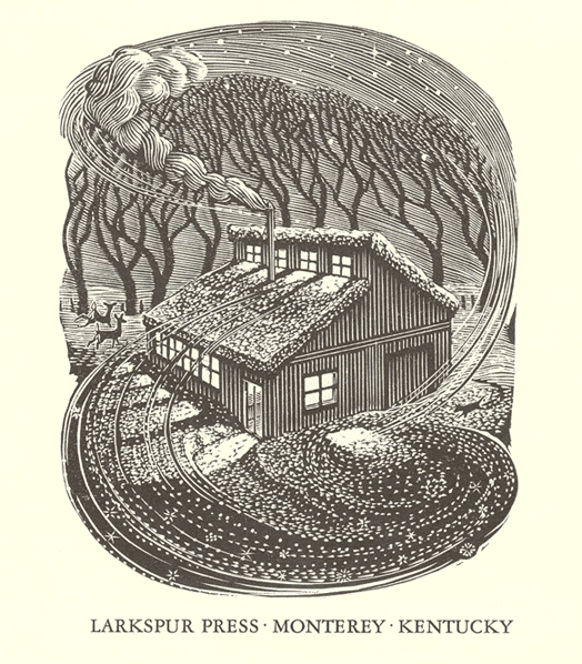
  1. The Larkspur Press is a small letter-press publisher based in Monterey, Kentucky, United States, founded and operated by Gray Zeitz. The work of the Larkspur Press is handset in metal type and printed mainly on a hand-fed C&P. Some times the artwork (photo engravings, woodcuts and wood engravings) are printed on a Vandercook #4 or on a Washington hand press. The press publishes mostly Kentucky writers in two editions. The regular edition is printed on fine machine made paper, and since 2005 hand bound at the press. The special editions are printed on Moldmade or handmade paper and hand bound, usually with decorated papers over boards.
  2. Gaspereau Press was founded in 1997 by Gary Dunfield & Andrew Steeves. It’s books—Smyth-sewn trade paperbacks, cloth-bound hardcovers and letterpress-printed limited edition—are produced in Gaspereau’s own printing works, located in the sleepy shiretown of Kentville, Nova Scotia. The press employs an unusual mixture of techniques & technologies in its book production, ranging from traditional letterpress printing using metal type and photopolymer plates to modern offset lithographic printing using customized digital type. Trade paperbacks are Smyth-sewn for strength and flexibility and often sport handprinted jackets on handmade paper; hardcovers are case-bound by hand. From editing, typesetting and production to sales and promotion, this hands-on approach carries through every aspect of a book’s creation, resulting in a process which is as culturally enriching as the books it fosters. In February 1997, Gaspereau Press was established in Wolfville, Nova Scotia, as a registered partnership by Andrew Steeves and Gary Dunfield. That year, Gaspereau Press launched the first issue of its literary quarterly, The Gaspereau Review, and published three trade titles. By 2000, the company’s publishing activities had expanded to eight titles annually. Gaspereau Press relocated to Kentville, Nova Scotia, where a printing press and bindery equipment were installed, allowing the company to undertake the production of its own books and to maintain better control of both the cost and the quality of book production. That year the Press received its first grant from the Canada Council for the Arts, joined the Literary Press Group of Canada and expanded from four to six full-time employees. In 2001, Gaspereau Press discontinued publication of The Gaspereau Review in order to focus its resources on book publishing and printing. It also won its first of many national literary awards—the Governor General’s Literary Award for poetry for George Elliott Clarke’s Execution Poems. By the start of 2004, Gaspereau Press had nine full-time employees and was publishing a dozen titles annually. That summer the company moved its shop and offices a few paces up the street 47 Church Avenue, where it is located today. In 2009, faced with financial pressures, Gaspereau Press decreased it overheads, reduced its full-time staff and returned the size of its list to between eight and ten books annually, realizing that discovering the proper scale of operation would be critical to its ongoing success. Gaspereau’s publishing program stresses the importance of quality across the entire process, from editorial and design to the manufacturing stage. At the core of its philosophy is a commitment to making books that reinstate the importance of the book as a physical object, reuniting publishing and the book arts. Many of Gaspereau’s book jackets are letterpress-printed, feature original artwork by artists like Wesley Bates, and are printed on fine paper—in some cases even handmade. Most of its books are smyth-sewn, bound into paper covers and enfolded in letterpress-printed jackets. Its house paper is the Canadian-made Rolland’s Zephyr Antique Laid, a creamy, sensual book paper. Overall, the result is strong, flexible, attractive books that are comfortable, attractive and durable. In addition to the trade titles, Gaspereau Press occasionally releases letterpress books, broadsides, and chapbooks. Gaspereau Press plays an important role in the culture, both by publishing contemporary literature by both emerging and established Canadian authors and as one of the few Canadian publishers that continue to print and bind its own books in-house. Like Coach House Books and The Porcupine’s Quill in Ontario, Gaspereau Press offers an alternative publishing model to that of the contemporary trade, one which reunites printing and publishing together under one roof.
FDI Farbmeister: simulate letterpress letters with this set of color bitmap fonts …
×
×
  • Create New...

Important Information

We are placing functional cookies on your device to help make this website better.