Jump to content
Join our community of friends of typography!

Search the Community

Showing results for tags 'sachsenwald'.

  • Search By Tags

    Type tags separated by commas.
  • Search By Author

Content Type


The Typography.Guru Forums

  • Public Typography Forums
    • Talk
    • Font Identification
    • Font Downloads
  • Exclusive to Members
    • Type Design Forum
    • Letterpress Forum
    • Calligraphy/Lettering Forum
    • Show
    • Internal
    • Coffee Shop

Categories

  • Journal

Categories

  • Artisanal workshops & studios
  • Museums & Libraries
  • Apps
  • Education
  • Organizations
  • Online Typography Resources
  • Educational Video Channels
  • Typography Books
  • Magazines
  • Publishers

Categories

  • Link suggestions
  • Newsletter Archive (1-99)
    • Typography Weekly #1
    • Typography Weekly #2
    • Typography Weekly #3
    • Typography Weekly #4
    • Typography Weekly #5
    • Typography Weekly #6
    • Typography Weekly #7
    • Typography Weekly #8
    • Typography Weekly #9
    • Typography Weekly #10
    • Typography Weekly #11
    • Typography Weekly #12
    • Typography Weekly #13
    • Typography Weekly #14
    • Typography Weekly #15
    • Typography Weekly #16
    • Typography Weekly #17
    • Typography Weekly #18
    • Typography Weekly #19
    • Typography Weekly #20
    • Typography Weekly #21
    • Typography Weekly #22
    • Typography Weekly #23
    • Typography Weekly #24
    • Typography Weekly #25
    • Typography Weekly #26
    • Typography Weekly #27
    • Typography Weekly #28
    • Typography Weekly #29
    • Typography Weekly #30
    • Typography Weekly #31
    • Typography Weekly #32
    • Typography Weekly #33
    • Typography Weekly #34
    • Typography Weekly #35
    • Typography Weekly #36
    • Typography Weekly #37
    • Typography Weekly #38
    • Typography Weekly #39
    • Typography Weekly #40
    • Typography Weekly #41
    • Typography Weekly #42
    • Typography Weekly #43
    • Typography Weekly #44
    • Typography Weekly #45
    • Typography Weekly #46
    • Typography Weekly #47
    • Typography Weekly #48
    • Typography Weekly #49
    • Typography Weekly #50
    • Typography Weekly #51
    • Typography Weekly #52
    • Typography Weekly #53
    • Typography Weekly #54
    • Typography Weekly #55
    • Typography Weekly #56
    • Typography Weekly #57
    • Typography Weekly #58
    • Typography Weekly #59
    • Typography Weekly #60
    • Typography Weekly #61
    • Typography Weekly #62
    • Typography Weekly #63
    • Typography Weekly #64
    • Typography Weekly #65
    • Typography Weekly #66
    • Typography Weekly #67
    • Typography Weekly #68
    • Typography Weekly #69
    • Typography Weekly #70
    • Typography Weekly #71
    • Typography Weekly #72
    • Typography Weekly #73
    • Typography Weekly #74
    • Typography Weekly #75
    • Typography Weekly #76
    • Typography Weekly #77
    • Typography Weekly #78
    • Typography Weekly #79
    • Typography Weekly #80
    • Typography Weekly #81
    • Typography Weekly #82
    • Typography Weekly #83
    • Typography Weekly #84
    • Typography Weekly #85
    • Typography Weekly #86
    • Typography Weekly #87
    • Typography Weekly #88
    • Typography Weekly #89
    • Typography Weekly #90
    • Typography Weekly #91
    • Typography Weekly #92
    • Typography Weekly #93
    • Typography Weekly #94
    • Typography Weekly #95
    • Typography Weekly #96
    • Typography Weekly #97
    • Typography Weekly #98
    • Typography Weekly #99
  • Newsletter Archive (100-199)
    • Typography Weekly #100
    • Typography Weekly #101
    • Typography Weekly #102
    • Typography Weekly #103
    • Typography Weekly #104
    • Typography Weekly #105
    • Typography Weekly #106
    • Typography Weekly #107
    • Typography Weekly #108
    • Typography Weekly #109
    • Typography Weekly #110
    • Typography Weekly #111
    • Typography Weekly #112
    • Typography Weekly #113
    • Typography Weekly #114
    • Typography Weekly #115
    • Typography Weekly #116
    • Typography Weekly #117
    • Typography Weekly #118
    • Typography Weekly #119
    • Typography Weekly #120
    • Typography Weekly #121
    • Typography Weekly #122
    • Typography Weekly #123
    • Typography Weekly #124
    • Typography Weekly #125
    • Typography Weekly #126
    • Typography Weekly #127
    • Typography Weekly #128
    • Typography Weekly #129
    • Typography Weekly #130
    • Typography Weekly #131
    • Typography Weekly #132
    • Typography Weekly #133
    • Typography Weekly #134
    • Typography Weekly #135
    • Typography Weekly #136

Categories

  • Typography Quotes

Categories

  • Typography Videos

Categories

  • Free Font Lists
  • Font alternatives
  • Fonts by topic/style
  • Fonts by region
  • Signage Fonts
  • Fonts by User

Categories

  • Typography Terms Glossary

Categories

  • How to choose and pair fonts
  • Understanding Kerning & Tracking
  • How to use OpenType in InDesign
  • Font Licensing 101
  • How to use color fonts
  • Variable fonts for graphic and web designers
  • Typography on Apple devices

Categories

  • Font List entries

Categories

  • Hall of Fame
    • 2023
    • 2022
    • 2021
    • 2020
    • 2019

Categories

  • Exclusive Content

Product Groups

  • Community support options

Find results in...

Find results that contain...


Date Created

  • Start

    End


Last Updated

  • Start

    End


Filter by number of...

Joined

  • Start

    End


Group


Job


Location

Found 1 result

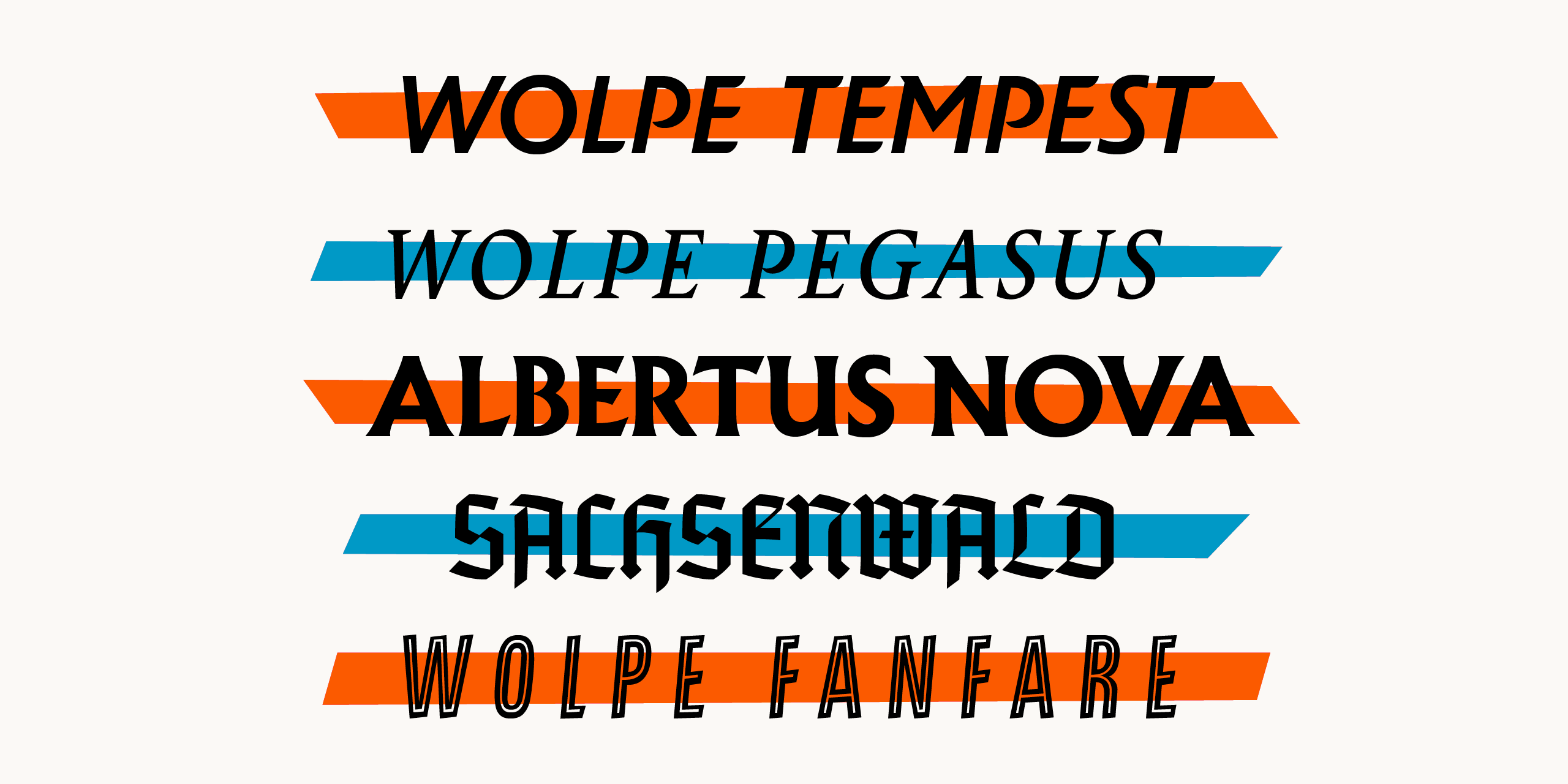
  1. The typefaces were modeled around Wolpe’s original Albertus, Fanfare, Pegasus, Tempest and Sachsenwald designs, embracing their collective quirks and deliberate inconsistencies. “The inconsistencies in Wolpe’s designs were freeing in the sense that it taught me to challenge conventional design and rethink how typefaces should be constructed,” said Toshi Omagari, Type Designer at Monotype. “Wolpe made compromises in his designs due to the limitations of typesetting in his time. However, the modern digital environment means that typefaces can be revised to capture his original design vision and applied across a wide range of offline and online media.” Wolpe’s designs achieved varying levels of popularity when they were first created, but weren’t meant to be used exclusively in their era. And while the Albertus typeface has been used in some modern applications, the others were never digitized, and as a result, faded from view. Monotype saw the opportunity to revive these designs with contemporary appeal and flair. Albertus Nova has been expanded to include a set of small capitals and five weights. The fonts incorporate original designs including a new capital J and Q and fixing different proportions and lost details of characters. The Albertus Nova typeface also reintroduces a number of alternate capital letters originally created by Wolpe, including an unusual M with a lower apex and a slanted left stroke, a W with crossing center strokes, a 2 with a closed loop, and an open ampersand. Monotype has also added new designs including an A with a top bar, a lunar-shaped lower and upper E and a long-tailed Q and R. The Fanfare typeface was built for Fanfare Press in 1935 and has graced hundreds of book covers. The sharp resolution of digital media makes the Wolpe Fanfare typeface great for display use. It is available now in six weights. Building off the original Pegasus typeface commissioned by Monotype in 1937 as the text companion to the Albertus design, the Wolpe Pegasus design takes advantage of its predecessors’ inconsistencies. For example, characters that would conventionally share details, such as b, d, p and q, don’t share them in this set. Additionally, some serifs in the uppercase alphabet of the Pegasus typeface are different. This was a conscious effort by Wolpe to create individual letterforms. Wolpe Pegasus keeps every convention-defying detail of the original character set and adds Regular and Bold weights (with italics) as well as small caps and various sets of numerals. The Tempest typeface was originally created exclusively for use on book jackets by Fanfare Press and, despite being designed in the mid-1930s. The revived Wolpe Tempest design continues on its original path to set itself apart from the formal and static sans serif italic typefaces of that era and offers three weights, including Regular, Bold and Black, preserving Tempest’s unmistakable profile and skeleton. It also offers alternates for the A, B, D, E, L, M, N, P, R, X, Y and Z characters which sport flourishes on entry and exit strokes, and are great for adding extra embellishments to book titles, logotypes and headlines. Monotype has digitized the original Sachsenwald typeface for the first time, adding an alternate X character to the original set to make it more legible. Wolpe first created the Sachsenwald design for a German publisher, who abandoned the order just before World War II. Wolpe then tried to make the Sachsenwald typeface suitable for use in the general public, with the hope that it would ignite the interest of “horizon-scanning advertisers” and create a “passing vogue” for blackletter type. The letterforms are softer and less decorative than traditional blackletter script. However, the use of blackletter type declined in favor of more legible Roman type within Germany and was not popular in other regions of the world – keeping the Sachsenwald typeface from achieving wider adoption at that time. Monotype saw the opportunity to revive and preserve a beautiful design and bring it into the modern era – as blackletter usage becomes more commonplace in areas such as publishing, fashion and album covers. The Wolpe Collection is available now. The Albertus Nova, Wolpe Fanfare and Wolpe Tempest designs are available in Latin, Greek and Cyrillic. The Wolpe Pegasus and Sachsenwald designs are available in Latin, only.
Wayfinding Sans Symbols: the pictogram font for signs
×
×
  • Create New...

Important Information

We are placing functional cookies on your device to help make this website better.