Jump to content
Nova Caps is a striking and globe-trotting editorial typeface that steals inspiration from Roman inscriptions and Art-Deco architectural lettering.

Search the Community

Showing results for tags 'spain'.

  • Search By Tags

    Type tags separated by commas.
  • Search By Author

Content Type


The Typography.Guru Forums

  • Public Typography Forums
    • Talk
    • Font Identification
    • Font Downloads
  • Exclusive to Members
    • Type Design Forum
    • Letterpress Forum
    • Calligraphy/Lettering Forum
    • Show
    • Internal
    • Coffee Shop

Categories

  • Artisanal workshops & studios
  • Museums & Libraries
  • Apps
  • Education
  • Organizations
  • Online Typography Resources
  • Educational Video Channels
  • Typography Books
  • Magazines
  • Publishers

Categories

  • Link suggestions
  • Newsletter Archive (1-99)
    • Typography Weekly #1
    • Typography Weekly #2
    • Typography Weekly #3
    • Typography Weekly #4
    • Typography Weekly #5
    • Typography Weekly #6
    • Typography Weekly #7
    • Typography Weekly #8
    • Typography Weekly #9
    • Typography Weekly #10
    • Typography Weekly #11
    • Typography Weekly #12
    • Typography Weekly #13
    • Typography Weekly #14
    • Typography Weekly #15
    • Typography Weekly #16
    • Typography Weekly #17
    • Typography Weekly #18
    • Typography Weekly #19
    • Typography Weekly #20
    • Typography Weekly #21
    • Typography Weekly #22
    • Typography Weekly #23
    • Typography Weekly #24
    • Typography Weekly #25
    • Typography Weekly #26
    • Typography Weekly #27
    • Typography Weekly #28
    • Typography Weekly #29
    • Typography Weekly #30
    • Typography Weekly #31
    • Typography Weekly #32
    • Typography Weekly #33
    • Typography Weekly #34
    • Typography Weekly #35
    • Typography Weekly #36
    • Typography Weekly #37
    • Typography Weekly #38
    • Typography Weekly #39
    • Typography Weekly #40
    • Typography Weekly #41
    • Typography Weekly #42
    • Typography Weekly #43
    • Typography Weekly #44
    • Typography Weekly #45
    • Typography Weekly #46
    • Typography Weekly #47
    • Typography Weekly #48
    • Typography Weekly #49
    • Typography Weekly #50
    • Typography Weekly #51
    • Typography Weekly #52
    • Typography Weekly #53
    • Typography Weekly #54
    • Typography Weekly #55
    • Typography Weekly #56
    • Typography Weekly #57
    • Typography Weekly #58
    • Typography Weekly #59
    • Typography Weekly #60
    • Typography Weekly #61
    • Typography Weekly #62
    • Typography Weekly #63
    • Typography Weekly #64
    • Typography Weekly #65
    • Typography Weekly #66
    • Typography Weekly #67
    • Typography Weekly #68
    • Typography Weekly #69
    • Typography Weekly #70
    • Typography Weekly #71
    • Typography Weekly #72
    • Typography Weekly #73
    • Typography Weekly #74
    • Typography Weekly #75
    • Typography Weekly #76
    • Typography Weekly #77
    • Typography Weekly #78
    • Typography Weekly #79
    • Typography Weekly #80
    • Typography Weekly #81
    • Typography Weekly #82
    • Typography Weekly #83
    • Typography Weekly #84
    • Typography Weekly #85
    • Typography Weekly #86
    • Typography Weekly #87
    • Typography Weekly #88
    • Typography Weekly #89
    • Typography Weekly #90
    • Typography Weekly #91
    • Typography Weekly #92
    • Typography Weekly #93
    • Typography Weekly #94
    • Typography Weekly #95
    • Typography Weekly #96
    • Typography Weekly #97
    • Typography Weekly #98
    • Typography Weekly #99
  • Newsletter Archive (100-199)
    • Typography Weekly #100
    • Typography Weekly #101
    • Typography Weekly #102
    • Typography Weekly #103
    • Typography Weekly #104
    • Typography Weekly #105
    • Typography Weekly #106
    • Typography Weekly #107
    • Typography Weekly #108
    • Typography Weekly #109
    • Typography Weekly #110
    • Typography Weekly #111
    • Typography Weekly #112
    • Typography Weekly #113
    • Typography Weekly #114
    • Typography Weekly #115
    • Typography Weekly #116
    • Typography Weekly #117
    • Typography Weekly #118
    • Typography Weekly #119
    • Typography Weekly #120
    • Typography Weekly #121
    • Typography Weekly #122
    • Typography Weekly #123
    • Typography Weekly #124
    • Typography Weekly #125
    • Typography Weekly #126
    • Typography Weekly #127
    • Typography Weekly #128
    • Typography Weekly #129
    • Typography Weekly #130
    • Typography Weekly #131
    • Typography Weekly #132
    • Typography Weekly #133
    • Typography Weekly #134
    • Typography Weekly #135
    • Typography Weekly #136

Categories

  • Free Font Lists
  • Font alternatives
  • Fonts by topic/style
  • Fonts by region
  • Signage Fonts
  • Fonts by User

Categories

  • How to choose and pair fonts
  • Understanding Kerning & Tracking
  • How to use OpenType in InDesign
  • Font Licensing 101
  • How to use color fonts
  • Variable fonts for graphic and web designers
  • Typography on Apple devices

Categories

  • Hall of Fame
    • 2023
    • 2022
    • 2021
    • 2020
    • 2019

Find results in...

Find results that contain...


Date Created

  • Start

    End


Last Updated

  • Start

    End


Filter by number of...

Joined

  • Start

    End


Group


Job


Location

Found 6 results

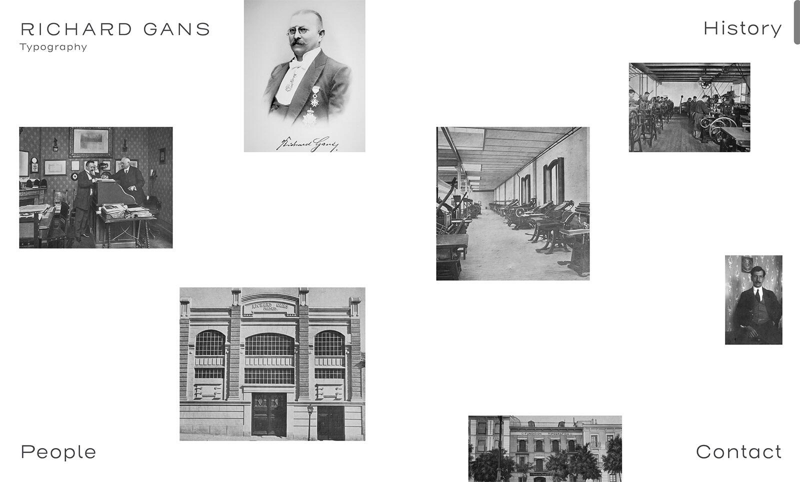
  1. Discover the legacy of the Richard Gans Type Foundry, established in 1888, a cornerstone in Spanish printing history until the late 20th century.
  2. Granja Grafica is a letterpress studio in Barcelona that was founded in 2012. It is run by a Spanish letterpress printer and an Argentinian graphic designer that met by chance in Tokyo back in 2006. It was Gaby’s last day in the city and Elies’ first one, but during dinner they found many things in common and started a long distance hand lettered friendship for a couple of years. In 2008 they decided to shorten the distances and Gaby moved to Spain. After a year of adaptation, the idea of Granja Grafica took shape.
  3. The Imprenta Municipal is a printing museum in Madrid. Its origin dates from 1853, with the establishment of Saint Bernardino Orphanage Printing Office to supply the printing needs of the City Council. The building was designed in 1931 and opened in 1933 for use as a printing office. It is an interesting example of Rationalism and Art Deco style. In 2009 it was refurbished to be used as a printing museum. The Imprenta Municipal material collection is a very rich one, with historical machines and other artefacts related to graphic arts. Some of them are displayed in the permanent exhibition, Printing and the book, a story, that is located on the ground floor, offering visitors an agreable promenade through the sections dealing with the hand press printing period, the industrial age, illustration techniques and the bindery. On the first floor a temporary exhibition room and workshop spaces open to the public. One of the most important features of the museum are the professional typography and bookbinding workshops which are a means of preserving the skills and techniques which are the non-material heritage of printing. From its opening as a museum at the end of 2011, the Imprenta Municipal has developed an ongoing programme of temporary exhibitions about written culture, book and printing history and the graphic arts, accompanied by many lectures and public workshops.
  4. The first book ever printed in Spain (a devotional book exalting the Virgin Mary) was made in Valencia in 1474. This museum was founded as a tribute to this event and is located in the El Puig de Santa María Royal Monastery. It has many extremely valuable facsimile books, as well as wooden presses, letter moulds, printers’ marks, hand-carved relief plates and printing implements from Gutenberg's era. Since the museum's creation in 1986, the collection has expanded thanks to the addition of private collections.
  5. Animatipia is a letterpress printing studio in Spain run by Lola and Antonio, a History graduate and a doctor of Physics.
  6. Pabloblicuo

    Chulotype

    Chulotype is a non-profit organisation dedicated to promote typography culture in Spain. Based in Madrid, we fill the city’s agenda with typographic events and activities. From the annual Typomad Festival (our biggest event for 300 attendees and first level speakers) to our monthly events El Aperitipo and Typolocos (smaller talks and work spaces to build a strong and connected comunmity of typographic lovers). We also organize visits to some special areas of the city (our Type Safaris) to discover and rediscover the typographic, printing and lettering heritage of Madrid. We are also building a strong presence in social media to spread the typographic culture and latest news. And we are currently working to launch our on-line publication for Spanish readers. Our collective is formed by volunteers from different parts of Spain. Chulotype is totally independent of any institution or brand.
FDI Farbmeister: simulate letterpress letters with this set of color bitmap fonts …
×
×
  • Create New...

Important Information

We are placing functional cookies on your device to help make this website better.