Typography Weekly #21
6 typography news links in this category
-
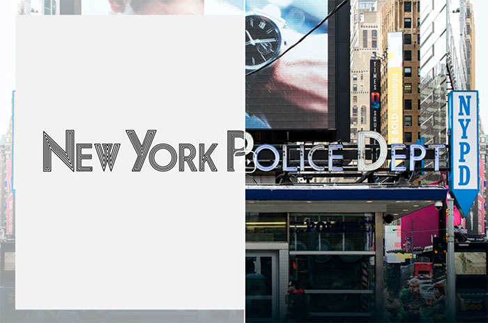
As the Main Street of Manhattan, Broadway exhibits a catalogue of lettering—from neon lights to mom-and-pop shop signs, from theater marquees to building names. Join Hopes&Fears as we tour the typography of Broadway.
-
One of the type families that undeniably shaped the iconic FontFont library is Albert-Jan Pool’s FF DIN® typeface family. At the suggestion of Erik Spiekermann during a taxi cab ride, Albert-Jan examined the rigid, mechanical shapes of the DIN 1451 Mittelschrift and Engschrift typefaces.
-
For the first time ever, the Oxford Dictionaries Word of the Year is a pictograph, officially called the ‘Face with Tears of Joy’ emoji. There were other strong contenders from a range of fields, but U+1F602 was chosen as the ‘word’ that best reflected the ethos, mood, and preoccupations of 2015.
-
The new version has 196 pages and is made for Glyphs 2.2.2.
-
Microsoft Font Validator is a tool that evaluates how closely a TrueType or OpenType font adheres to the current font format specification, as well as whether the font meets basic recommendations and deliverable guidelines from Microsoft.
-
“Tenez is a new typeface designed by Rodrigo Saiani, from Plau. As most of our projects, it started from a branding project (Coralinda), further developing into a typeface we felt could solve many designer’s needs …”


Don’t miss the latest typography news!
Typography Weekly via email: Subscribe here
Typography Weekly via RSS feed: Subscribe here