Typography Weekly #24
8 typography news links in this category
-
-
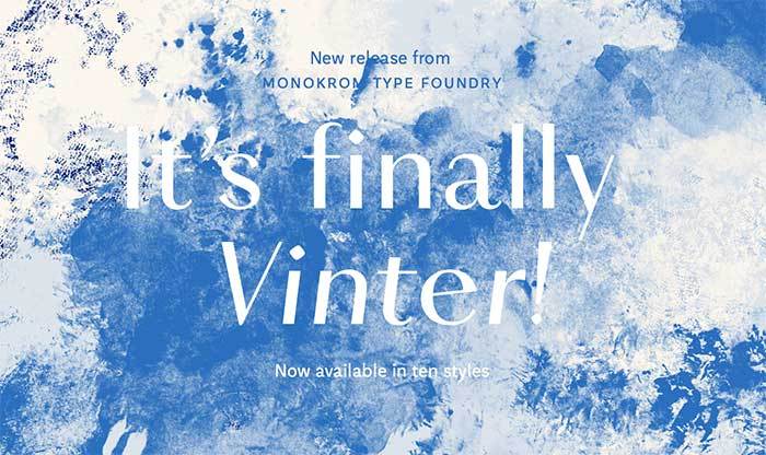
“A TDC-awarded design, completely remastered and expanded to a family of ten styles. Vinter is a confident venture into the world of contrasted sans serifs. Deeply rooted in the tradition of Scandinavian design, with acute sensibility to shape and rhythm …”
-
David Sudweeks interviews type historian and fellow FontShop editor Ferdinand Ulrich, known best here for his writing on type systems, the history of geometric sans serif type, and recently, a detailed look into rounded fonts.
-
A Kickstarter campaign to bring the dumpling emoji to life, and an attempt to open up the discussion on emoji policy and what it should look like going forward. The goal is to form a grassroots organisation called Emojination to give voice to regular folks on issues of emoji.
-
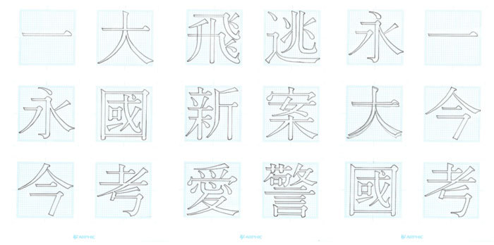
“Part of the reason Chinese writing has changed so little is that China firmly established the writing system by standardizing the script early on, and by inventing a thing called printing. The other factor, though, is that the Chinese writing system is huge.”
-
“Simply choose your sponsorship level, select your character, and make your donation. All sponsors are acknowledged in Sponsors of Adopted Characters with their level of support, and will receive a certificate for their character.”
-
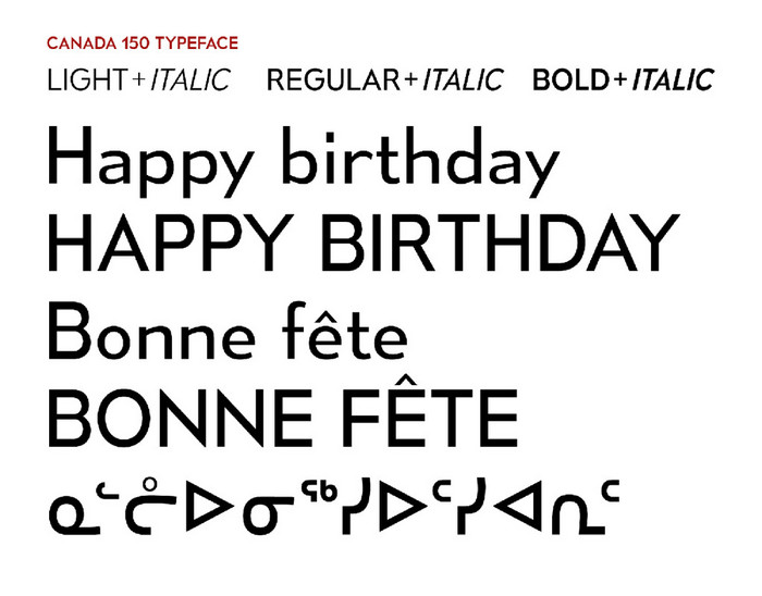
While the United States has yet to determine its typographic identity, its northern neighbor recently chose one. Canada 150, created for the country’s 150th birthday, is a typographic family that unites the Latin characters of English/French with the syllabic characters of the indigenous dialects.
-


Don’t miss the latest typography news!
Typography Weekly via email: Subscribe here
Typography Weekly via RSS feed: Subscribe here