


Typography Weekly #26
8 typography news links in this category
-
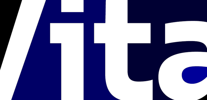
“Vita is a distinctive and quietly confident 21st century sans serif typeface for high and low resolutions.”
-
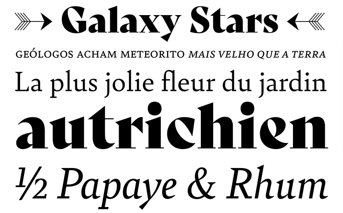
“Bely is the first design by French newcomer Roxane Gataud. It is a high-class throwback containing four text weights which were built upon classical proportions to capitalise on reading familiarity.”
-
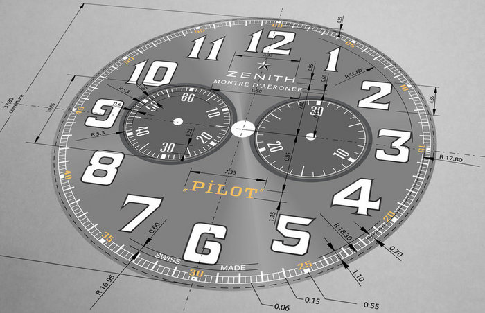
“Study the face of a watch and you’re likely to notice something other than the time: The typography used to design the logo, numerals and words, which subtly communicates critical information about the timepiece, from the era in which it was produced to the values of its maker.”
-
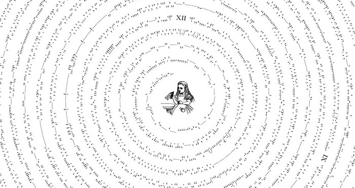
An exploration of visual rhythm of punctuation in well-known literary works. All letters, numbers, spaces, and line breaks were removed from entire texts of classic stories in the public domain, leaving only the punctuation in one continuous line of symbols in the order they appear in texts.
-
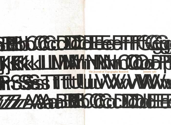
Visible Language is a peer-reviewed design journal that advocates the potential for the research and practice of visual communication to enhance the human experience. All issues are now available online
-
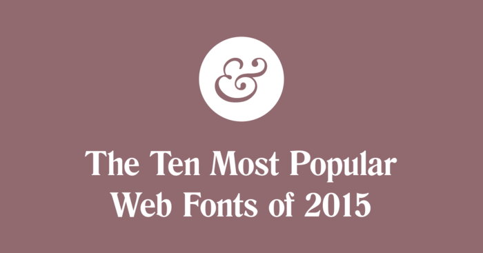
Compiling font usage data from my web typography side project, Typewolf, I analyze the most popular web fonts of 2015 and give my best predictions for 2016.
-
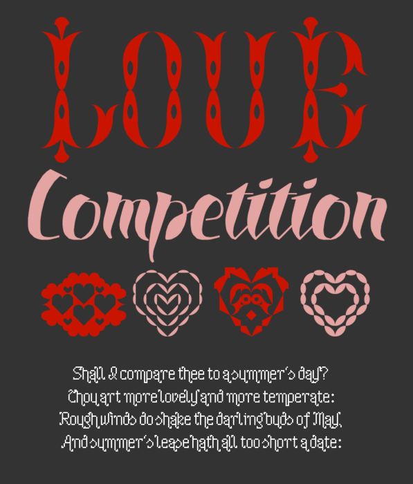
“We’d like you to design a FontStruction on the theme of “Love”. You can interpret the theme as broadly as you’d like, as long as you can somehow relate it to the word “Love”. You can be literal, but don’t need to be. Keep it decent though please!”
-
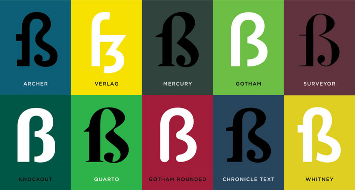
“THE MOST BANAL QUESTION asked of artists after What is your favorite color? is What pencil/pen/brush do you use? I expected type designers to be equally bored by inquiries into their favorite letterforms. Boy was I wrong.”


Don’t miss the latest typography news!
Typography Weekly via email: Subscribe here
Typography Weekly via RSS feed: Subscribe here

