Jump to content
A monospaced type family with an editorial state of mind.
  • Typography Weekly #28

      R::bert

      Open the Link

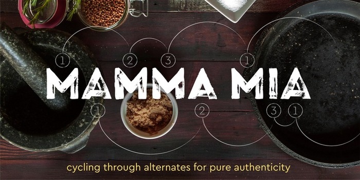
      Cera Brush by TypeMates

      Cera Brush is the handmade display companion to clean multi-script Cera and Cera Stencil.

      www.myfonts.com

      Open the Link

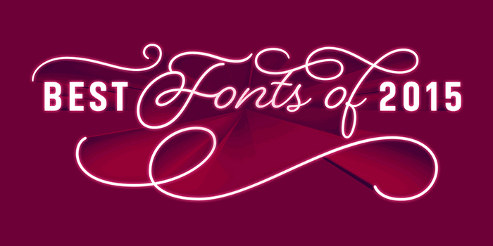
      Best FontShop fonts of 2015

      “Now with 2015 at a close we’re pleased to show our selections for the best of the past year, just the greats.”

      www.fontshop.com

      Open the Link

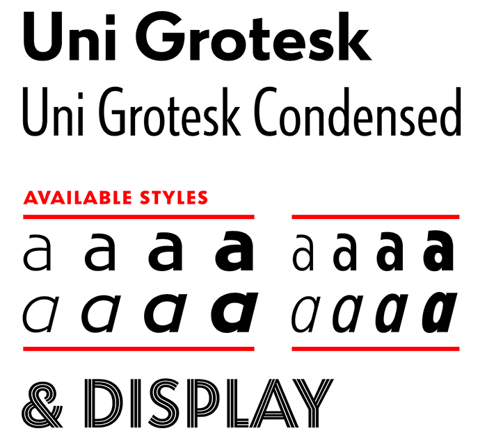
      Uni(versal) Grotesk released at Typotheque

      “Uni Grotesk is a modern adaptation of the ubiquitous early 20th century Universal Grotesk, a typeface that dominated communist Czechoslovakia.”

      www.typotheque.com

      Open the Link

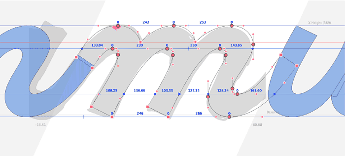
      Process of designing a typeface (Di Mare)

      “The idea of this typeface came to my mind when I was in Rome. It was an amazing journey. I visited museums, walked around the city squinting in the sun, ate delicious italian food, admired ancient architecture. I was especially happy because those were the days when I decided to change my life.”

      www.behance.net
      Open the Link

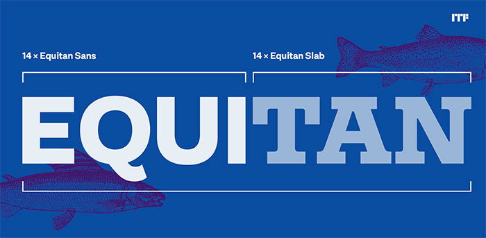
      Equitan Sans & Slab from Diana Ovezea released at ITF

      “Together, Equitan Sans and Equitan Slab make up an astounding 28-font super family. The two typefaces serve up industrial-era letterforms, refreshed for a new century.”

      www.indiantypefoundry.com

      Riccardo Sartori

      Open the Link

      Morisawa Type Design Competition 2016

      The tenth edition since 1984, for Latin and Kanji typeface designs.

      competition.morisawa.co.jp

      Riccardo Sartori

      Open the Link

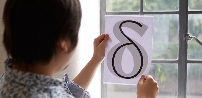
      Toshi Omagari on typeface revivals

      “Because every designer’s perfect vision of a typeface varies, all revivals of the same typeface end up different. That’s what makes it personal and interesting.”

      www.monotype.com

      Riccardo Sartori

      Open the Link

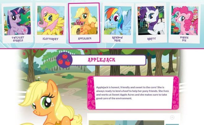
      Font Bros sues Hasbro over font licence issue

      “Such disputes are not unusual, but seldom made it into the public eye.”

      www.bbc.com

      1 comment

Our typography network

The best typography links of the week.
Discover the fonts from the Germany foundry FDI Type. A brand of Schriftkontor Ralf Herrmann.
Typografie.info – The German typography community
The type specimens of the world.
  • Add your content!

    We spread your news free of charge among a growing list of subscribers and tens of thousands of followers of our social media channels.
    Learn more about this
Graublau Sans Pro: A versatile font family with 18 styles
×
×
  • Create New...

Important Information

We are placing functional cookies on your device to help make this website better.