Typography Weekly #29
9 typography news links in this category
-
“By the time Jovica Veljović released his first font family in 1984, he was already an internationally renowned calligrapher. Back then, he taught at the art academy in Belgrade, the capital both of Serbia and the former Yugoslavia …”
-
“Yanone, (shorthand for Jan Gerner), is an exciting type designer, filmmaker, developer, and person. His recent commission led to an interesting exploratory process and resulted in the successful family expansion of one of our most popular and versatile typefaces, FF DIN …”
-
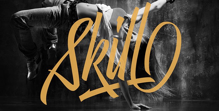
“After my font Indie I wanted to create something much more wild. Something that splashed the letters with life. To do this, I knew I'd have to break the barrier between analog and digital, so I took my best brush and started to play.”
-
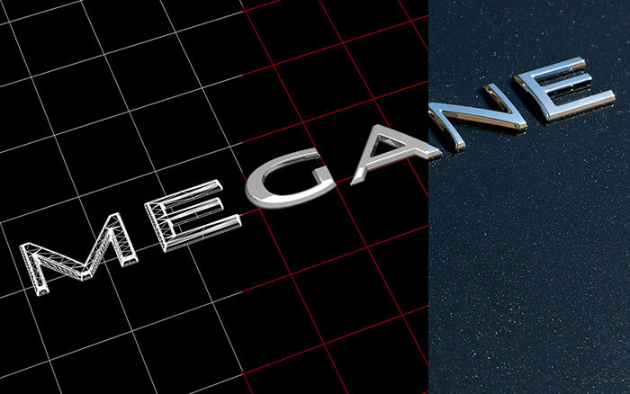
“Renault Carname is a new typeface system for the interior and exterior badges on Renault vehicles, designed to remain visible even when the car is in motion.”
-
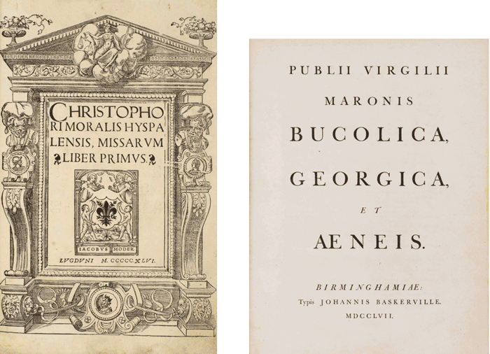
John Boardley writes about when and how books got their title-pages.
-
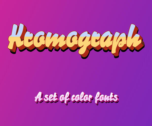
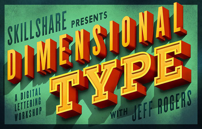
“Join designer and illustrator Jeff Rogers for a 70-minute class on designing dimensional type. In this fun and practical class, you'll dive into the essentials of working with typography in your digital illustration work …”
-
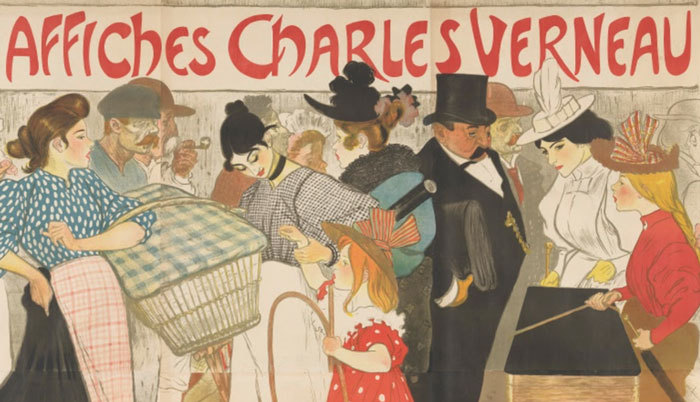
“Dive into the Parisian print world of the fin de siècle. Discover a period of artistic innovation and decadence, from quiet interiors to the bustling streets of the modern city.” From the Van Gogh Museum Amsterdam
-
“A monospace typeface and a monospace-inspired typeface”.
-
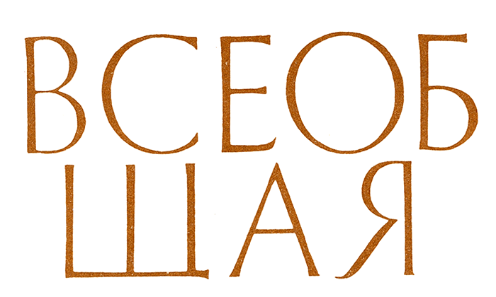
“On the role of the Trajan letter in the history of Soviet typographic design, and the development of Cyrillic versions of Adobe’s two typefaces, Trajan Pro 3 and Trajan Sans Pro.” by Maxim Zhukov


Don’t miss the latest typography news!
Typography Weekly via email: Subscribe here
Typography Weekly via RSS feed: Subscribe here