Typography Weekly #30
7 typography news links in this category
-
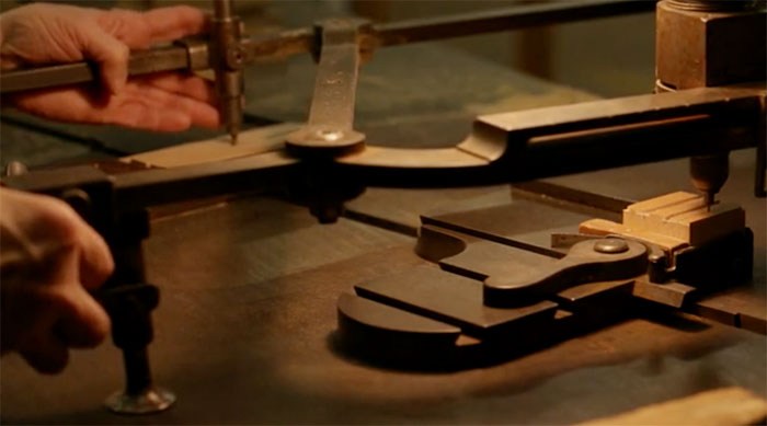
“A font designed by Alvin Lustig in the 1930s is being revived as wood type and digital fonts w/ the guidance of Elaine Lustig Cohen.”
-
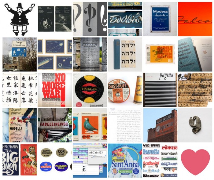
“During the month of February 2016, Alphabettes contributors opened their minds and hearts to create the Love Letters series. From Rio to Bangalore, Spain to California, we were taken on a world-wide tour of beloved treasures, found objects, personal histories and typographic ephemera.”
-
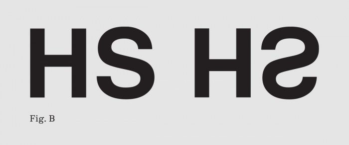
Anton Studer: “Every so often, I’m preoccupied by the question, ‘Is what I see also what I get?’ I catch myself thinking that there’s a discrepancy between what I ‘saw’ and the information my eye actually took in.”
-
Once a reseller of highly curated collections of typefaces. “As part of VCG’s purchase of Corbis and partnership with Getty Images, we are pleased to welcome all Veer customers to iStock by Getty Images. Effective March 30, the Veer business and website will no longer be accessible.”
-
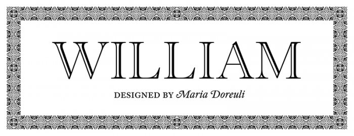
“William, a contemporary interpretation of Caslon, is a truly international font in which English, Dutch and Russian influences come together to create one complete, modern type family.”
-
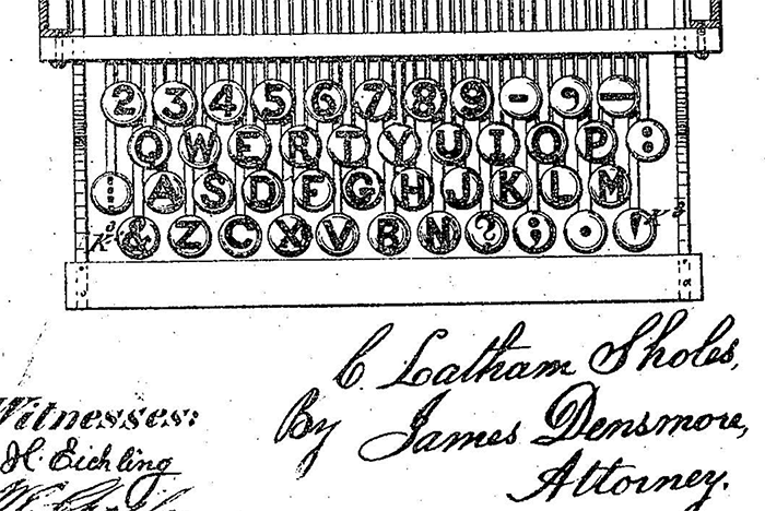
“Take a look at the leftmost key on the third row of Sholes’ keyboard, as shown in his 1878 patent for “Improvement in type-writing machines”.1 What on earth is that?”
-
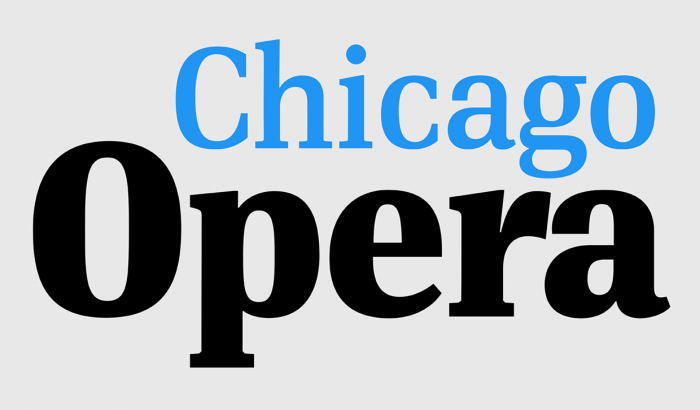
This is the first ever release of a true serif companion for the popular DIN typeface. DIN Serif originated in a custom project for a watchmaking journal which required a modern serif to work in unison and match the inherent simplicity of DIN.


Don’t miss the latest typography news!
Typography Weekly via email: Subscribe here
Typography Weekly via RSS feed: Subscribe here