Typography Weekly #35
9 typography news links in this category
-
“Type Network is a new model for type design, development, licensing, and use. A private company owned by type designers, Type Network is focused on its mission—to find and support the best type and publish it for the best designers.”
-
“The Society of Typographic Aficionados has announced that Roxane Gataud of Paris, France will be the recipient of the 2016 SOTA Catalyst Award. The award recognizes a person 25 years of age or younger who demonstrates significant achievement and future promise in the field of typography.”
-
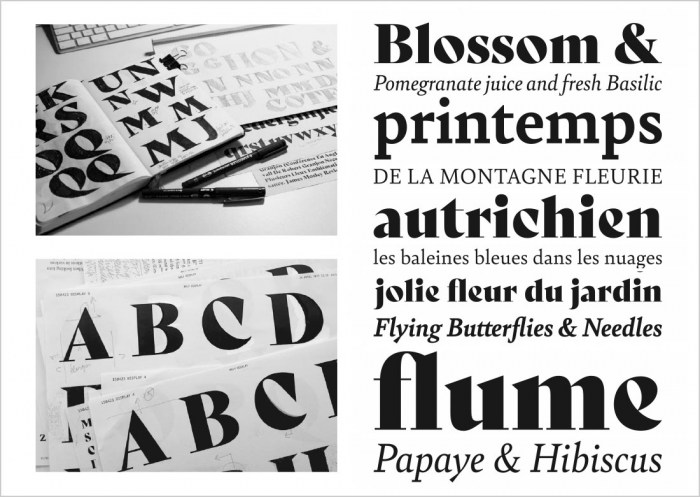
“Toshi Omagri looks at the letter ‘c’ from Futura - designed in 1927 by Paul Renner to perfectly accommodate the various idiosyncrasies of his mother tongue.”
-
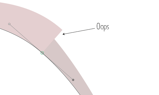
Curvature Visualization, Curve Harmonization, Tunni Lines and Path Simplification.
-
“Hormones flow through our bloodstream distributing “chemical messages” just as letterforms distribute words throughout bodies of text. Language bears the responsibility of communication, and like typography, gender must be understood as an expressive format that evolve with the needs of its user.”
-
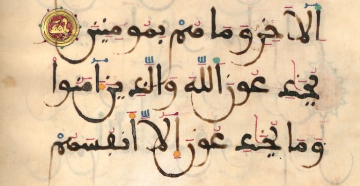
“There are many different calligraphic styles used for writing the Arabic script, styles that developed over the span of many years and in different regions. This article will explain the characteristics of the major styles and styles that were influential on future typographic developments …”
-
“Why we see the same typefaces used absolutely everywhere.”
-
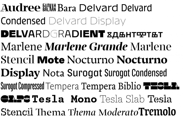
“After a decade of close collaboration, Typotheque and Typonine type foundries are joining forces.”
-


Don’t miss the latest typography news!
Typography Weekly via email: Subscribe here
Typography Weekly via RSS feed: Subscribe here