


Typography Weekly #39
10 typography news links in this category
-
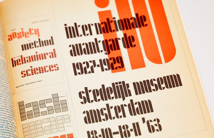
Issue #106 of the Creative Characters series from MyFonts
-
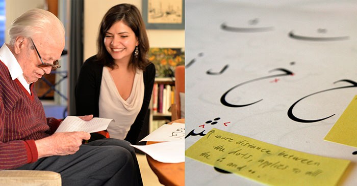
“Designing a legible, stylish, and functional typeface in a foreign language whose very letterforms are unfamiliar to the designer seems like an impossible task.”
-
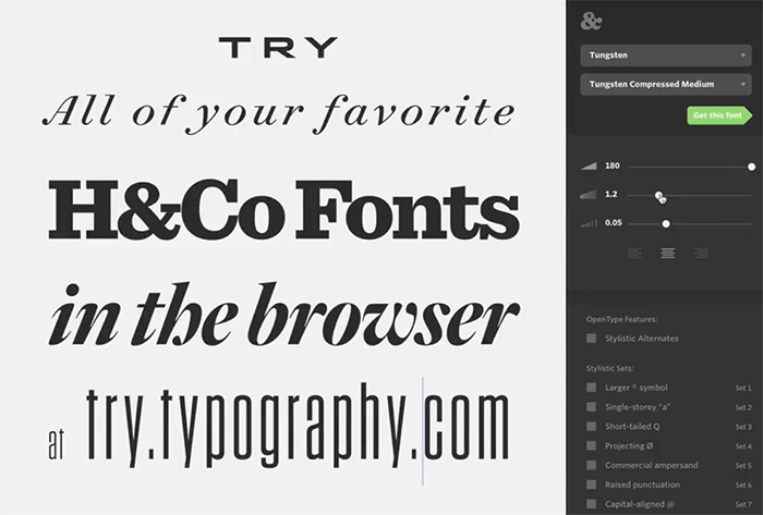
A new webfont-based font tester for all typefaces from Hoefler & Co.
-
“Actually, not a whole helluva lot”
-
“A versatile designer little known outside his own country. His designs for photobooks and corporate identities were innovative, and he helped to organize the design community and elaborate state policy regarding the creative industries.”
-
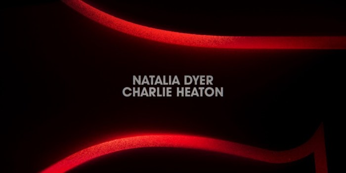
“The opening of ‘Stranger Things’ is refreshingly simple. It trims the fat and shows only what is necessary to set the mood. More importantly, it proves a lesson I’ve learned time and time again as a designer: you can do a lot with type.”
-
“I was making a font. It seemed like a pretty simple thing when I started: you create 26 letters, 10 numbers, and a handful of special ones (-!$?%). Wham, bam, thank you ma’am — this thing was going to cost me a few weeks and i’d be on to the next project.”
-
In this webcast, Dan Rhatigans explains the basics of OpenType features and how to use them in applications like Adobe InDesign.
-
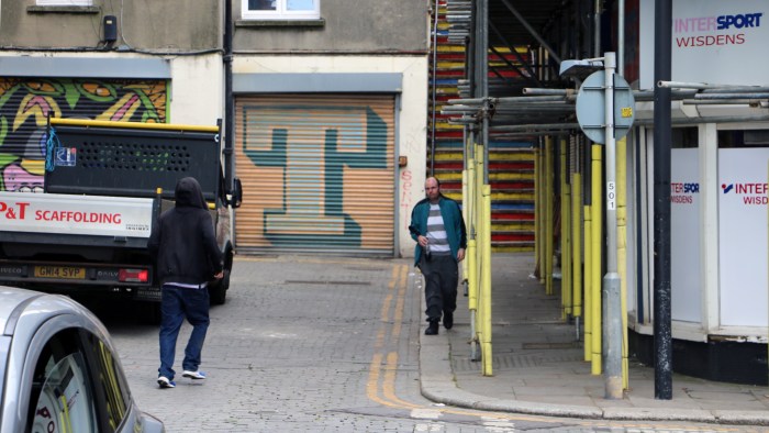
An observation of typography, lettering and visual communication in Hastings, a town rich in history, in the county of East Sussex on the south coast of England. Ranked third most deprived seaside town in England, the town centre is split into two main areas...
-
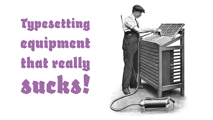
A video about a device used in print shops which is little-known today.


Don’t miss the latest typography news!
Typography Weekly via email: Subscribe here
Typography Weekly via RSS feed: Subscribe here

