Jump to content
Nova Caps is a striking and globe-trotting editorial typeface that steals inspiration from Roman inscriptions and Art-Deco architectural lettering.
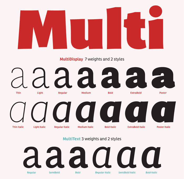
  • Multi by Laura Meseguer released

    Open the Link

    “Multi is the first extensive family created by Laura Meseguer. It was originally commissioned by the publisher of Dutch regional newspapers in 2011, with the aim to match the serif typefaces (Lexicon by Bram de Does and Tiempos by Kris Sowersby) …”

    www.laurameseguer.com


    User Feedback

    Recommended Comments

    There are no comments to display.


    Create an account or sign in to comment

    You need to be a member in order to leave a comment

    Create an account

    Sign up for a new account in our community. It's easy!

    Register a new account

    Sign in

    Already have an account? Sign in here.

    Sign In Now

Our typography network

The type specimens of the world.
Typografie.info – The German typography community
Discover the fonts from the Germany foundry FDI Type. A brand of Schriftkontor Ralf Herrmann.
The best typography links of the week.
  • Add your content!

    We spread your news free of charge among a growing list of subscribers and tens of thousands of followers of our social media channels.
    Learn more about this
Graublau Slab Pro: The expressive addition to the Graublau Sans family.
×
×
  • Create New...

Important Information

We are placing functional cookies on your device to help make this website better.