Jump to content
Education typography videos. Check out our YouTube channel …
  • Ambroise Pro: fifteen years in the making

    Riccardo Sartori

    Open the Link

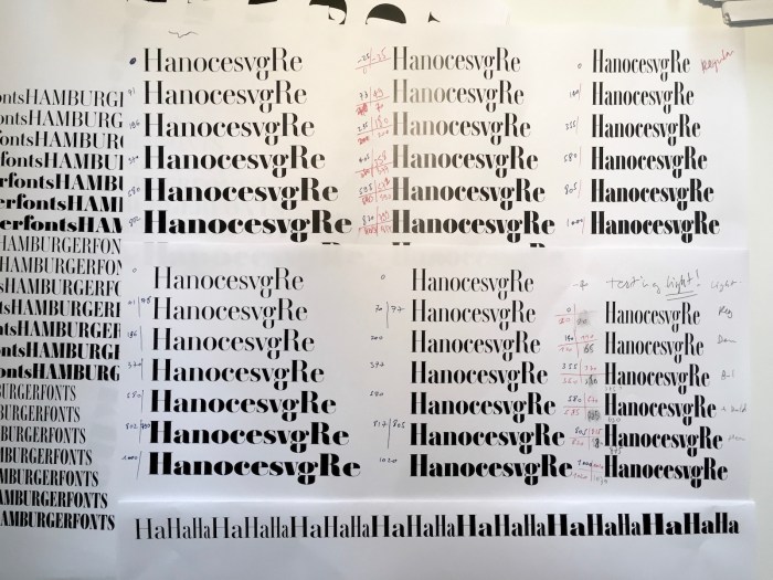
    “To better understand the history of Ambroise, at least a few references to the Didot’s history provide some clarity. Where to start when exploring the Didot story? From Romain du Roi or Fournier, as strategic roots? For the sake of brevity, we will start with: Gillé.”

    typofonderie.com


    User Feedback

    Recommended Comments

    Hello,


    ¶ I purchased a licence of Ambroise Pro because in the first release of 2001, the format was PostScript —that included the alternate files (Alt)— and no italics were provided.

    ¶ Now Porchez offered OpenType files and expanded the weights to seven (light, regular, demi, bold, extra bold, heavy, black) and added the related italics: very good news!

    ¶ The style of Ambroise Pro is based on the design of Pierre Didot's Romantic leaning: see François Rappo's Didot Elder for reference.

    http://www.optimo.ch/typefaces_Didot-Elder_Roman_ABCD1234.html


    Link to comment
    Share on other sites


    Create an account or sign in to comment

    You need to be a member in order to leave a comment

    Create an account

    Sign up for a new account in our community. It's easy!

    Register a new account

    Sign in

    Already have an account? Sign in here.

    Sign In Now

Our partners

Discover the Best Deals for Freelance Designers.
Get to your apps and creative work. Explore curated inspiration, livestream learning, tutorials, and creative challenges.
The largest selection of professional fonts for any project. Over 130,000 available fonts, and counting.
Discover the fonts from the Germany foundry FDI Type. A brand of Schriftkontor Ralf Herrmann.
The type specimens of the world in one database
×
×
  • Create New...

Important Information

We are placing functional cookies on your device to help make this website better.