Typography Weekly #44
7 typography news links in this category
-
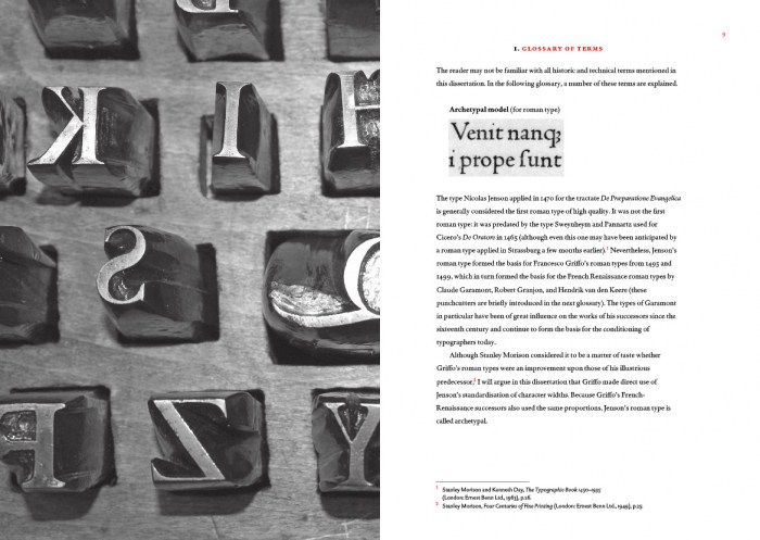
“Blokland’s research is conducted to test the hypothesis that Gutenberg and consorts developed a standardised and even unitised system for the production of textura type, and that this system was extrapolated for the production of roman type in Renaissance Italy.”
-
“Font Awesome 5 will be the most time-intensive, complicated version of Font Awesome ever. There are considerable challenges to keeping our icons readable at small size and the framework super-easy to use. We're confident we can deliver all products on time. And we're excited to get started.”
-
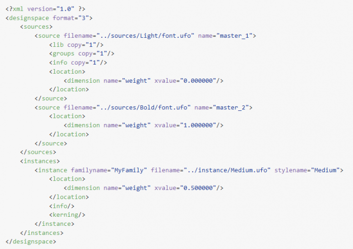
Notes and tips for generating a simple variable font on a Mac. These assume you’re already familiar with the UFO format, creating masters that can be interpolated, and have some comfort using Terminal.
-
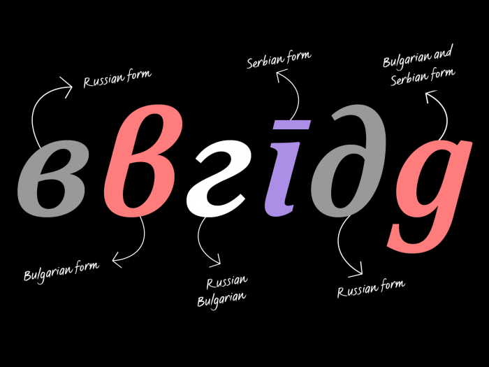
“Cyrillic script is used by more than 629 million people across over 50 languages including Bulgarian, Macedonian, Russian, Serbian and Ukrainian. It was originally developed in Bulgaria during the 9th century but spread to become the basis of many others, each with a different set of characters.”
-
“People often ask us how emoji are created and how they get into our phones … Given our direct involvement in emoji at Google, we thought we’d share this process and tell you more about why we chose to focus on women in professions as a concrete example.”
-
“GT America builds a bridge between the American Gothic and European Grotesque typeface genres. It combines design features from both traditions and unites them in a contemporary family. The versatile system consists of eighty-four styles across six widths and seven weights.”
-
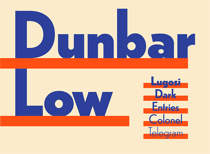
“Dunbar is an exuberant geometric sans with a unique structure, including Tall and Low display versions for large sizes and a Text version for smaller sizes.”


Don’t miss the latest typography news!
Typography Weekly via email: Subscribe here
Typography Weekly via RSS feed: Subscribe here