


Typography Weekly #48
7 typography news links in this category
-
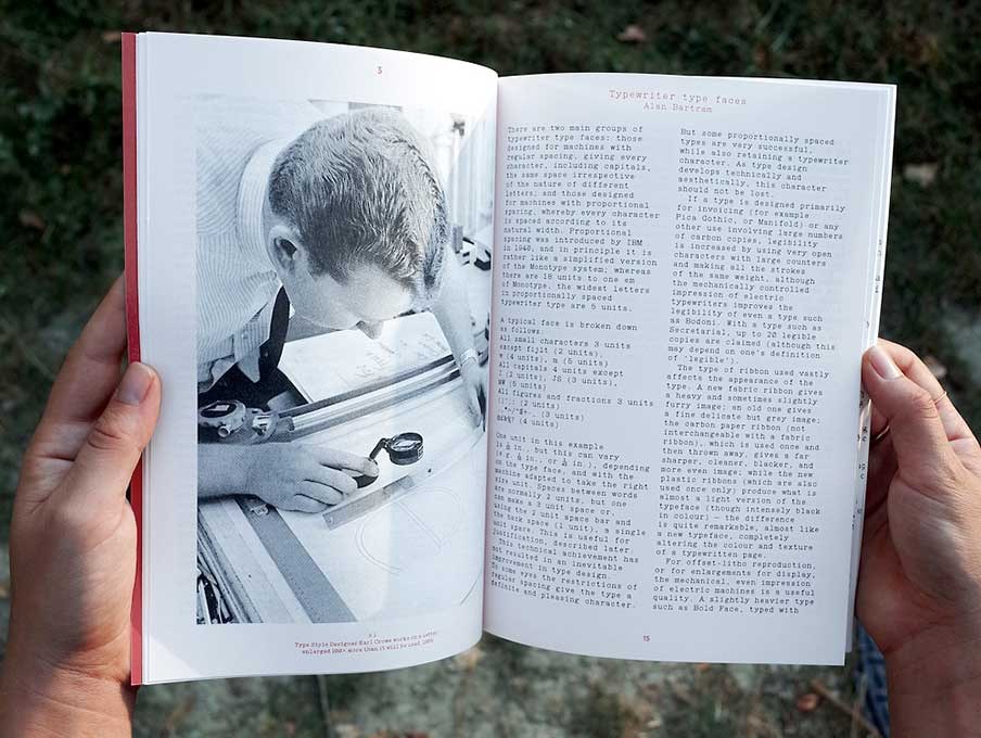
Footnotes is a type design periodical published by La Police.
-
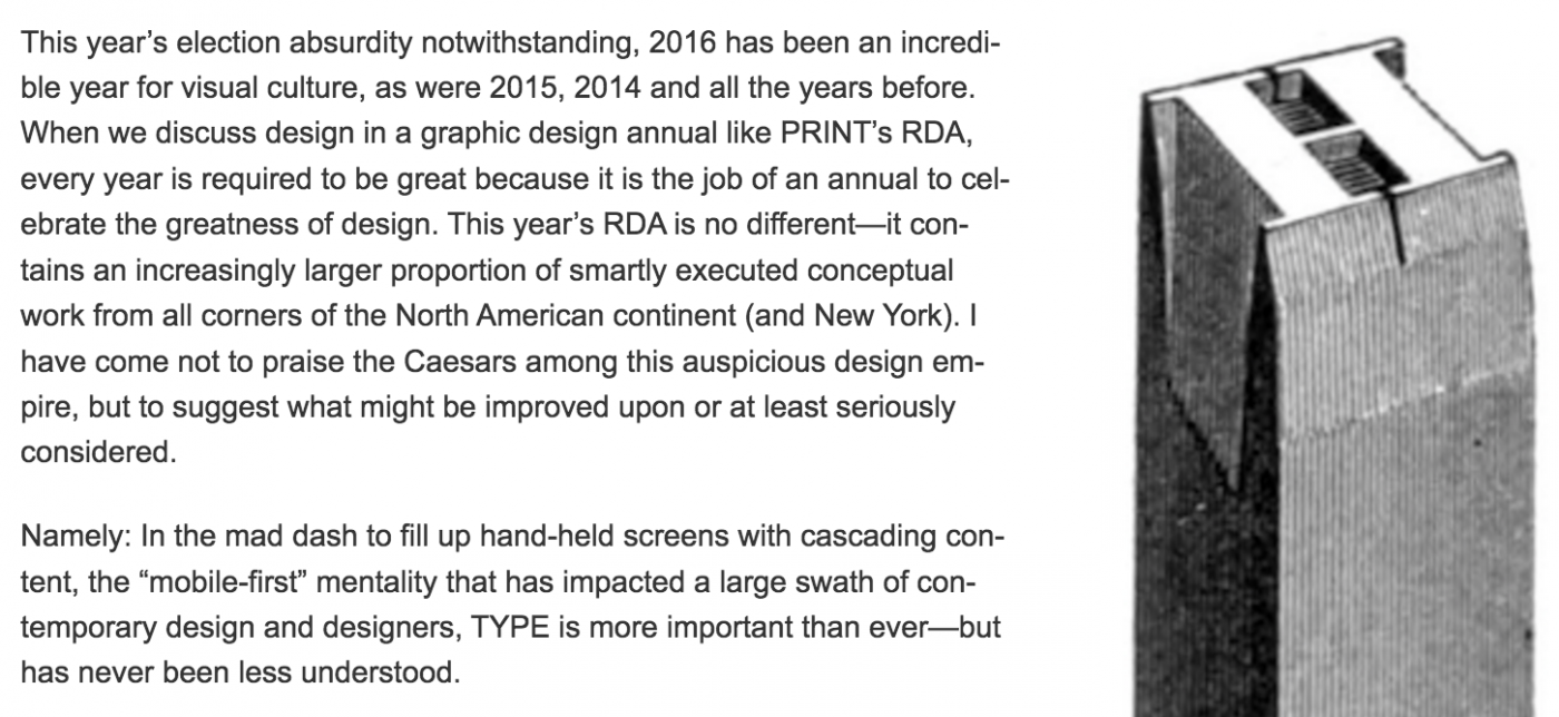
Steven Heller: “So, now that 2016 is recorded for future generations, next year should be considered the year of type intelligence. As Paul Rand once said, learn more about what you’re doing with type: ‘It will make you much happier.’”
-
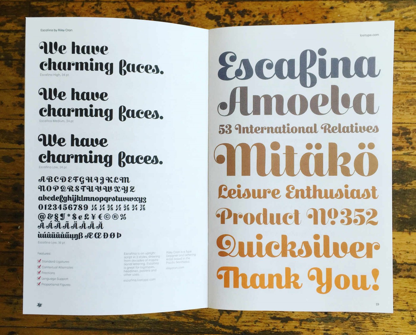
“Escafina is an upright script typeface that I drew from 2014-2016. It threw me a considerable number of challenges, and made me a better type designer. You can’t ask for much more than that from a project.”
-
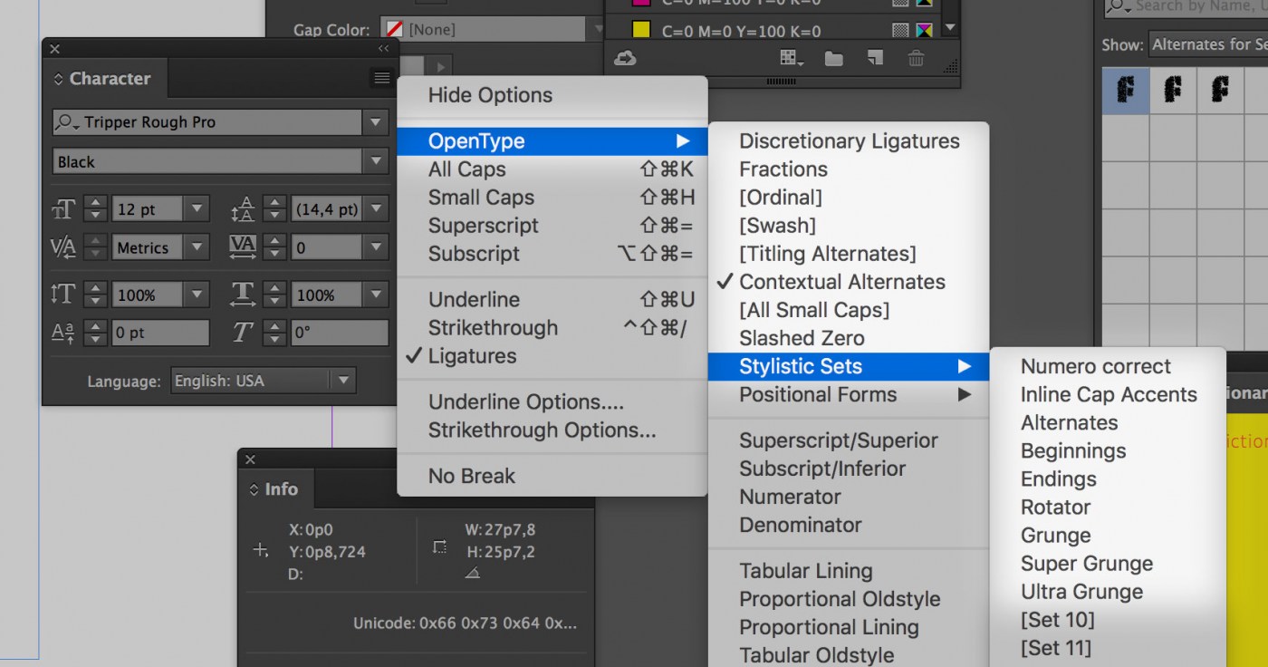
“The most recent version of InDesign will show a descriptive name for each stylistic set. Instead of listing them as Set 1, Set 2, Set 3, InDesign will show a text in case these descriptions are included in a font.”
-
An article by Paul Shaw on Typographica.
-
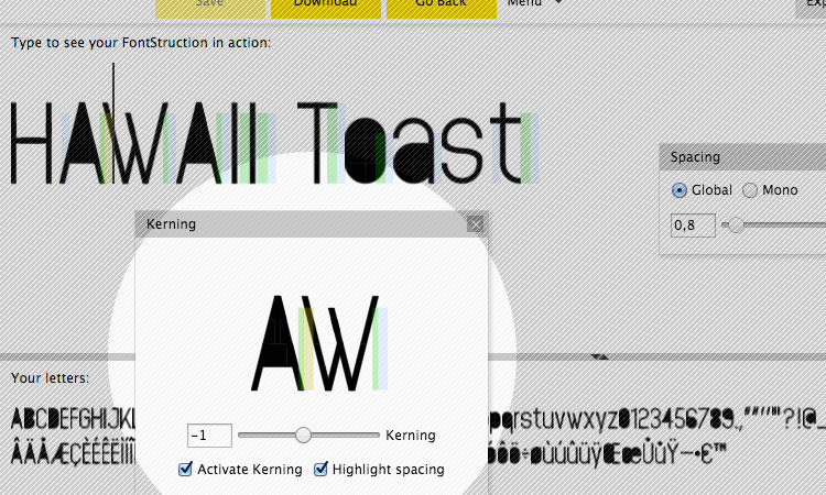
“I would like to stress that many FontStructions really do not need to be kerned, and that everyone should continue to use the other spacing controls as far as possible to achieve the letter spacing they’re aiming for.”
-
“For the past month, we have been working on a new OpenType variations font with Dave Crossland and the Google Fonts team.”


Don’t miss the latest typography news!
Typography Weekly via email: Subscribe here
Typography Weekly via RSS feed: Subscribe here

