Typography Weekly #50
9 typography news links in this category
-
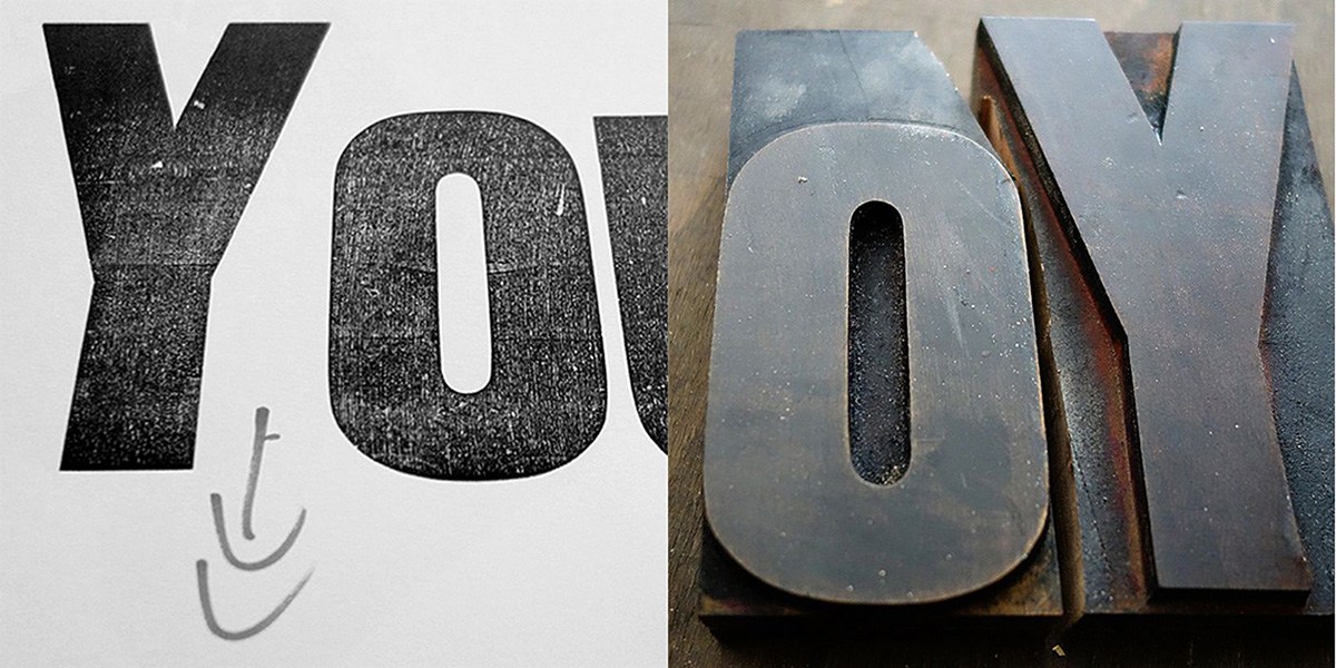
“Since the advent of computers in our studios, we’ve all spent hours looking for the right typeface from thousands of choices, fussed with tiny increments in size, introduced refinements in OpenType fonts containing hundreds of ligatures, alternate characters and content-sensitive positions. And now ‘letterpress’ is back”
-
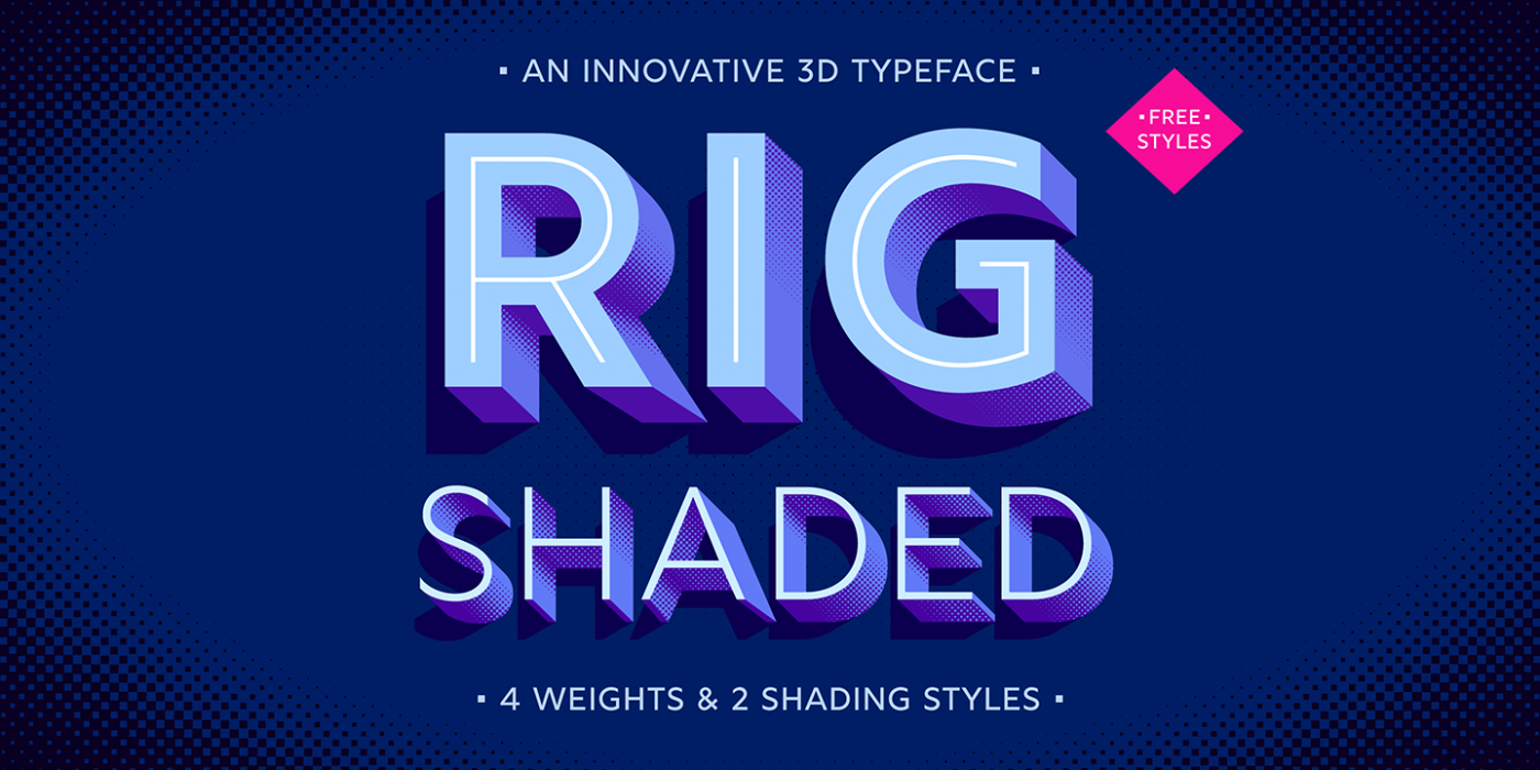
“As its name suggests, Rig is designed as a framework to support a range of striking 3D effects.”
-
Monotype looks to encourage the use of easy-to-read typefaces. Monotype is working with MIT AgeLab on new research looking at how easily typefaces can be read at a glance, reflecting our “increasingly fast-paced, information-gathering” culture.
-
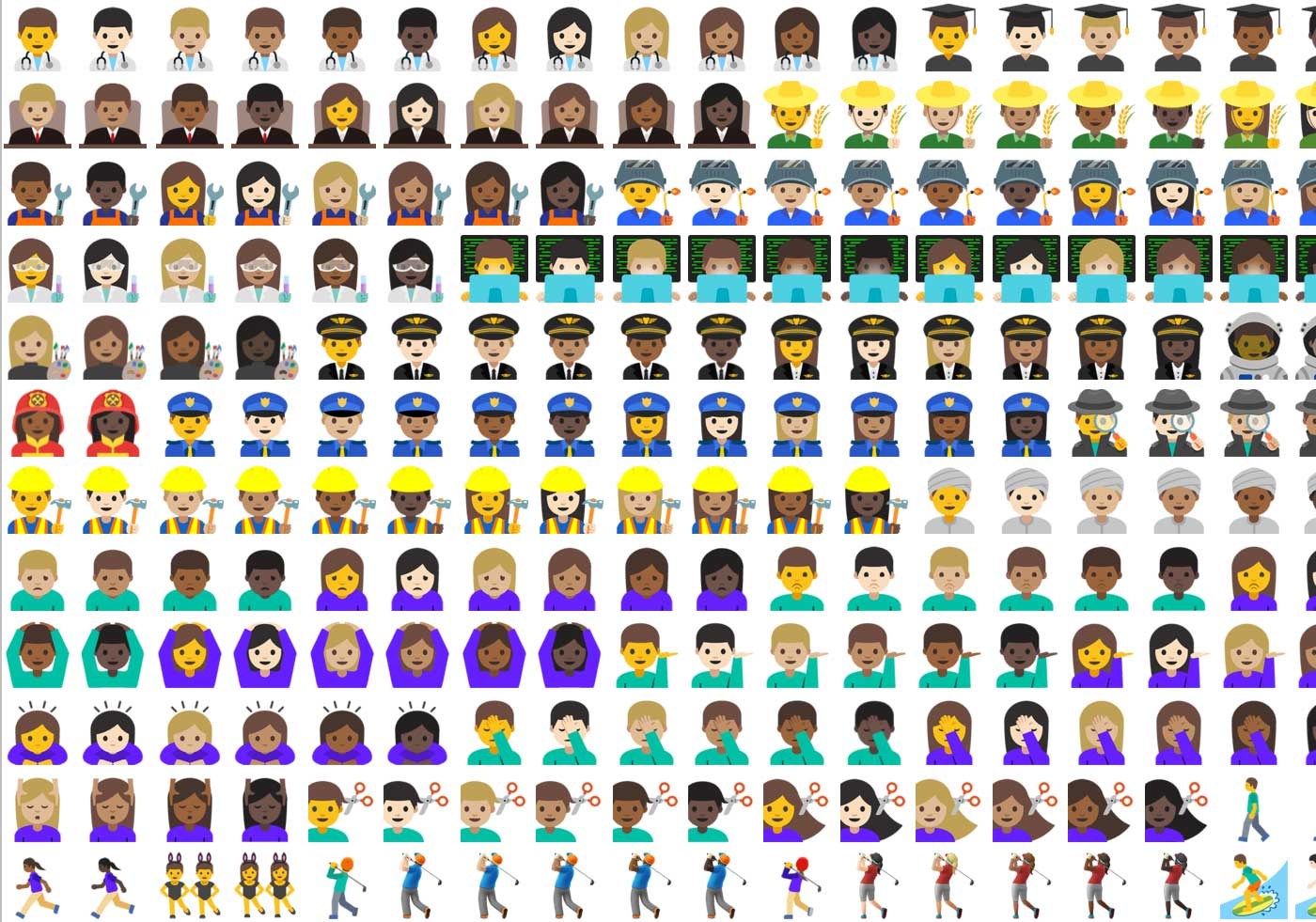
“So here I am, a year later, trying myself as an emoji designer and simultaneously exploring possibilities of bringing this font to life. And that, I discovered, is a bottomless pit if I’ve ever seen one.”
-
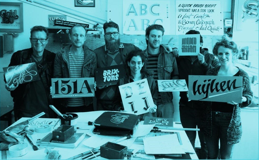
“Dalton Maag is growing, and we’re excited to be looking for talented additions to our team in Brixton, South London and São Paulo, Brazil.”
-
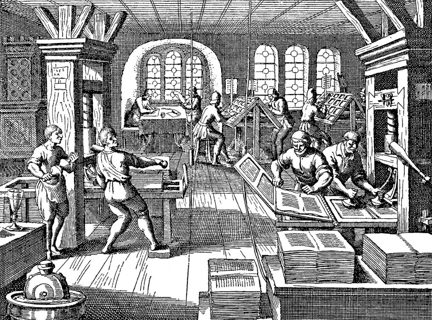
“What are the skills we need to contribute to the future of typography? And what do two ghostly figures from the 15th century have to do with that future?”
-
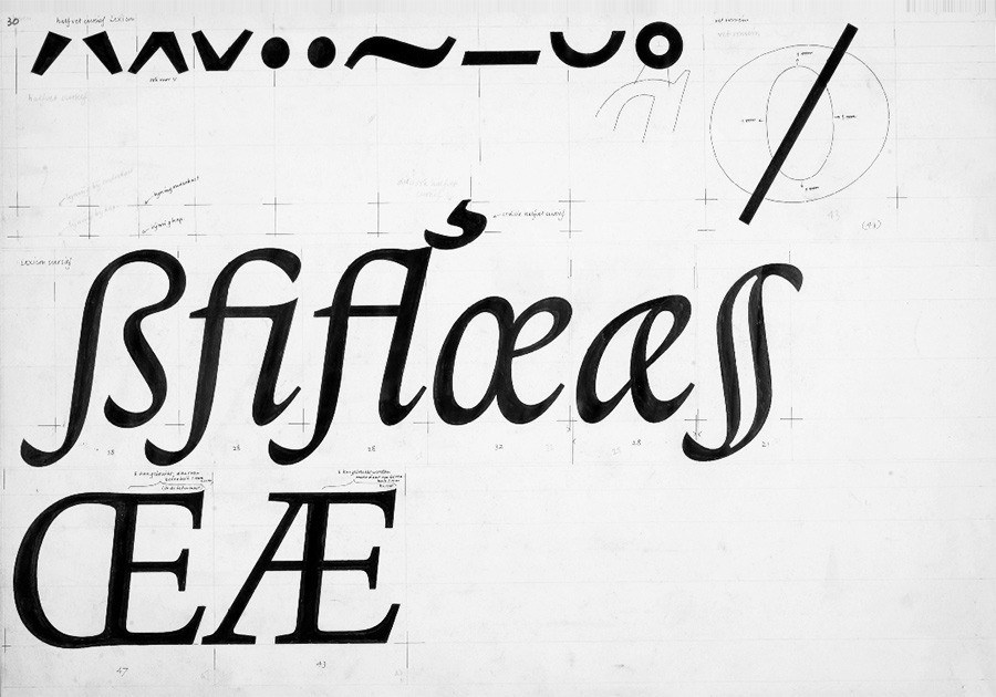
“The letter ‘Æ’ evolved from the Classical Latin diphthong ‘AE’. With its long history, there are multiple models for its design. Nevertheless, there are some aspects worth highlighting.”
-
“A quirky OpenType font, magically readjusting as you write based on the preceding and following letter.”
-
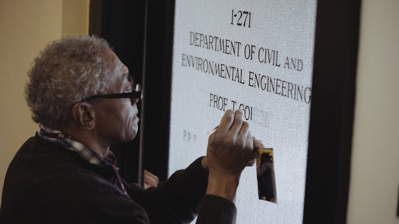
“If a name appears written in black letters on a professor’s office door at the Massachusetts Institute of Technology, it’s more likely than not that Glenn Silva put it there with the delicate stroke of his paintbrush.”


Don’t miss the latest typography news!
Typography Weekly via email: Subscribe here
Typography Weekly via RSS feed: Subscribe here