Typography Weekly #52
10 typography news links in this category
-
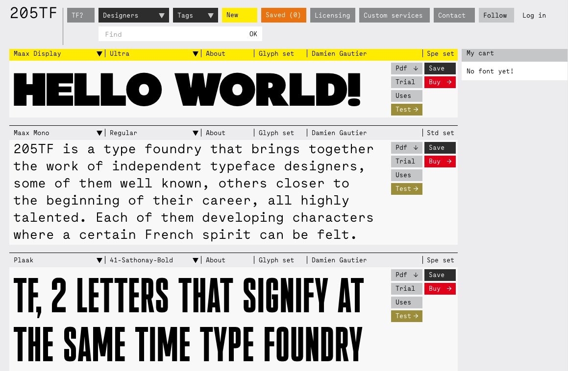
“TF, 2 letters that signify at the same time Type Foundry and Typographie Française (French Typography). 205TF is a type foundry that brings together the work of independent typeface designers. Each of them developing characters where a certain French spirit can be felt.”
-
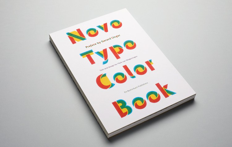
‘Why do type designers traditionally think in black and white?’ ‘Color will be the new Italic. Color will be the new Bold.’ The Novo Typo Color Book is published by De Buitenkant, Amsterdam, The Netherlands. Preface by Gerard Unger, text and design by Mark van Wageningen. Hardcover, size 16,5 x 24 cm, 96 pages printed in 3 pms colors offset and letterpress. ISBN 978 94 90913 65 6
-
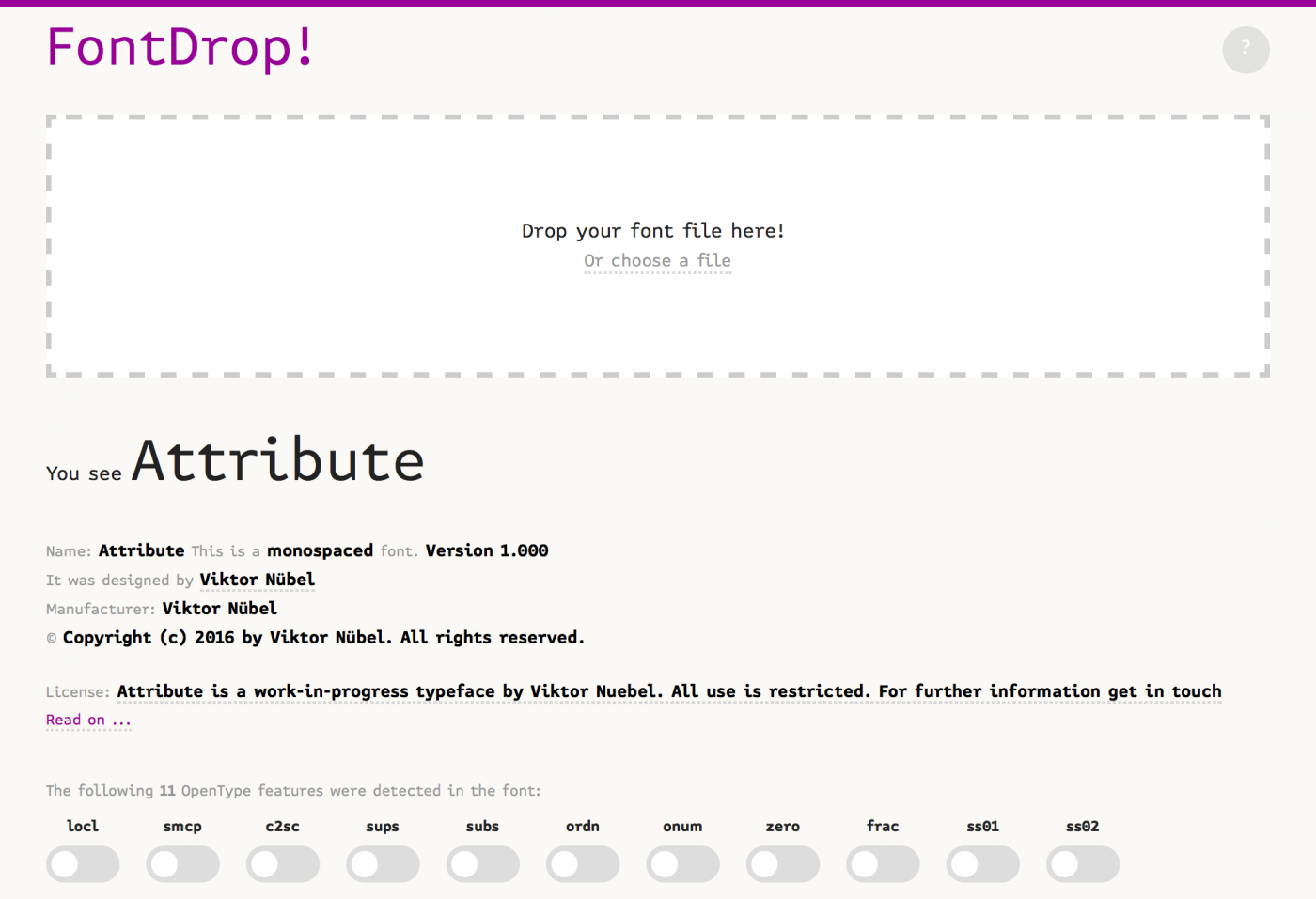
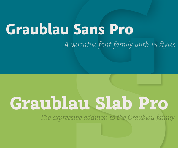
See meta data, glyphs and OpenType features of any font.
-
“Today, we are opening a whole new chapter in entry-level font editing: Say hello to Glyphs Mini 2! All you need for simple and straight-forward, single-master font editing in a unified single window with an integrated, document-specific palette.”
-
Participants of the Arabic Type Design program will embark on an intensive foundational course in Arabic type design. The application deadline is at midnight on Monday April 24, 2017.
-
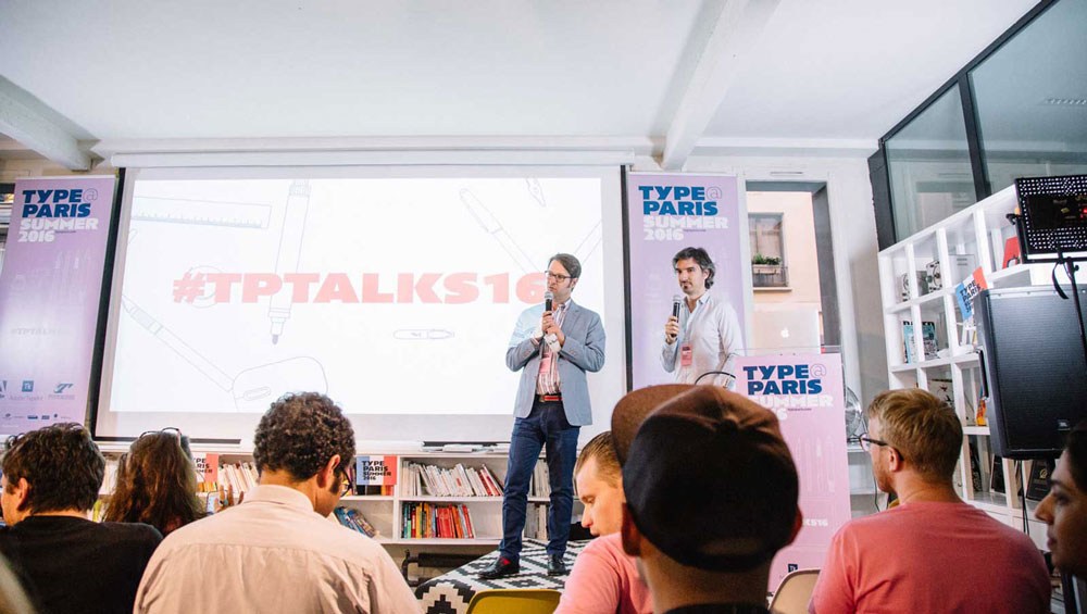
“In my experience, life presents a fascinating series of opportunities, decisions and challenges, each of which impact us in different ways. Pushing and pulling us in various directions, and introducing new opportunities, decisions and challenges along the way. Of these experiences, one of the most special was my time at TypeParis.”
-
This piece focuses on the Japanese font foundry scene. It is a scene in constant change, a result of bankruptcies by individual companies, mergers, start-ups and constantly shifting licensing models.
-
Richard Lipton has been designing type and lettering for over 40 years and continues releasing new typefaces with style and utility.
-
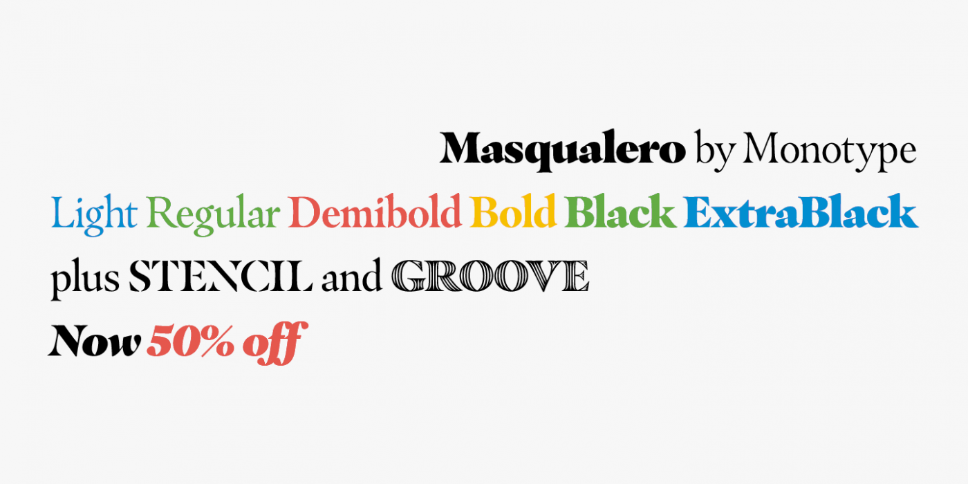
“Like the legendary jazz song of the same name, Masqualero is haunting and sophisticated. Drawn as a tribute to Miles Davis, its letterforms are as beautiful as his Masqualero composition.”
-
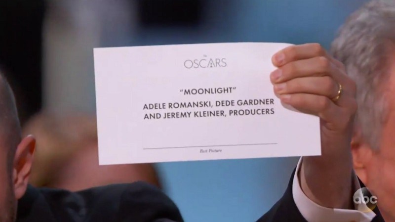
“Warren reads the card, then stops for a moment to read it again to be sure (which the audience thinks is supposed to be comical). He even checks to see if there’s anything else in the envelope.”