Jump to content
Nova Caps is a striking and globe-trotting editorial typeface that steals inspiration from Roman inscriptions and Art-Deco architectural lettering.
  • Typography Weekly #64

      Open the Link

      Recasting Electra as Aluminia

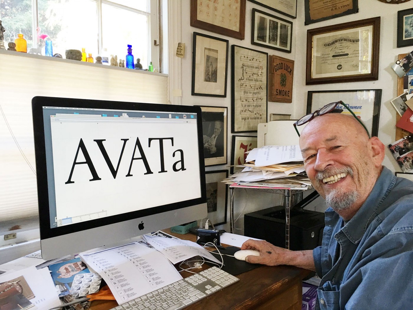
      Jim Parkinson tells us about reviving Electra for Bruce Kennett’s W. A. Dwiggins biography.

      letterformarchive.org

      Open the Link

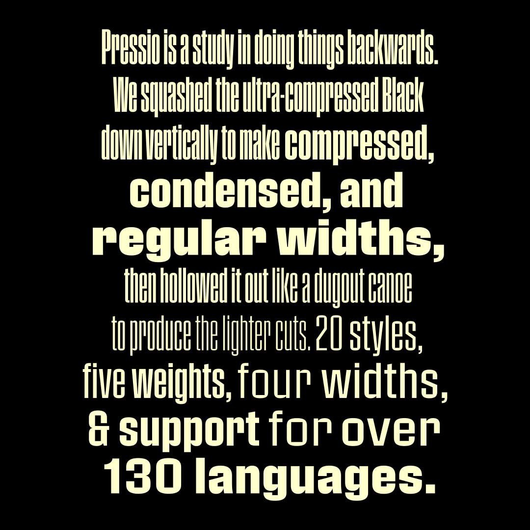
      Signal Type Foundry releases Pressio

      “Pressio is a study in doing things backward. We began with the weight that’s usually drawn last: the ultra-compressed black.”

      www.fontspring.com

      Riccardo Sartori

      Open the Link

      The Font Detectives Who Ferret Out Fakery

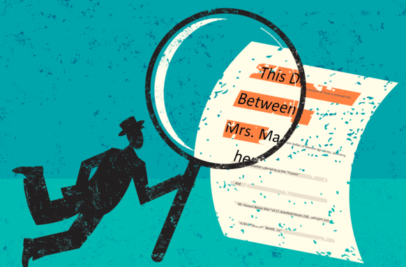
      “Detecting fraud via fonts isn’t as sexy as sleuthing art forgery; it often involves tedious measurements with digital calipers, examinations under loupes and microscopes, charts that track the slight differences between two versions of the Times Roman face, or evidence that a particular form of office printer didn’t exist at the document’s dated execution.”

      www.wired.com

      • very interesting! 1

      Open the Link

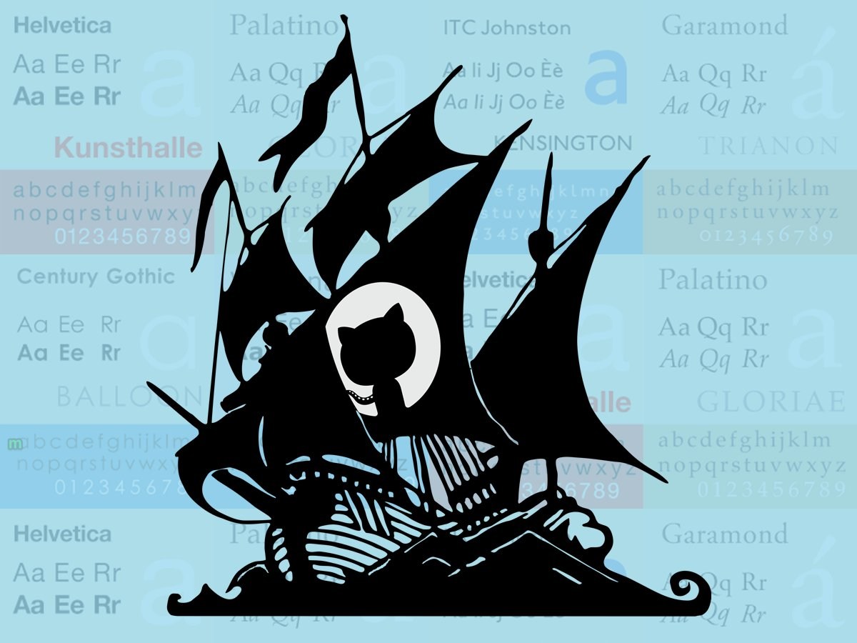
      How Github became the web's largest font piracy site (and how to fix it)

      “When a commercial font ends up where it shouldn’t — for instance on a huge, freely searchable database of code — it’ll most certainly break the terms of the license, and once downloaded from there, it becomes a pirated font.”

      pixelambacht.nl

      • very interesting! 1
      • sad 1

      Open the Link

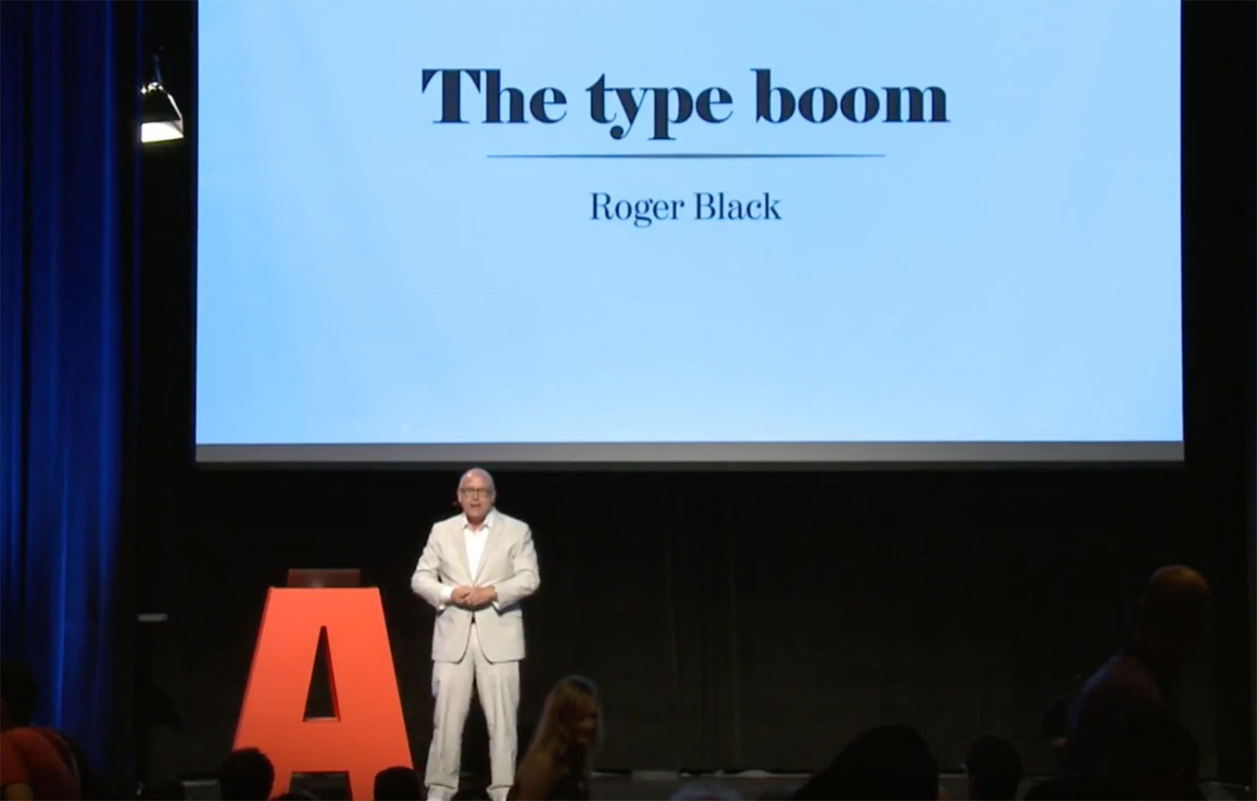
      Talks of ATypI 2017 on YouTube

      Watch over 50 talks from ATypI 2017 Montreal on YouTube.

      www.youtube.com

      • Like 1

      Open the Link

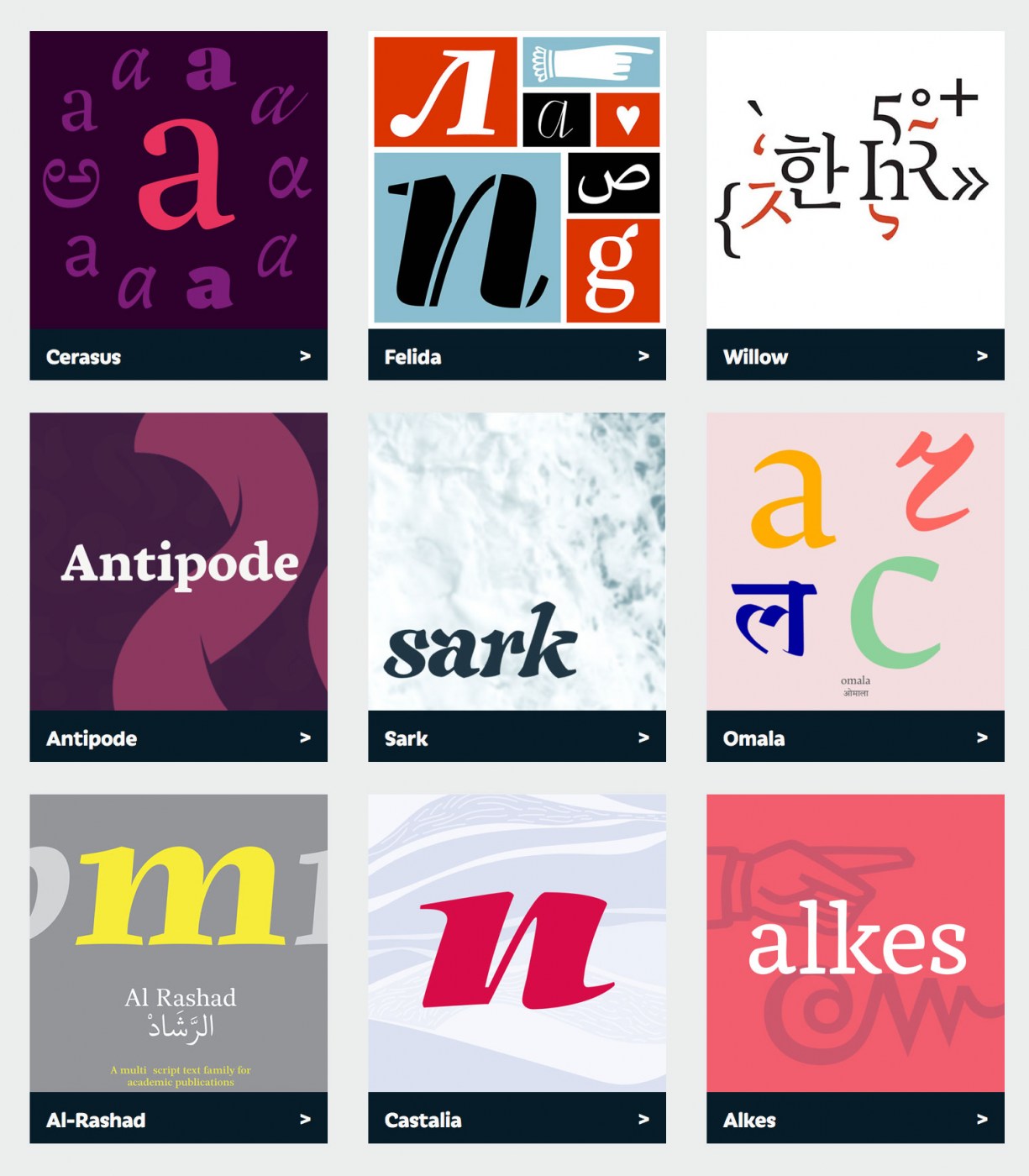
      This year’s Reading typefaces and dissertations

      New work from the Department of Typography & Graphic Communication at the University of Reading.

      typefacedesign.net

      • very interesting! 1

      Open the Link

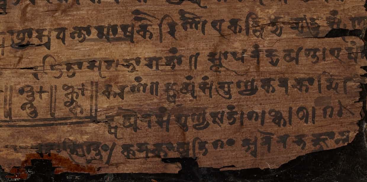
      Ancient Indian text contains earliest zero symbol

      The Guardian: “one of the greatest conceptual breakthroughs in mathematics has been traced to the Bakhshali manuscript, dating from the 3rd or 4th century”

      www.theguardian.com

      • very interesting! 1

Our typography network

Typografie.info – The German typography community
The type specimens of the world.
Discover the fonts from the Germany foundry FDI Type. A brand of Schriftkontor Ralf Herrmann.
The best typography links of the week.
  • Add your content!

    We spread your news free of charge among a growing list of subscribers and tens of thousands of followers of our social media channels.
    Learn more about this
Canape—a cosy type family from FDI Type …
×
×
  • Create New...

Important Information

We are placing functional cookies on your device to help make this website better.