


Typography Weekly #71
10 typography news links in this category
-
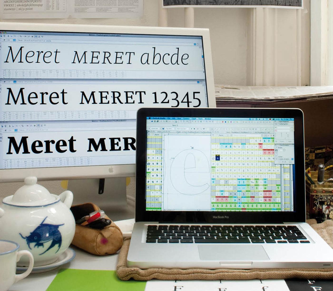
“After being initially released with OurType in 2011, Nils Thomsen’s Meret Pro has now been republished with TypeMates. With this release comes an update: Meret Pro’s forms and features have been subtly remastered; additional experience improving a tried and tested design.”
-
A new typeface family designed by Alice Savoie, commissioned by the Centre National des Arts Plastiques, in partnership with the Groupe Imprimerie Nationale.
-
“Third time’s the charm? Why OpenType Font Variations (variable fonts) will likely succeed where predecessors failed.”
-
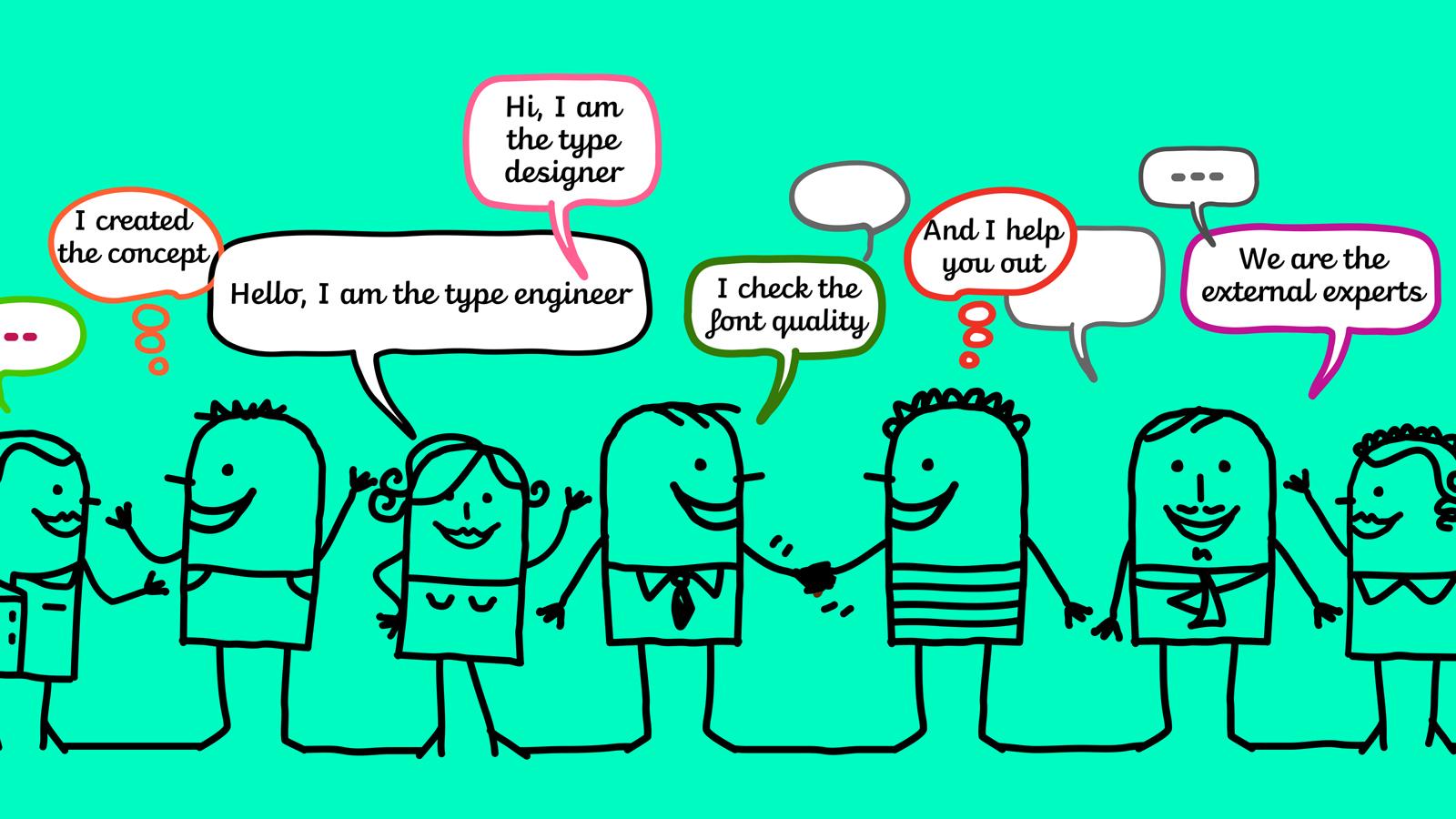
Larger teams and more complex work are moving type design toward more thorough crediting systems. But it’s only partially about the system and more about honouring the often unknown ones investing their considerable skills into producing the fonts we use and love. TypeTogether has begun making improvements in this area. What considerations were taken into account and what conclusions have been reached thus far?
-
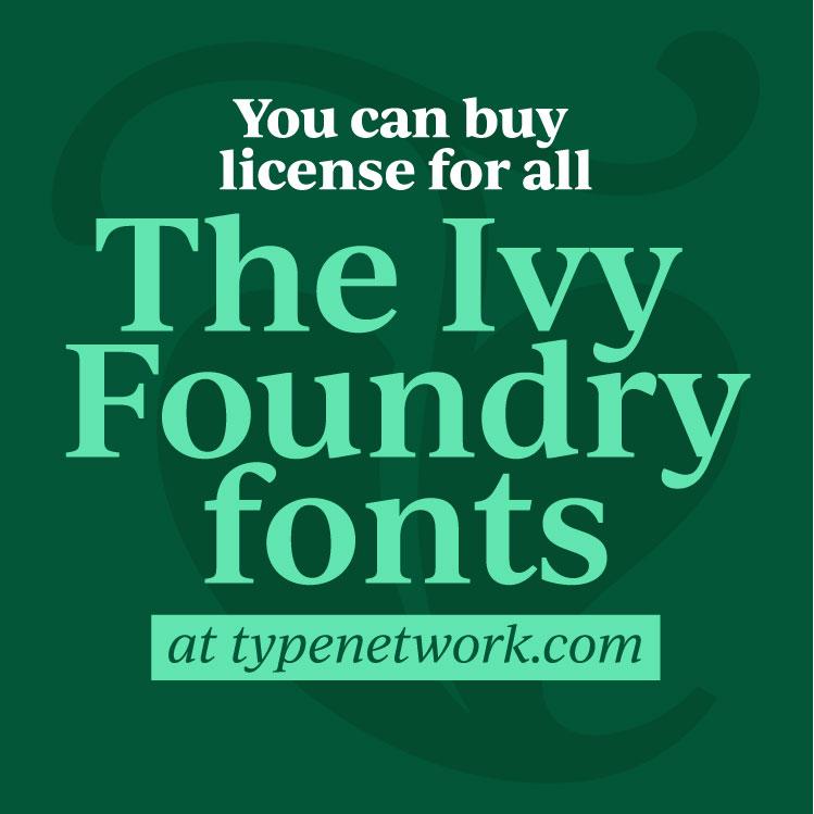
“I have long been an admire of Type Network and their high standards, so I am very pleased to be joining the network, and I am thankful for the support and input from the great people behind the scenes at TN.”
-
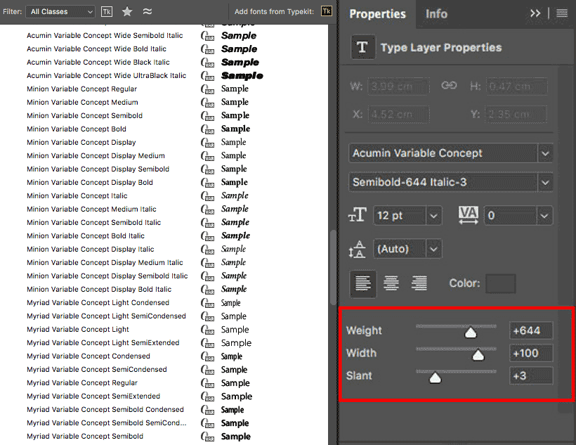
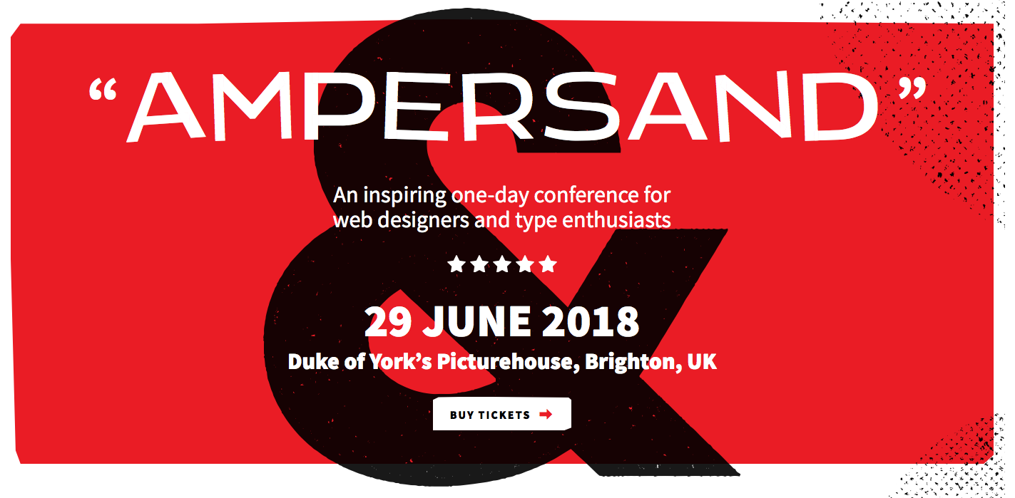
by Richard Rutter. “Using variable fonts in the real world turns out to be tricky. This post explains how we achieved it for the new Ampersand website and what we learned along the way.”
-
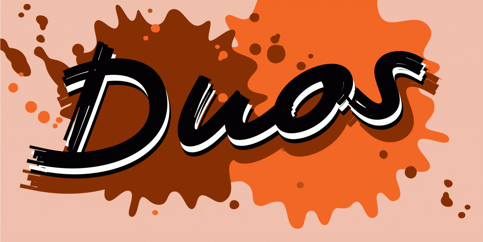
“Duos, a script for illusionists, comes in 10 styles. Whatever style you pick: apply this speedy monolinear handwriting font in large sizes, because it is made for catching the attention.”
-
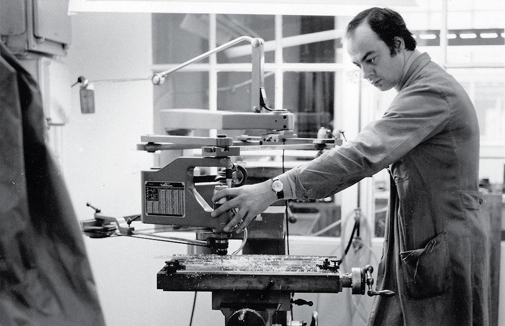
Re-type published an interview with Piet Jacobs who worked at Enschedé foundry for many years and, at his own private press, published the autobiography of Paul Rädisch.
-
F37 Bergman is a revival of Hans Möhring’s Florida typeface. The Swedish director Ingmar Bergman consistently used Florida in his films — always presented in stark black and white. This new digitalisation expands the original creating a matching lower-case with 4 new weights.
-
Black[Foundry] designed a new typeface family for the French national institute for computer science Inria (Institut National de Recherche en Informatique et en Automatique). It comprises both Serif and Sans Serif styles, each in 3 weights and matching italics. The fonts are available under an Open Font Licence.


Don’t miss the latest typography news!
Typography Weekly via email: Subscribe here
Typography Weekly via RSS feed: Subscribe here

