Typography Weekly #76
10 typography news links in this category
-
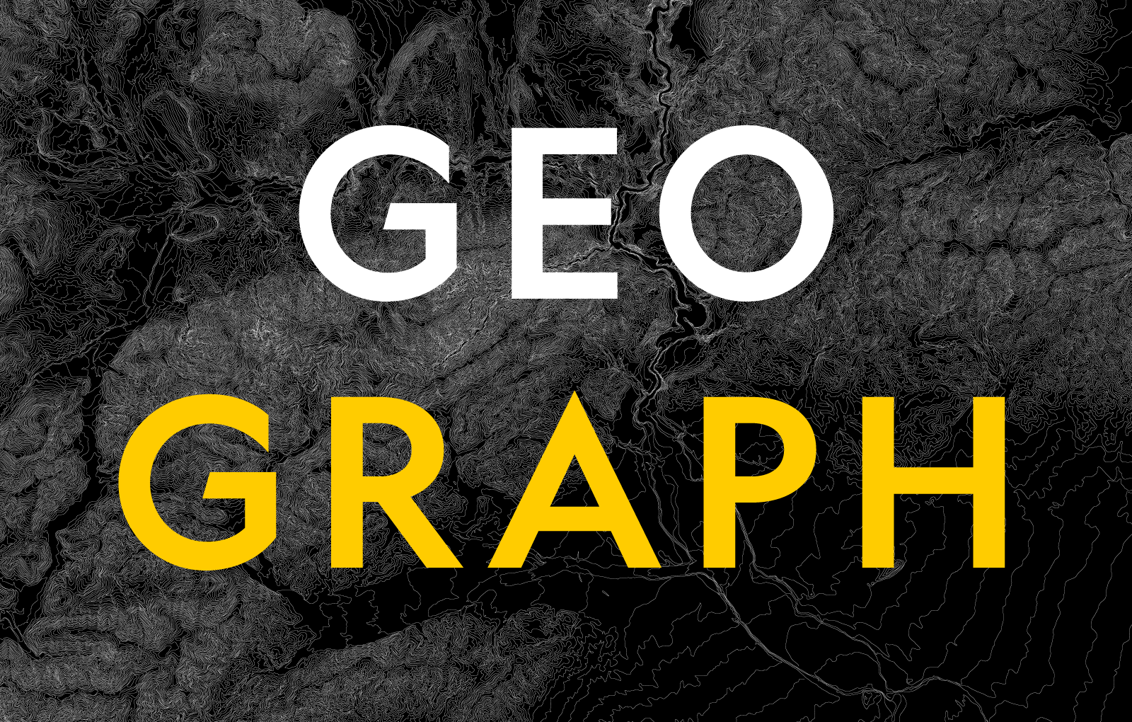
“Geograph is a contemporary, plain sans serif designed for National Geographic. It comprises 24 styles for use across their broadcast, print and web channels.”
-
“Originally designed in 1928, Plak is something of a lost gem in the type world. Despite being drawn by Futura creator Paul Renner, it never achieved the same popularity and spent decades lacking a much-needed digital revival.”
-
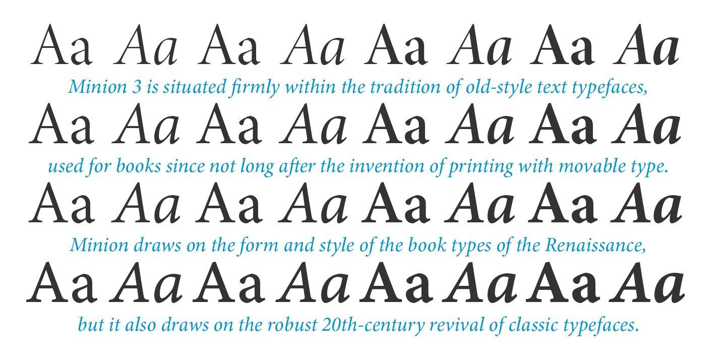
“Minion 3 introduces a new script, Armenian, as well as full IPA coverage. Other enhancements include an additional style of Greek with a traditional reverse-oblique pen angle, as well as refinements to the Cyrillic designs. Newly refined optical sizes are now available, which take advantage of the latest font technology to make Minion 3 an even more versatile tool for digital typesetting.”
-
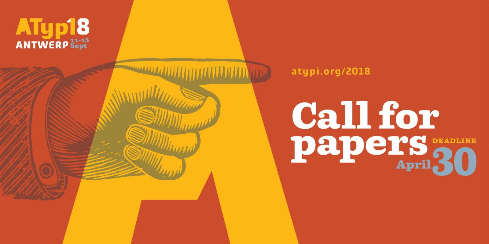
The ATypI 2018 Call for Proposals for the conference in Antwerp is now open.
-
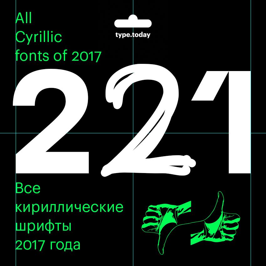
Ilya Ruderman and Yury Ostromentsky divide the list of 221 typefaces into several groups: • typefaces with perfect Cyrillic; • typefaces with good or acceptable Cyrillic; • typefaces with questionable Cyrillic; • and typefaces with visible mistakes in Cyrillic.
-
“A team of researchers at Columbia University, led by Changxi Zheng, have found a way to embed secret messages in typefaces by making negligible tweaks to their designs that are almost indistinguishable to the human eye.”
-
“How did we get to this state of affairs? Why do we exist in this maddening world where we are taught to write one way and our books are printed in another?”
-
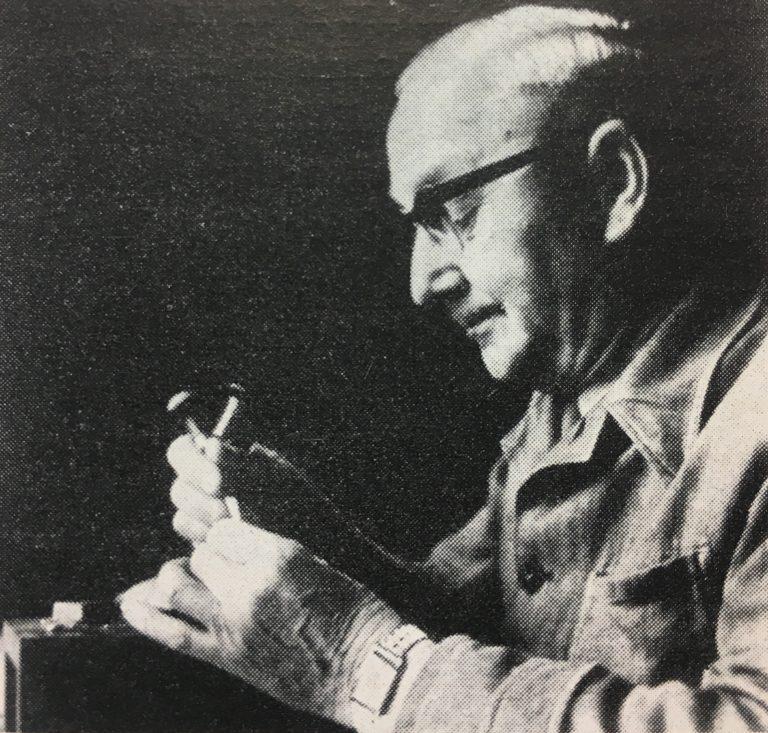
“This is a 2,300-word article on the Leipzig punchcutter Otto Erler (1890–1965), whose career began before the First Word War and lasted all the way through to his death. For decades, he ran the punchcutting department at Schelter & Giesecke, one of the largest twentieth-century German typefoundries – and probably one of the world’s largest, too.”
-
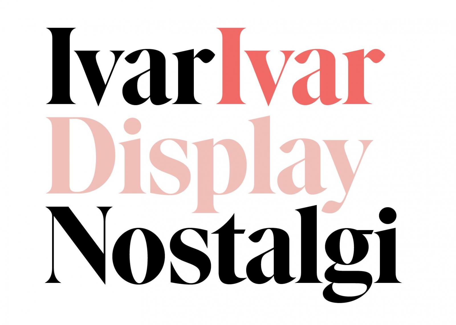
“The special cut of Ivar, tailored for compact, high-impact headlines, flirts with almost-forgotten faces like Times Modern, Caslon Graphique, Trooper Modern, Hawthorn and ITC Grouch.”
-
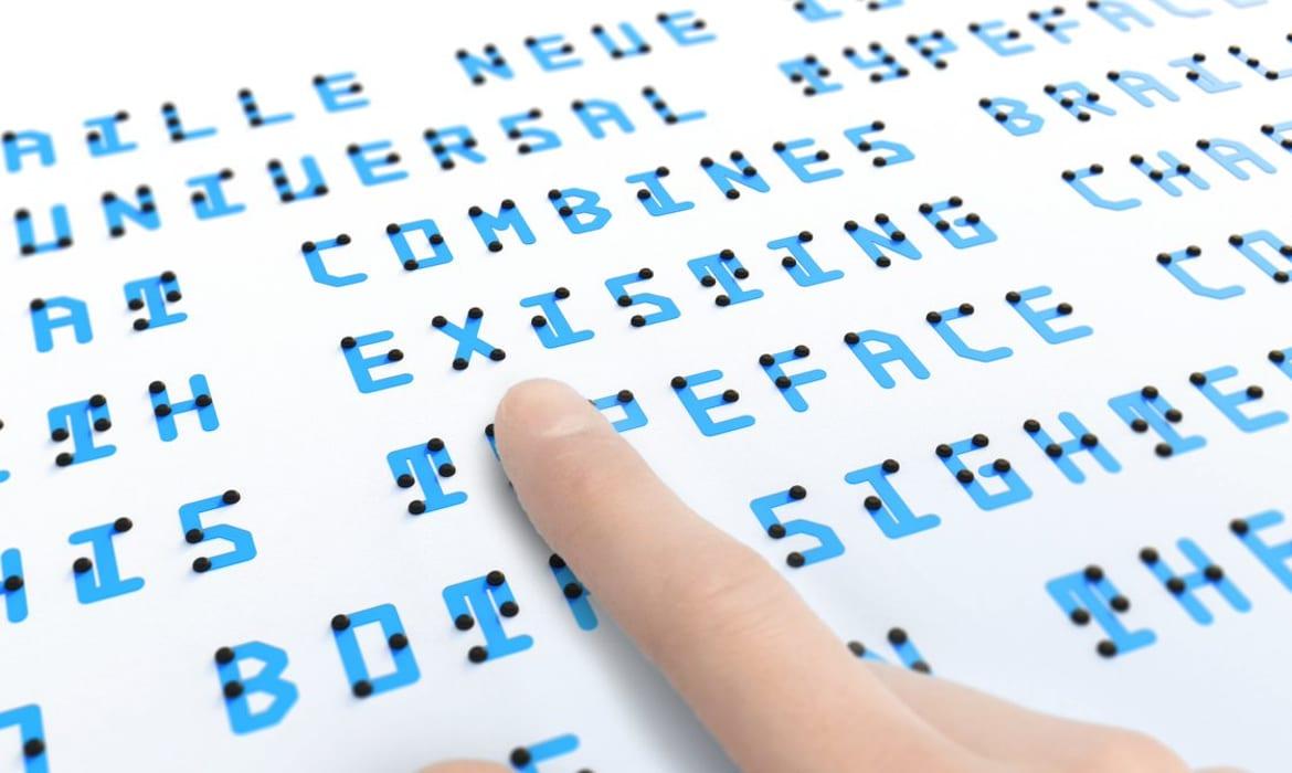
“Japanese designer Kosuke Takahashi has created a new typeface that allows everyone equal access to information, whether they can see or not.”


Don’t miss the latest typography news!
Typography Weekly via email: Subscribe here
Typography Weekly via RSS feed: Subscribe here