-
Typography Weekly #78
Suggested By Riccardo Sartori
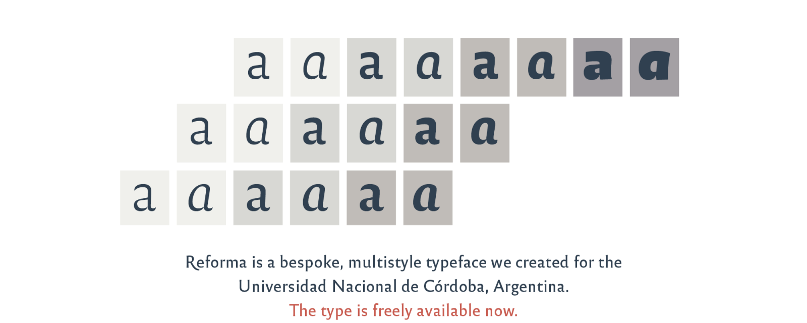
Reforma. A new voice for an institution with deep roots
“Reforma is a bespoke typeface designed by PampaType for the Universidad Nacional de Córdoba, Argentina, earliest university in the country and one of the first in the continent, with a history of more than 400 years. The typeface was commissioned as part of the celebrations for the centenary of the University Reform. The typeface has been liberated for public and private use under a Creative Commons license.”
pampatype.com

Suggested By Riccardo Sartori
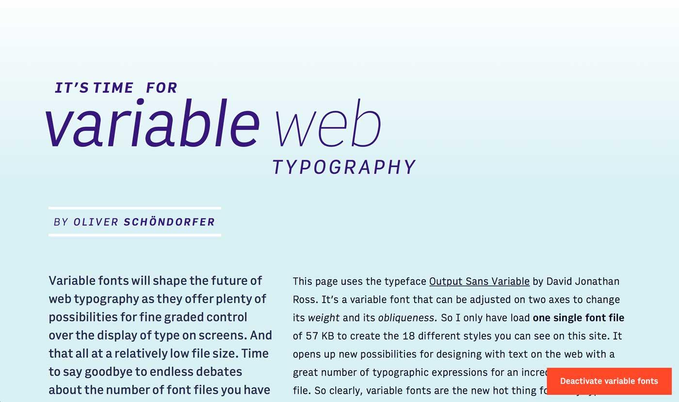
How to start with variable fonts on the web
“Variable fonts are the font technology made for the digital era. They have the power to bring more typographic richness to the web at a lower file size. But with new possibilities and advantages new challenges and complexity arise. So what’s so hot about the next big thing since the introduction of web fonts (at least to all type nerds) and how can you use it?”
www.zeichenschatz.net

Suggested By Gecko
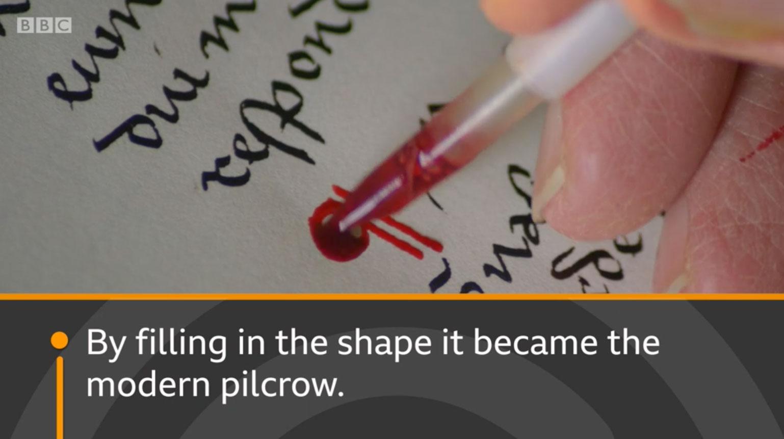
What does that funny squiggle mean?
A series of short BBC videos explaining glyphs like &, #, the interrobang and the pilcrow sign.
www.bbc.com

Suggested By Riccardo Sartori
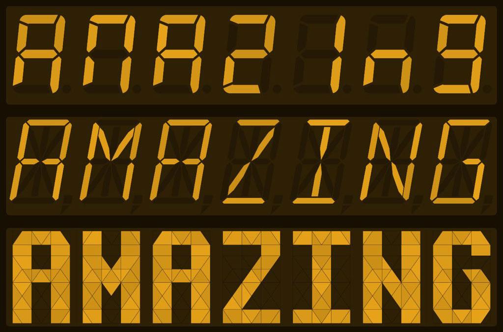
Segmented type appreciation corner
Fascinated by segmented typography – not quite vectors, not quite pixels – designer/typographer/writer Marcin Wichary made an interactive typing playground showcasing both real world and experimental designs.
aresluna.org

Suggested By Riccardo Sartori
Hidden Sheep and Typography Archaeology
Unpacking the original Macintosh bitmap fonts
medium.com

Suggested By Riccardo Sartori
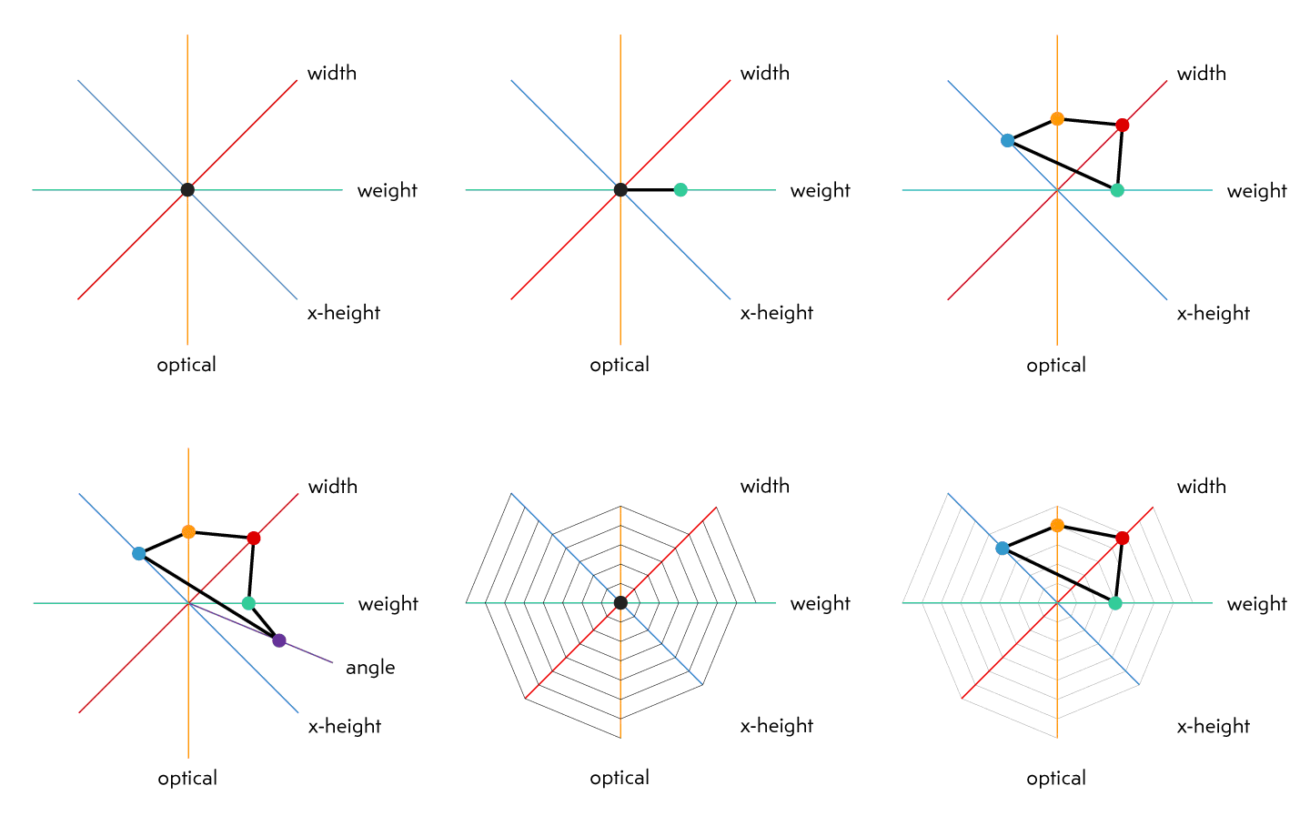
Visualizing design space in variable fonts
María Ramos: At TYPO Labs 2018, Gerry Leonidas pulled the trigger with a thoughtful presentation: ‘I am now in an environment where the design space is by default way bigger than my ability to imagine it, not just my ability to do something with it’.
www.alphabettes.org
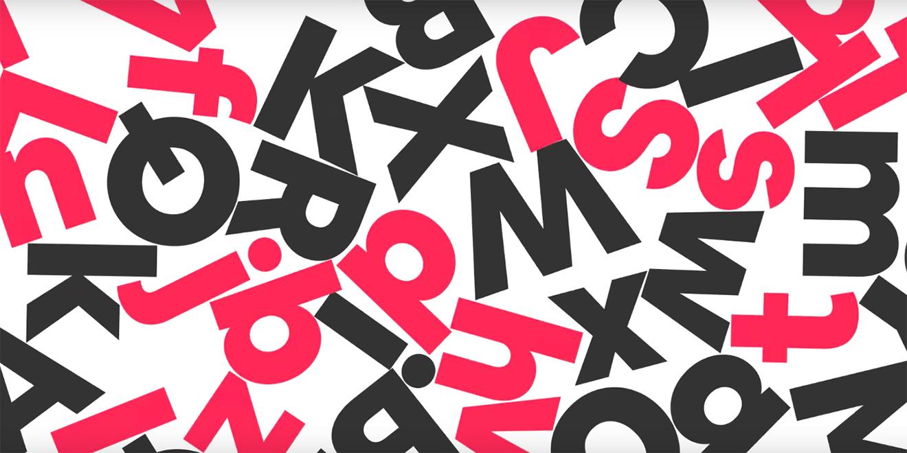
Cereal: a new corporate font for Airbnb
“After trying to find an available screen-optimized font system that would work for the company’s needs and coming up empty-handed, the company worked with typeface foundry Dalton Maag to create the new font.”
www.adweek.com
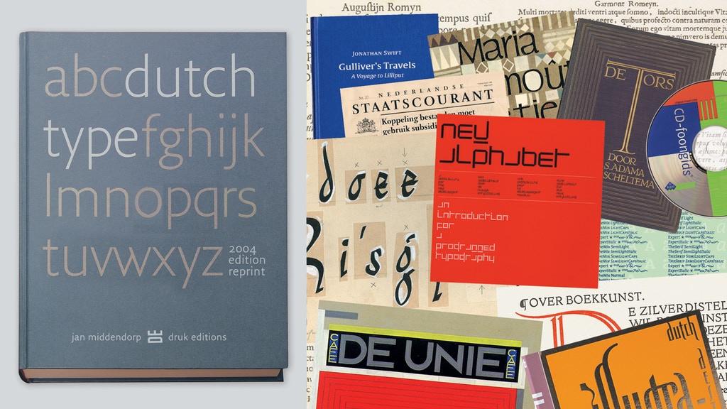
1 commentDutch Type reprint now on Kickstarter
Dutch Type was published in March 2004 and was received with huge enthusiasm. Its 3,500 copies sold out in 3 years. The book soon became hard to find and ended up being offered at embarrassingly high prices on Amazon and eBay – from 500 € to $ 1,200 for a copy.
www.kickstarter.com


