Typography Weekly #80
9 typography news links in this category
-
“Morisawa Type Design Competition has been giving birth to new typeface designs for decades since the first competition held in 1984. Through entries with bold ideas and new attempts in anticipation with unprecedented expressive capacity, the last competition in 2016 received more than 700 entries from 49 countries and regions, including both Kanji and Latin categories.”
-
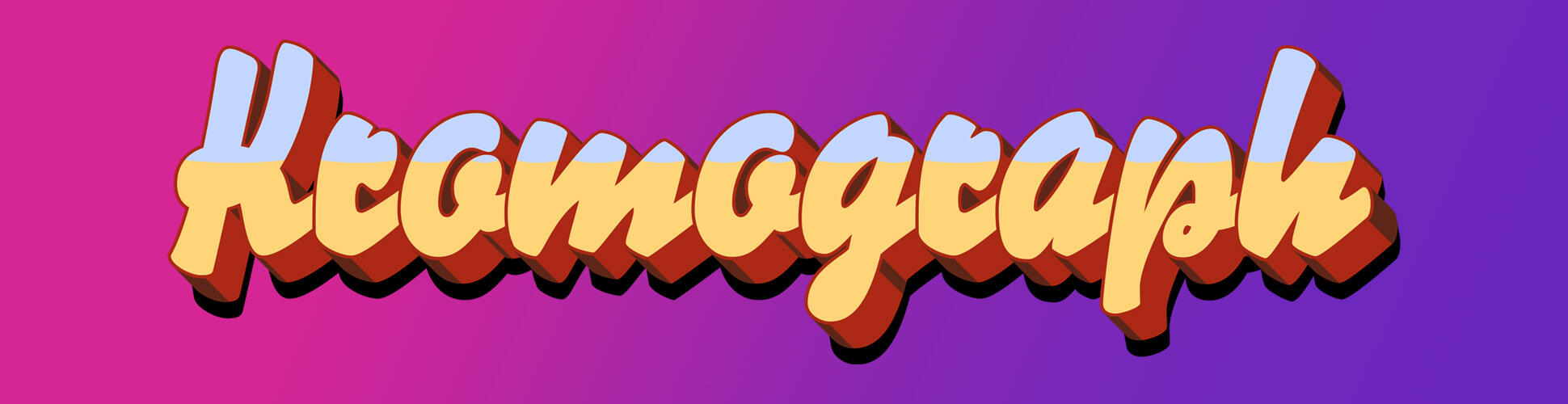
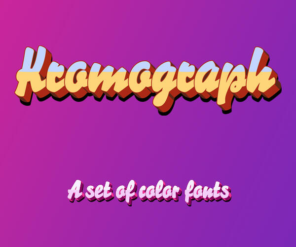
This collection of 7 typefaces is based on the disappearing signs of Soho, at risk of being lost forever due to the ever changing landscape of the area. Fontsmith partnered with The House of St. Barnabas, whose work as a not for profit charity aims to break the cycle of homelessness in London. Each purchase comes with a one month membership to The House and 100% of the proceeds from sales of fonts go directly to the charity.
-
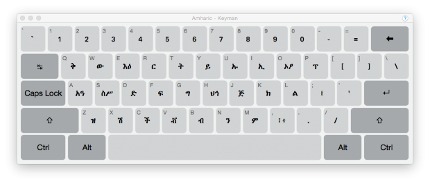
Keyman makes it possible to type in over 1,000 languages on Windows, macOS, iPhone, iPad, Android tablets and phones, and in a web browser.
-
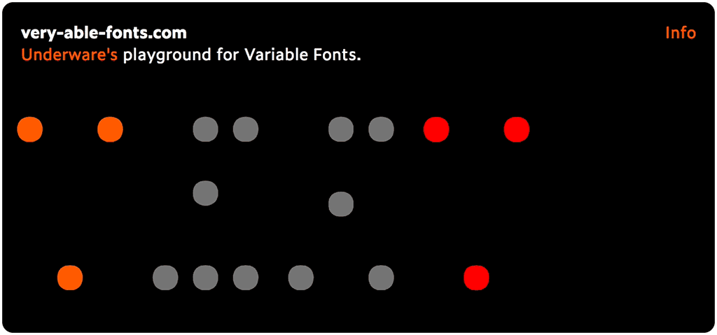
“Instead of wrapping old ideas into new techologies, maybe variable fonts require new ideas?” Underware’s new playground for variable fonts works in the latest versions of Chrome, Edge, and Safari.
-
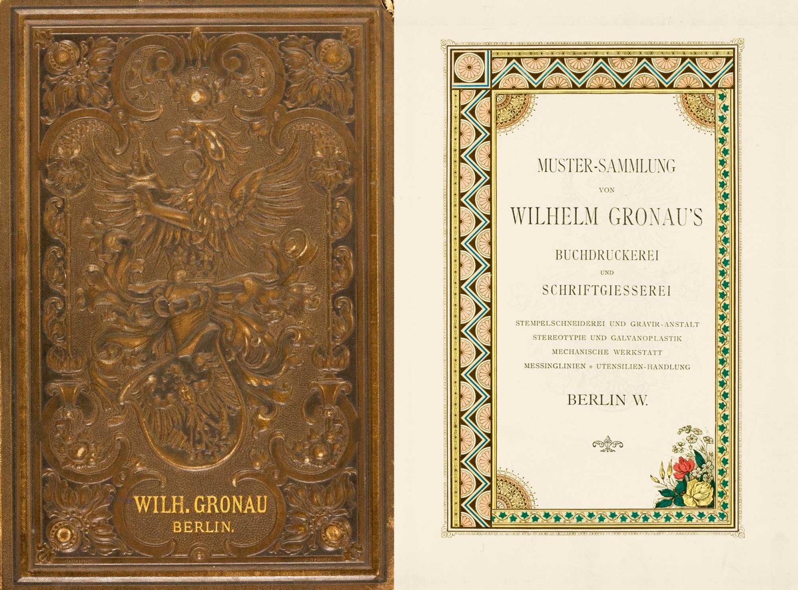
“The Haenel printing house’s roots went back to 1731. It was founded in Magdeburg – where it was a court establishment (Hofbuchdruckerei) …”
-
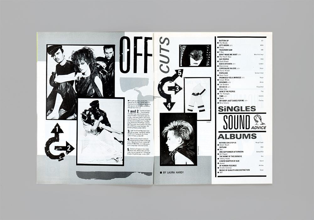
“In our first post we look at how Letraset helped to bring about the visual language of punk and became a staple of the DIY attitude to music-making established in the late 1970s and early 80s.”
-
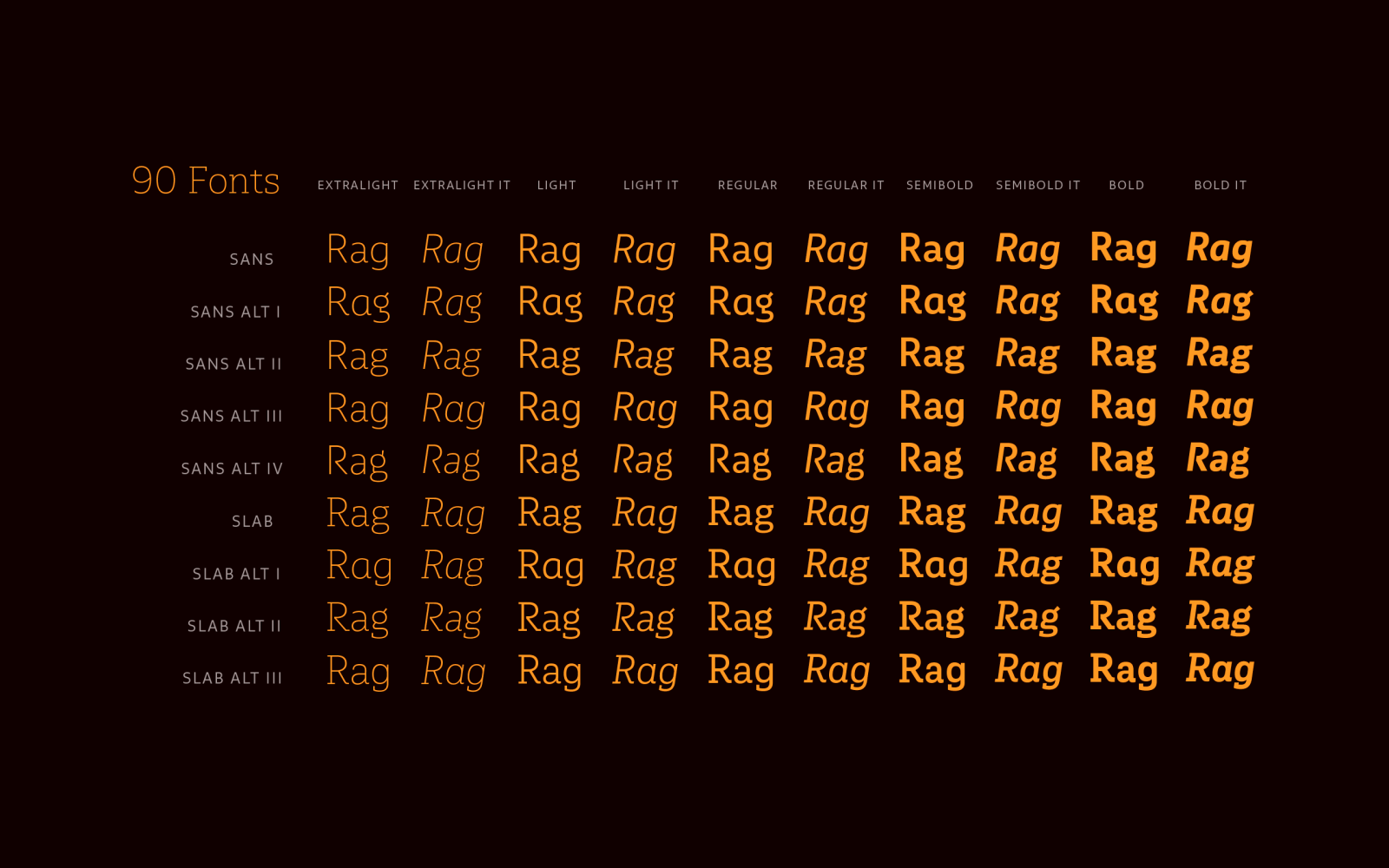
“As its name suggests, Multiple is a family with multiple font styles. The idea that sums up the concept behind the typeface is a workhorse—the challenge was to develop a useful font fit for any scenario and suitable to any design needs: editorial design, packaging, branding, screen use, etc.“ A “pay what you want” 90 fonts typeface family.
-
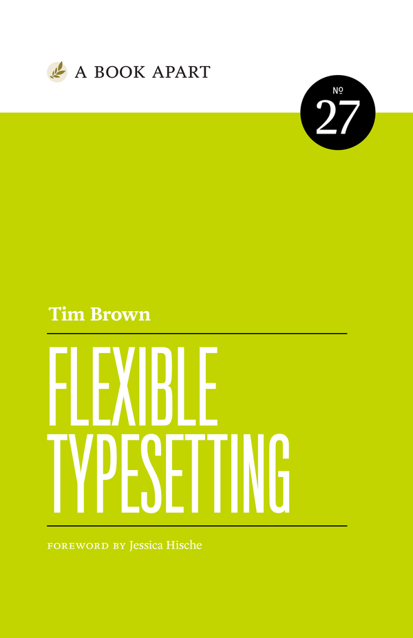
Because of the web, the role of the typographer has changed. We no longer decide; we suggest. In this book, available July 24, Tim Brown illuminates the complex, beautiful world of typesetting—arguably the most important part of typography, as it forms the backbone of the reading experience—and shows us how to parry the inevitable pressures that arise when we can no longer predict how, and where, our text will be read.
-
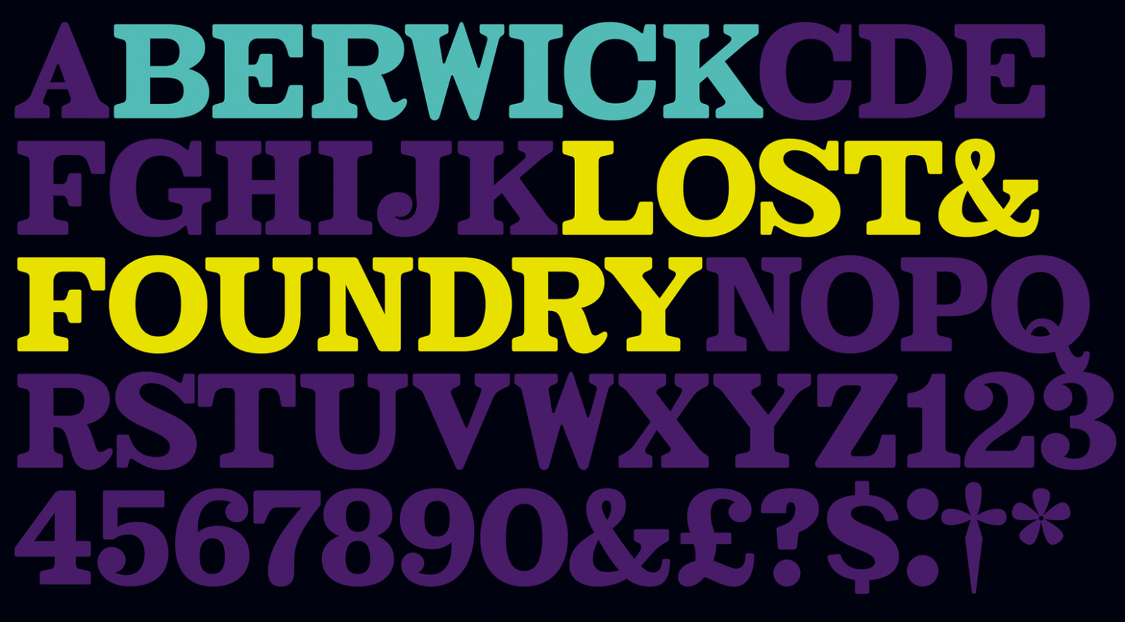
The family is an exploration of contrast methodologies, combining various aspects from the canon expansionist systems, inverted contrast, and the contrast behavior of standard sans-serif grotesks.


Don’t miss the latest typography news!
Typography Weekly via email: Subscribe here
Typography Weekly via RSS feed: Subscribe here