-
Typography Weekly #81
Suggested By Riccardo Sartori
A Spectre is Haunting Unicode
“Several of the added characters had no obvious sources, and nobody could tell what they meant or how they should be pronounced. Nobody was sure where they came from. These are what came to be known as the ghost characters.”
www.dampfkraft.com
1 comment
Suggested By Riccardo Sartori
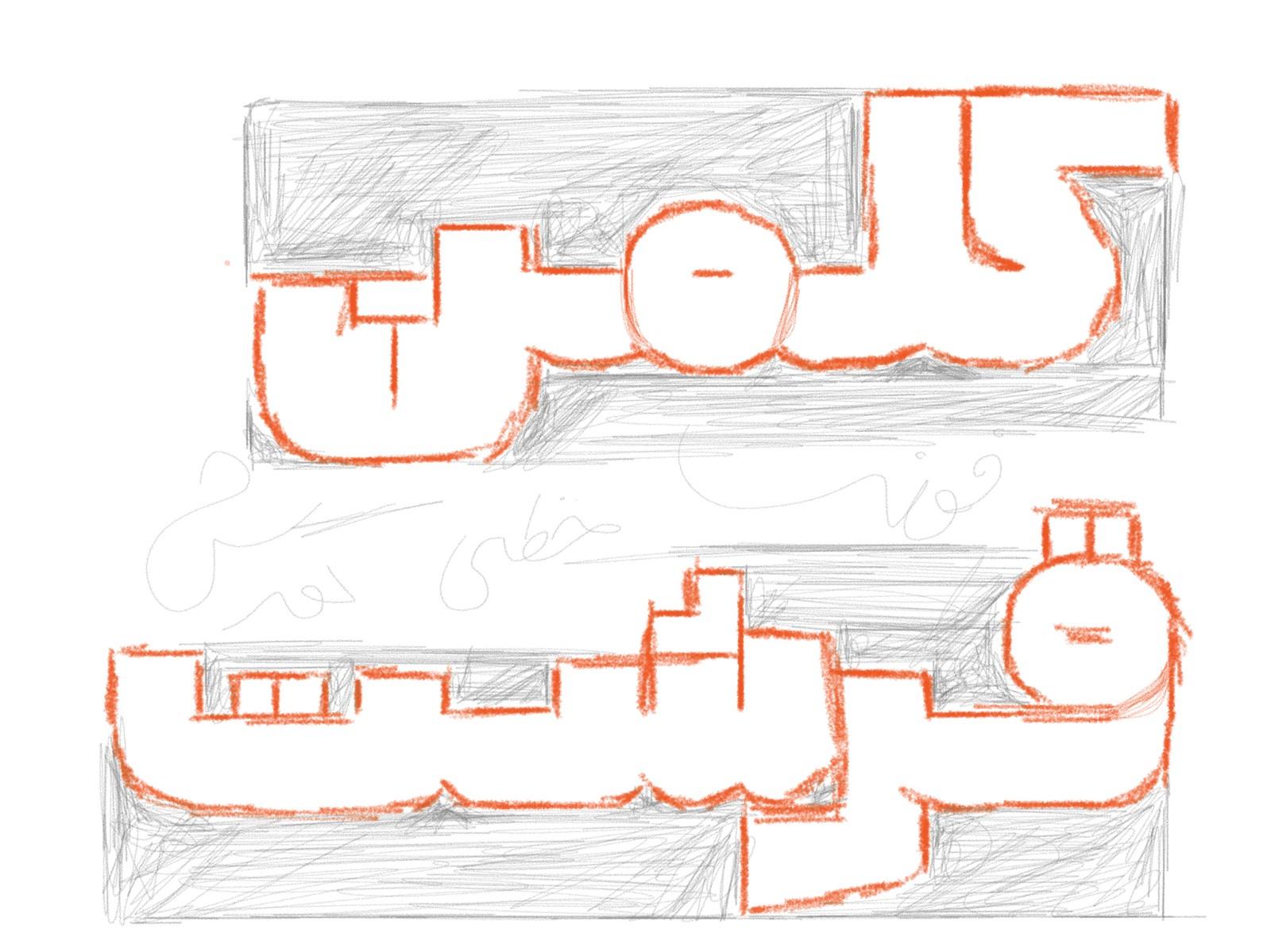
The Grammar of Arabic
“How do you adapt a latin type design into Arabic? TypeThursday spoke with Arabic typeface designer Kourish Beigpour to find out how he interpreted the font Faction from Lost Type Co-op.”
medium.com
Registration for ATypI 2018 Antwerp is now open
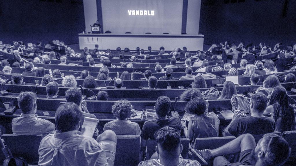
“You’re invited to a celebration of all things typographic! Join us 11–15 September in Antwerp for ATypI 2018, the sixty-second annual conference of the non-profit Association Typographique Internationale. Five type-filled days and nights in this historic city will engage, entertain, and inspire you.”
www.atypi.org

Suggested By Riccardo Sartori
Call for papers for ICTVC 7
“In 2019 the 7th International Conference on Typography & Visual Communication – titled ‘Challenging design paths’ – travels to Patras, Greece. In collaboration with the Library & Information Centre of the University of Patras the conference will examine the value of design for visual communication and provoke participants to challenge current assumptions.”
easychair.org
Font scandal at FIFA World Cup
“While millions of people are enjoying the excitement and drama of the World Cup matches, the type design community is outraged at the low level of the event’s typography. We have undertaken to shed light on the situation, adopting a broader approach to the issue …”
type.today

Suggested By Riccardo Sartori
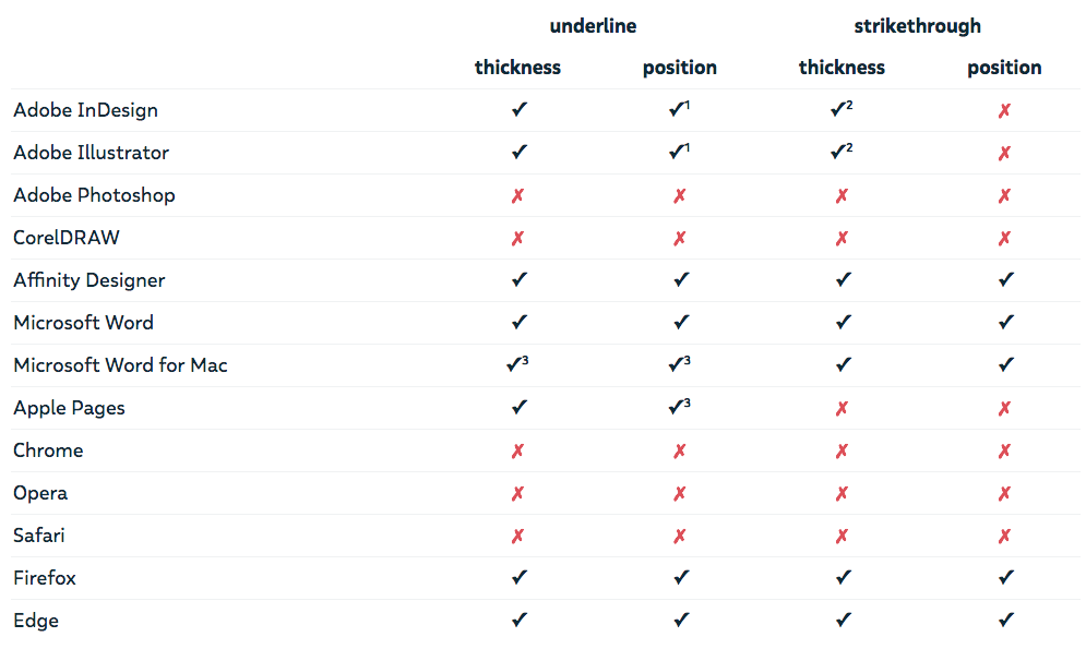
The state of underlines and strikethroughs
“OpenType has 4 parameters we can customize. However, are these values really enforced outside our font editors? The specs for underlines and strikethroughs treat them as suggestions, so it is up to the software to use them or not. On the other hand, if a type designer bothered to set values for these parameters, I strongly believe the software should honor them.”
www.harbortype.com


