Jump to content
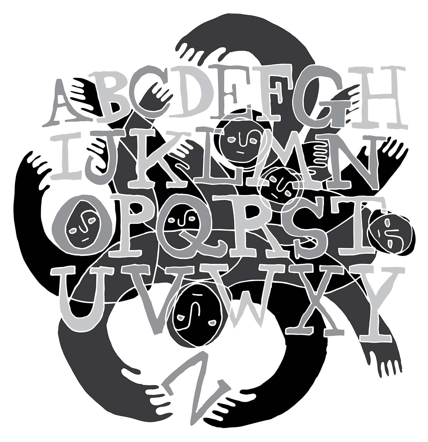
Nova Caps is a striking and globe-trotting editorial typeface that steals inspiration from Roman inscriptions and Art-Deco architectural lettering.
  • Typography Weekly #91

      Open the Link

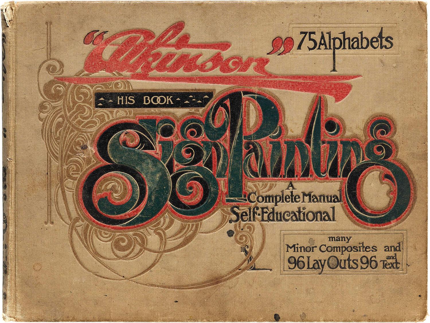
      The Art of Lettering Instruction, 1716–2016

      The diagrams, illustrations, models, and methods used to teach people how to make letters can be as engaging as the resulting letters themselves. Stephen Coles, the Archive’s Associate Curator & Editorial Director, explores a few highlights of instructional material spanning the last three centuries.

      letterformarchive.org

      • Like 1

      Open the Link

      Monotype Is Weighing Options After Buyout Interest

      Monotype Imaging Holdings Inc., a developer of typefaces, is exploring its strategic options after receiving takeover interest from private equity firms, according to people with knowledge of the matter.

      www.bloomberg.com

      • very interesting! 2

      Open the Link

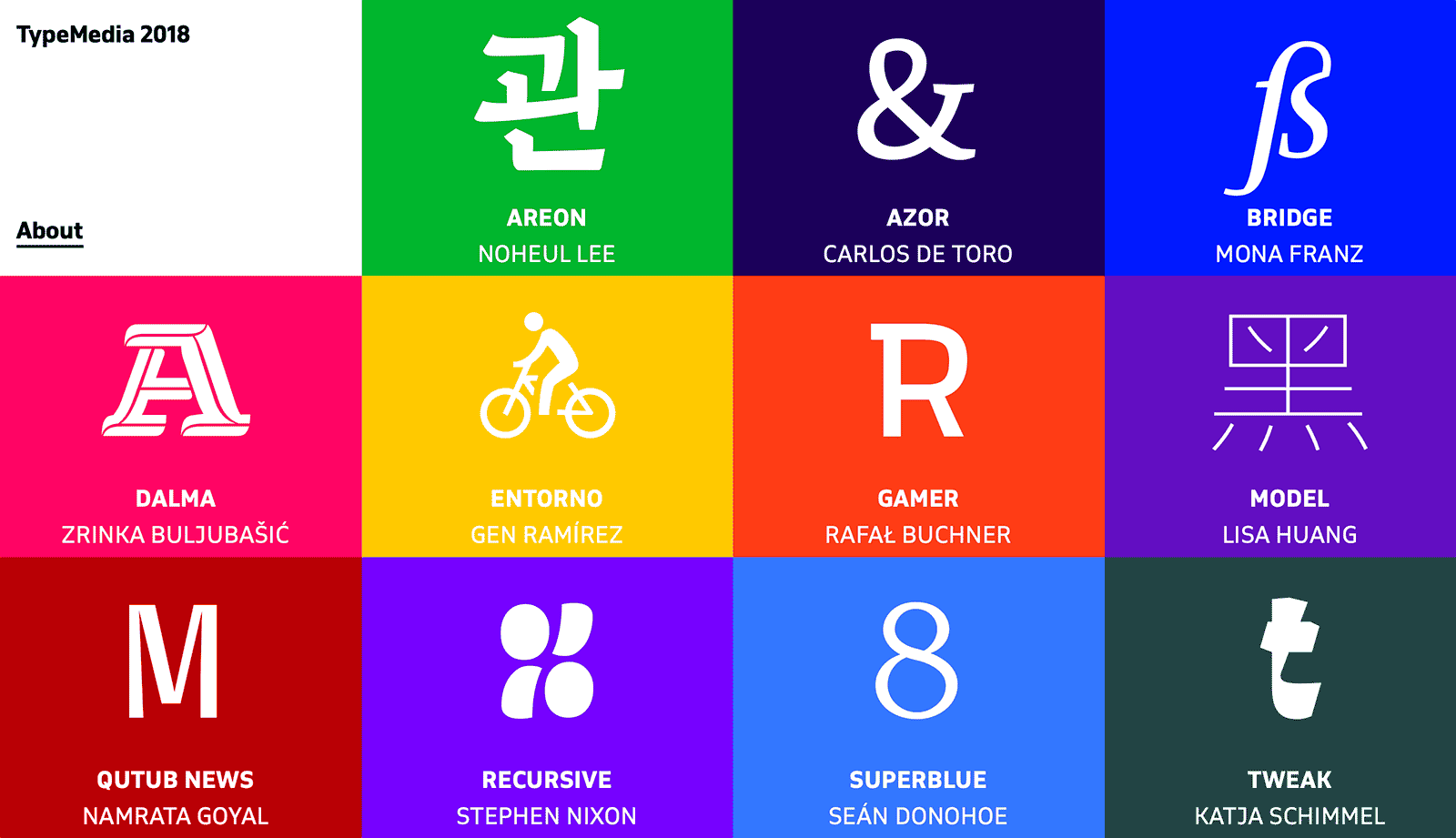
      Typefaces from TypeMedia 2018

      “The Master TypeMedia at the Royal Academy of Art, The Hague, NL, is a 10-month program that delves into type design and typography for different contexts including print, screens and interactive media.”

      www.typemedia2018.com

      Open the Link

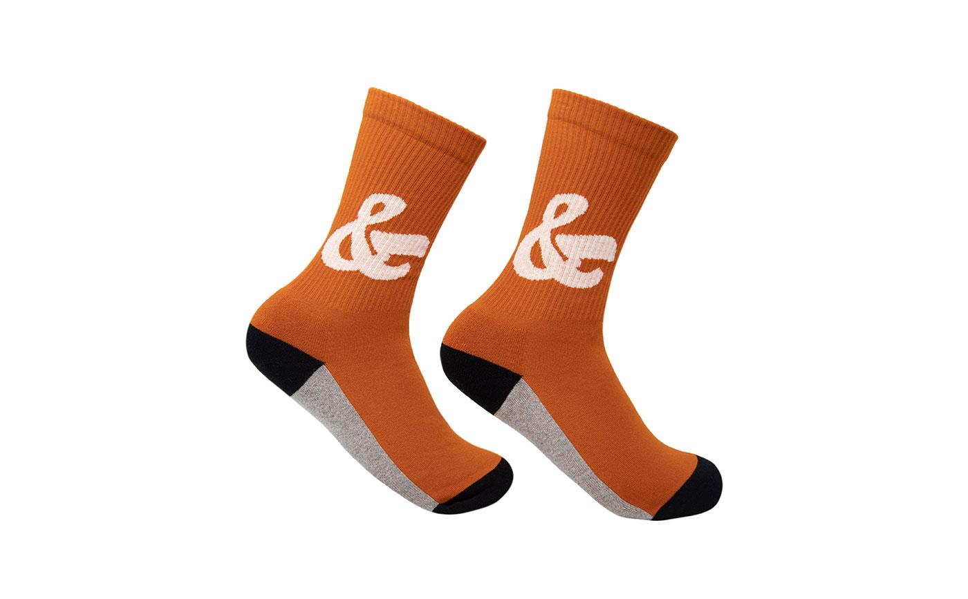
      New from House Industries: ampersand socks

      Typographic footwear by House Industries and The Athletic Community.

      houseind.com

      Open the Link

      Kontour: An Aura of One’s Own

      An article, presenting the work of Sibylle Hagmann, type designer, educator, and the woman behind the Kontour type foundry.

      fontstand.com

      Open the Link

      Postgraduate Certificate in Type Design opens June 1

      Applications for the 2019–20 Postgraduate Certificate in Type Design are open June 1–30. We’re launching the application period with an open house for prospective students. Pick the brains of Type West and Type@Cooper West grads, and see highlights from the Archive collection that will be on hand for next year’s course.

      letterformarchive.org
      Riccardo Sartori

      Open the Link

      The Tension Between Graphic and Type Design

      Brian LaRossa: “Typefaces are elemental enough to be taken for granted without consequence. Even graphic designers, who wield the work of type designers with great care, can become lulled by exposure into forgetting the years of learning and effort that lurk behind every letter.”

      designobserver.com

      2 comments

      Open the Link

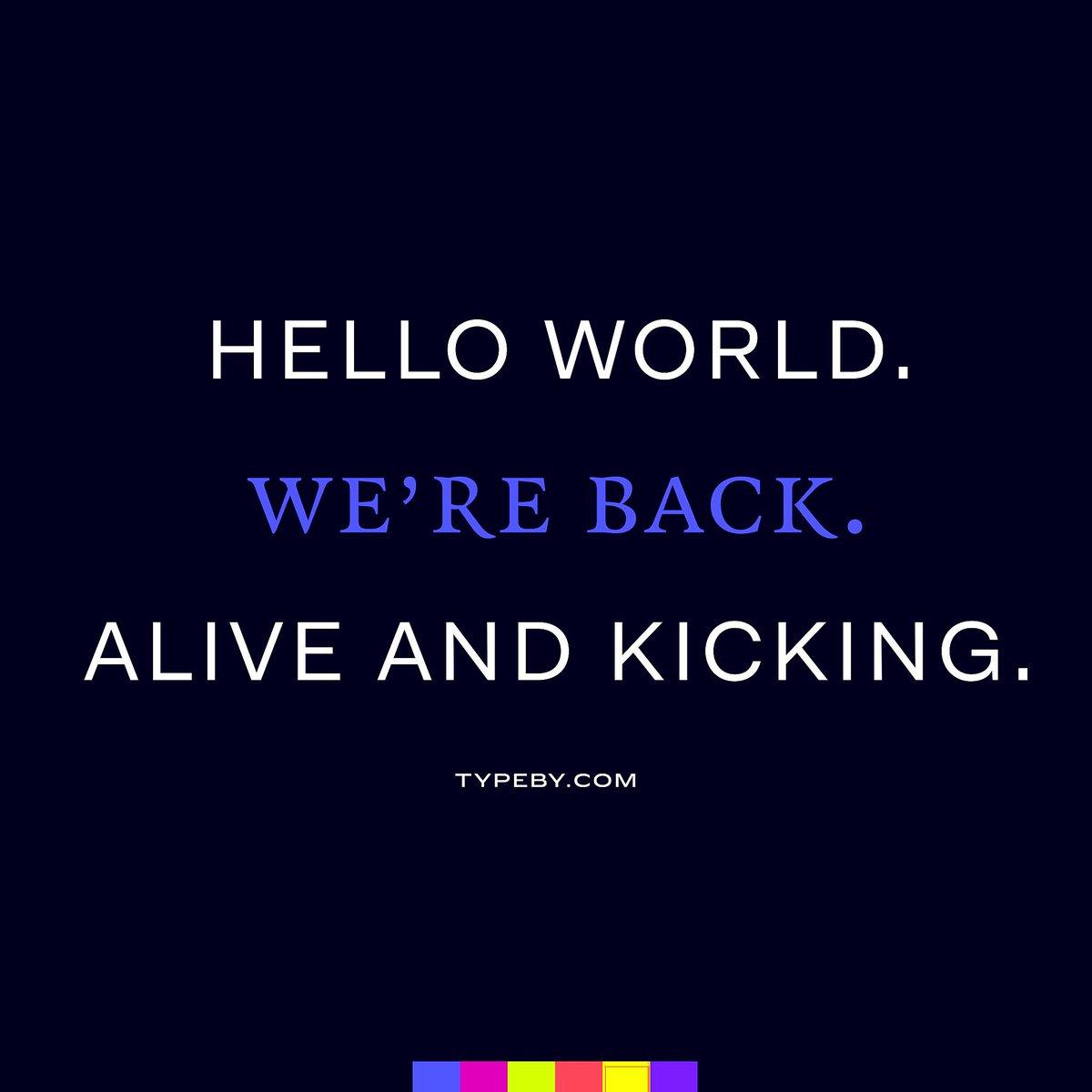
      TYPE BY font label website launched

      The new label by Fred Smeijers and Corina Cotorobai brings back typefaces originally published with the defunct OurType label.

      www.typeby.com

Our typography network

The type specimens of the world.
Discover the fonts from the Germany foundry FDI Type. A brand of Schriftkontor Ralf Herrmann.
Typografie.info – The German typography community
The best typography links of the week.
  • Add your content!

    We spread your news free of charge among a growing list of subscribers and tens of thousands of followers of our social media channels.
    Learn more about this
Watch our video course about font licensing.
×
×
  • Create New...

Important Information

We are placing functional cookies on your device to help make this website better.