Jump to content
Check out our typography channel on Instagram
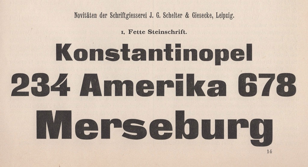
  • Imperial-era Germany’s definitive heavy sans

    Open the Link

    “The Danzig-based Francke typefoundry first advertised a heavy sans-serif typeface called Zeitungs-Grotesque in 1874. Their specimens for the typeface announced that other foundries could purchase duplicate matrices of its design. Many founders took Francke up on that offer: the Zeitungs-Grotesque design quickly became the most widely-distributed heavy sans serif in German-speaking Europe.”

    www.typeoff.de


    User Feedback

    Recommended Comments

    Yep that lowercase 's' is as ugly as !!! It looks like it came from a completely different font.


    • amusing 1
    Link to comment
    Share on other sites


    Create an account or sign in to comment

    You need to be a member in order to leave a comment

    Create an account

    Sign up for a new account in our community. It's easy!

    Register a new account

    Sign in

    Already have an account? Sign in here.

    Sign In Now

Our partners

The largest selection of professional fonts for any project. Over 130,000 available fonts, and counting.
Discover the Best Deals for Freelance Designers.
Discover the fonts from the Germany foundry FDI Type. A brand of Schriftkontor Ralf Herrmann.
Get to your apps and creative work. Explore curated inspiration, livestream learning, tutorials, and creative challenges.
Elfen-Fraktur—a monolinear blackletter typeface
×
×
  • Create New...

Important Information

We are placing functional cookies on your device to help make this website better.