-
Link suggestions
Suggested By Riccardo Sartori
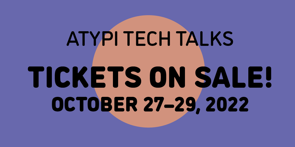
ATypI Tech Talks
ATypI Tech Talks is an event devoted to advances and innovation in technology, engineering, standards, formats, experimentation, tools, and other essential subjects related to type design, typography, font production, font formats, browsers, apps, web development, multiscript design, type education, type business, and more. ATypI Tech Talks will feature three days filled with presentations, panel discussions, workshops, and conversation.
10/27/2022 until 10/29/2022events.bizzabo.com

Suggested By Riccardo Sartori
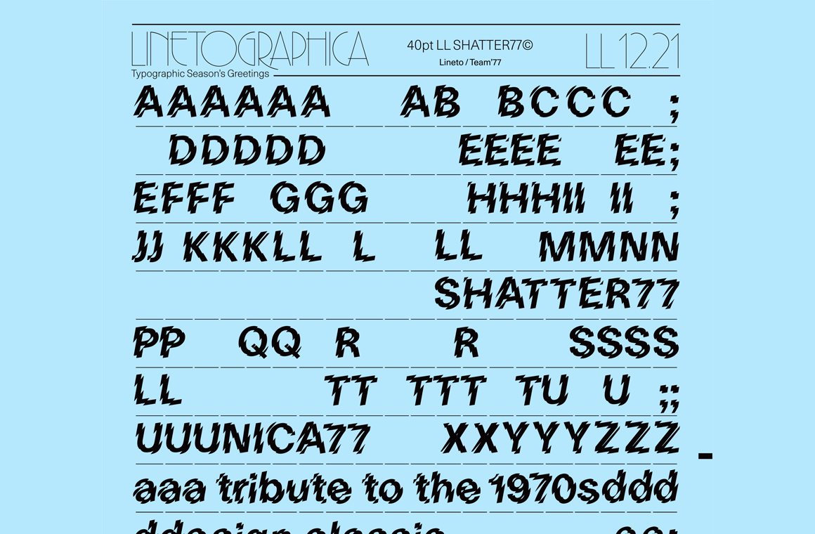
Seasonal gift: LL Shatter77
For a limited time, Swiss foundry Lineto is offering a free download of Shatter77, a design that applies the Shatter treatment to their Unica77.
until 12/31/2021lineto.com

Suggested By Riccardo Sartori
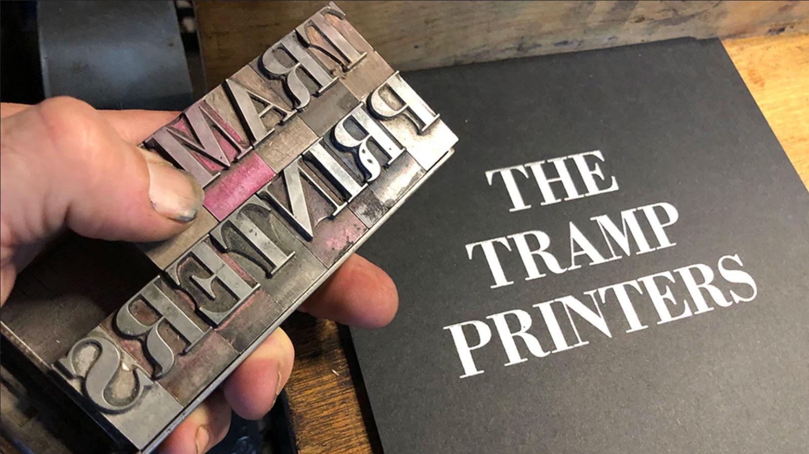
On Kickstarter: The Tramp Printers
“A tramp printer was a typesetting troubadour who came to town with a story in lieu of a song — an itinerant scholar and a master of the typecase. Carrying a union journeyman’s card and little else, these train-hopping typographers criss-crossed the continent by foot and rail for more than a century. To the tramp printers, freedom and the open road were far more valuable than material possessions.”
until 10/19/2021www.kickstarter.com

Suggested By Riccardo Sartori
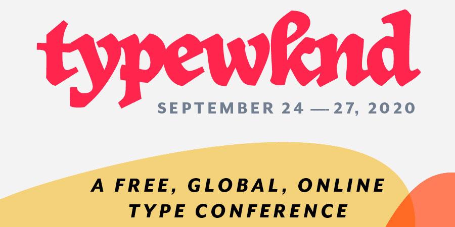
TypeWknd
A new, free, online-only type conference for those who see, draw, make, study, and sell type. Registrations are open.
typewknd.com

Suggested By Riccardo Sartori
It’s time to act
We ask the type and design industry
• to actively include more BIPOC
• to stop using the term Non-Latin
• to diversify education
• to challenge the practice of designing for scripts we did not grow up reading and writingwww.alphabettes.org

Suggested By Riccardo Sartori
Cymru Wales typefaces
“A contemporary font family designed to represent Wales to the world [...]. Whilst the bespoke typefaces take cues from the Welsh typographical heritage, special care was taken not to wander into the territory of pastiche or parody. All three commissions were developed in close collaboration with the Colophon Foundry with additional consultancy from Joseph Burrin.”
www.smorgasbordstudio.com

Suggested By Gecko
Letterform Archive on The Archive
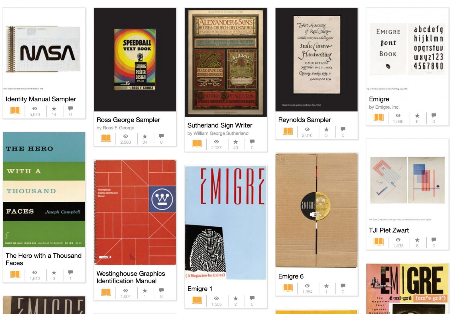
Archive of typography related magazines and other graphic design resources. The Letterform Archive is a non-profit library, museum, and educational institution dedicated to serving existing and potential practitioners, students, and admirers of the letter arts. Founded in 2014 and opened to the public in 2015, the San Francisco-based organization holds an extensive collection of 30,000 items ranging in age over 2,000 years.
archive.org
Suggested By Propaul
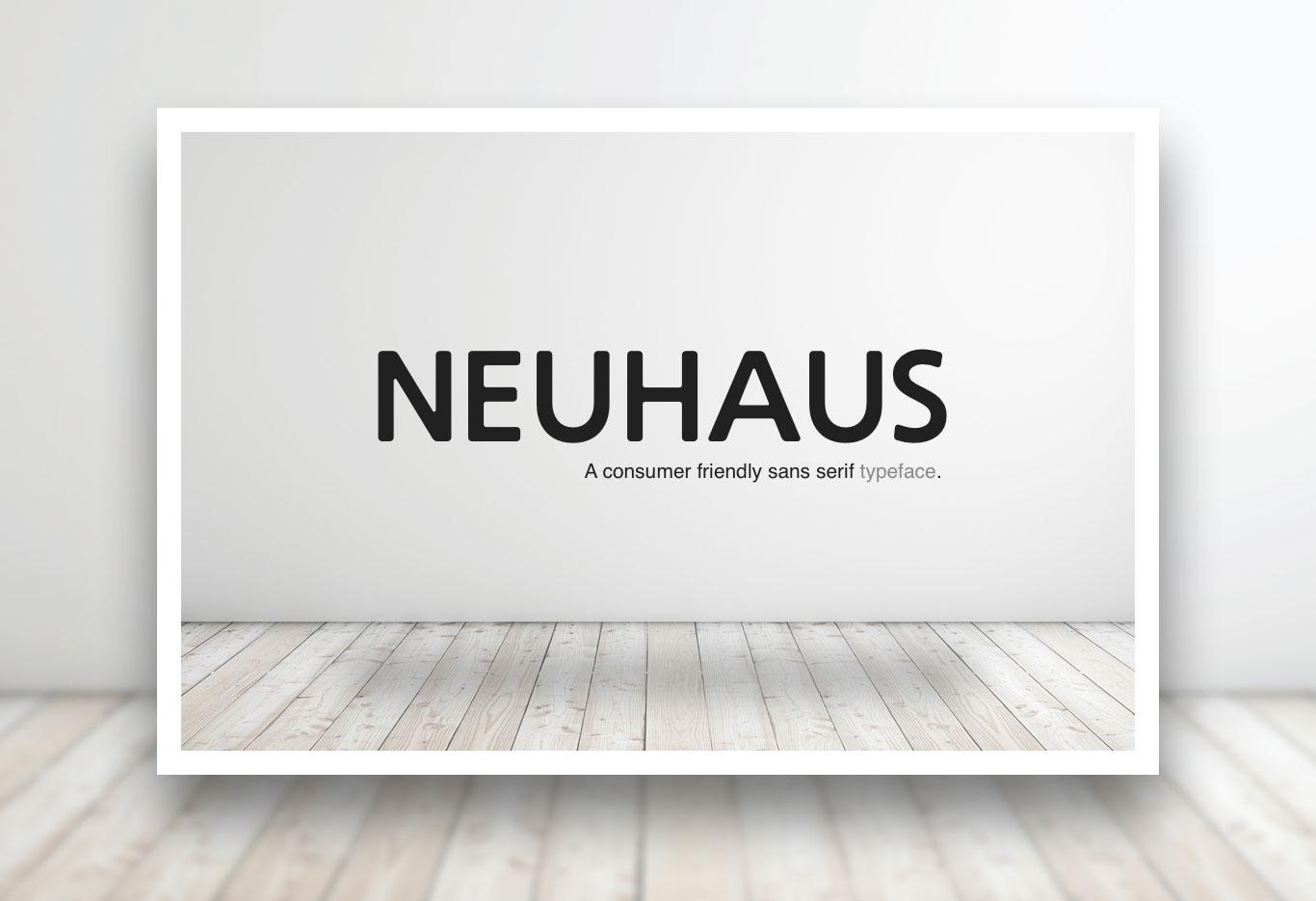
On Kickstarter: Neuhaus font
“I have built a new Font and in order to develop looking for backers on kickstarter to take this project to a finalised typeface.”
www.kickstarter.com
Suggested By RasmusTypeDesigner
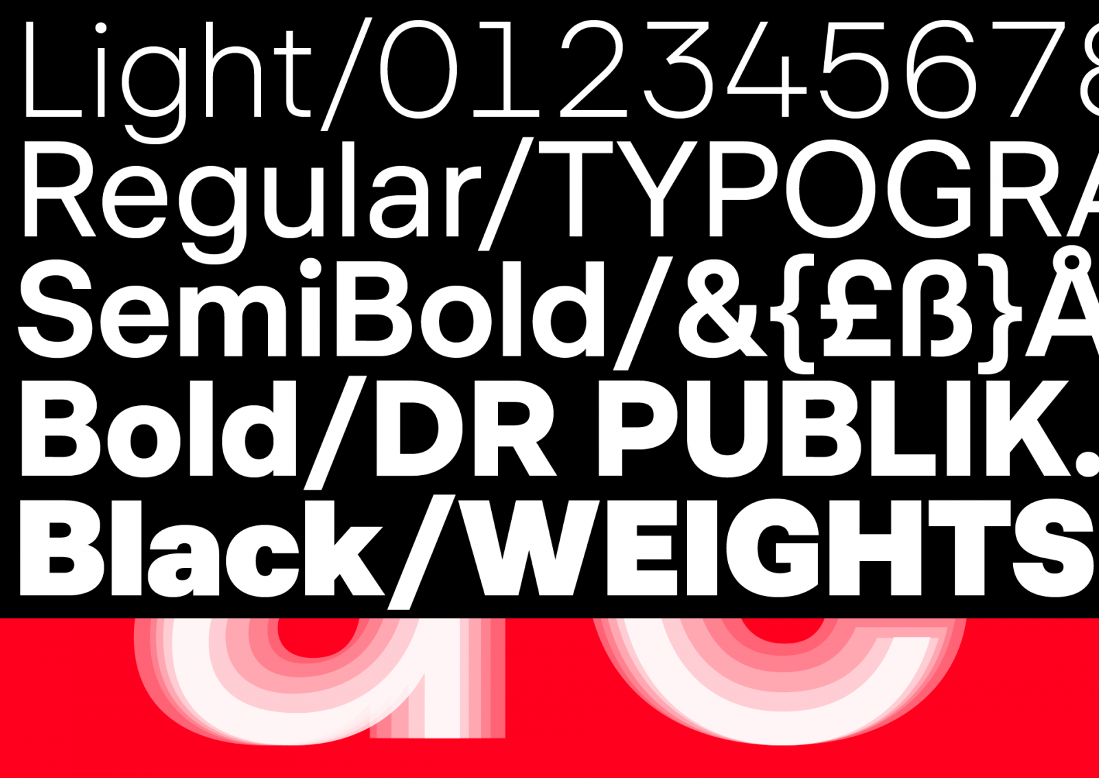
DR Publik — Type family for The Danish Broadcasting Corporation
The bespoke type family DR Publik is designed to strengthen legibility and ensure visual consistency on all platforms for millions of users. DR Publik will be used on TV channels, streaming platforms, news services, radio channels, websites, apps, concert hall, symphony orchestra, big band, choirs etc.
overtone.dk

Suggested By Riccardo Sartori
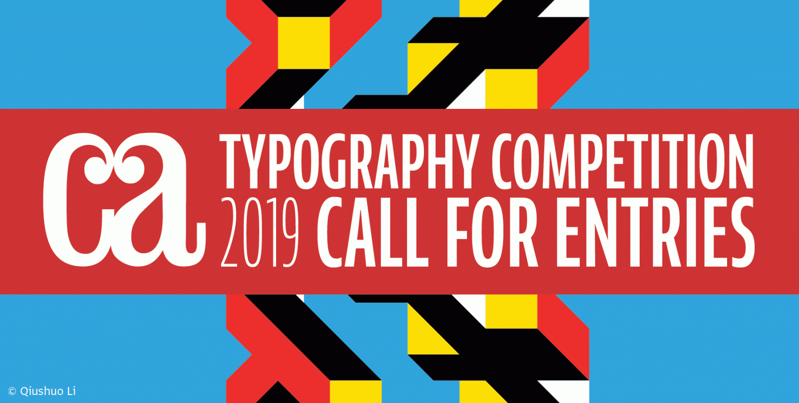
Communication Arts’ 2019 Typography Competition
“Our juried competition celebrates the best use of typography as the primary visual element in design and advertising, plus new typeface designs, calligraphy and hand lettering. Any typographic project first published or produced from September 2017 through September 2018 is eligible.”
www.commarts.com

Suggested By Rodrigo Saiani
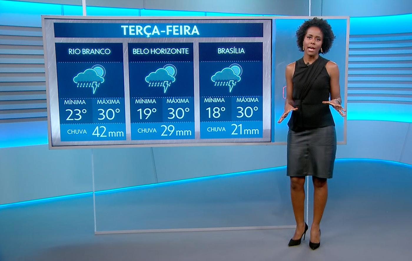
Globotipo - Rede Globo new custom type family designed by Plau
Making a typeface that one hundred million people see every day is no small task. Plau partnered with Rede Globo’s creative team to do just that. The result is Globotipo, a 3-style, 30-font super family created to refreshed and expand the typographic voice for Brazil’s ultimate broadcaster. Check out the video case above or scroll to learn more.
plau.co

Suggested By Nadia Papanikolaou
Patrick Slack and Jena Myung explore the art of type with accuracy
“Patrick Slack focuses on design influenced by art and technology. To showcase his work we chose to feature a collaboration that speaks volumes. “Fringe Intermission is an exploration of space using the city as medium” writes Slack.”
www.typeroom.eu

Suggested By Riccardo Sartori
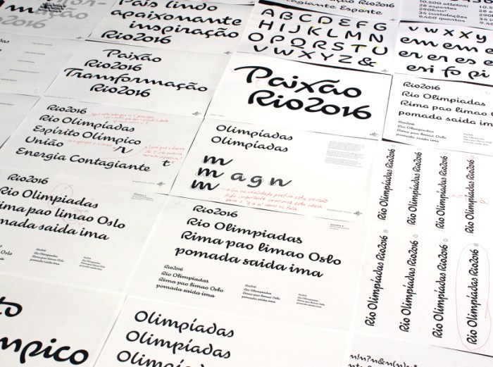
How The 2016 Olympic Logo and Font were Created
“Our prompt was that the font had to be an exact replica of the letters in the logo,” says Maag, who knew it would be a challenge due to its reverse creative process. “Usually you make the font and then do the logo,” he notes. Dalton Maag had 3 letters and 4 figures to use as a roadmap.
99u.com

Suggested By Riccardo Sartori
Alphabettes Mentorship Program
“Volunteers from our ranks or from outside the group will offer informal help to anyone who is looking for career, industry or educational guidance by professionals in the fields of type, typography, or the lettering arts.”
www.alphabettes.org

Suggested By Riccardo Sartori
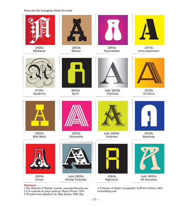
How typefaces impact your mood
A somewhat simplicistic introduction to the emotional elements conveyed by the visual design of typefaces.
www.itsnicethat.com

Suggested By Riccardo Sartori
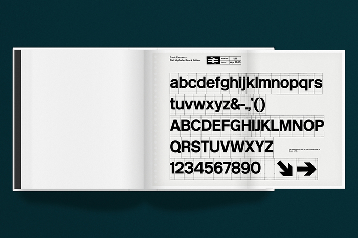
British Rail Corporate Identity Manual
After New York subway’s and NASA’s, here’s another reprint of a classic identity standards manual.
www.kickstarter.com

Suggested By Riccardo Sartori
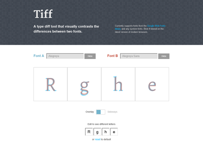
Type diff tool: Tiff
A type diff tool that visually contrasts the differences between two fonts.
tiff.herokuapp.com


