“Modern Cyrillic 2019 is an international type design competition. The aim is to get the objective evidence of the current state of Cyrillic type design and find the best examples of its development.”
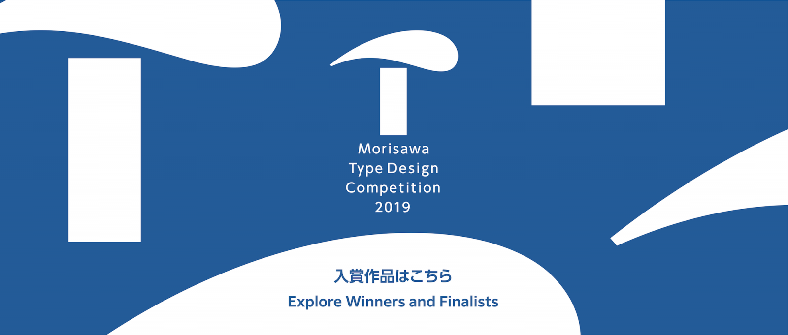
“Morisawa Type Design Competition 2019 was held to seek the most updated, unique, and challenging typefaces. We received 813 entry works from 53 countries (258 works for Japanese category, 555 works for Latin category). After the two days of intense evaluation, Gold prize, Silver prize, Bronze prize (one work each), and Honorable Mention (three works) were selected as Morisawa Award for both Kanji and Latin category.”
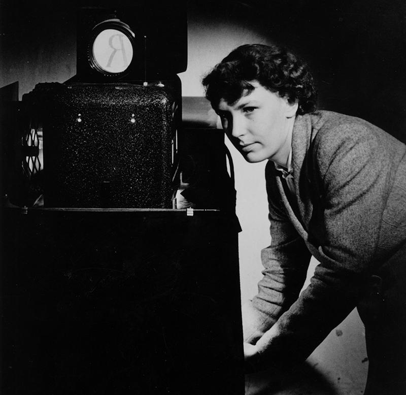
“It is with great sadness that our team has been informed that Patricia Saunders, former Monotype employee and designer of iconic typefaces such as Arial, Corsiva and Columbus, passed away last Tuesday 25 June 2019.”
“We are looking for the best Typeface Designs in nine script groups. Entries are possible in three categories to satisfy the wide range of multilingual typeface projects. To find the most excellent Non-Latin typefaces in the world, more than 60 international, well-known script experts will judge the entries in a three-level-process. This year the final jury meeting, the announcement of the winners and the celebration of the GRANSHAN GRAND PRIZE will take place during ATypI in Tokyo in September”
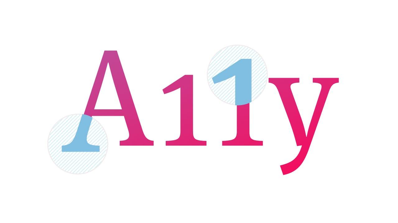
“How do we make sure that everyone can read the content of our website? And by everyone, I mean absolutely everyone. This includes people with impaired vision, reading disorders, colour blindness or anything that can often prevent them from reading comfortably.”
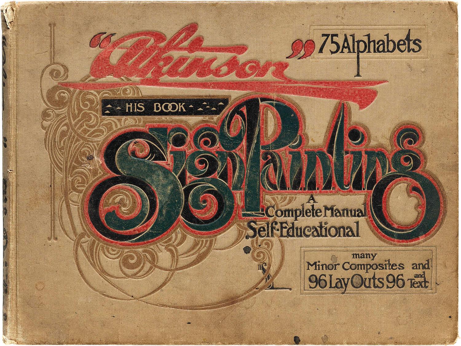
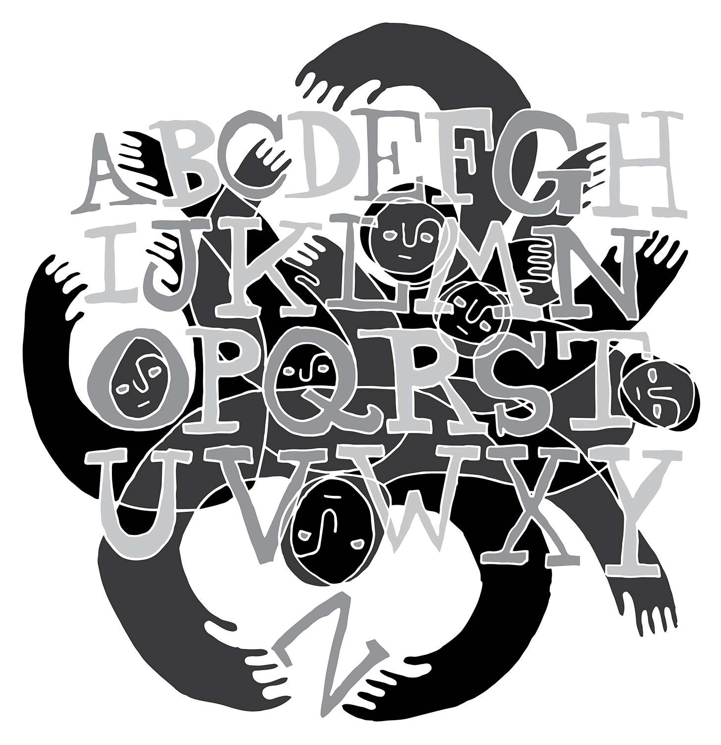
The diagrams, illustrations, models, and methods used to teach people how to make letters can be as engaging as the resulting letters themselves. Stephen Coles, the Archive’s Associate Curator & Editorial Director, explores a few highlights of instructional material spanning the last three centuries.
Monotype Imaging Holdings Inc., a developer of typefaces, is exploring its strategic options after receiving takeover interest from private equity firms, according to people with knowledge of the matter.
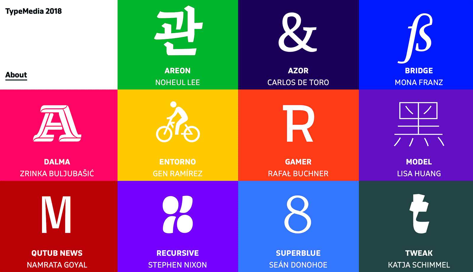
“The Master TypeMedia at the Royal Academy of Art, The Hague, NL, is a 10-month program that delves into type design and typography for different contexts including print, screens and interactive media.”
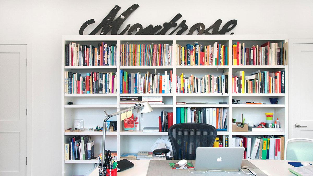
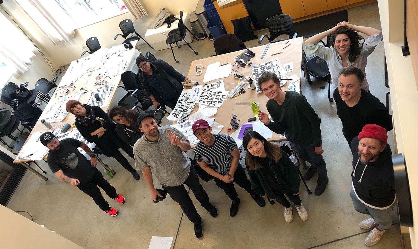
Applications for the 2019–20 Postgraduate Certificate in Type Design are open June 1–30. We’re launching the application period with an open house for prospective students. Pick the brains of Type West and Type@Cooper West grads, and see highlights from the Archive collection that will be on hand for next year’s course.
Brian LaRossa: “Typefaces are elemental enough to be taken for granted without consequence. Even graphic designers, who wield the work of type designers with great care, can become lulled by exposure into forgetting the years of learning and effort that lurk behind every letter.”
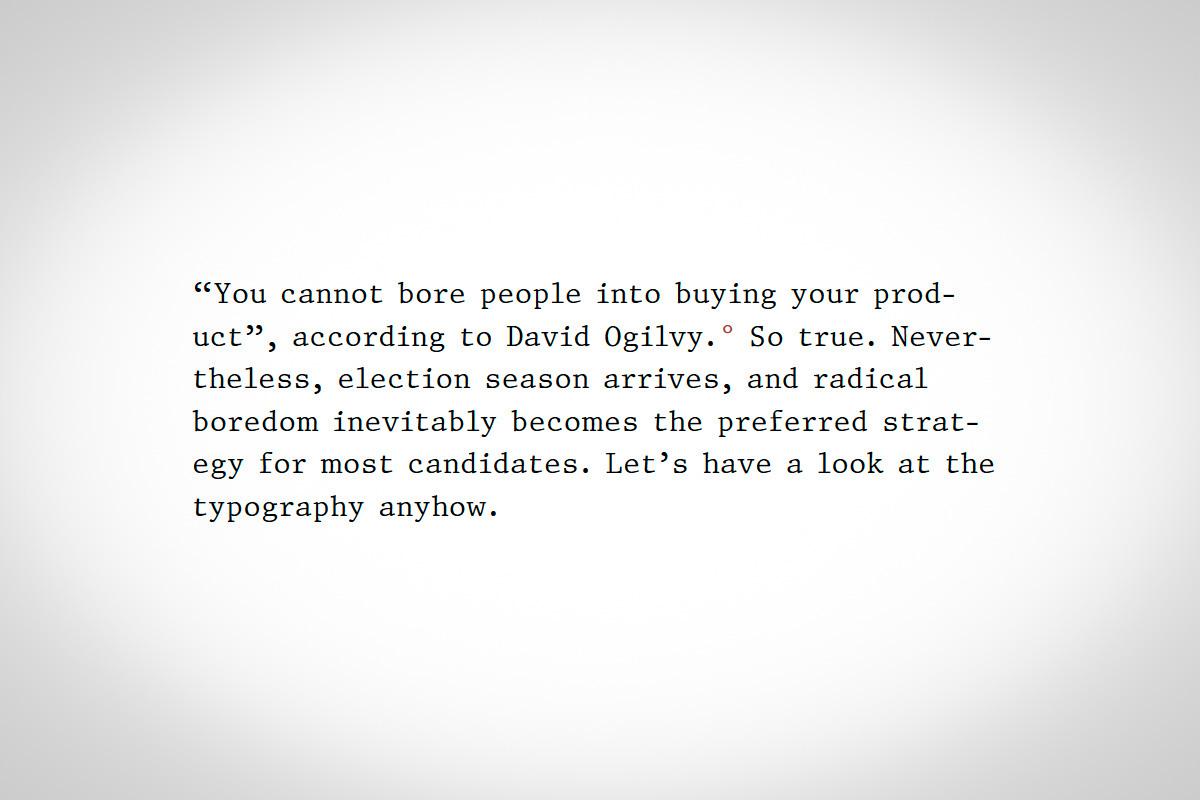
“Book publishers spend a lot on cover design. Candidates likewise spend a lot on their public presentation. Why? For the same reasons: voters (or readers) are going to make judgments based on design factors (whether consciously or not). So just as we should feel justified judging a book by its cover—because that’s what it’s for—we should likewise feel justified considering how typography reflects on each candidate.”
“To read Unicode’s own assessment, it sounds very much like the consortium would prefer to remove itself from the role of emoji arbiter by allowing anyone to send any characters they like, not only the emoji in the Unicode standard, as images embedded in their text.”