“Sources include early 20th century jobbing sanses like Morris Benton’s News Gothic and Candia, a 70s-era typewriter face Josef Müller-Brockmann designed for Olivetti.”
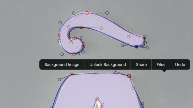
“Béziers is a vector editor for digitizing your lettering, sketches and other artwork. It’s designed with lettering artists in mind, with tools to help you trace your designs and produce smooth curves.”
“Welcome to our twelfth annual celebration of new type design. These are not necessarily the “best” typefaces, nor the most popular or top-selling (the big retailers already have that covered). What can be said is that each of these 2017 releases inspired at least one admirer among our distinguished group of designers, educators, and enthusiasts to take time away from their day jobs and pen their personal praises.”
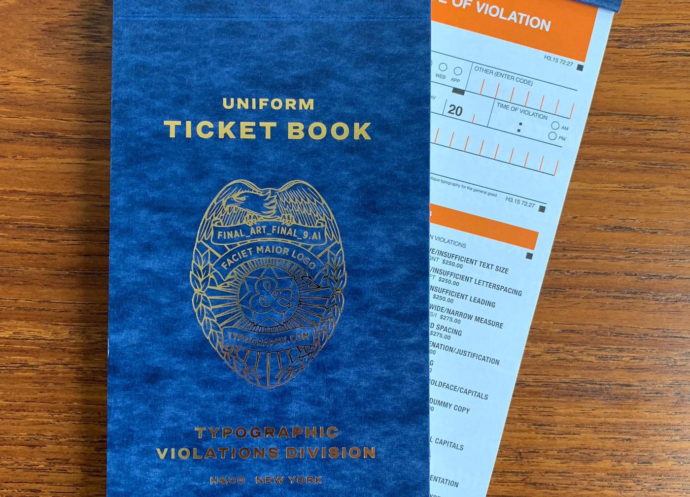
“By special issue from the 100% totally real Typographic Violations Division, the Uniform Ticket Book is standard equipment for the modern design enforcer. Lists thirty-two common design infractions, each with an appropriate penalty, with plenty of room for improvisation.”
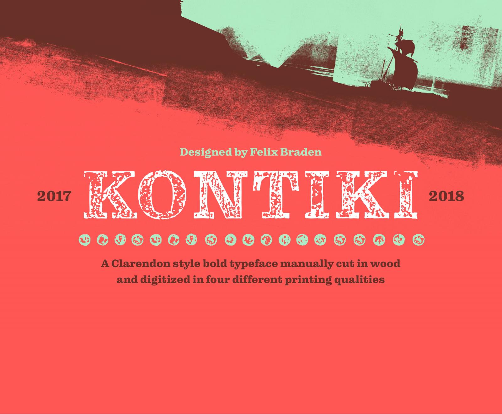
The Kontiki typeface digitally simulates a handmade woodprint, but is less expensive to produce and easier to correct. To create the Kontiki fonts, 193 glyphs were manually cut into five wooden plates and carefully printed by hand. From countless test prints, the most charming four were selected and digitized. For each of the 560 characters, the font features four different qualities of print and designer the possibility to create a printed image that is very close to a traditional woodcut.
“As Adobe Fonts, we are consolidating all previous Typekit plans into one streamlined service that gives you our complete library as part of all Creative Cloud plans.”
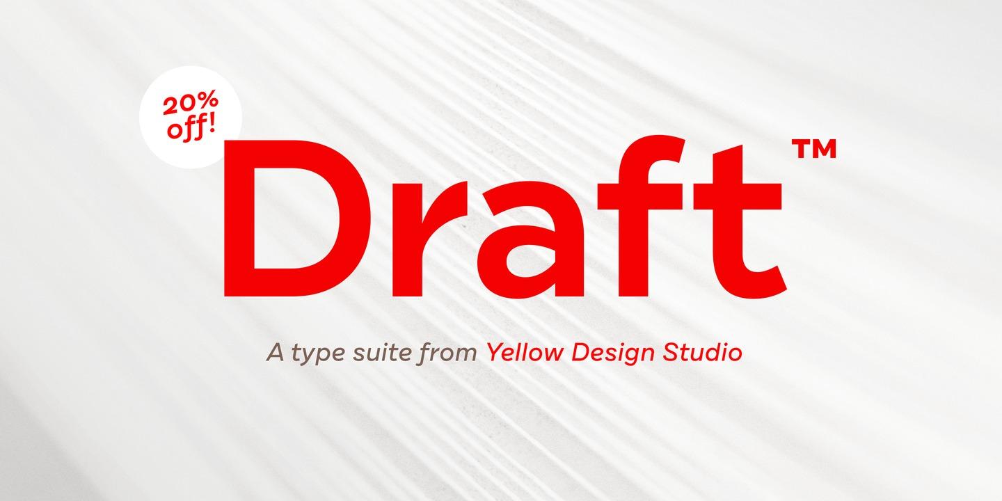
“Draft from Yellow Design Studio is a 144-font superfamily that features nine weights (Hairline to Black) and eight widths (A to H) for flexibility and fine-grain control.”
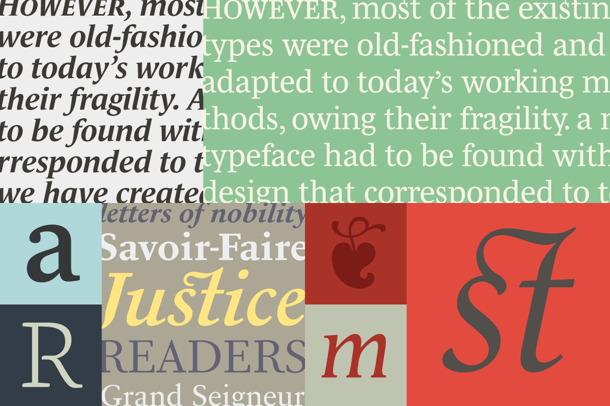
Bethany Heck: “Some of my favorite typographic pieces are the ones that use typography not only to deliver a message, but to serve as the compositional foundation that a design centers around. Letterforms are just as valuable as graphic elements as they are representations of language, and asking type to serve multiples roles in a composition is a reliable way to elevate the quality of your work.”
“A change was revealed earlier this year that would essentially delegitimize fonts as software, requiring “each line of the software code” to be written by the author. The development caused some type designers to wonder if US lawmakers might ever reconsider the question of whether a typeface design itself should be legally protected.”
“An exhibition curated by Keith Adams to celebrate the bicentenary Bodoni’s 1818 Manuale Tipografico together with a selection of his work from the previous 50 years.”
Held in the Layton Room at the St Bride Foundation from 2–12 October. Opening times are: Monday, Wednesday and Friday: 10.30–18.00pm; Tuesday and Thursday: 10.30–20.00pm; Saturday: 10.30–17.00pm.
Originally intended as a high-contrast companion for IvyJournal, Jan Maack’s IvyMode font dropped its serifs and picked up its own name. Now it’s ready to vogue.