Type Designer Mark Frömberg shares how important self-made program tools are to his type design practice. Together with TypeThursday founder Thomas Jockin, Mark goes into how you can start to integrate coding into how you make fonts, a brief discussion on Higher Order Interpolation (HOI) and finally do you need to know programing to make variable fonts.
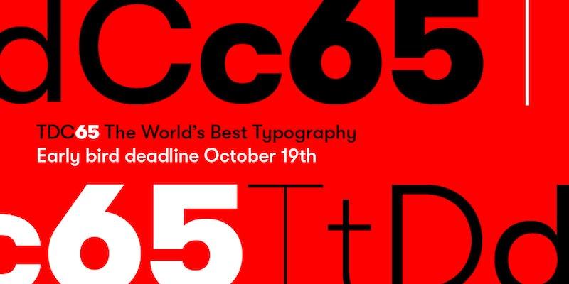
The 22nd Annual TDC Typeface Design Competition, and TDC65 Communication Design Competition, now with a student category, and discounted fees for residents of numerous countries. Also discounts for early registrations.
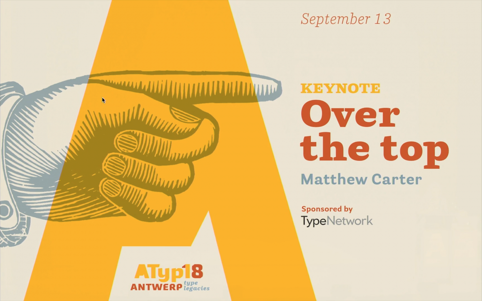
On the YouTube channel of the Association Typographique Internationale are being uploaded the videos of the speakers from the last ATypI in Antwerp, including Matthew Carter’s keynote.
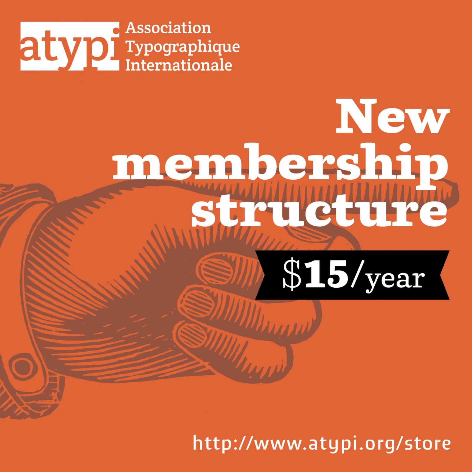
“As of today, #ATypI has a new, single membership fee for all individuals, globally: just $15 for an annual subscription, from whichever day in the year you sign up.”
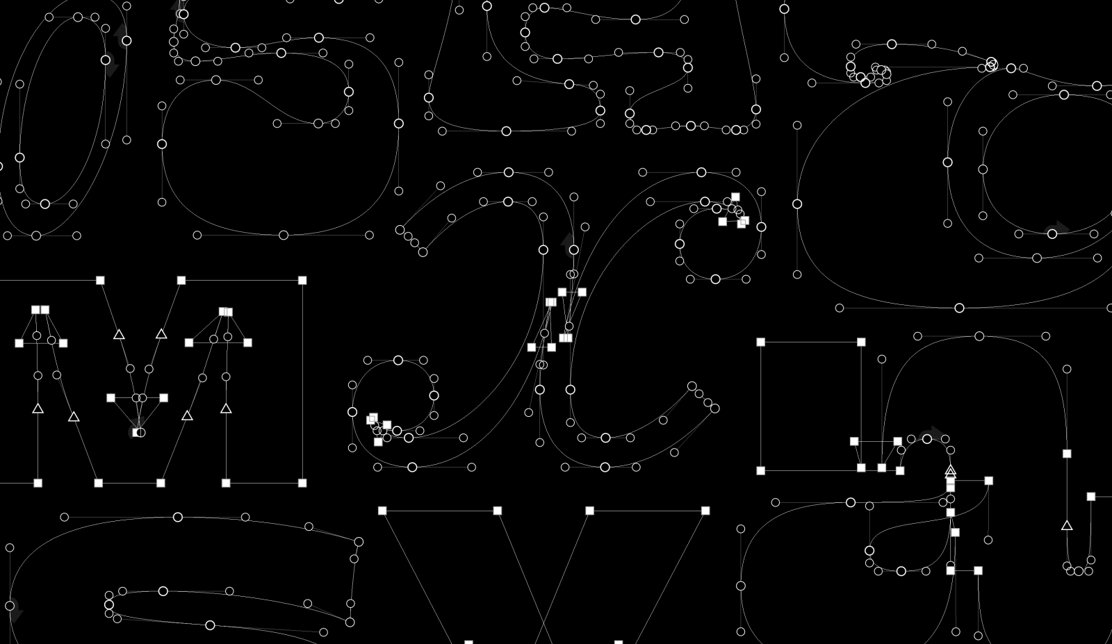
“There are even those who proudly display their drawings with points and handles visible to prove that their work is indeed technically immaculate. I don’t really get that, because the purpose of well-built vectors is to maintain efficient editability.”
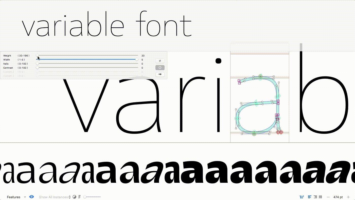
“Variable fonts are an evolution of the OpenType font specification that enables many different variations of a typeface to be incorporated into a single file, rather than having a separate font file for every width, weight, or style …”
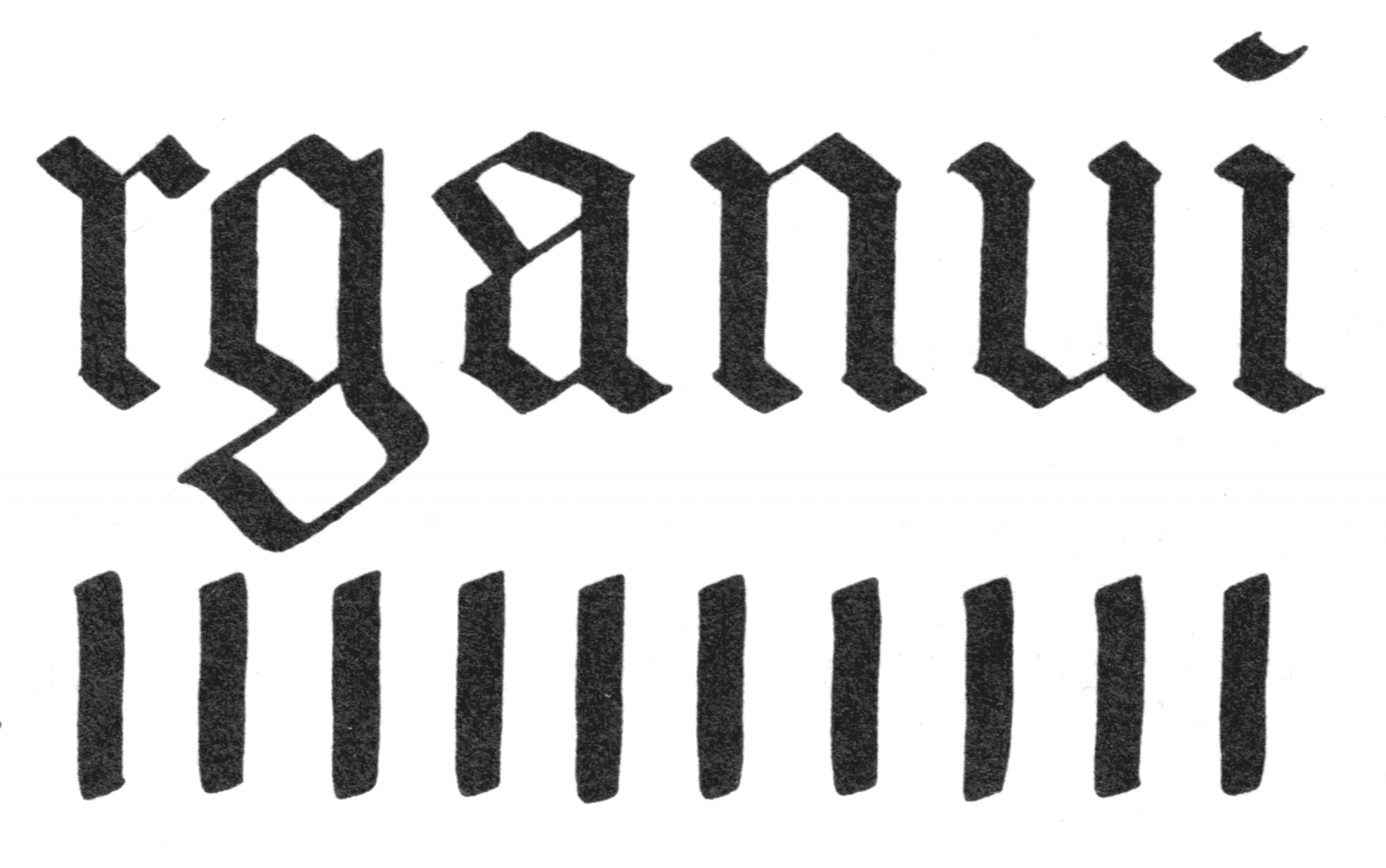
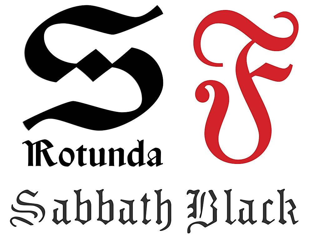
Since blackletter predates the invention of European printing, it is not surprising that blackletter is still popular with calligraphers and letterers. But what is blackletter’s appeal?
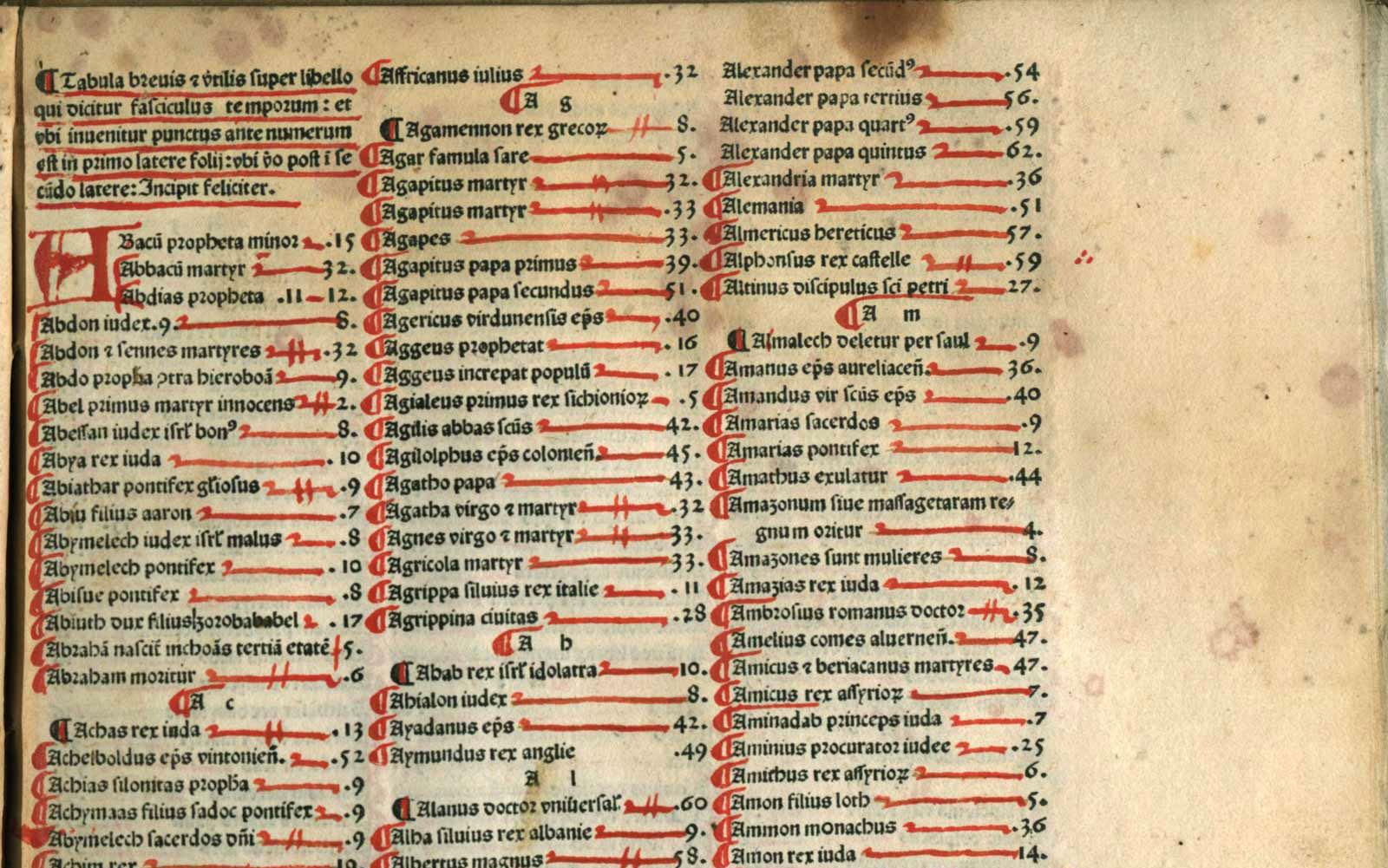
“The use of indexes dates back to Greco-Roman antiquity, with seeds of their origins found in the separate penned lists or summaries of books and chapter titles …”
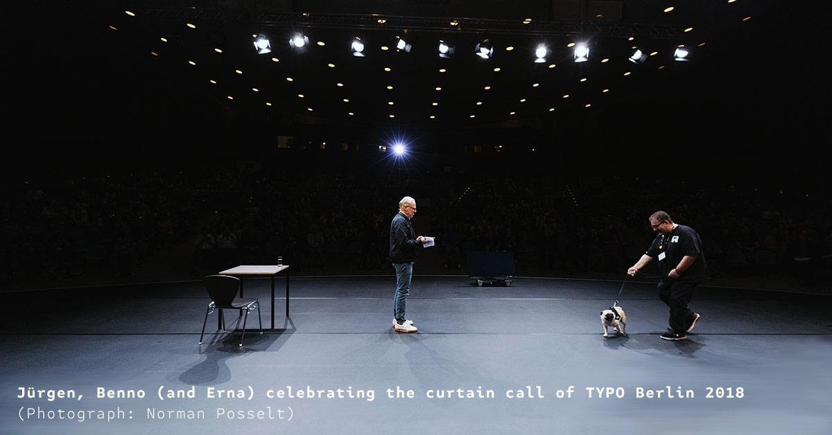
“Typically we would reach out to you at this time about next year’s TYPO Berlin. This year we have decided to take a new tact with our events going forward.”
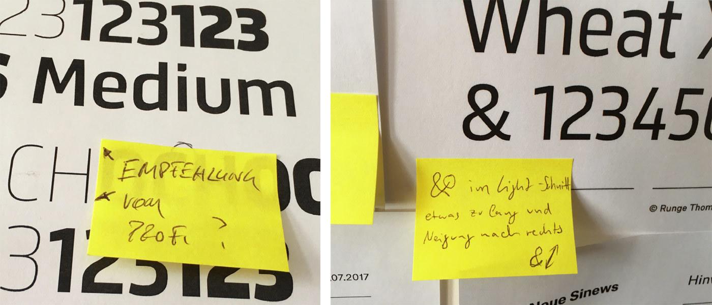
In 2017 the Regional Brands from BSH Hausgeräte GmbH needed a typeface fit for interface and information design. Thanks to them, TypeMates got to spend time looking again at one of Jakob Runge’s first designs, originally released in 2012. Working with the Regional Brands, it has been comprehensively re-mastered and trained for pan-European language support. It now stands a little straighter, its curves are a little more toned, it can stretch and flex in new ways.