Typography Books
74 directory entries in this category
-
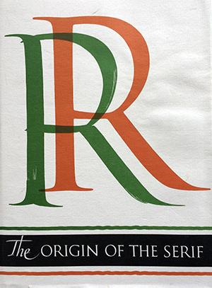
The Serif is the short cross stroke at the beginning and end of letter parts. Its origin in Roman inscription letters is one of the uncharted areas of paleography. In this book the author questions accepted theories as to the serif’s origin, and his own theory with skillful reasoning, detailed illustration, and epigraphic proof. Demand for copies of The Origin of the Serif has been constant since Fr. Catich published it in 1968. The information found there is not available elsewhere, and Ca
- Brush Writing & Roman Letters
-
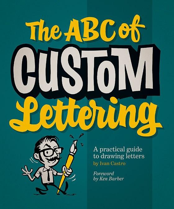
Need to produce a flyer? Want to draw up a logo for a band? Does your local speed shop need a T-shirt design? Don’t want to use the same old computer fonts? Well, let graphic designer and typography teacher Ivan Castro show you The ABC of Custom Lettering. This practical workbook features easy-to-follow, step-by-step guidance on hand drawing a range of letterforms, from Modern Roman and Gothic to Latin, Script, and Interlocked. It uses traditional instruction methods with a modern twist, and inc
-
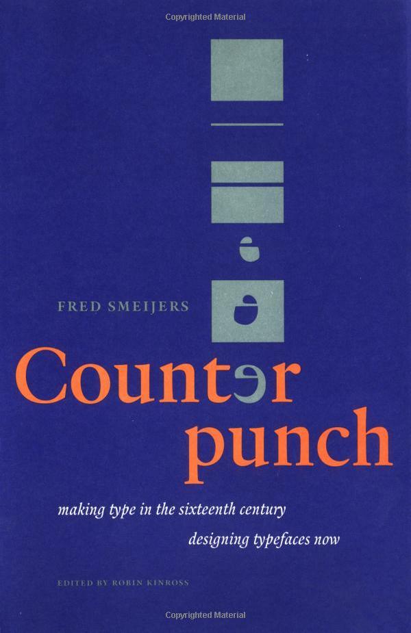
Counterpunch is both an explanation of the 16th-century method of cutting metal type and an impassioned plea for contemporary designers to incorporate the lessons of history as a means of creating typography in our digital age. Smeijers sees the counterpunch technique as essential for ensuring the regularity of form, repeatability, and speed of production necessary for rational design. Smeijers traces the history of letterform design to discover how technique influenced the shape of type, w
- Making Type in the 16th Century
-
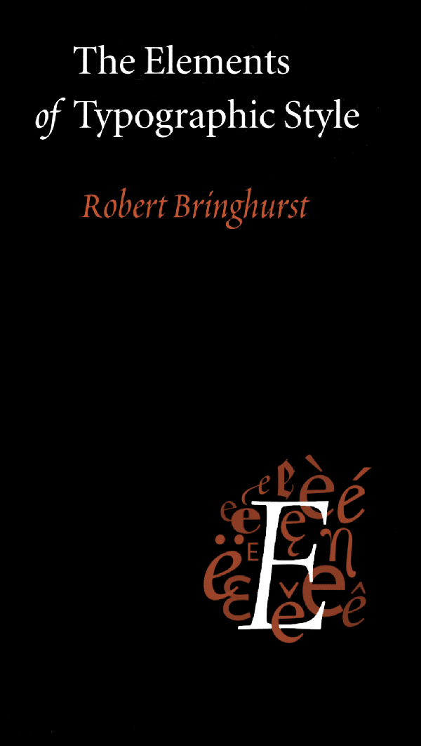
Renowned typographer and poet Robert Bringhurst brings clarity to the art of typography with this masterful style guide. Combining the practical, theoretical, and historical, this edition is completely updated, with a thorough revision and updating of the longest chapter, “Prowling the Specimen Books”, and many other small but important updates based on things that are continually changing in the field.
-
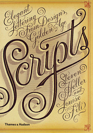
Seen in everything from wedding invitations and birth announcements to IOUs, menus, and diplomas, script typefaces impart elegance and sophistication to a broad variety of texts. Scripts never go out of style, and the hundreds of inventive examples here are sure to inspire today’s designers. Derived from handwriting, these are typefaces that are stylized to suggest, imply, or symbolize certain traits linked to writing. Their fundamental characteristic is that all the letters, more or less, touch
-
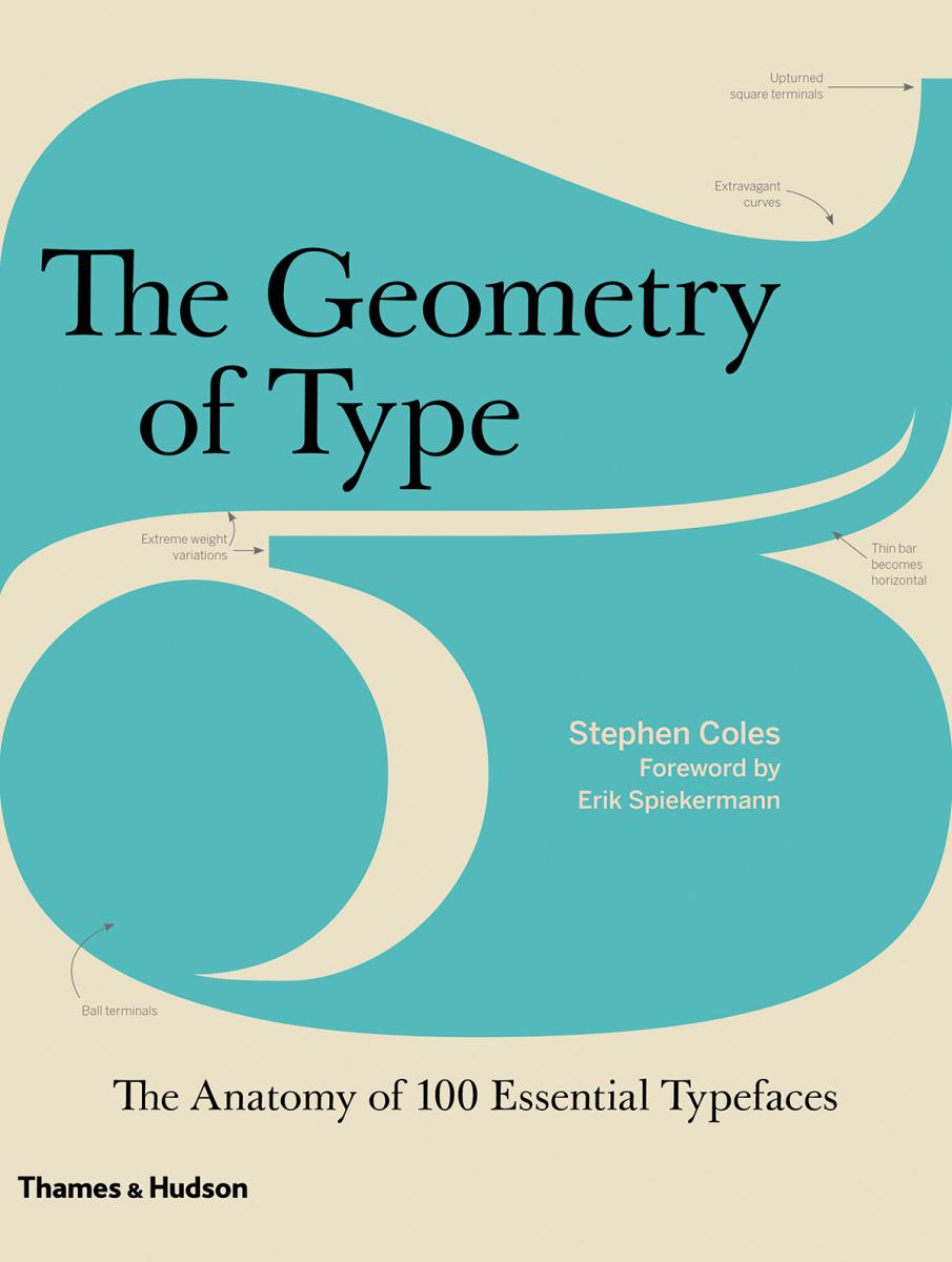
The Geometry of Type explores 100 traditional and modern typefaces in loving detail, with a full spread devoted to each entry. Characters from each typeface are enlarged and annotated to reveal key features, anatomical details, and the finer, often-overlooked elements of type design, which shows how these attributes affect mood and readability. Sidebar information lists the designer and foundry, the year of release and the different weights and styles available, while feature boxes explain the o
- A Graphic Guide to 100 Typefaces
-
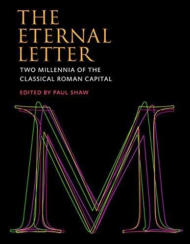
The fiftieth anniversary of Helvetica, the most famous of all sans serif typefaces, was celebrated with an excitement unusual in the staid world of typography and culminated in the release of the first movie ever made starring a typeface. Yet Helvetica’s fifty-year milestone pales in comparison with the two thousandth anniversary in 2014 of Trajan’s Column and its famous inscription — the preeminent illustration of the classical Roman capital letter. For, despite the modern ascendance of the san
-
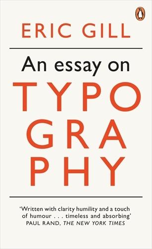
Eric Gill’s opinionated manifesto on typography argues that “a good piece of lettering is as beautiful a thing to see as any sculpture or painted picture”. This essay explores the place of typography in culture and is also a moral treatise celebrating the role of craftsmanship in an industrial age. Gill, a sculptor, engraver, printmaker and creator of many classic typefaces that can be seen around us today, fused art, history and polemic in a visionary work which has been hugely influential on m
-
This history of typography starts with the early years of the Enlightenment in Europe, around 1700. It was then that typography began to be distinct from printing. Instructional manuals were published, a record of the history of printing began to be constructed, and the direction of the printing processes was taken up by a new figure: the typographer. This starting point gives the discussion a special focus, missing from existing printing and design history. Modern typography is seen as more tha
- an essay in critical history
-
Helmut Salden Uncovered 1:1 is the first international monograph on Helmut Salden (1910–96), exploring his original sketches and working drawings. The material spans the years 1939 through 1970. In those years, Salden was the most celebrated Dutch lettering artist. All drawings are reproduced at actual size and reveal in detail his pursuit of the ultimate form. Helmut Salden Uncovered 1:1 by Mathieu Lommen & Karen Polder Language: English/German Pages: 80 Size: 16
-
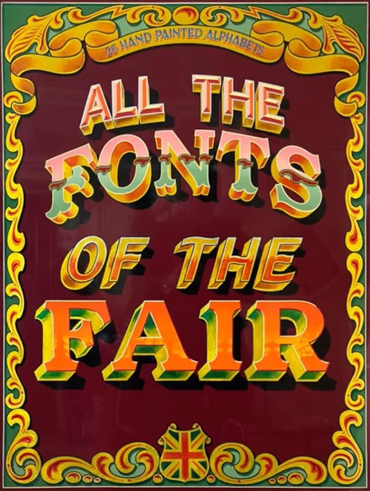
All the Fonts of the Fair, Joby Carter’s second book, takes a deep dive into fancy lettering styles found at traditional British fairgrounds up until the 1960s. Many of these vibrant, whimsical designs are missing from graphic design manuals and typography archives. This book helps continue their legacy and give them a new lease of life. This full colour book includes 26 hand drawn fairground inspired alphabets. Each alphabet has a reference guide with tips on how to accurately recreate the
-
Written and designed by poet, linguist, and typographer Robert Bringhurst, Palatino is a definitive account of Hermann Zapf’s most ambitious and enduring design project. This book provides a detailed and sumptuously illustrated history of the evolution of all members of the Palatino tribe: foundry Palatino, Linotype Palatino, Michelangelo, Sistina, Aldus, Heraklit, Phidias, American Palatino, Enge Aldus, Linofilm Palatino, Zapf Renaissance, PostScript Palatino, Palatino Nova, Aldus Nova, an
- The Natural History of a Typeface
-
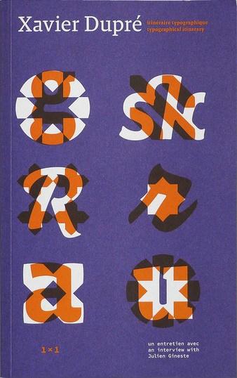
- itinéraire typographique / typographical itinerary
-
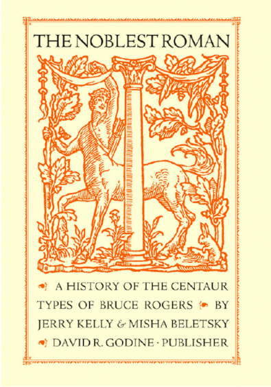
Bruce Rogers was a towering figure in the history of graphic arts, and remains one of the most important American book designers of the twentieth century. The unrivaled subtlety of his style also sets apart Rogers’s most widespread accomplishment, the Centaur type. This type was born of the late-nineteenth-century quest to create a modern revival of Nicolas Jenson’s humanist roman of 1470, long held by scholars to be both the origin and the apogee of the Venetian roman, and which has inspired de
- A History of the Centaur Types of Bruce Rogers
-
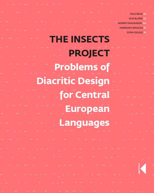
The Insects Project is a product of a collaborative research aimed at sharing knowledge about Central European typography and promoting design that is sensitive to the needs of all those who are unlucky enough to be native users of Czech, Hungarian, Polish and Slovak. Perhaps few users of “diacriticless” languages (such as e.g. English) realise how lucky they are to be able to choose from literally thousands of typefaces. Central Europeans, on the other hand, are nowhere near as spoiled for
- Problems of Diacritic Design for Central European Languages
-
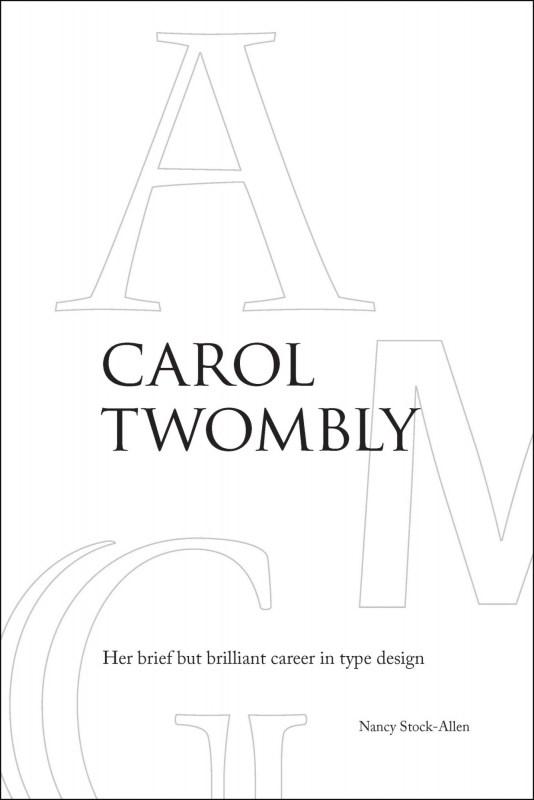
This study is a fascinating inside look at digital type design, the rather mysterious career of one of its most important practitioners, and the history and culture of Adobe Type, with additional insight into other type designers of the digital era. It is difficult to imagine a graphic designer in the last quarter century who is not familiar with at least some of Carol Twomblys typefaces. Yet many of those who use her fonts today would be hard pressed to name their designer. Twombly studied at t
- Her brief but brilliant career in type design
-
In 2016 type designer, software developer, and lecturer Frank E. Blokland successfully defended this PhD dissertation at Leiden University. Blokland’s research is conducted to test the hypothesis that Gutenberg and consorts developed a standardised and even unitised system for the production of textura type, and that this system was extrapolated for the production of roman type in Renaissance Italy. For roman type, Humanistic handwriting was moulded into a prefixed standardised system already dev
-
Dutch Alphabets is a portfolio containing 47 broadsides featuring new samples of lettering and writing by today’s most significant ‘Dutch’ lettering artists, type designers, calligraphers and sign painters. All the contributors are working and/or educated in the Netherlands. This collection of lettering has been compiled by Mathieu Lommen (University of Amsterdam) & Peter Verheul (Royal Academy of Art, The Hague), and was published in a limited edition. It showcases a wide variety of let
- compiled by Mathieu Lommen and Peter Verheul
-
Explorations in Typography is a vast collection of typesetting examples. Page after page, a brief article by Erik Spiekermann has been set in hundreds of ways in hundreds of typefaces, creating an extended visual taxonomy of typesetting that allows you to learn by looking. Beautifully printed and bound, with complete type specifications on every page and examples set in hundreds of faces (many from the FontFont library), the book is an extensive resource of typesetting ideas. The seco
- Mastering the Art of Fine Typesetting
-
The book contains 464 pages of in-depth history of the people, places, and products manufactured by the Mergenthaler Linotype Company. Frank Romano traces the history of corporate acquisitions, product development, and competing machines all with his usual wit and experience. He also writes about his own personal history working at Linotype starting in 1959. There are hundreds of color reproductions of advertisements, publications, photographs, and typeface specimens. It also includes 120 pages
-
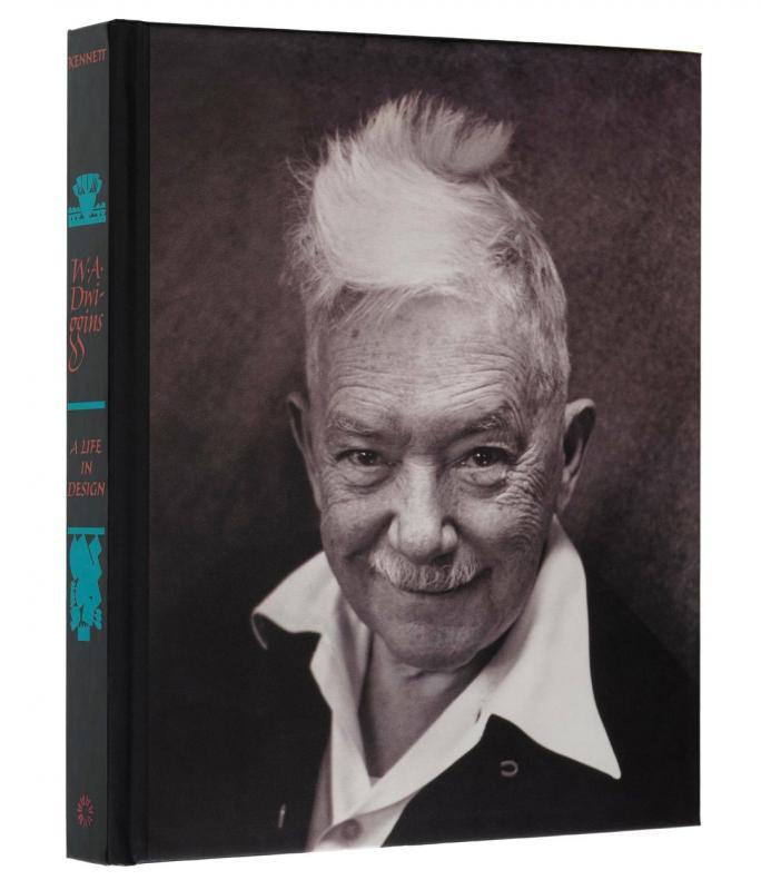
Often credited with inventing the term "graphic design," W. A. Dwiggins was a quintessential maker — fabricating his own tools, inventing techniques, and experimenting with design in areas as wide-ranging as modular ornament, stamps, currency, books, kites, marionettes, and theatrical sets and lighting. More than any of his contemporaries, he united the full range of applied arts into a single profession — designer. Despite this, a thorough study of Dwiggins has never been published. Until now.
-
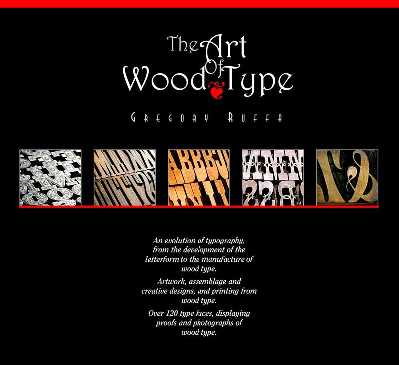
330 pages filled with the history of alphabet, the anatomy of the letterform, and how wood type was made. Personal stories from artists, typographic designers, the new uses of wood type in printing from two university professors, and the story of the world’s largest collector of wood type, Leo Kaplan, the Grandfather of the wood type collage and Dave Greer, the largest collector of rare wood and metal type. The book is not available in stores, but can be ordered via [email protected]
-
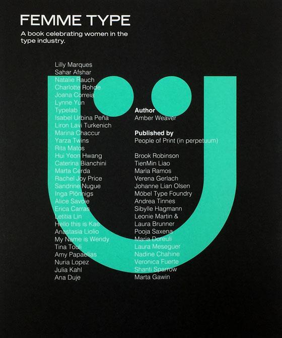
Femme Type is an all-female publication conceptualised by ex-University of Arts London Chelsea attendant Amber Weaver aiming to celebrate over 40 skilled, international women in the type industry. The mission is to create a valuable stage and platform for designers to showcase their typographic achievements wrapped up in a printed format. Includes contributions from over 40 international women Foreword by GoodType Founder Brooke Robinson 272 pages + 4pp Cover / 25cm x 21c
- A book celebrating women in the type industry
-
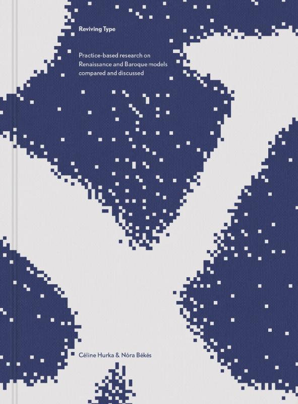
Reviving Type is a book by Céline Hurka and Nóra Békés. Two studies, that started as a university course assignment and developed into an independent design-research, are woven together into one volume: one about the Renaissance letters of Garamont and Granjon, the other about the Baroque types of Nicholas Kis. The publication guides the reader from finding original sources in archives, through historical investigation and design process to the finished typeface. The first part of the book provi
- Practice-based research on Renaissance and Baroque models compared and discussed