Jump to content
Check out our typography channel on Instagram
  • Counterpunch

    2,202 views

    (0 reviews)

    Counterpunch is both an explanation of the 16th-century method of cutting metal type and an impassioned plea for contemporary designers to incorporate the lessons of history as a means of creating typography in our digital age. Smeijers sees the counterpunch technique as essential for ensuring the regularity of form, repeatability, and speed of production necessary for rational design.

    Smeijers traces the history of letterform design to discover how technique influenced the shape of type, whether the metal punches of the past or today's computer-generated forms. Counterpunch is generously illustrated with drawings by the author, examples of early type specimens, and detailed photographs of punches.
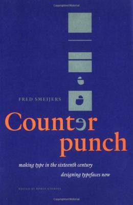
    ❝Making Type in the 16th Century❞
    1997
    by: Fred Smeijers
    Publisher: Hyphen Press
    ISBN: 978-0907259060
    Amazon search
    Abebook search


    User Feedback

    Create an account or sign in to leave a review

    You need to be a member in order to leave a review

    Create an account

    Sign up for a new account in our community. It's easy!

    Register a new account

    Sign in

    Already have an account? Sign in here.

    Sign In Now

    There are no reviews to display.


Graublau Slab Pro: The expressive addition to the Graublau Sans family.
×
×
  • Create New...

Important Information

We are placing functional cookies on your device to help make this website better.