Typography Books
74 directory entries in this category
-
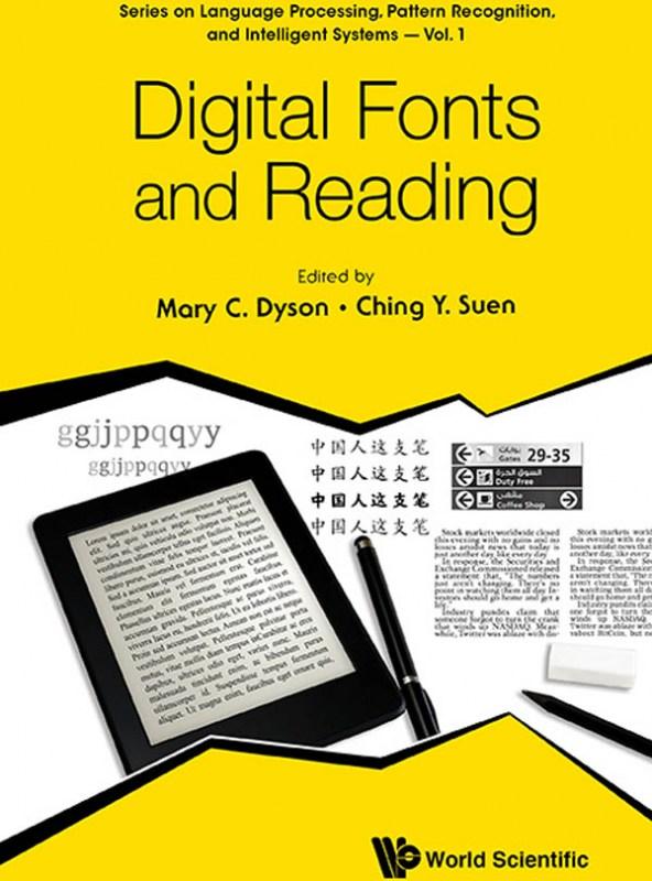
The book is a collection of invited chapters by renowned experts and is part of a series on Language Processing, Pattern Recognition, and Intelligent Systems. The content is wide-ranging, encompassing perspectives from computer science to social science to design and reflecting the considerable experience of researchers, teachers and practitioners. This diversity offers rigorous approaches to the topic of Digital fonts and reading, organised in four sections: vision and reading; scientific appro
-
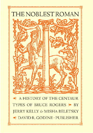
Bruce Rogers was a towering figure in the history of graphic arts, and remains one of the most important American book designers of the twentieth century. The unrivaled subtlety of his style also sets apart Rogers’s most widespread accomplishment, the Centaur type. This type was born of the late-nineteenth-century quest to create a modern revival of Nicolas Jenson’s humanist roman of 1470, long held by scholars to be both the origin and the apogee of the Venetian roman, and which has inspired de
- A History of the Centaur Types of Bruce Rogers
-
The Insects Project is a product of a collaborative research aimed at sharing knowledge about Central European typography and promoting design that is sensitive to the needs of all those who are unlucky enough to be native users of Czech, Hungarian, Polish and Slovak. Perhaps few users of “diacriticless” languages (such as e.g. English) realise how lucky they are to be able to choose from literally thousands of typefaces. Central Europeans, on the other hand, are nowhere near as spoiled for
- Problems of Diacritic Design for Central European Languages
-
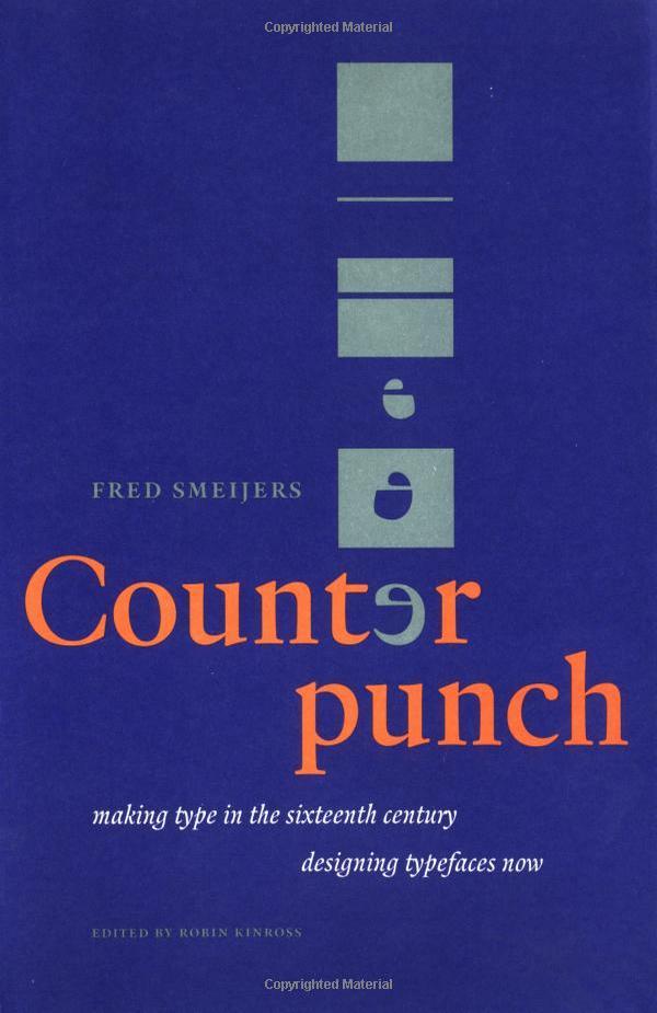
Counterpunch is both an explanation of the 16th-century method of cutting metal type and an impassioned plea for contemporary designers to incorporate the lessons of history as a means of creating typography in our digital age. Smeijers sees the counterpunch technique as essential for ensuring the regularity of form, repeatability, and speed of production necessary for rational design. Smeijers traces the history of letterform design to discover how technique influenced the shape of type, w
- Making Type in the 16th Century
-
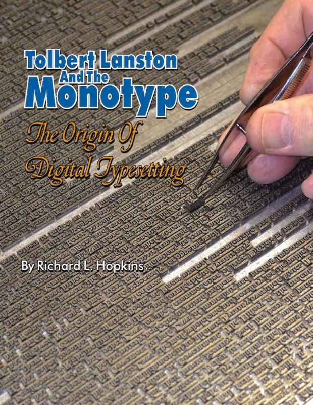
This special hardback edition is limited to 300 copies. It includes a 24-page Monotype letterpress keepsake booklet, Going with Goudy to Philadelphia, composed, printed in several colors, and signed by Richard Hopkins. Tolbert Lanston and the Monotype is printed in full color, with more than three hundred photos and illustrations, 232 pages, plus several appendices and index. Tolbert Lanston, at the end of the nineteenth century, was a man obsessed with the idea of creating a machine which wo
- The Origin of Digital Typesetting
-
This study is a fascinating inside look at digital type design, the rather mysterious career of one of its most important practitioners, and the history and culture of Adobe Type, with additional insight into other type designers of the digital era. It is difficult to imagine a graphic designer in the last quarter century who is not familiar with at least some of Carol Twomblys typefaces. Yet many of those who use her fonts today would be hard pressed to name their designer. Twombly studied at t
- Her brief but brilliant career in type design
-
In 2016 type designer, software developer, and lecturer Frank E. Blokland successfully defended this PhD dissertation at Leiden University. Blokland’s research is conducted to test the hypothesis that Gutenberg and consorts developed a standardised and even unitised system for the production of textura type, and that this system was extrapolated for the production of roman type in Renaissance Italy. For roman type, Humanistic handwriting was moulded into a prefixed standardised system already dev
-
Explorations in Typography is a vast collection of typesetting examples. Page after page, a brief article by Erik Spiekermann has been set in hundreds of ways in hundreds of typefaces, creating an extended visual taxonomy of typesetting that allows you to learn by looking. Beautifully printed and bound, with complete type specifications on every page and examples set in hundreds of faces (many from the FontFont library), the book is an extensive resource of typesetting ideas. The seco
- Mastering the Art of Fine Typesetting
-
The fiftieth anniversary of Helvetica, the most famous of all sans serif typefaces, was celebrated with an excitement unusual in the staid world of typography and culminated in the release of the first movie ever made starring a typeface. Yet Helvetica’s fifty-year milestone pales in comparison with the two thousandth anniversary in 2014 of Trajan’s Column and its famous inscription — the preeminent illustration of the classical Roman capital letter. For, despite the modern ascendance of the san
-
Eric Gill’s opinionated manifesto on typography argues that “a good piece of lettering is as beautiful a thing to see as any sculpture or painted picture”. This essay explores the place of typography in culture and is also a moral treatise celebrating the role of craftsmanship in an industrial age. Gill, a sculptor, engraver, printmaker and creator of many classic typefaces that can be seen around us today, fused art, history and polemic in a visionary work which has been hugely influential on m
-
This history of typography starts with the early years of the Enlightenment in Europe, around 1700. It was then that typography began to be distinct from printing. Instructional manuals were published, a record of the history of printing began to be constructed, and the direction of the printing processes was taken up by a new figure: the typographer. This starting point gives the discussion a special focus, missing from existing printing and design history. Modern typography is seen as more tha
- an essay in critical history
-
Responsive web design helps your site maintain its design integrity on a variety of screen sizes, but how does it affect your typography? With this practical book, graphic designers, web designers, and front-end developers alike will learn the nuts and bolts of implementing web fonts well, especially how to get the best appearance from type without sacrificing performance on any device. After examining typography fundamentals and the evolution of type on the Web, author Jason Pamental provi
- Using Type Well on the Web
-
Fifty Type Specimens is a collection of postcards with typographic images, for inspiration, correspondence, or display. Cards feature classic letterforms, pages from specimen books, and crops of letters presented in a box with the feel of an old specimen book. Historic typefaces, selected by renowned designer Tobias Frere-Jones, are organized into four geographic categories by thumb tabs: Germany, France, United States, and the United Kingdom.
-
Theory of Type Design by type designer Gerard Unger is a comprehensive theory of typeface design. This volume consists of 24 chapters, each describing a different aspect of type design, from the influence of language to today’s digital developments, from how our eyes and brain process letterforms to their power of expression. This book includes more than 200 illustrations and practical examples that illuminate the theoretical material. The terminology is explained in the volume’s extensive gl
-
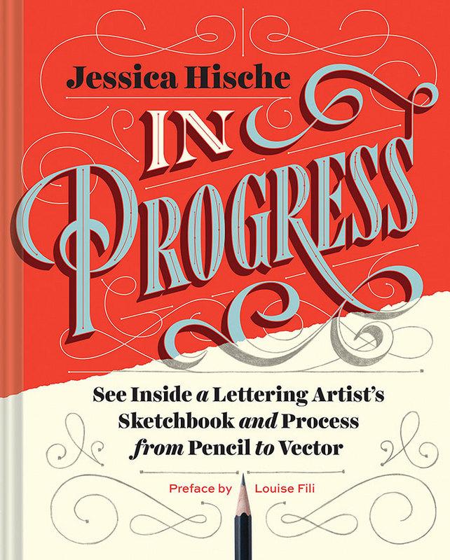
This show-all romp through design-world darling Jessica Hische’s sketchbook reveals the creative and technical process behind making award-winning hand lettering. See everything, from Hische’s rough sketches to her polished finals for major clients such as Wes Anderson, NPR, and Starbucks. The result is a well of inspiration and brass tacks information for designers who want to sketch distinctive letterforms and hone their skills. With more than 250 images and metallic silver ink printed th
- See Inside a Lettering Artist’s Sketchbook and Process
-
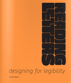
Sofie Beier from Denmark holds a PhD from the Royal College of Art in London. Her research focuses on typeface legibility, aiming at a better understanding of how different typefaces and letter shapes can influence the reading process. Her book “Reading Letters—designing for legibility” tries to bridge the gap between scientific research and applied graphic and type design. The purpose of the book is to support type designers in creating legible typefaces and help graphic designers to deter
- Designing for Legibility
-
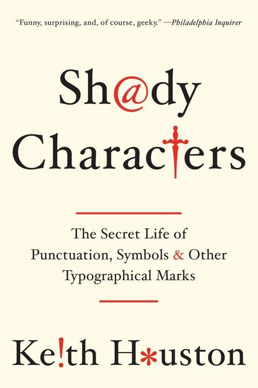
Shady Characters: The Secret Life of Punctuation, Symbols, & Other Typographical Marks (USA), or Shady Characters: Ampersands, Interrobangs and Other Typographical Curiosities (UK), is an illustrated companion book of the website Shady Characters: The secret life of punctuation. “Shady Characters weaves a fascinating trail across the parallel histories of language and typography. Whether investigating the asterisk (*) and dagger (†)—which alternately illuminated and skewered heretical v
-
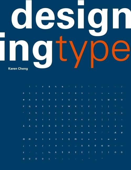
“One of the most essential tools of graphic design, typography influences the appearance of visual print materials perhaps more than any other component. This essential book explains the processes behind creating and designing type. Author Karen Cheng discusses issues of structure, optical compensation, and legibility, with special emphasis given to the often overlooked relationships between letters and shapes in font design. The book is illustrated with numerous diagrams that demonstrate visual
-
Learn FontLab Fast; A Simplified Guide to Creating Fonts with FontLab, TypeTool, ScanFont and AsiaFont Studio covers versions 4.6 and 5.0 of FontLab. It has been written to enable users to dramatically cut down the learning curve required to master FontLab and its sister programs, TypeTool and AsiaFont Studio. Author and designer Leslie Cabarga (who also wrote The Logo Font & Lettering Bible) packed Learn FontLab Fast with illustrations, diagrams and screenshots, and cut the text to a minimu
-
Arcade Game Typography presents readers with a fascinating new world of typography: the pixel typeface. Video game designers of the ’70s, ’80s, and ’90s faced color and resolution limitations that stimulated incredible creativity. With each letter having to exist in a small pixel grid, artists began to use clever techniques to create elegant character sets within a tiny canvas. This book presents typefaces on a dynamic and decorative grid, taking reference from high-end type specimens while addi
- The Art of Pixel Type
-
How were the first fonts made? Who invented italics? When did we work out how to print in color? Typographic Firsts charts the formative early history of the printed or typographic book. Many of the standard features of the printed book were designed by pioneering typographers and printers in the latter half of the fifteenth century. Although Johannes Gutenberg is credited with printing the first books with moveable type, at the height of the Renaissance printers and publishers found innova
- Adventures in Early Printing
-
The Evolution of Type takes the reader on a journey through the development of type design and typographic style from the mid-15th century to the present day, by way of 100 typefaces. Chosen to represent the key elements of style and form used by the punch cutters, calligraphers and designers of their day, and presented in chronological order according to release date, each typeface is discussed in terms of its origins and its impact on the design and print industry, and latterly the additional
- A Graphic Guide to 100 Landmark Typefaces
-
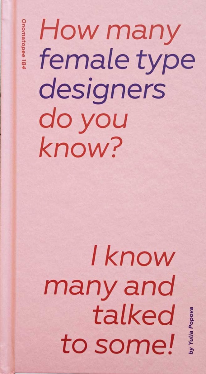
This book aims to shine light on work of women in type. The first part of the book offers research on the gender issue in type design field. It includes statistics, data and an overview of some works that address this issue. Further it contains some biographies of female type designers that worked in the 19th and in the beginning of 20th century. These women contributed to the industry, yet they are rarely mentioned in educational material. The second part is a series of the interviews with 14
- I know many and talked to some.
-
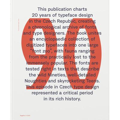
Typo 9010 unites an encyclopaedic collection of Czech digitized typefaces starting from 1990, a time when computers were starting to replace phototypesetting and copying letters by hand, and ending with 2010, when almost a dozen small type foundries were operating in the country. The book captures the most important moments at the oldest Czech type design studio (at the Academy of Arts, Architecture and Design in Prague) and recapitulates the most important milestones in the industry.
- Czech Digitized Typefaces 1990–2010