

Typography Feed (complete)
- Yesterday
-
Yes, that’s it. I just did a qualified guess based on what I saw in my Norwegian version of Safari.
-
Also, I'd consider purchasing a non-commercial, personal use license to FDI Qualia Serif if it were made available.
-
Thank you, Ralf, for the information. And thanks, too, Bjørn, for suggesting the WhatFont extension, which I like very much. BTW, on my version of Safari (17.4.1), the sequence you mentioned seems to be Safari > Settings > Advanced > Show features for web developers. Or at least I assume that's the same thing you're talking about. Now if I just had a spare £40 so I could buy a license to Robert Green's Doves Type.
-

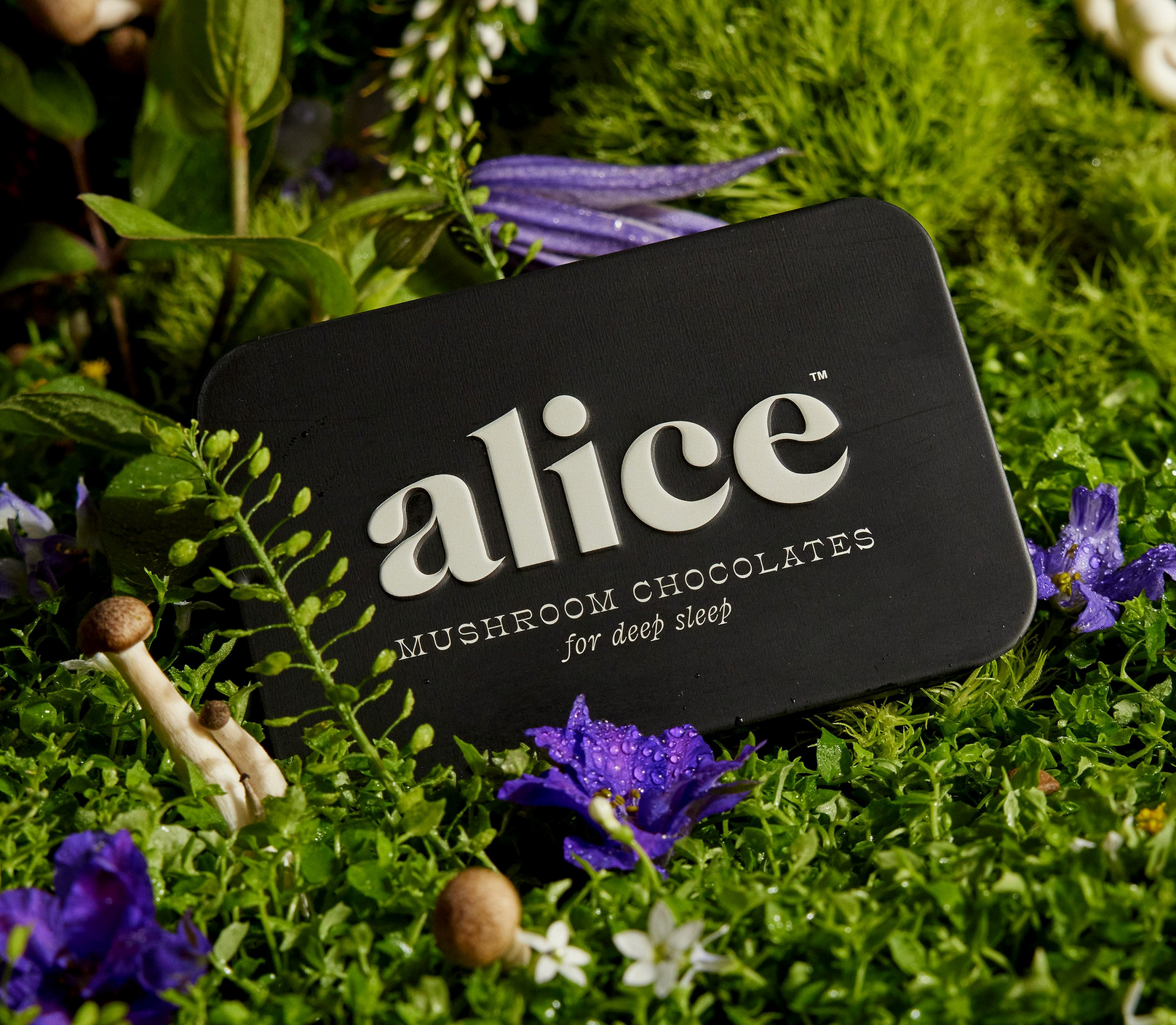
Looking for some help in identifying this lovely 70s serif font (Alice Mushrooms)
Member Nei… replied to Member Nei… 's topic in Font Identification
Amazing. thank you all so much!! 'Clifton' is a beautful font! Nice one @Kevin Thompson🙂 -

Looking for some help in identifying this lovely 70s serif font (Alice Mushrooms)
Member Kev… replied to Member Nei… 's topic in Font Identification
Ah, Clifton (a revival of Athenian Extended from 1889) appears to be used for Mushroom Chocolates. -
Looking for some help in identifying this lovely 70s serif font (Alice Mushrooms)
Member Kev… replied to Member Nei… 's topic in Font Identification
Seconding MissNobody’s ID of of a modified Caslon Graphique. Mushroom Chocolates is very similar to JMH Cajita, but not quite a match. -

Looking for some help in identifying this lovely 70s serif font (Alice Mushrooms)
Member Bjø… replied to Member Nei… 's topic in Font Identification
It kind of reminded me a little of a carglass firm we have here in Scandinavia. Also custom.
-
.thumb.png.51dfb6cc71a655bbb607ec7a044b60c4.png)
Looking for some help in identifying this lovely 70s serif font (Alice Mushrooms)
Member Mis… replied to Member Nei… 's topic in Font Identification
On the site it says it's a custom typeface, the most similar I can find is Caslon Graphique. -
Looking for some help in identifying this lovely 70s serif font (Alice Mushrooms)
Member Nei… posted a topic in Font Identification
Hello! Can anyone help identify the font used for 'alice' and also the smaller font for 'mushroom chocolates'? Link here - https://cristiestevens.com/alice-case-study Thanks!
-
Fontstand—a new way of font licensing
Member Bjø… commented on Ralf Herrmann's journal article in Journal
I am basically sympathetic to the concept, but boy do they need some high impact headliners on their poster. One true flagship per category (Questa, Graphik, Bree Serif, Drone and Nitti) is not enough. We need to see true heavy hitters like real Garamonds, Frutigers, Futuras, Bodonis, Baskervilles, Caslons, Goudys, , Universes, Gills, Helveticas, DINs and so forth. As it is, this looks very much like a collection of replacement fonts. Imagine having House Industries on board and not getting Neutraface or Eames. That just makes no sense. -
@Ralf Herrmann I also recommend that you do whatever it was that you did to the FDI Elfenfraktur font (which I have purchased) on its demo page to Qualia Serif on this site. That would stop sneaky b*stards like yours truly from snatching it from this website. 😉 PS. I respect intellectual property and will never use your font for anything public. Perhaps for the odd birthday invitation, but that's about it. I'd buy it if it was for sale, though.
-
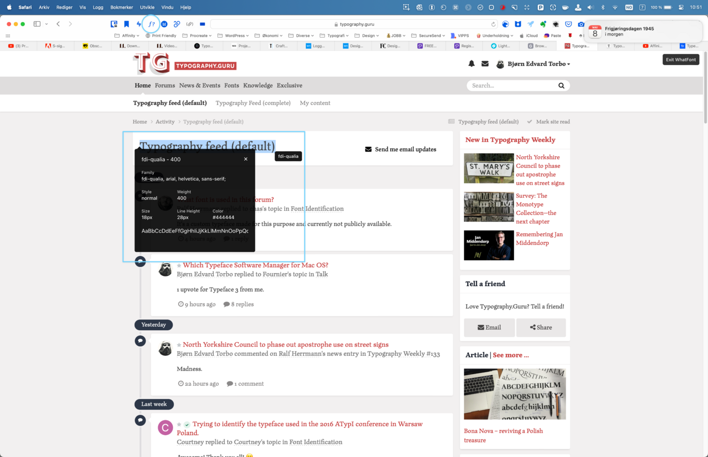
FDI Qualia Serif. I recommend activating the Safari > Preferences > Advanced > Show functions for Developers option in Safari if you're on a Mac. Also, the browser extension WhatFont? is a great tool to look up fonts you are curious about.

-
 Member Bad… joined the community
 -
 Member Pen… joined the community
 -

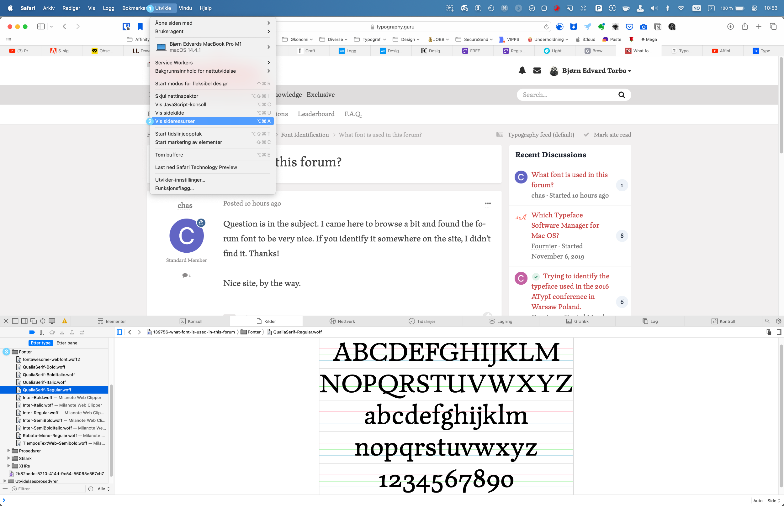
What font is used in this forum?
Ralf Herrmann replied to Member cha… 's topic in Font Identification
It’s a custom typeface made for this purpose and currently not publicly available. - Last week
-
1 upvote for Typeface 3 from me.
-
 Member And… joined the community
 -
Question is in the subject. I came here to browse a bit and found the forum font to be very nice. If you identify it somewhere on the site, I didn't find it. Thanks! Nice site, by the way.
-
 Member cha… joined the community
 -
FontExplorer X Pro 7 and Suitcase Fusion 10 both have good reputations, but you'll want to look at the specific features and interface changes in these newer versions to see if they address your concerns about presentation and functionality. When it comes to building software, developers often release significant updates to ensure their applications run smoothly on the latest operating systems. Checking the version histories and user feedback for these updates can provide insight into how well they integrate with new OS features and might help you decide.
-
North Yorkshire Council to phase out apostrophe use on street signs
Member Bjø… commented on Ralf Herrmann's news entry in Typography Weekly #133
Madness. -
North Yorkshire Council to phase out apostrophe use on street signs
Ralf Herrmann posted a news entry in Typography Weekly #133
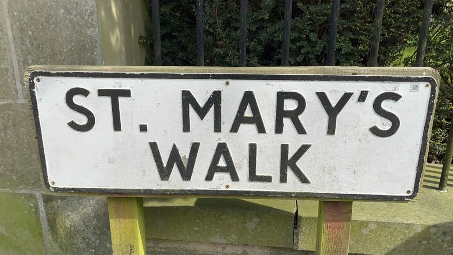 A local authority has announced it will ban apostrophes on street signs to avoid problems with computer systems.
- 1 comment
-
- 1
-

-
- apostrophe
- grammar
- (and 1 more)
-
 Member Aft… joined the community
 -
 Member Nic… joined the community
 -
 Member onl… joined the community
 -
 Member aMe… joined the community
 -
 Member deb… joined the community
 -
 Member Tin… joined the community
 -

Trying to identify the typeface used in the 2016 ATypI conference in Warsaw Poland.
Member Cou… replied to Member Cou… 's topic in Font Identification
Awesome! Thank you all! 🙂 -
IDing generic Cyrillic font used for government approval stamps
Ralf Herrmann replied to Member Gor… 's topic in Font Identification
Do you have more samples? With the resolution of this image it’s impossible to identify the font. Or to put it another way: any common sans-serif design will match that if it’s typeset so small or in such a low resolution. You could just use a system font like Helvetica or something like DIN or Bahnschrift for a more geometric feel.- 1 reply
-
- 1
-

-
Fantastic! Many, many thanks. This will save me a TON of work!
-

IDing generic Cyrillic font used for government approval stamps
Member Gor… posted a topic in Font Identification
Hey all, So, the font in question is the one in this image. Basically, I'm trying to create a novelty stamp for wedding invitations in a Soviet-esque style, but I really want this exact font as it fits the part. I think this is from a Serbian government office, something of that nature... I've seen other stamps and they basically all use this exact font. The closest match I've found is a font called Queen of Clubs, which does look similar-ish but is way more narrow... and the effect is lost somewhat. I've tried all automatic font ID sites, and nothing comes up, and also researched manually heavily... I've been designing for 15 years, and I don't think I've ever actually not been able to ID a font, so this is quite irritating actually. Thanks in advance, and if anyone can get it, I'll happily get them a coffee.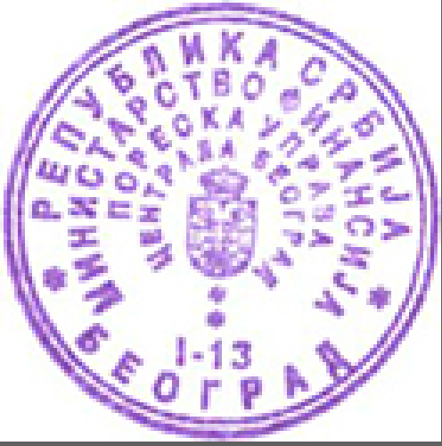
-
Font from LE REX in Nogent-le-Rotrou (France)'s logo.
Member Bjø… replied to Member mth… 's topic in Font Identification
What’s strange though, is that in your first sample, the E in CINÉMA isn’t rounded like in REX and the text below it. The rounded E looks more like it belongs in Exo 2.0 or thereabouts. -

Font from LE REX in Nogent-le-Rotrou (France)'s logo.
Member mth… replied to Member mth… 's topic in Font Identification
Hey! Thank you very much for the suggestions. Mittelschrift is actually what I had ended up with using one of those automated tools online. So you reckon it was - at least in part - a custom job? -
Looking for the name of a rounded serif font from mark circa 2005.
Member Kev… replied to Member mon… 's topic in Font Identification
Sorry, but so little detail is visible in your sample as to make it pretty much useless to font matching software programs. It's a semi-slab typeface, at least, but that's not a lot to go on. Do you know the name of the restaurant? Better images may be available elsewhere on the 'net.- 1 reply
-
- 1
-


-
Newsletter
Sign UpSubscribe to our monthly newsletter, which highlights recent and noteworthy content from the community.
-
New in Typography Weekly
-
Tell a friend
-
Article | See more …
-
Latest Videos | see more…
-
Latest Lists | see more…
-
Random Quote
As I never saw my father or my mother, and never saw any likeness of either of them (for their days were long before the days of photographs), my first fancies regarding what they were like, were unreasonably derived from their tombstones. The shape of the letters on my father's, gave me an odd idea that he was a square, stout, dark man, with curly black hair. From the character and turn of the inscription, “Also Georgiana Wife of the Above”, I drew a childish conclusion that my mother was freckled and sickly.


