

Typography Feed (complete)
- Past hour
-

Help with fonts used in a web video published on the BBC website in 2005
Member Joh… replied to Member Joh… 's topic in Font Identification
OK, I apologise. How should I proceed from here? -

Help with fonts used in a web video published on the BBC website in 2005
Ralf Herrmann replied to Member Joh… 's topic in Font Identification
It’s probably best to ask specifically about one or two fonts. Asking about 26 at once might be a bit too much for our volunteers helping with these kinds of questions. - Today
-
On a recent visit to The Royal Courts of Justice in The Strand, London, I noticed that the typeface used on the main sign outside is also used for large print sign posts and notices in and around the courts (over 100) court rooms accross the inter-linked buildings. I thought this would be easy to look up. But all I find is a suggestion that the typeface was designed by the Architect George Edmund Street. Street was at the spearhead of the 'gothic revival' during the mid-victorian period, and the RCJ is his seminal work, which was mostly churches and books on design and architecture. One of Street's apprentices was William Morris and scans show the closest font to be 'Morris', a recent design based on Morris's original typefaces; but 'closest' doesn't mean close. Nothing really comes close to the capital R, with the downward slope at the top of the bowl,the decorative 'blade' protruding from the leg. The tilted oval bowl on the lower case 'o'; 'drunk as a judge'? Has anyone come accross this in digital font, or indeed have any knowledge about the history of the font or a full copy of the glyphs? I'm assuming it's 'crown copyright' but I need support; clearly. Thanks for reading.

-
Help with fonts used in a web video published on the BBC website in 2005
Member Joh… replied to Member Joh… 's topic in Font Identification
Have I done something wrong or broken the rules? I opened my query four days ago and no one has replied. I thought that the experts here would at least be able to confirm some of the 18 fonts I identified myself, if not the 8 unknown fonts. Am I wrong? -
Is it normal to be a little hot and bothered by this? 😂❤️
- 3 comments
-
- 1
-

-
- germany
- tschichold
- (and 1 more)
-
 Member R joined the community
 - Last week
-

Custom VKP80 II Kiosk Printer Font
Member Mah… replied to Member DVS… 's topic in Font Identification
Boleh minta soft file font vkp 80 versi 2 -
Please let us know what changes you make, and whether or not the changes improve the final product.
-

Looking name of font in First Things magazine ad
Member Jim… replied to Member Jim… 's topic in Font Identification
Thanks, MissNobody, it looks like you basically got it. It turns out that it's FontFont Reminga Titling Italic with alternates for the letters k and l. To answer Ralf Hermann's question, it's from an ad for the magazine's podcast, "Conversations with Mark Bauerlein." The magazine uses Reminga for body text, but I didn't look at the titling version or its alternates. -
.thumb.png.51dfb6cc71a655bbb607ec7a044b60c4.png)
Looking name of font in First Things magazine ad
Member Mis… replied to Member Jim… 's topic in Font Identification
I found it as a knock-off of Reminga. Can't find any legit source.
-
Thank you for all the comments. It is a4 in size.
-
Member Mah… joined the community
-
My first reaction upon looking at the sample page is that the text isn't fully justified. Just changing that might make a difference. My next comment is that, instead of indenting the first line of each new paragraph by one em, you instead added a blank line. I respectfully suggest eliminating the blank lines and indenting the first line of each paragraph (except that the first paragraph following a heading or section break should not be indented). (I typically indent 0.2", which equates to 5mm.) Third comment: Is this a tabloid-size publication, or is it on letter-size paper (8-1/2" x 11" U.S., or A4 in most other places)? If it's on letter-size paper, with fairly wide margins and three columns, the columns are narrow. In general, we are advised to avoid using Times New Roman for body text because it is so widely used (and abused). However, this is exactly the application that Times New Roman was designed for -- being readable when used in the narrow columns typically used by newspapers.
-
Looking name of font in First Things magazine ad
Ralf Herrmann replied to Member Jim… 's topic in Font Identification
What was the ad for? The magazine itself? -
This text is scanned from an ad in the print edition of a recent issue of First Things magazine. Neither the ad nor the font appears on the magazine website. I've found a number of very similar fonts, but none have the same right-facing serifs on the letters k and l. I'm just looking for the name of the font. Thanks in advance for any suggestions.

-
Member Jim… joined the community
-

I need help finding this fancy font type from a bridal shower invitation
Member khi… replied to Member khi… 's topic in Font Identification
Thank you so much for the help!!! I really appreciate it! -
Remember that hier, at Typography.guru, under Fonts > Font Lists, you have lists of free fonts that can be really useful.
-

Looking for AUSTIN THEORY font from WWE NXT in 2019
Member Ken… posted a topic in Font Identification
Hi everyone. I am looking for this futuristic/space looking for for AUSTIN THEORY used back on the WWE Network in 2019. I used to have this font downloaded but somehow I must've misplaced it and I can no longer remember its name. If anyone happens to know what this font is, it would be much appreciated. Thanks!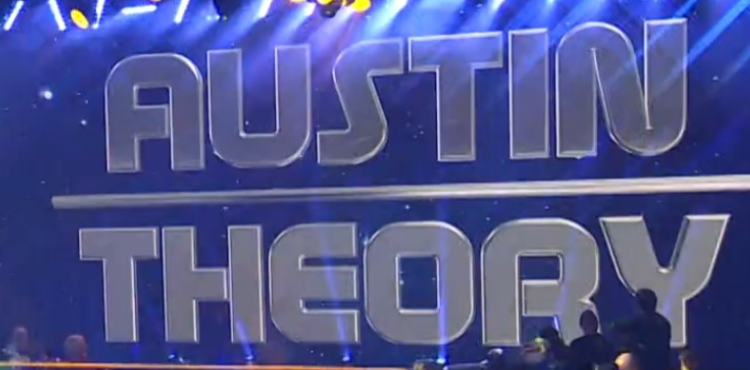
-
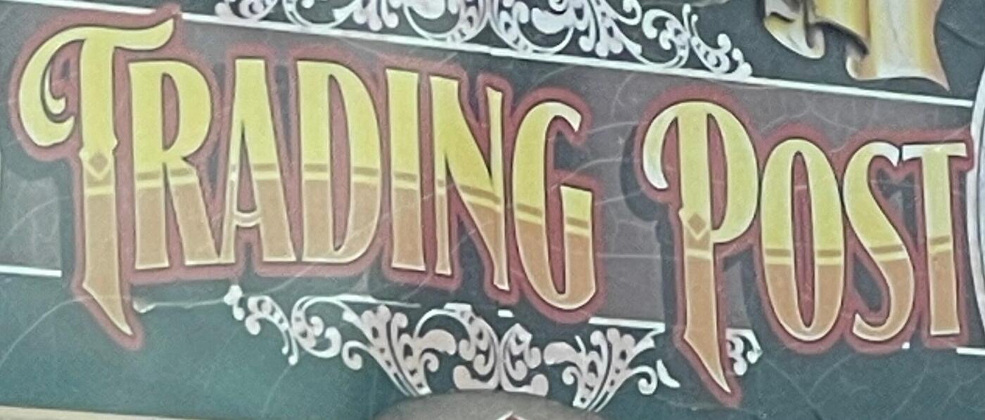
Looking for the name of the font used for this Trading Post store in Custer, SD
Member Mis… replied to Member MDo… 's topic in Font Identification
I think it's Signmaker 2 from LHF. Mix of Regular and Fancy. -

Looking for the name of the font used for this Trading Post store in Custer, SD
Member MDo… posted a topic in Font Identification
-
Member MDo… joined the community
-
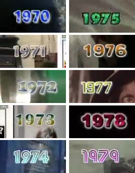
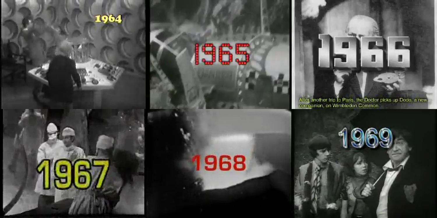
Help with fonts used in a web video published on the BBC website in 2005
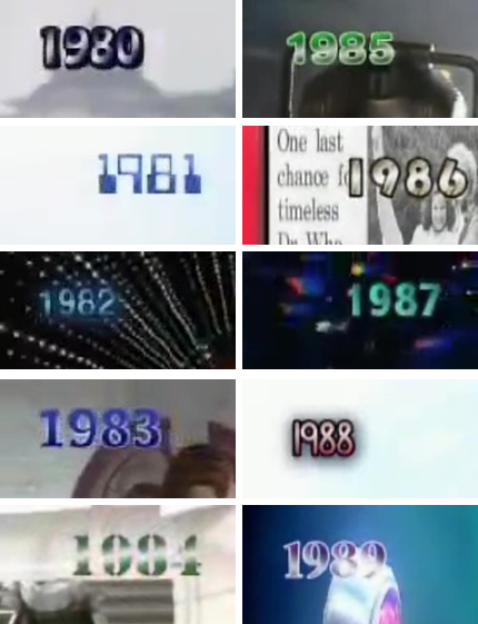
Member Joh… posted a topic in Font Identification
Hi all, I would like some help with fonts used in a BBC web video from 2005. Here are screenshots from said video (sorry about the picture quality but it was 2005). I think I've managed to identify most of them, but would like to have a second opinion from the experts on here; and also have help to narrow down some to specific fonts within a family. 1964 > Cooper Black 1965 > ?? 1966 > ?? 1967 > in Eurostile family 1968 > in Eurostile family 1969 > Arial 1970 > ?? 1971 > Maiandra 1972 > Cooper Black 1973 > Britannic Bold 1974 > Budmo Jiggler 1975 > Futura Extra Bold 1976 > Arial Rounded or Helvetica Rounded 1977 > ?? 1978 > Arial Black 1979 > Street Cred 1980 > Hobo 1981 > Computer Regular 1982 > ?? 1983 > ?? (similar to Tahoma) 1984 > Stencil 1985 > Arial Rounded or Helvetica Rounded 1986 > Bauhaus 1987 > Segoe UI 1988 > ?? 1989 > ?? Thank you in advance 🙂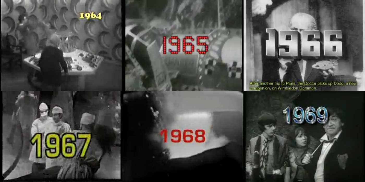
-
 Member ess… joined the community
 -
I am looking for the font used in this Kabi Kabi People logo.
Member Mis… replied to Member Dar… 's topic in Font Identification
Looks like Luna by Carolina Mejia Villegas.
-

Looking for the font used on RM's upcoming album Right Place, Wrong Person
Member mer… posted a topic in Font Identification
This font is used in graphics for RM's album Right Place, Wrong Person that's coming out in a few weeks. I've done some digging on my own including inspecting the website and it seems similar to Nanum Myeongjo but it doesn't match perfectly. I'm looking for a digital version and commercial fonts are fine.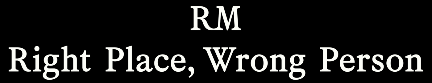

-

I am looking for the font used in this Kabi Kabi People logo.
Member Dar… posted a topic in Font Identification
I am looking to re draw this logo for the Kabi Kabi People.
-
Member Dar… joined the community
-

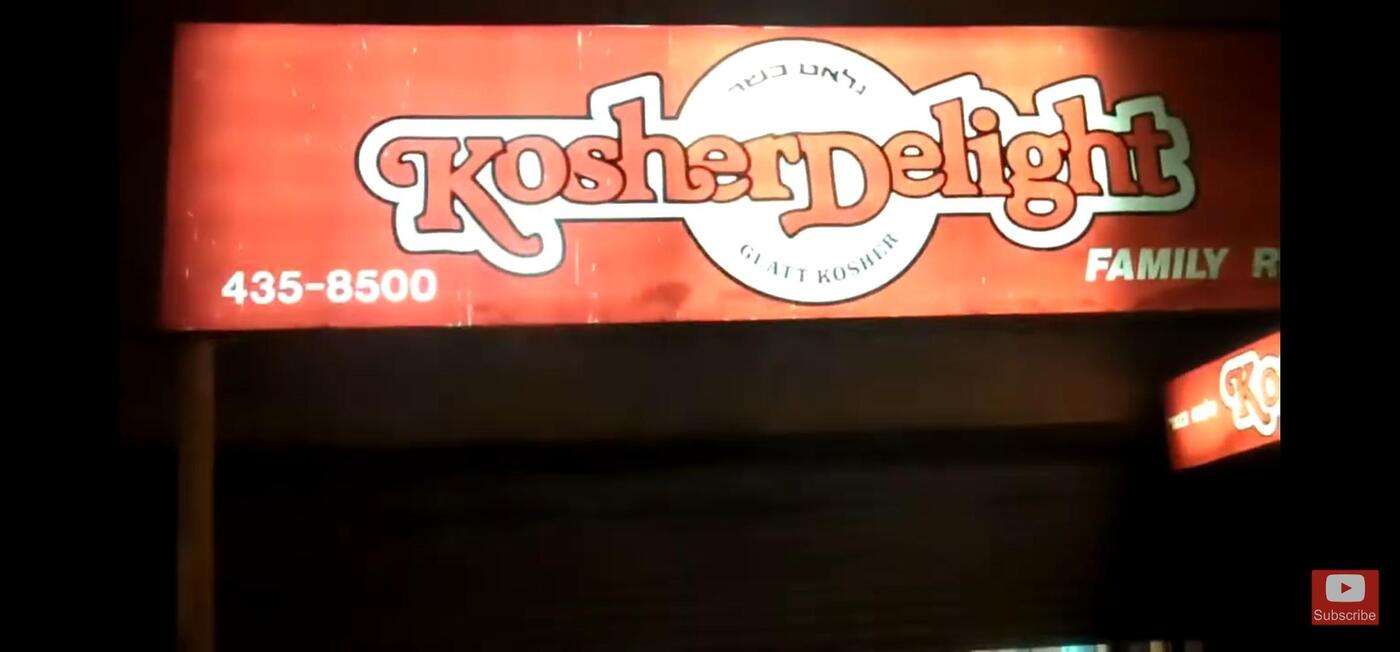
80's logo signage identification Kosher Delight
Member Kev… replied to Member Naf… 's topic in Font Identification
Mellissa, which sadly has never been digitized.- 1 reply
-
- 1
-

-
This store used to be on 13th Ave in Brooklyn. Looks super familiar but i can't seem to find a match with the swashes. Thanks!!

-
 Member Naf… joined the community
 -
If you're not sure what doesn't work, how could anyone assist you? 🤷♂️ You need to identify the problem, and share it. Then it would be possible to give advice. There are an abundance of beautiful typefaces out there, and Bembo is clearly one of them. I think Spectral would be a nice alternative to Bona Nova, if we were to stick to Google Fonts.


-
Newsletter
Sign UpSubscribe to our monthly newsletter, which highlights recent and noteworthy content from the community.
-
New in Typography Weekly
-
Tell a friend
-
Article | See more …
-
Latest Videos | see more…
-
Latest Lists | see more…
-
Random Quote
Type is a beautiful group of letters, not a group of beautiful letters.

.")
