

Typography Feed (complete)
- Past hour
-

Looking for the font used in the Touchstone 3rd edition of Viktor Frankl's Man's Search for Meaning
Member Kev… replied to Member Ell… 's topic in Font Identification
Sorts Mill Goudy vs. the sample: In 1984 this would have been a phototypesetting font, and while I've yet to find a digital version of Baskerville that is a close match, the Q, a, and g point in that general direction. You have to take into account the low quality of the sample and the effect of ink spread on the paper, but the tail on Goudy's Q (plus it's poor match on other letters) rule it out.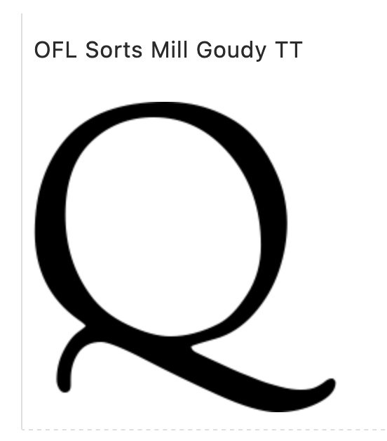

- Today
-

Looking for the font used in the Touchstone 3rd edition of Viktor Frankl's Man's Search for Meaning
Member Sap… replied to Member Ell… 's topic in Font Identification
Actually, the upper case 'Q' is much more like Goudy Old Style than it is to Baskerville. https://www.1001fonts.com/ofl-sorts-mill-goudy-font.html -
My computers currently run Windows 10. For testing and comparison, I have installed on my primary desktop computer Microsoft Office 2019, SoftMaker Office 2024, and LibreOffice 7.x.x. Some time ago I noticed that this computer had somehow, somewhere, installed a huge number of fonts, all beginning with "Noto." A bit of research on the Internet has told me that these fonts originated with Google and that they are intended to provide similar-appearing fonts in every language. That's wonderful, but I don't write in every language. I write almost exclusively in American English, and a bit of Spanish and French. When I discovered the Noto fonts, I laboriously went through and uninstalled all of them. They came back! I suspect they were installed when LibreOffice updated itself. Does that seem like a reasonable supposition? More importantly, is there any reason why I shouldn't delete them -- again? More importantly, if I delete them, how can I prevent them from returning? Thank you.
- Yesterday
-
I am looking to identify the font used in this decal, specifically the 400EX portion of it (I already have the Honda font). Thanks in advance for your assistance. https://www.ebay.ca/itm/334804487905?chn=ps&norover=1&mkevt=1&mkrid=706-89093-2056-0&mkcid=2&mkscid=101&itemid=334804487905&targetid=1656417413430&device=m&mktype=pla&googleloc=9047918&poi=&campaignid=17297476241&mkgroupid=135489415143&rlsatarget=pla-1656417413430&abcId=9300870&merchantid=591716756&gad_source=1&gbraid=0AAAAAD00iICRYn9d1gkoUMbBl2UtGsTKj

-

Looking for the font used in the Touchstone 3rd edition of Viktor Frankl's Man's Search for Meaning
Member Bjø… replied to Member Ell… 's topic in Font Identification
That would be my second guess, agreed. -
 Member Jan… joined the community
 -
Looking for the font used in the Touchstone 3rd edition of Viktor Frankl's Man's Search for Meaning
Member Kev… replied to Member Ell… 's topic in Font Identification
With that Q, g, and a, I would have guessed some flavor of Baskerville, but without a larger and sharper sample, hard to be sure. -
Looking for the font used in the Touchstone 3rd edition of Viktor Frankl's Man's Search for Meaning
Member Bjø… replied to Member Ell… 's topic in Font Identification
I'm thinking some sort of Goudy Old Style. A free alternative for that would be Sorts Mill Goudy by Barry Schwartz. Not an exact match, but fairly close. -

Looking for the font used in the Touchstone 3rd edition of Viktor Frankl's Man's Search for Meaning
Member Ell… posted a topic in Font Identification
As stated in the title, the book is Viktor Frankl's Man's Search for Meaning. It's the Touchstone (Simon & Schuster) 3rd edition with a copyright year of 1984. Here is a random paragraph from the book: I would like to know the exact font name, and also any free alternatives if possible.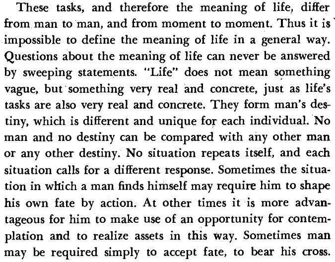
-
Member Ell… joined the community
- Last week
-
Yes, that’s it. I just did a qualified guess based on what I saw in my Norwegian version of Safari.
-
Also, I'd consider purchasing a non-commercial, personal use license to FDI Qualia Serif if it were made available.
-
Thank you, Ralf, for the information. And thanks, too, Bjørn, for suggesting the WhatFont extension, which I like very much. BTW, on my version of Safari (17.4.1), the sequence you mentioned seems to be Safari > Settings > Advanced > Show features for web developers. Or at least I assume that's the same thing you're talking about. Now if I just had a spare £40 so I could buy a license to Robert Green's Doves Type.
-

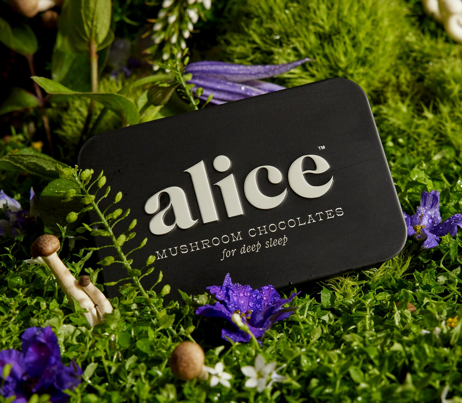
Looking for some help in identifying this lovely 70s serif font (Alice Mushrooms)
Member Nei… replied to Member Nei… 's topic in Font Identification
Amazing. thank you all so much!! 'Clifton' is a beautful font! Nice one @Kevin Thompson🙂 -
Looking for some help in identifying this lovely 70s serif font (Alice Mushrooms)
Member Kev… replied to Member Nei… 's topic in Font Identification
Ah, Clifton (a revival of Athenian Extended from 1889) appears to be used for Mushroom Chocolates. -
Looking for some help in identifying this lovely 70s serif font (Alice Mushrooms)
Member Kev… replied to Member Nei… 's topic in Font Identification
Seconding MissNobody’s ID of of a modified Caslon Graphique. Mushroom Chocolates is very similar to JMH Cajita, but not quite a match. -
Looking for some help in identifying this lovely 70s serif font (Alice Mushrooms)
Member Bjø… replied to Member Nei… 's topic in Font Identification
It kind of reminded me a little of a carglass firm we have here in Scandinavia. Also custom.
-
.thumb.png.51dfb6cc71a655bbb607ec7a044b60c4.png)
Looking for some help in identifying this lovely 70s serif font (Alice Mushrooms)
Member Mis… replied to Member Nei… 's topic in Font Identification
On the site it says it's a custom typeface, the most similar I can find is Caslon Graphique. -
Looking for some help in identifying this lovely 70s serif font (Alice Mushrooms)
Member Nei… posted a topic in Font Identification
Hello! Can anyone help identify the font used for 'alice' and also the smaller font for 'mushroom chocolates'? Link here - https://cristiestevens.com/alice-case-study Thanks!
-
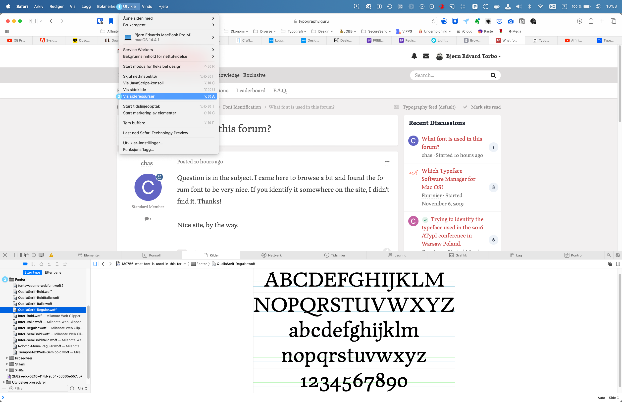
Fontstand—a new way of font licensing
Member Bjø… commented on Ralf Herrmann's journal article in Journal
I am basically sympathetic to the concept, but boy do they need some high impact headliners on their poster. One true flagship per category (Questa, Graphik, Bree Serif, Drone and Nitti) is not enough. We need to see true heavy hitters like real Garamonds, Frutigers, Futuras, Bodonis, Baskervilles, Caslons, Goudys, , Universes, Gills, Helveticas, DINs and so forth. As it is, this looks very much like a collection of replacement fonts. Imagine having House Industries on board and not getting Neutraface or Eames. That just makes no sense. -
@Ralf Herrmann I also recommend that you do whatever it was that you did to the FDI Elfenfraktur font (which I have purchased) on its demo page to Qualia Serif on this site. That would stop sneaky b*stards like yours truly from snatching it from this website. 😉 PS. I respect intellectual property and will never use your font for anything public. Perhaps for the odd birthday invitation, but that's about it. I'd buy it if it was for sale, though.
-
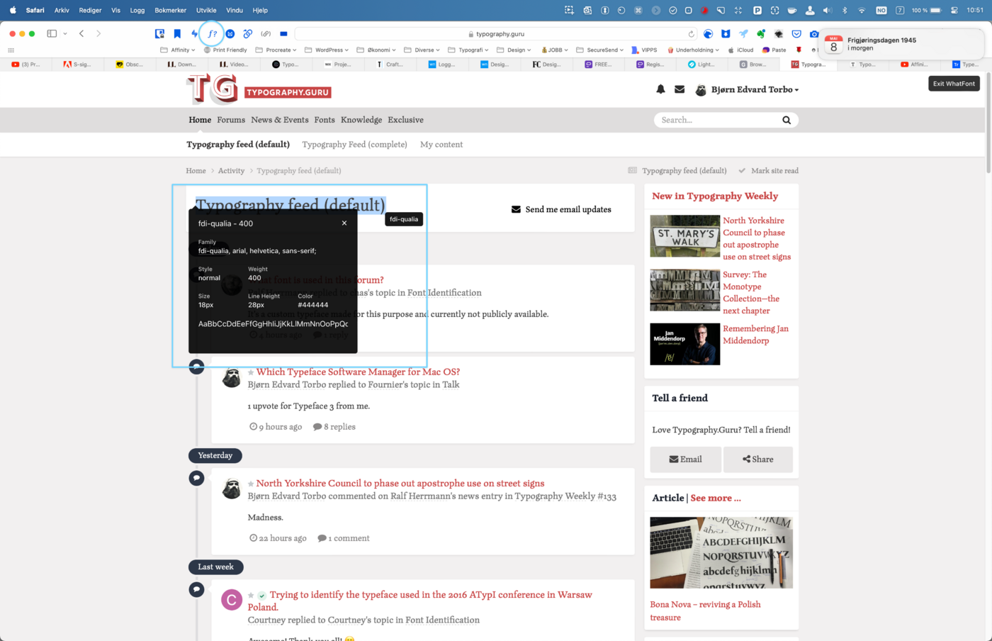
FDI Qualia Serif. I recommend activating the Safari > Preferences > Advanced > Show functions for Developers option in Safari if you're on a Mac. Also, the browser extension WhatFont? is a great tool to look up fonts you are curious about.

-
 Member Bad… joined the community
 -
 Member Pen… joined the community
 -

What font is used in this forum?
Ralf Herrmann replied to Member cha… 's topic in Font Identification
It’s a custom typeface made for this purpose and currently not publicly available. -
1 upvote for Typeface 3 from me.
-
 Member And… joined the community
 -
Question is in the subject. I came here to browse a bit and found the forum font to be very nice. If you identify it somewhere on the site, I didn't find it. Thanks! Nice site, by the way.
-
 Member cha… joined the community
 -
FontExplorer X Pro 7 and Suitcase Fusion 10 both have good reputations, but you'll want to look at the specific features and interface changes in these newer versions to see if they address your concerns about presentation and functionality. When it comes to building software, developers often release significant updates to ensure their applications run smoothly on the latest operating systems. Checking the version histories and user feedback for these updates can provide insight into how well they integrate with new OS features and might help you decide.
-
North Yorkshire Council to phase out apostrophe use on street signs
Member Bjø… commented on Ralf Herrmann's news entry in Typography Weekly #133
Madness.


-
Newsletter
Sign UpSubscribe to our monthly newsletter, which highlights recent and noteworthy content from the community.
-
New in Typography Weekly
-
Tell a friend
-
Article | See more …
-
Latest Videos | see more…
-
Latest Lists | see more…
-
Random Quote
Type design moves at the pace of the most conservative reader. The good type-designer therefore realizes that, for a new fount to be successful, it has to be so good that only very few recognize its novelty.


