

Typography Feed (complete)
- Yesterday
-

Font resembling 3 lined Neon Tubes, Steps Artwork 2022
DanielM posted a topic in Font Identification
Hi, Try to identifying the font used in Steps' album logo for "What the Future Holds." After examining the logo, the font appears to be a custom design specifically created for the album artwork. While I found a font called Wox Striped Triple Demo that bears some resemblance, it's not an exact match but it may be a custom design https://en.wikipedia.org/wiki/What_the_Future_Holds Clean Logo (SVG) https://static.wikia.nocookie.net/logopedia/images/b/b4/Steps_WTFH_era.svg/revision/latest?cb=20230508165417 Webpage: https://logos.fandom.com/wiki/Steps May very well be a custom font, closest i could find is: https://www.fontspace.com/wox-striped-triple-demo-font-f2.png.9ac1743ff3eca7f1274ebb6cbd6a8fb5.png)
-
DanielM joined the community
-
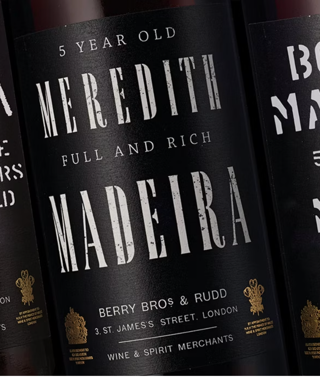
Wine Label Fonts (Berry Bros & Rudd)
Bjørn Edvard Torbo replied to Future Days's topic in Font Identification
Now try «La Cucaracha». 😂👍 -

Wine Label Fonts (Berry Bros & Rudd)
Kevin Thompson replied to Future Days's topic in Font Identification
It would be helpful if I could spell—that should read Chaparral. -

Wine Label Fonts (Berry Bros & Rudd)
Future Days replied to Future Days's topic in Font Identification
Hi Kevin, You are correct. Thank you for all your help. Best, Robert -
Wine Label Fonts (Berry Bros & Rudd)
Kevin Thompson replied to Future Days's topic in Font Identification
BERRY BROS & SONS et al. may be Grot12 Normal, if you use the italic for the ampersand. -
Wine Label Fonts (Berry Bros & Rudd)
Kevin Thompson replied to Future Days's topic in Font Identification
5 YEAR OLD and FULL AND RICH may be Chaparrel. -
Wine Label Fonts (Berry Bros & Rudd)
Kevin Thompson replied to Future Days's topic in Font Identification
MEREDITH MADEIRA is set in Partype's Bardi (texture added by the label designer). Working on the others…. - Last week
-
Hello. I need a little help. Would anyone please be able to tell me the name of the three fonts in the image and where I might purchase them. Happy to have alternatives if the fonts are not easy to name. Thank you for all you assistance. Robert
-
Future Days joined the community
-
 JWill795 joined the community
 -
Wow, thanks so much for that Ralf! I've tested Literata before, but this is the first time I've heard of Dolly. Dolly looks fabulous!
-
Not sure about almost identical, but what comes to mind: Underware Dolly ☞ https://www.underware.nl/fonts/dolly/ Type Together Literata ☞ https://www.type-together.com/literata-font
-
I really like the look of Amazon's Bookerly font which they use for their ebooks and previews. I find that it has a modern casual feel compared to other fonts such as Minion which feels more archaic and serious. I also like the larger x-height of Bookerly. Unfortunately, it's not optimized for print, and it's also exclusive to Amazon only. So I wonder, is there a print-optimized font that is almost identical to Bookerly that we can buy? I attached an image showing a comparison of Minion (top) versus Bookerly (bottom). Kind regards, Alan
-
 Thanks Ralf! Just curious, how did you know it was Interstate?
 -
 Interstate ☞ https://en.wikipedia.org/wiki/Interstate_(typeface)
 -
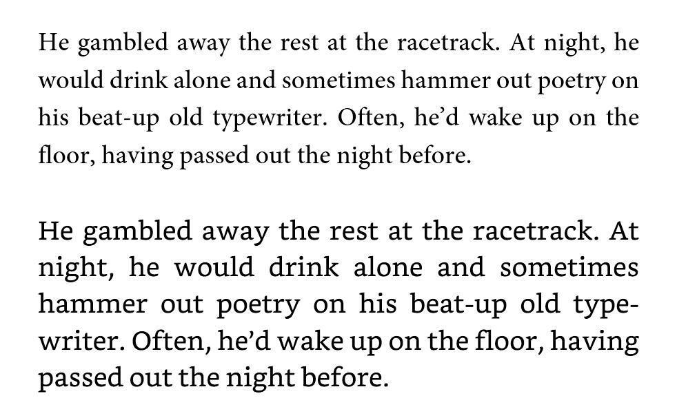
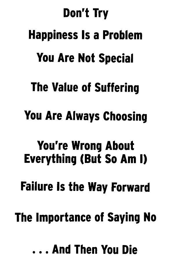
Hi all, I'd like to ask if anyone recognises the font used for the chapter/header text of 'The Subtle Art of Not Giving a F***" by Mark Manson, Australian version, ISBN: 978-1-76055-877-2, published by Pan Macmillan Australia. It works really well as a header due to it being quite narrow. You can also see a high-resolution original scan here. I've attached a scan below. Thanks in advance! Alan
-

Searching for Football club Cologne T Shirt Font
sdaio h replied to Jun H's topic in Font Identification
thank you, how did you know that? -
sdaio h joined the community
-
 Michael Oldenburg joined the community
 -
 buiducvu36998 joined the community
 -
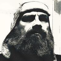
Indeed. Looks like Real Head.
- 1 reply
-
- 1
-

-
 Shefee Ks joined the community
 -
 nothinhers joined the community
 -
Looking to ID this beautifully modern sans serif for a recent logo redesign of the Episcopal Church digital subscription service for youth development here. The font may be inspired by Franklin Gothic. I can't identify it, but I've a feeling @MissNobody will.
-
Thanks for commenting - My last day there yesterday, I had planned to get some sneak pics - photography is banned - but were were in deliberation for over 5 hours and there was only security left. Morris' Golden families are closer than Kelmscott because the RCJ has a pronounced, ornate broken cross apex on the uppercase W. Other notable caps are N and B, there is a sign designating a room as "BBC Studio" and the fancy Bs next to relativly normal C could not have been predicted in the 1870s, but might have influenced the design. The type is easily differentiated from the simplicity of William Morris or Emery Walker but still seems related. Looking into it further, I also wonder why Street did not go for a more Gothic design given his passion for Gothic revival is realised in this building. As for use - most signs are either printed on ceramic or plastic tiles - inserted into wooden slots on A2-A1 sized boards - reminicent of church hymn number boards, but mounted atop on wooden stands. These might be recent but appear to be old or restored. Some are printed on paper and stuck on notice boards. The Royal Courts of Justice are open to the public and free to enter Mon-Fri 9-4.30.
-
Affinity software gains support for variable fonts in version 2.5
Bjørn Edvard Torbo commented on Ralf Herrmann's news entry in Typography Weekly #133
Affinity is slowly becoming the graphic design powerhouse that we long for it to be. We need true vector brushes, a decent image trace feature and preferably support for plugins like Astute and FontSelf, but you could switch today and live a happy, productive life as a designer as it is. It plays very nice with Glyphs 3, for instance. -
Introducing Spotify Mix, Our New and Exclusive Font
Bjørn Edvard Torbo commented on Ralf Herrmann's news entry in Typography Weekly #133
I feel that “To design this typeface, we broke free from traditional typographic constraints and merged elements from a variety of font styles” is a bit of a mouthful for a pretty standard sans serif with a modest level of personality. They didn’t exactly reinvent the wheel with this. -
 saku joined the community
 -
Introducing Spotify Mix, Our New and Exclusive Font
Ralf Herrmann posted a news entry in Typography Weekly #133
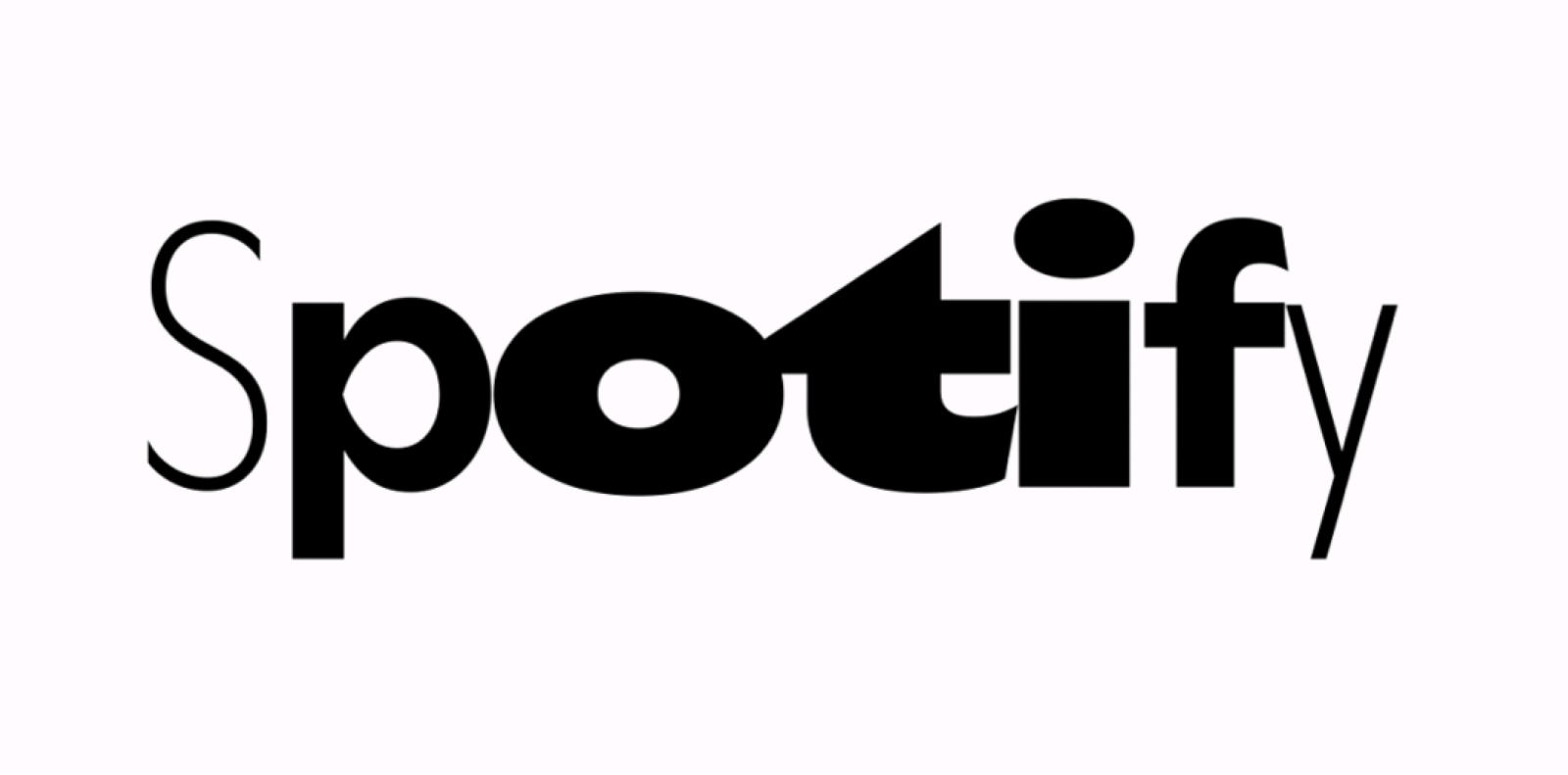 “Today we are introducing our new bespoke typeface: Spotify Mix. Spotify Mix replaces the current font used in our in-app and desktop experiences.”
 -
 Thank you.
 -
Affinity software gains support for variable fonts in version 2.5
Ralf Herrmann posted a news entry in Typography Weekly #133
 You’re now able to use variable fonts in all Affinity apps. In addition, the typography dialog was converted from a pop-up into a panel so you can easily dock it.
 -
.thumb.png.51dfb6cc71a655bbb607ec7a044b60c4.png) I can't find any legit source. If you google 'ComputerNarrow', you'll find it.
I can't find any legit source. If you google 'ComputerNarrow', you'll find it. -
That looks like it. Thank you, MissNobody. 👍 Do you have a link to its website?


-
Newsletter
Sign UpSubscribe to our monthly newsletter, which highlights recent and noteworthy content from the community.
-
New in Typography Weekly
-
Tell a friend
-
Article | See more …
-
Latest Videos | see more…
-
Latest Lists | see more…
-
Random Quote
Type and typography—what you do and how you do it—are both science and art.


