

Typography Feed (complete)
- Past hour
-
.thumb.png.51dfb6cc71a655bbb607ec7a044b60c4.png)
Font identification: Jean Cocteau Handwriting/Signature
Member Mis… replied to Member CN1… 's topic in Font Identification
The closest I can find is Kasdio. - Today
-
 Member Tam… joined the community
 -

Font identification: Jean Cocteau Handwriting/Signature
Member CN1… posted a topic in Font Identification
Hi All, Can anyone recommend a handwriting typeface that's a close match to this example of Jean Cocteau's handwriting/Signature? Many thanks!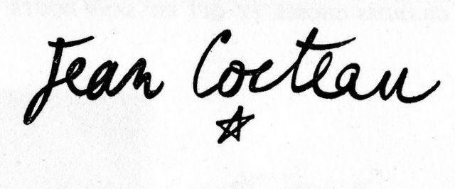
-
 Member Zaf… joined the community
 -
Looking for this Chinese font on the package
Member Bjø… replied to Member Yin… 's topic in Font Identification
Maybe you can try Merchant Copy? -
 Member Joh… joined the community
 -

Looking for this Chinese font on the package
Ralf Herrmann replied to Member Yin… 's topic in Font Identification
That’s not a regular outline font, but the internal dot matrix grid from a labelling machine. It might not be available outside of the specific machine. -
I have to press/print some sentences with this font on the packages. But when I contact mother company, they said the font used is Song typeface. They are from China. When I searched, too many song typeface fonts appeared but they did not match what I am looking for. I need the digital font file because I can't send back packages to China.

-
 Member Yin… joined the community
 -

Sans Serif display font on record cover from 1958 (The Thompson Touch)
Member Chr… replied to Member Chr… 's topic in Font Identification
Many thanks - that's a great starting point. Cheers CM - Yesterday
-

Need to ID Serif and Sans Serif (Getting Better book)
Member Kev… replied to Member Typ… 's topic in Font Identification
A DOCTOR’S STORY… is set in Neutraface No. 2 Text Demi . -
Need to ID Serif and Sans Serif (Getting Better book)
Member Kev… replied to Member Typ… 's topic in Font Identification
The title and author’s name are set in Sabon Roman and Sabon Bold, respectively. -

Need to ID Serif and Sans Serif (Getting Better book)
Member Typ… posted a topic in Font Identification
From the cover of the book Getting Better. Link here. Sans serif is similar to Jost but not quite. Serif is a Garamond but not Adobe Garamond. Thank you in advance, Gurus.
-
Sans Serif display font on record cover from 1958 (The Thompson Touch)
Member Kev… replied to Member Chr… 's topic in Font Identification
Not finding a historical match—all of it my very well have been hand lettered, not typeset. Resembles the Filmotype series Galaxy/Gable/Garfield/Gamma. Similar: Header 12 -
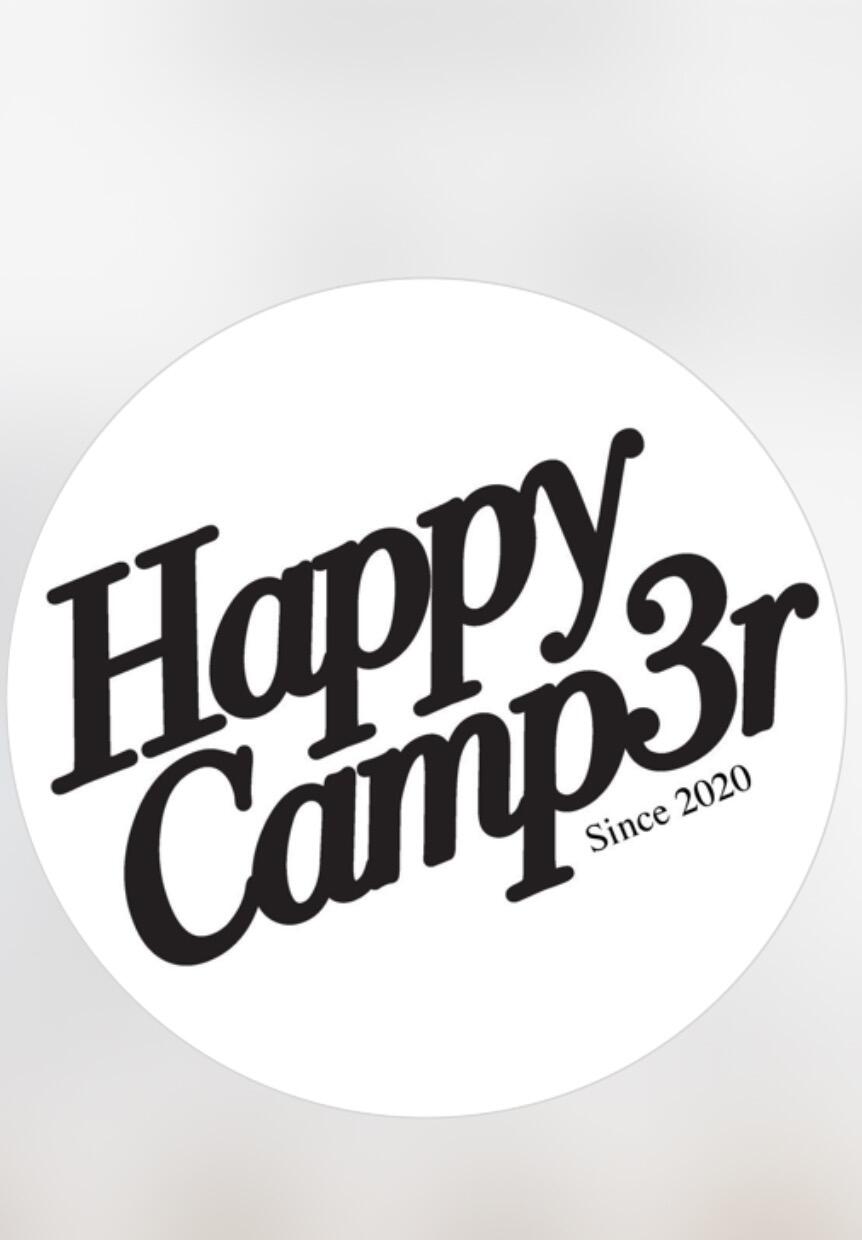
Looking for the font of this clothing brand’s hoodies and crewneck. (Happy Camp3r)
Member Kev… replied to Member est… 's topic in Font Identification
You shouldn’t be surprised that the brand never responded—if your goal is to create "matching designs," why should they help you infringe on their copyrighted identity? I wasn't inclined to help you either, for the same reason. There are actually two distinct, modified typefaces in your sample—Miss Nobody has already identified Happy Camp3r (stroke added and joints rounded), while Club is set in a similarly modified roman of another typeface that was released in 2008. I urge you, however, to find your own style for whatever you want to create—people often quote Oscar Wilde on this topic, but almost always leave off the end of the statement (italics mine): “Imitation is the sincerest form of flattery that mediocrity can pay to greatness.” -
Looking to identify this font from a t-shirt, Comic style?
Member Mis… replied to Member Sil… 's topic in Font Identification
I've tried to find '5', but I can't. It is possible it might be some older version of the font where '5' was a bit different, but that's just a wild guess. -
Looking for the font of this clothing brand’s hoodies and crewneck. (Happy Camp3r)
Member Mis… replied to Member est… 's topic in Font Identification
The closest I can find is Bodoni Twelve. They probably rounded the corners. -

Looking to identify this font from a t-shirt, Comic style?
Member Sil… replied to Member Sil… 's topic in Font Identification
awesome, thank you Miss Nobody. I'll keep searching for that "5". -

Looking for the font of this clothing brand’s hoodies and crewneck. (Happy Camp3r)
Member est… posted a topic in Font Identification
I'm on the hunt for the distinctive font used by a particular clothing brand on their hoodies and crewnecks. It's a unique typeface that gives their apparel a recognizable look. Identifying this font could help in creating matching designs or finding similar styles. The brand hasn’t replied for months so you guys are my last resort.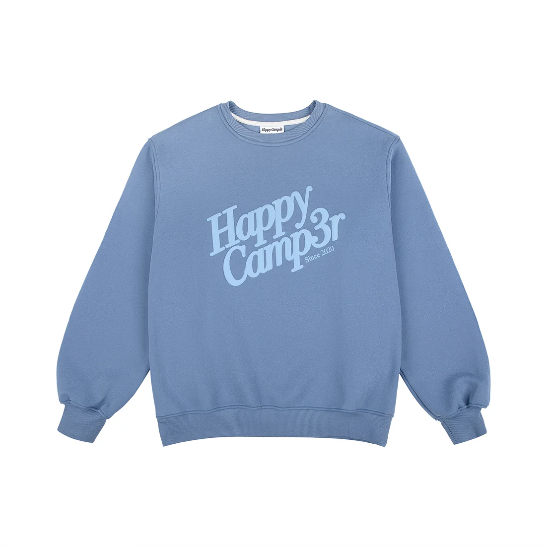


-
Member est… joined the community
-

What’s this font (Signwritten Art book)
Member Sue… replied to Member Sue… 's topic in Font Identification
Thank you for your advice on this Ralf and Kevin. -
Looking to identify this font from a t-shirt, Comic style?
Member Mis… replied to Member Sil… 's topic in Font Identification
Looks like Nutty Noisses. It's a text of 'ComeOn' and is edited, rotated and scaled. The '5' seems like a different font.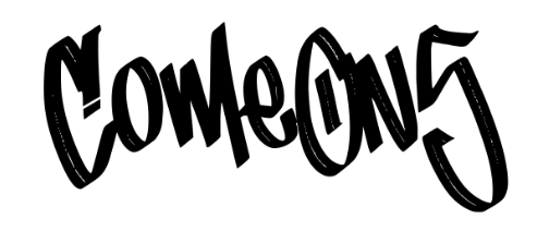
-
Looking to identify this font from a t-shirt, Comic style?
Member Sil… posted a topic in Font Identification
This font is found on a T-shirt design on https://dantemooreshop.com. I feel like i've seen this before. It seems like a comic or graffiti style. A free version would be nice but just an ID would make me happy. The 'O' has a unique center to it. Thanks All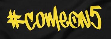
-
Member Sil… joined the community
-
Sans Serif display font on record cover from 1958 (The Thompson Touch)
Member Chr… posted a topic in Font Identification
Hello, first post. Wondering if anyone can help me find this font. Used on a record cover (New Zealand) from 1958. Cover was designed and printed by Coulls Somerville Wilkie Ltd. a New Zealand print company operating in the 40s-70s. The font on the cover has obviously been customised but only to the extent of the arms thickened and lengthened on the Ts. The lower case 's' seems most distinctive. Many Thanks CM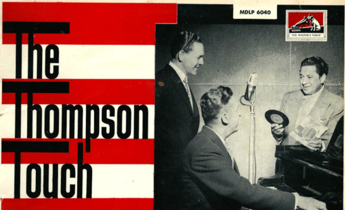
-
Member Chr… joined the community
- Last week
-
 Member sha… joined the community
 -
 Member Chr… joined the community
 -
Awesome, thanks!
-
It is a Chank Diesel offering from 1996. Not listed on his website, but you could reach out and ask if a licensed version is available.
-
Looking for big love font on State of Elliot wedding welcome sign
Member Kev… replied to Member Geo… 's topic in Font Identification
The ampersand (and other cursive type on the other samples on the website) is Bourdos, and the smaller text appears to be Milk and Clay Regular. -
Looking for big love font on State of Elliot wedding welcome sign
Member Mis… replied to Member Geo… 's topic in Font Identification
The names look like Bigola (Display). Smaller text is too small to be sure. -

Looking for big love font on State of Elliot wedding welcome sign
Member Geo… posted a topic in Font Identification
Looking to identify the font for the names of the people & the below smaller body text Found at https://stateofelliott.com.au/products/big-love-welcome-board-a1
-
It is! Thank you so much.


-
Newsletter
Sign UpSubscribe to our monthly newsletter, which highlights recent and noteworthy content from the community.
-
New in Typography Weekly
-
Tell a friend
-
Article | See more …
-
Latest Videos | see more…
-
Latest Lists | see more…
-
Random Quote
Type and typography—what you do and how you do it—are both science and art.


